Solène
Beauty e-commerce homepage, wireframe to code
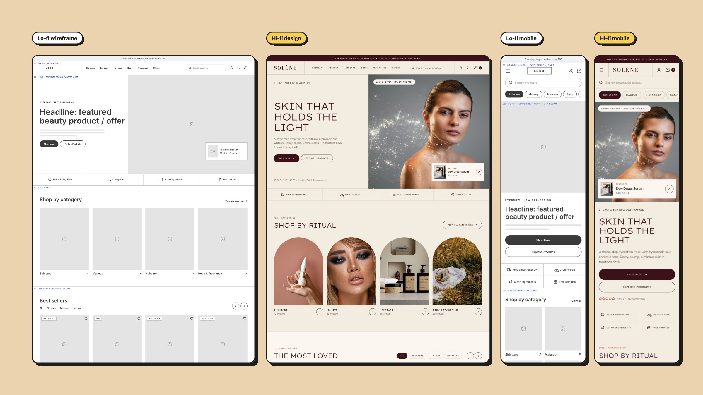
A beauty e-commerce homepage designed in three passes: structure first as lo-fi wireframes, then the visual design, then a working build, with desktop and mobile carried through every stage.
At a glance
A homepage that sells the ritual
Solène is a clean-beauty brand selling skincare, makeup, haircare, body and fragrance. Its homepage has a lot to carry in one scroll: a featured product and an offer, the reasons to trust the brand, a way into each category, the best sellers, the current promotions, and a newsletter sign-up.
I designed it in three passes so each decision was made at the right level of detail: the order and weight of sections as wireframes, the look once the structure was settled, and the behaviour in code.
- 01Lo-fi wireframesGrey boxes and numbered sections, desktop and mobile.
- 02Hi-fi designColour, type and photography on the same structure.
- 03BuildA working Next.js page, one component per section.
Structure before style
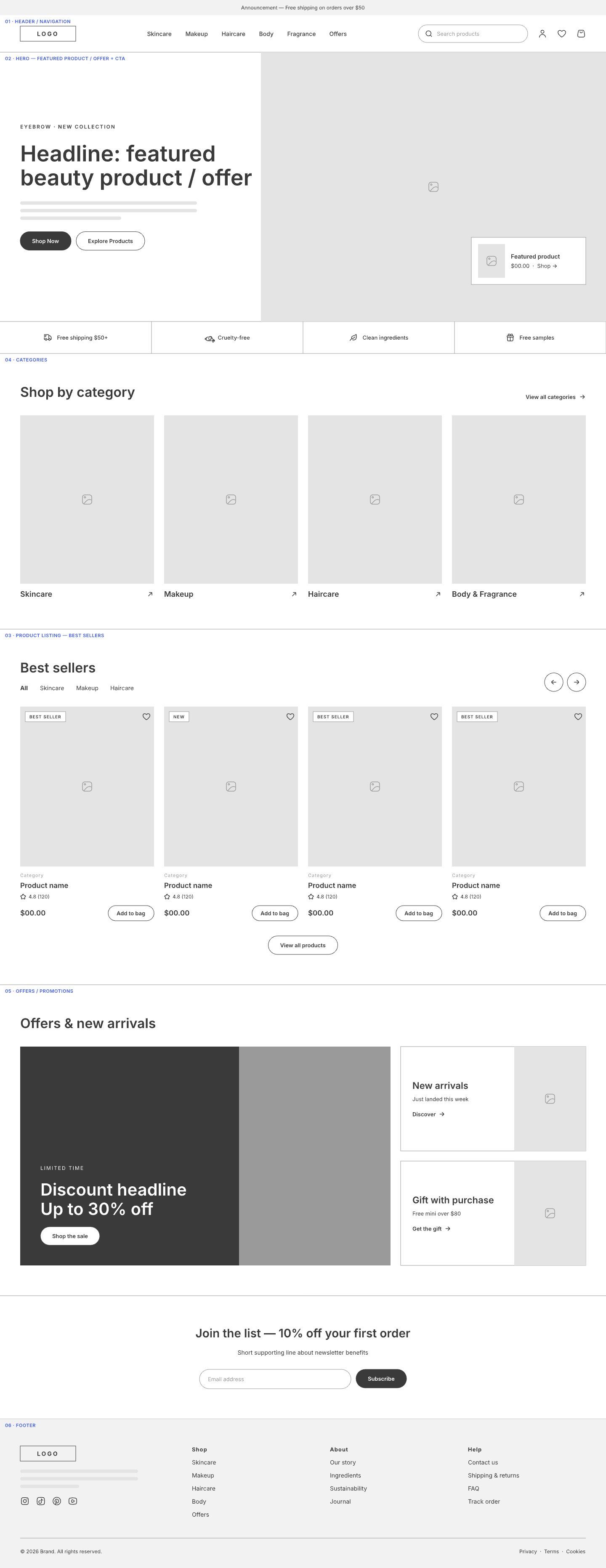
The lo-fi pass has no brand in it on purpose. Every section is numbered and named in the margin: header and navigation, the hero with its featured product, offer and call to action, categories, the product listing, offers and promotions, and the footer.
Working in grey kept the questions structural. The hero pairs the headline and two calls to action with a product card that floats over the image, so there is a way to buy above the fold. A trust strip sits directly under it, before any browsing starts.
Warm, quiet, and a little editorial
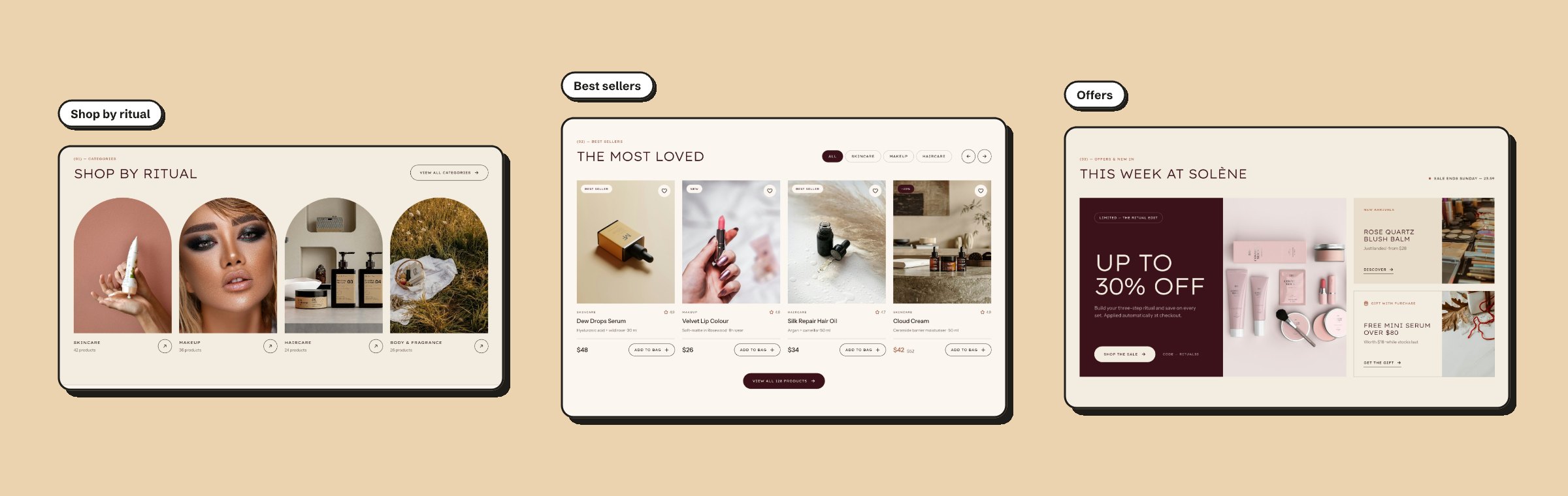
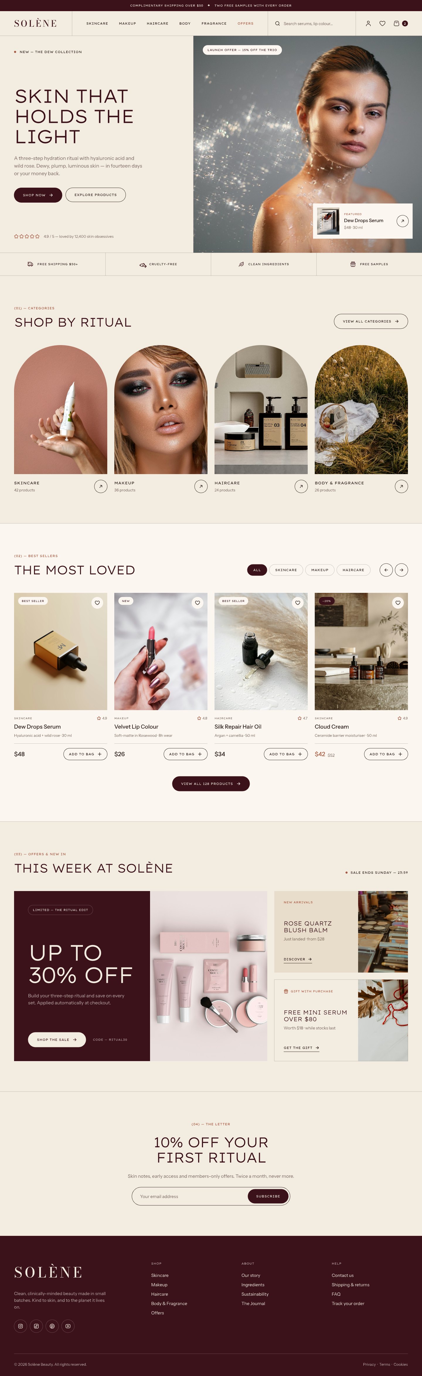
The palette is six colours. Cream and ivory alternate as section grounds, so the page has rhythm without rules or boxes. Burgundy is the one strong colour, used for the announcement bar, the primary buttons, the sale panel and the footer. Terracotta is kept for small accents like the eyebrow labels.
Three typefaces share the work. Lexend Exa, wide and light, sets the headlines in capitals. Bodoni Moda is used once, for the wordmark. Instrument Sans carries the body copy and the interface.
The category images are cut into arches, which gives the grid a shape of its own and separates it from the square product cards that follow.
Not a squeezed desktop
The mobile design at 390 is its own layout. Search moves out of the header into a full-width bar, and the navigation links become a row of category chips directly under it, so the two most common ways into the catalogue are both in reach before the hero.
From canvas to working page
I built the design in Next.js with Tailwind CSS. The design tokens carried straight across: the colours and the three font roles in the design file are the same colours and font roles in the stylesheet.
- One component per section: header, hero, categories, best sellers, offers, newsletter and footer.
- The best sellers filter works, with an empty state for a category that has nothing in it yet.
- Add to bag updates the count in the header through shared cart state, and each card has a wishlist toggle.
- The mobile header opens a menu and keeps the category chips selectable.
Every screen
4 frames

More projects
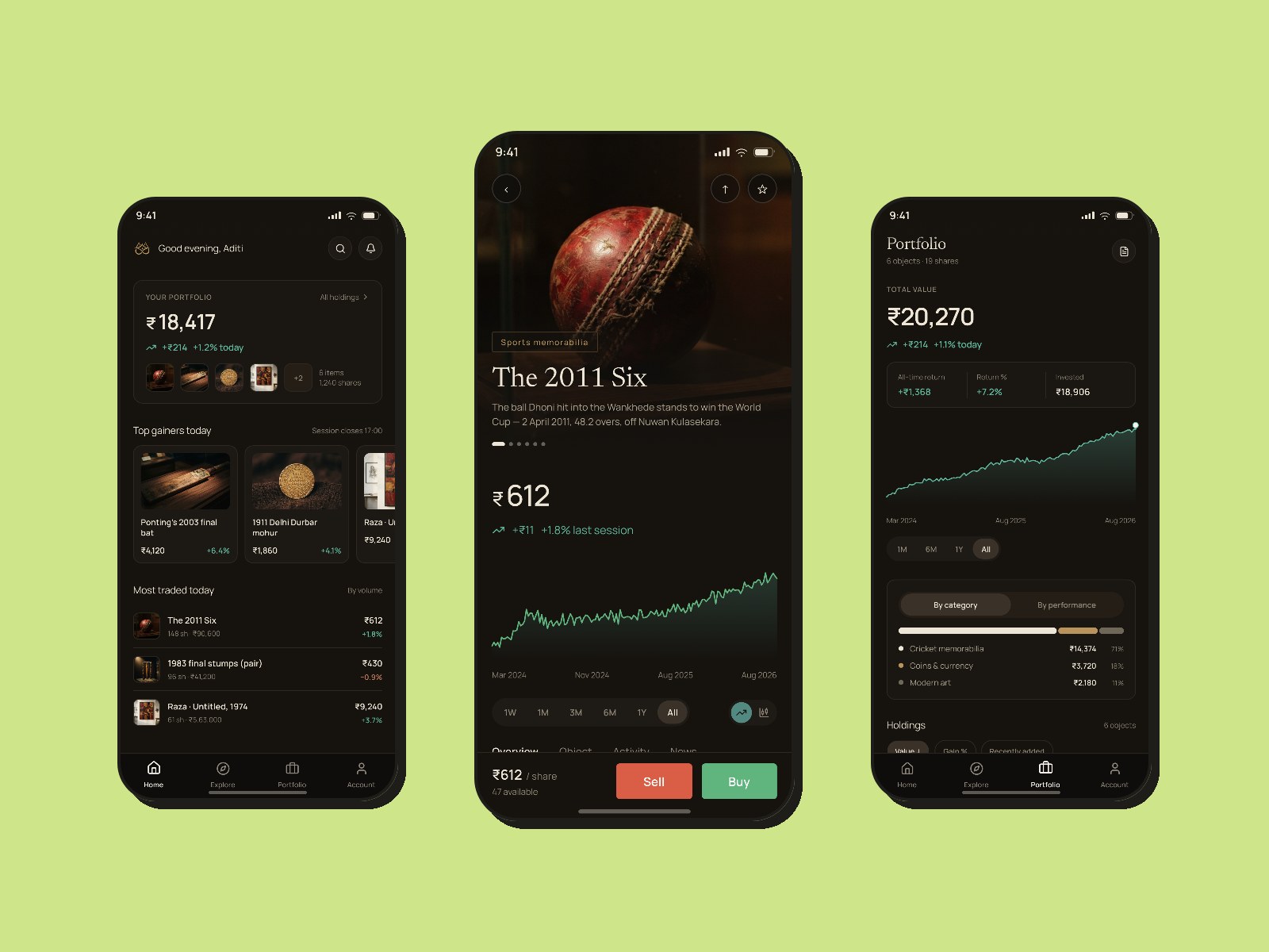
VaultedFractional ownership of collectables
A mobile app for buying and trading shares in collectables — a Dhoni World Cup ball, a Raza canvas, a 1911 mohur. Designed for a bank’s product-design brief, built around the one problem that killed every Western platform in this category: liquidity.
See full case study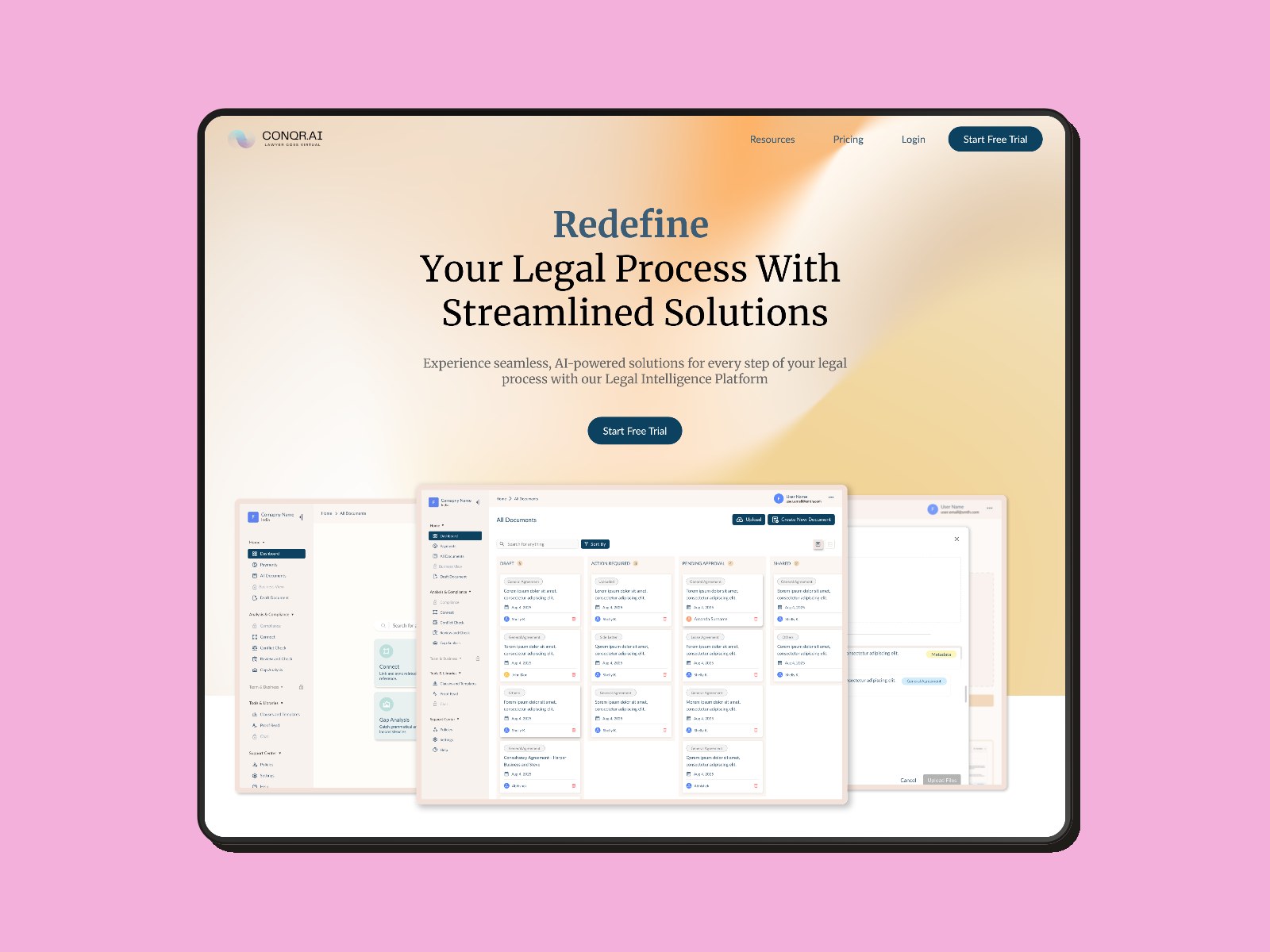
Conqr.aiBrand, design system, and a launch landing page
Turning an undirected brief into a design system: brand, component language, and a single-scroll landing page built from scratch for a legal-AI product’s launch.
See full case study