All work
Product Design — concept 2.5-day design sprint 2026

Vaulted

Fractional ownership of collectables

MobileProduct DesignFintechConcept
Vaulted — hero
Role
Product Designer — research, IA, UI, design system, prototype
Platform
Native mobile, 393×852
Scope
22 screens, one interactive prototype
Context
Design assignment for a leading Indian bank · 2.5 days

A 2.5-day assignment. The brief asked for three screens; the research said the category dies of illiquidity and broken trust, so I designed the market model and the buyout — the two things that actually decide whether this product works.

At a glance

3
Platforms in this category that shut down, 2022–2024
~95%
Of the week the market is closed — so that state got designed first
0
Scarcity counters, urgency timers or projected-return claims
ContentsThe brief
  1. 01The brief
  2. 02Research
  3. 03Product decisions
  4. 04The market surfaces
  5. 05The trust stack
  6. 06The differentiator
  7. 07Design system
  8. 08Outcome

Design a mobile app for trading shares in collectables

A leading Indian bank set the assignment. Design a mobile concept for a platform that buys collectables outright — art, vintage cars, memorabilia — stores them, and lists each one as N shares at a fixed price per share. The worked example in the brief: the ball MS Dhoni hit for six to win the 2011 World Cup final. A thousand shares at ₹500 is a ₹5 lakh valuation. Two years later a collector buys the whole thing for ₹20 lakh, and every holder gets four times their money.

The deliverables were a concept, a feature list and IA, UI for the dashboard, items listing and item detail, and a prototype. The audience was specified unusually precisely: 27–32, high-earning, Tier-1 Indian cities, crypto-curious, design-literate — and, stated outright in the brief, people for whom using the app adds to their social status.

The category already failed, and it failed for UX reasons

Before drawing anything I looked at what happened to the platforms that tried this in the West. The answer reframed the whole assignment.

Otis was acquired and its assets largely liquidated. Dibbs raised $13M and shut down. Collectable emailed every holder to withdraw their funds before a deadline. The survivors are not clean either: one was fined by the SEC for operating as an unregistered broker-dealer and carries a going-concern warning in its own filing; another discloses to investors that its market “frequently lacks liquidity,” and roughly nine in ten of its holdings have never exited.

3
Platforms shut down or liquidated, 2022–2024
Otis, Dibbs, Collectable
~90%
Of one survivor’s holdings that have never exited
platform’s own investor disclosure
15–25%
Of returns eaten by fees, cited across the category

This is not two died and two survived. It is one liquidity-and-trust disease across the whole category — the survivors just have longer runways.

That gave me the thing a brief like this rarely hands you: a clear, evidenced reason to reject the obvious design. The obvious design is a dark trading app — dashboard, grid of items, line chart, Buy button. It satisfies the deliverables and fails the product, because it models a liquid market that does not exist.

Four decisions made before any screen was drawn

Weekly market sessions, not a continuous order book

A secondary market in 1,000 shares of one cricket ball is thin. A continuous order book would sit empty, and a UI that renders a busy book is a UI that does not understand its own product.

So the market opens once a week, on Saturday, 11:00–17:00, with a pre-session order queue and an opening auction. Concentrating a week of demand into one window is how a thin market gets a real spread and real fills — and it makes trading a Saturday-evening ritual for an audience that treats this as a social object rather than a day job.
Design the closed state first

The consequence of weekly sessions is that the app is closed roughly 95% of the time. Most designers would draw the open state and treat closed as an error.

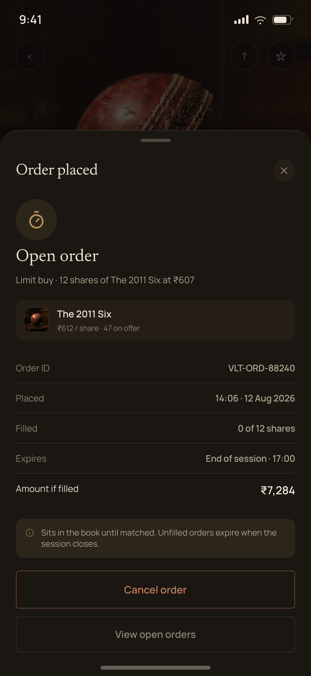
I did the opposite. Outside session hours the Buy button never goes dead — it changes state to “Queue order”, using the AMO (after-market order) language every Indian investor already knows from their broking app. Queued orders appear as a modifiable row: 4 sh @ ₹600 · Executes Sat, 11:00. There are three market states — open, closed, and halted for a buyout vote — and they exist as component variants across five screens rather than as separate designs.

No FOMO mechanics, and say so out loud

The regulator is moving on urgency messaging, artificial scarcity and countdown pressure in adjacent investment products. It does not yet cover this category — I was careful not to imply it did.

But designing to it pre-emptively is the stronger position, and in a category that died of broken trust, restraint is the product. There are no scarcity counters, no panic timers, no projected-return headlines. A new listing shows subscription progress as a plain fact, not a race.

Brass marks ownership, never action

The palette has one accent: brass. It is allowed on the percentage of an item you own, your holding badge, the authentication and vault marks, and the exited-item seal.

It is not allowed on primary buttons, links, or anything you tap to spend money — those are high-contrast neutral. This is the rule that keeps the app reading as a museum rather than a casino, and it means the single gold thing on any screen is always your stake.

Dark for trading

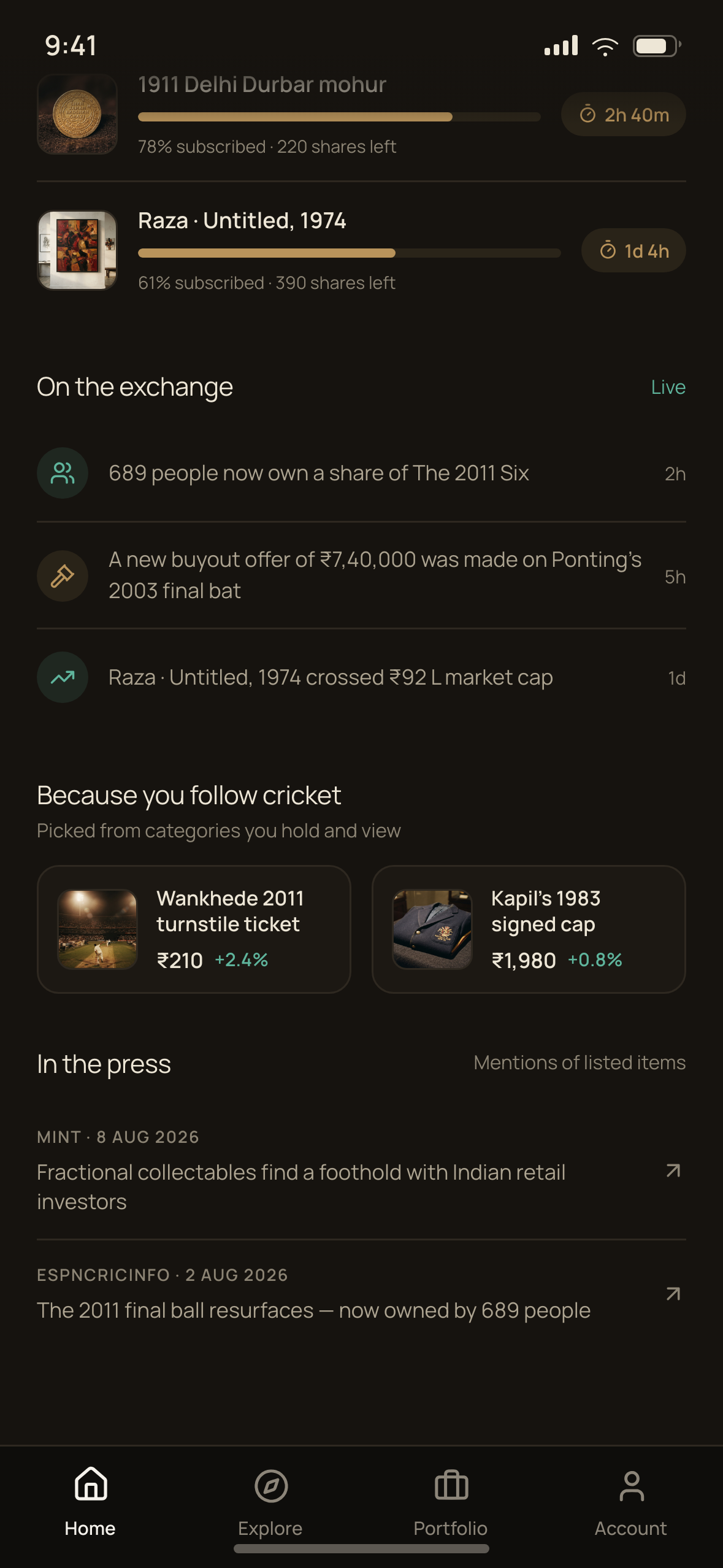
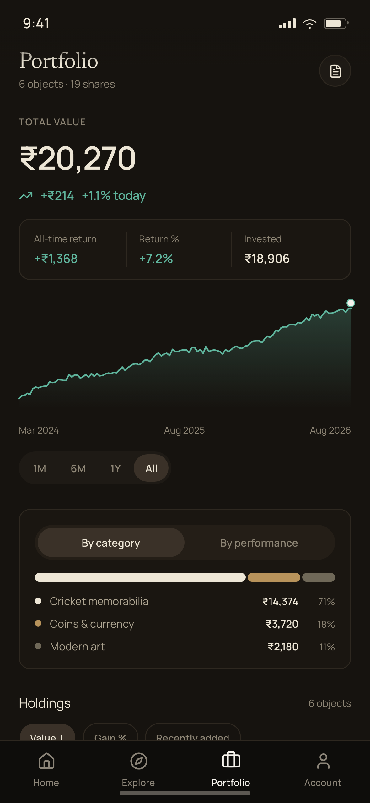
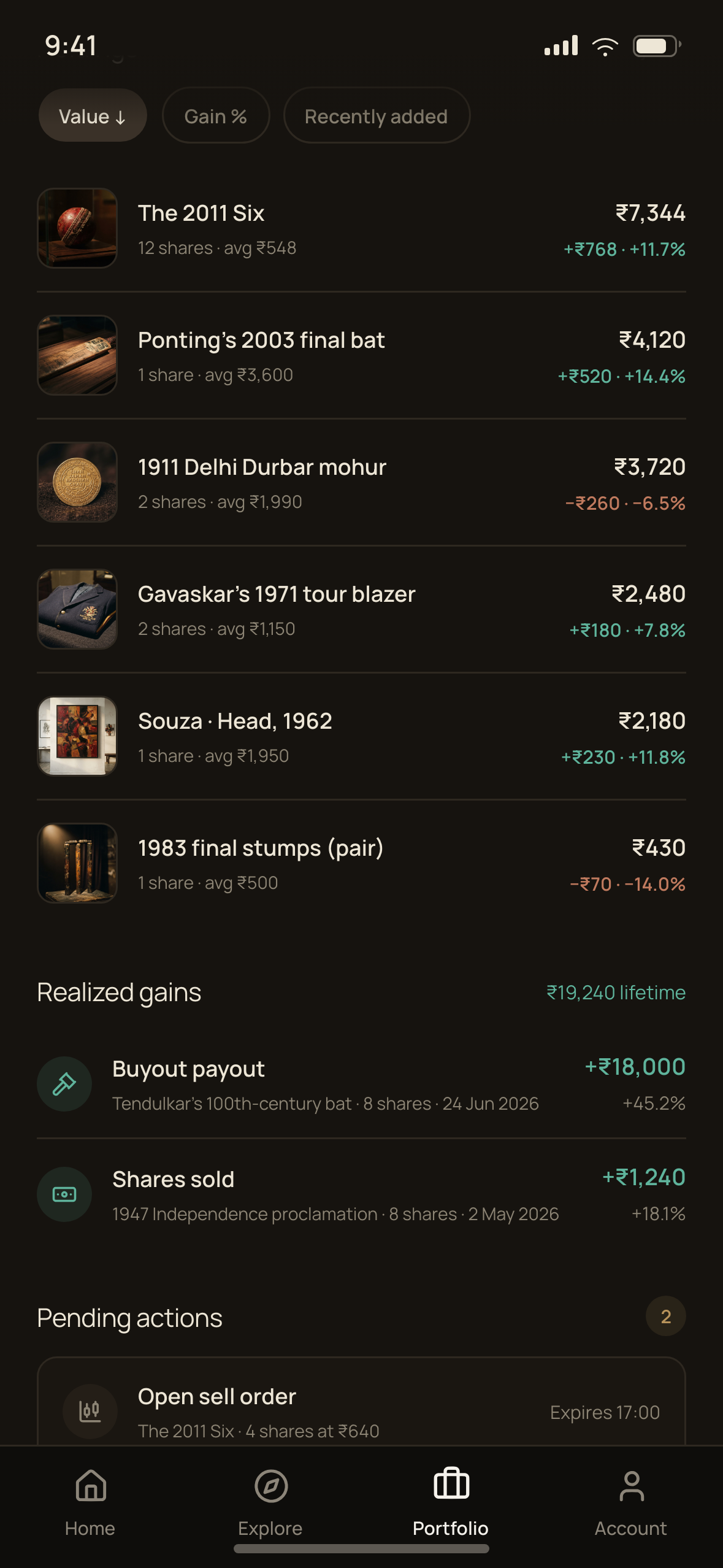
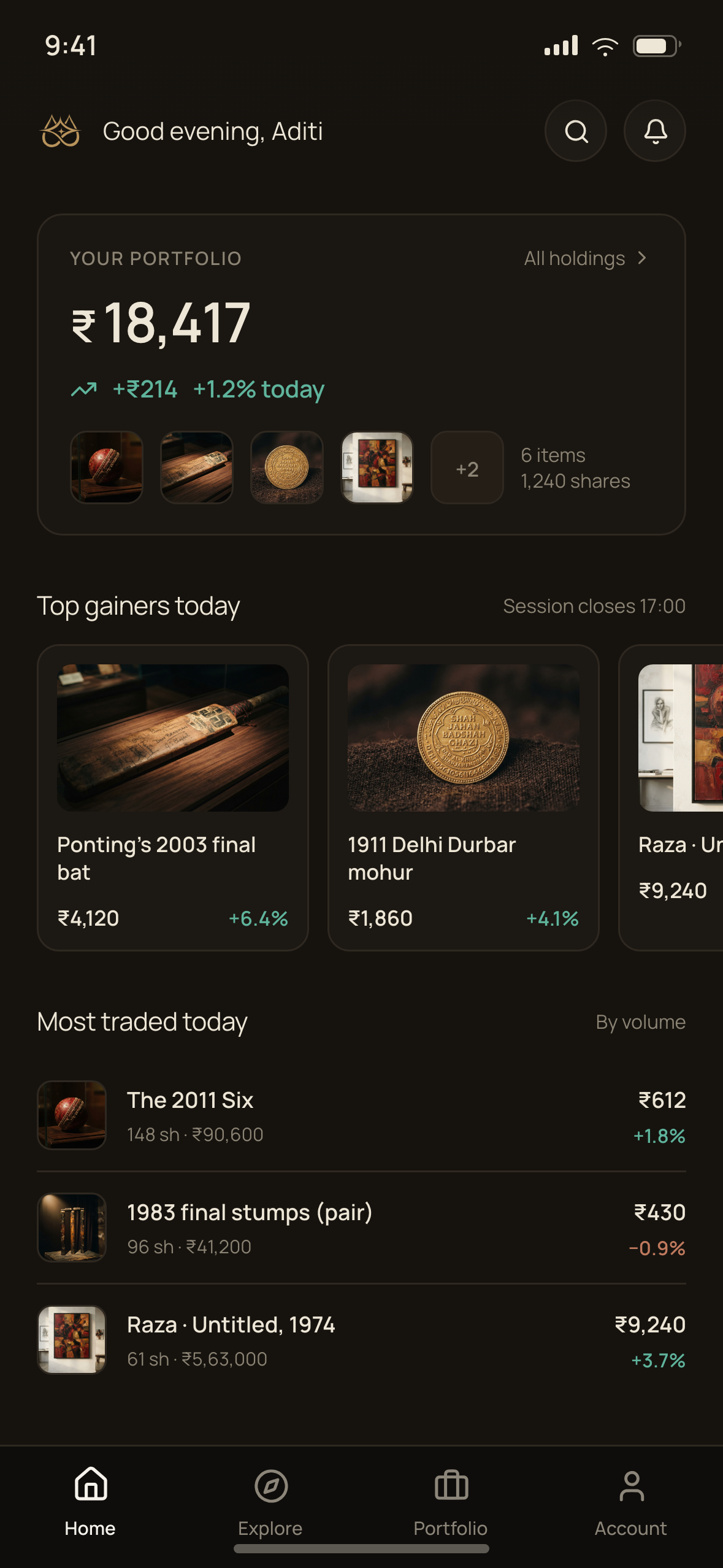
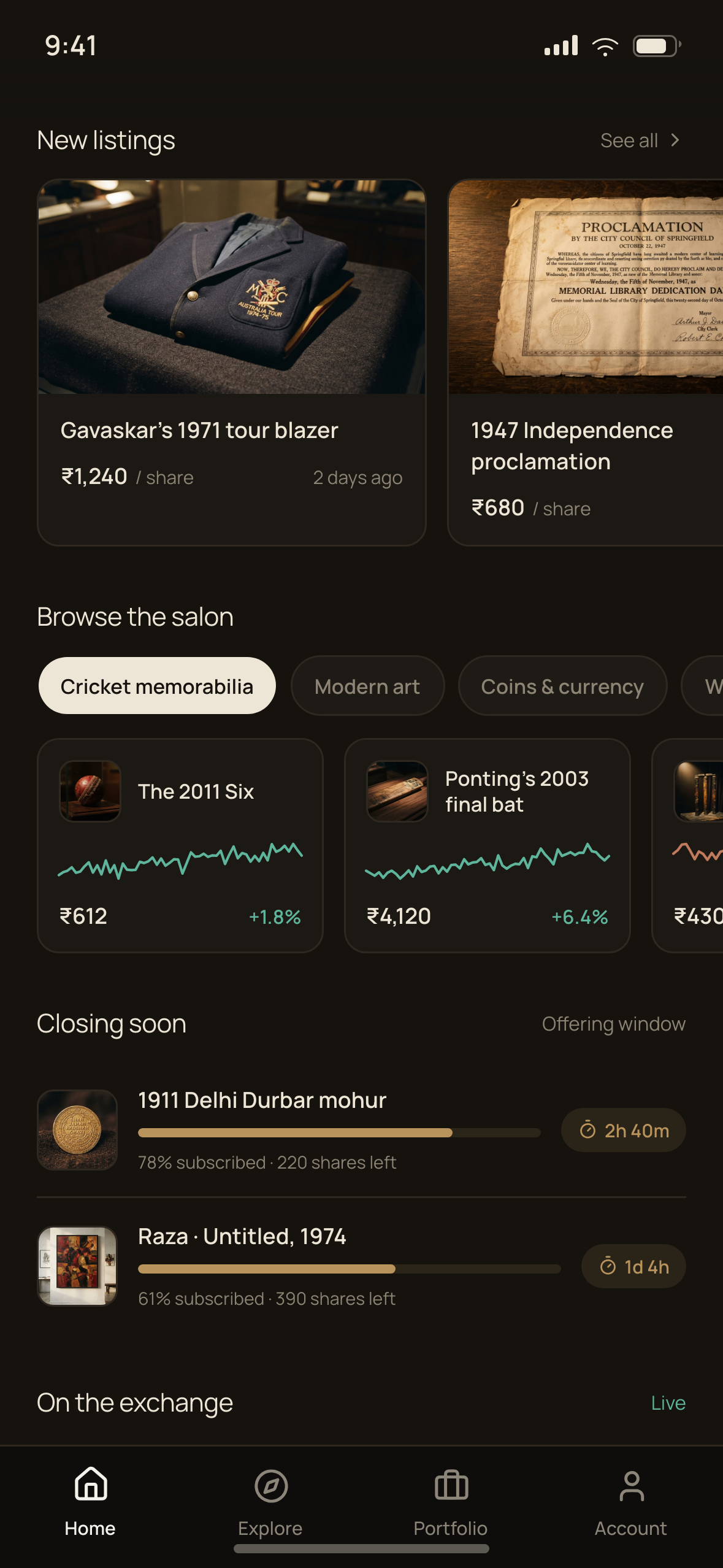
The dashboard leads with portfolio value and the day’s change, then the session state, then movers. Prices are set in tabular figures so digits do not jitter between updates, and every number uses Indian digit grouping — ₹6,12,000, never ₹612,000 — with lakh and crore abbreviations on aggregate figures and full rupees on per-share prices.

Portfolio value, holdings and the session-state chip
Top gainers and most-traded, by session volume
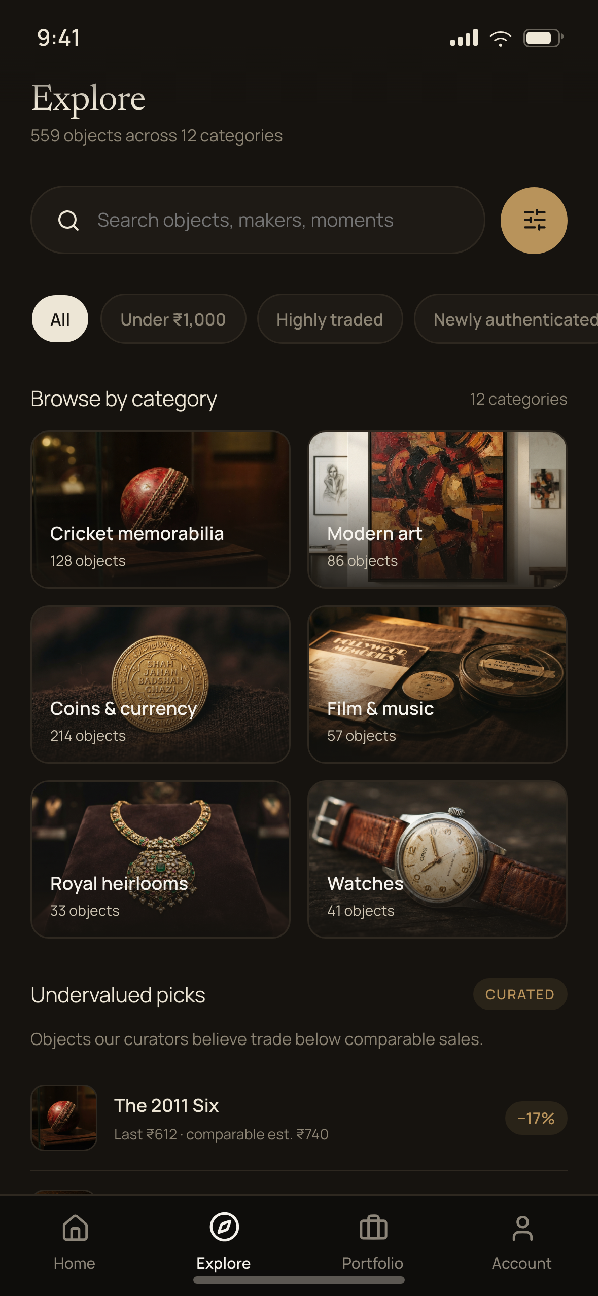
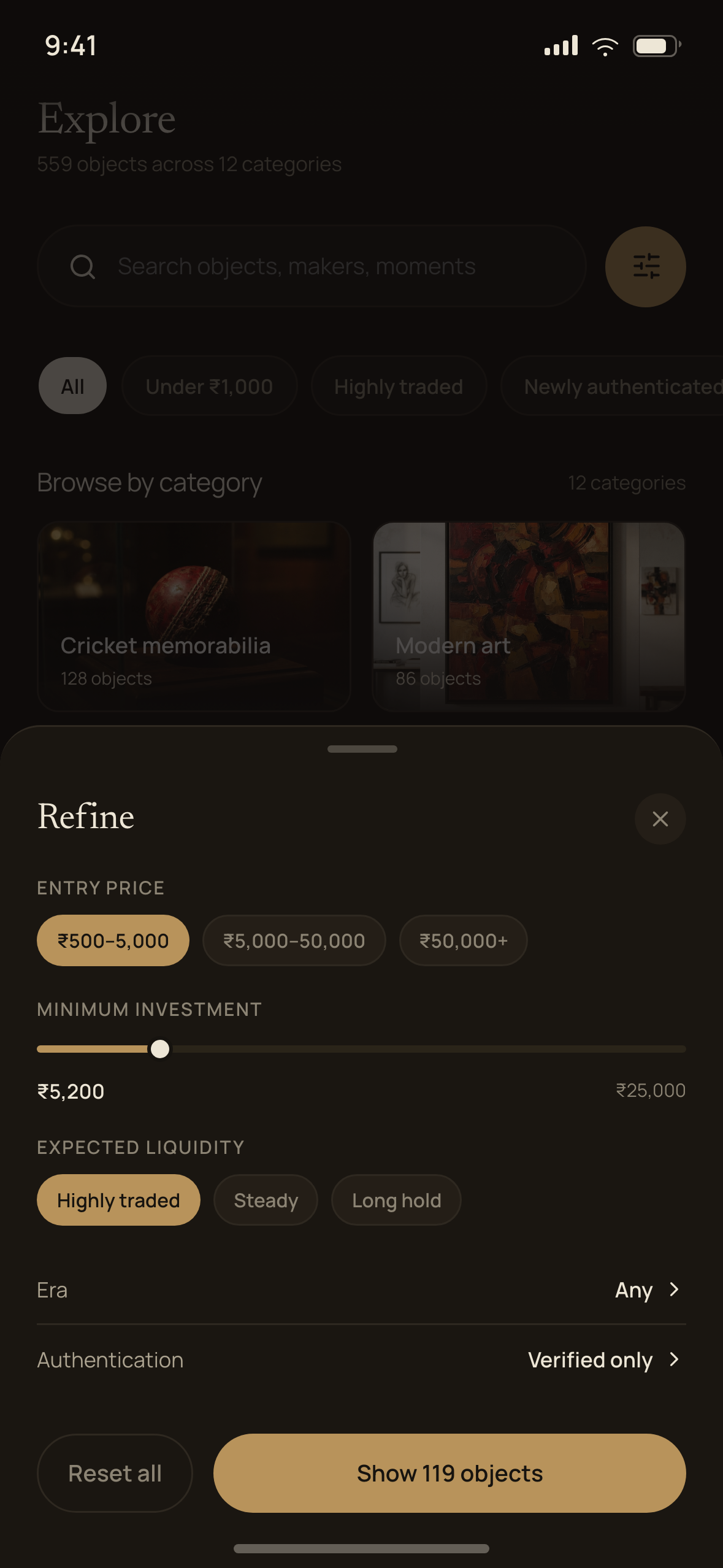
Listing, filtered by category and momentum

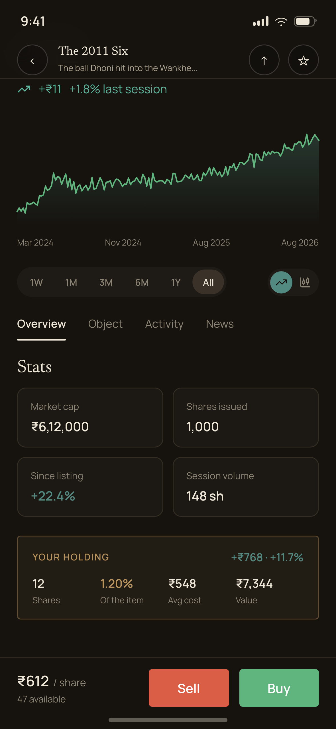
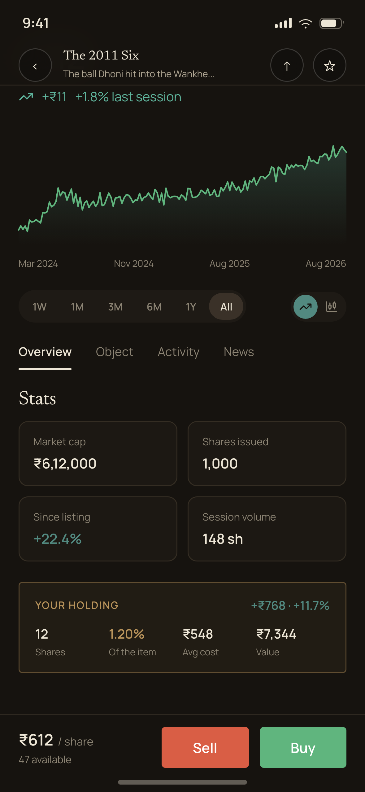
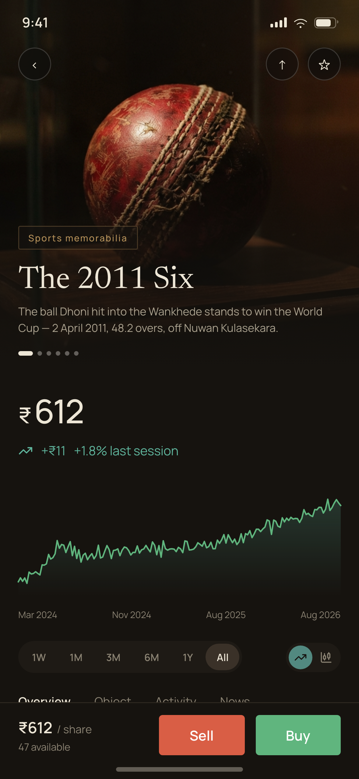
Item detail is the brief’s headline screen and the one that carries the art-direction argument. It opens as a market surface — price, last session’s change, price history, stats, your holding — and flips to light catalogue at the provenance divider.

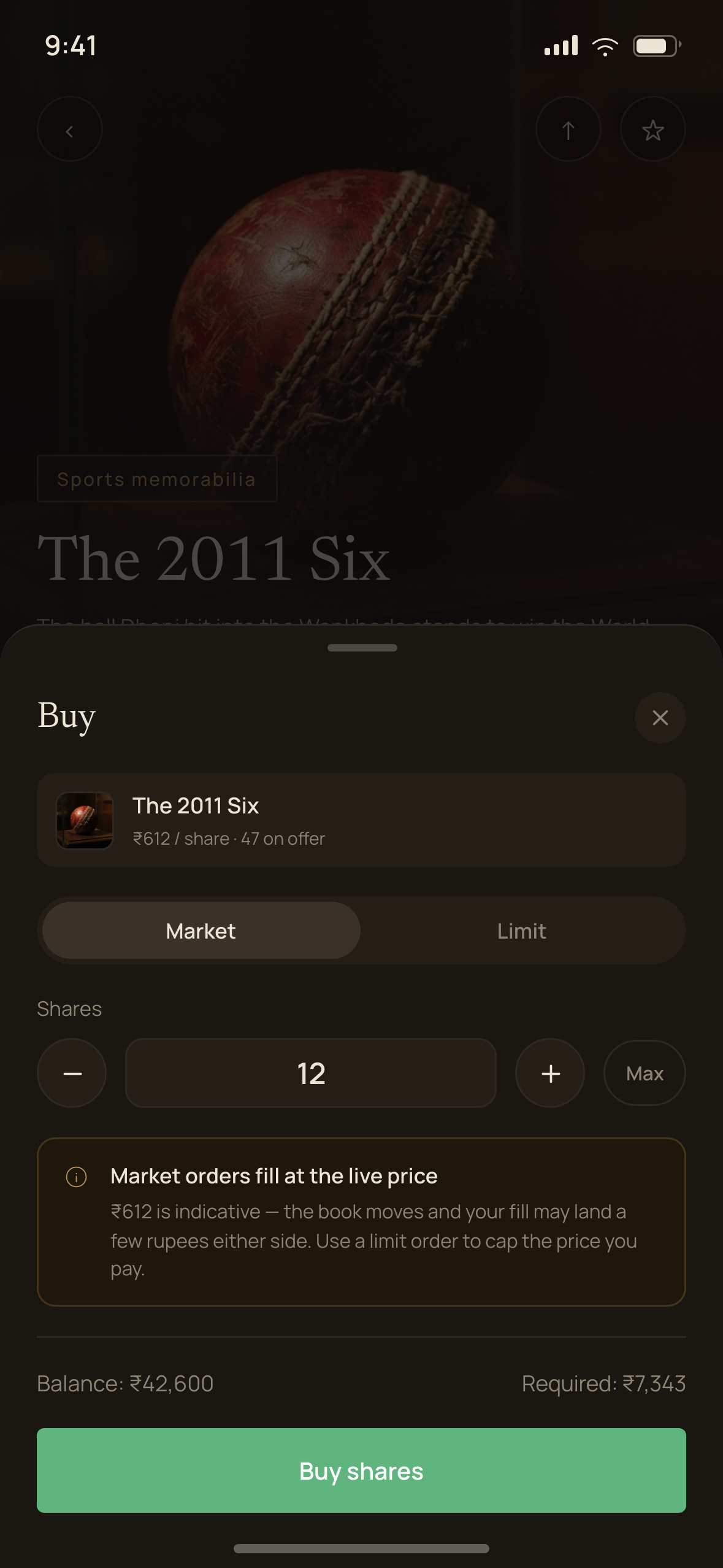
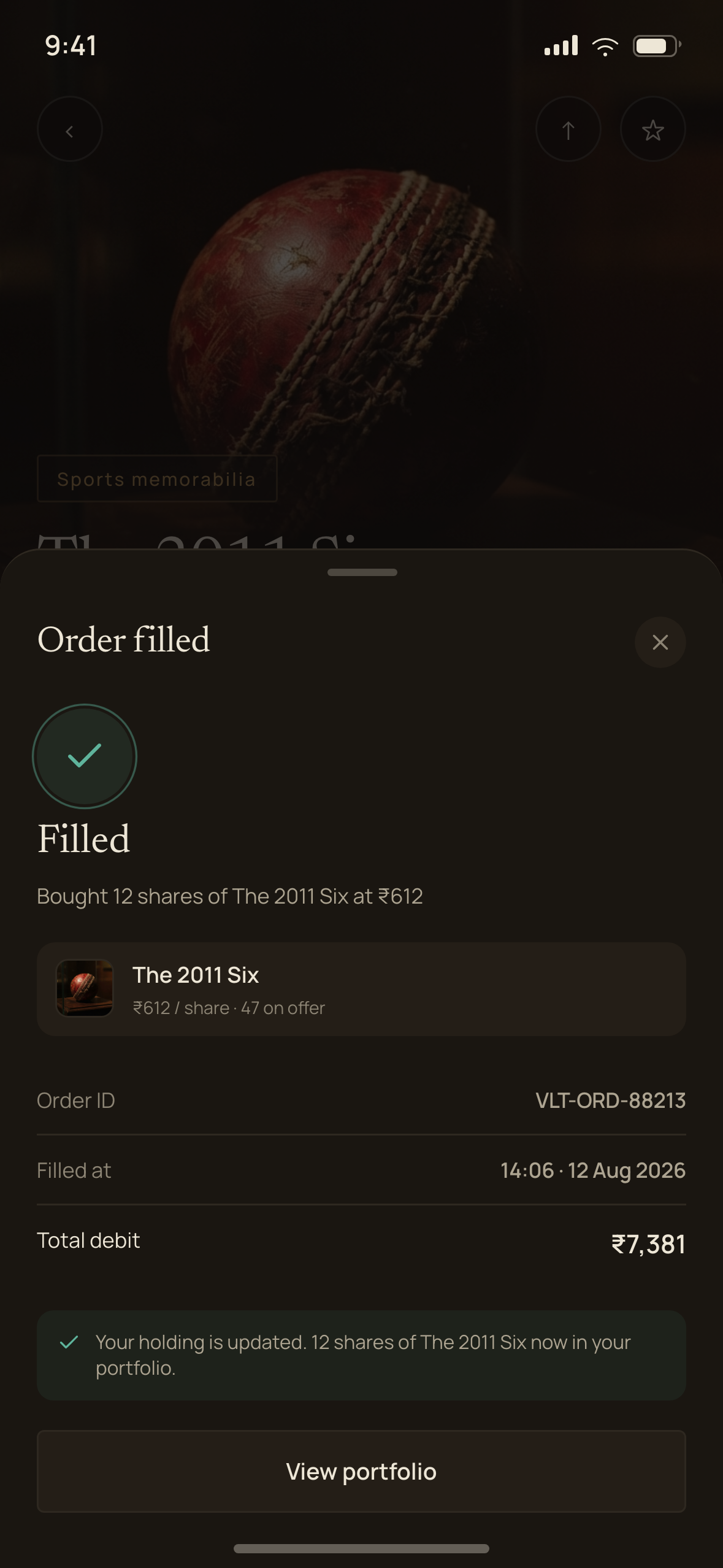
The order ticket keeps its guardrails visible rather than buried in terms: a 30% floor under any ask price to stop fat-finger sales, a five-day settlement lock before newly bought shares can be resold, and the fee breakdown shown before confirm, not after.

Item detail — the market half
Stats and your holding — brass marks the stake
Order ticket with guardrails surfaced
A queued order, modifiable until the open

Light for the catalogue

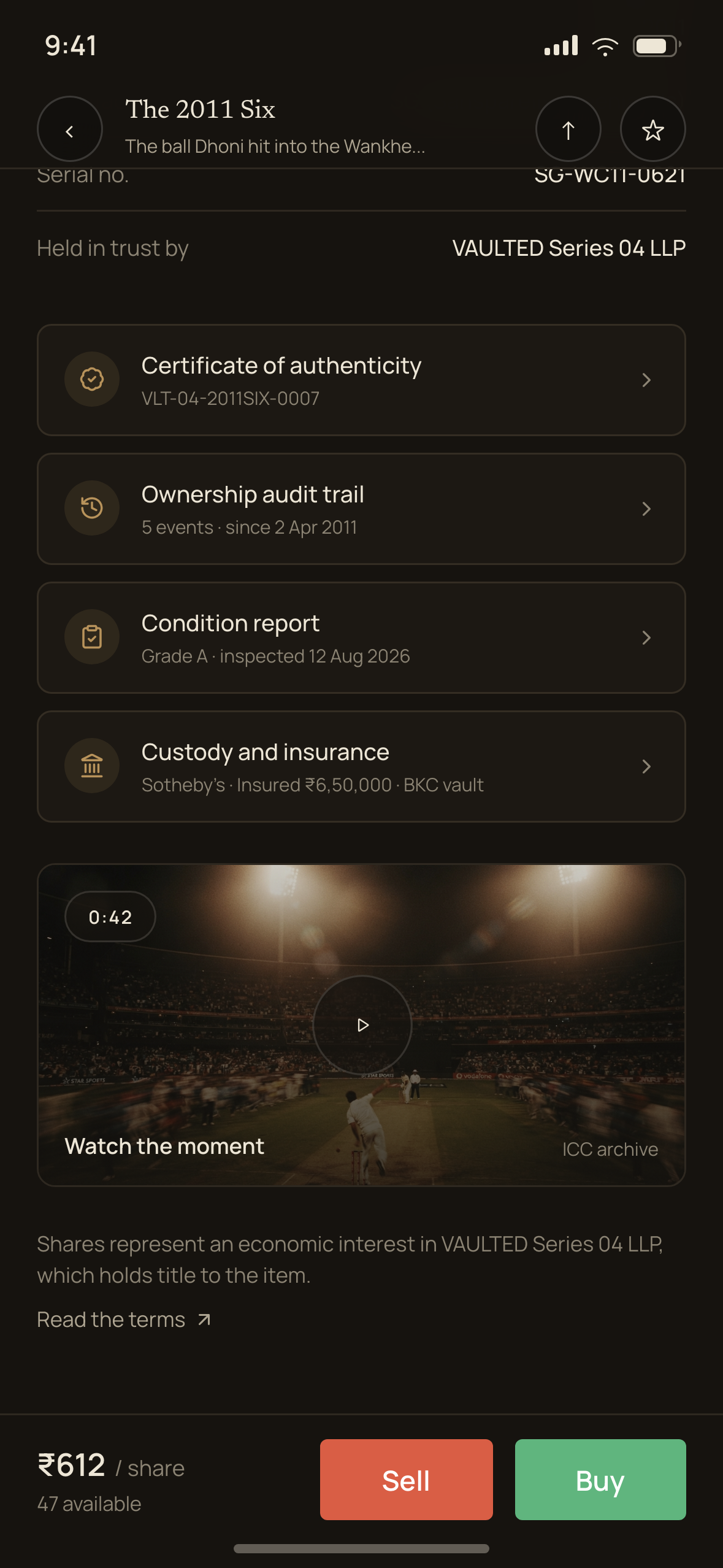
A collectable pays no dividend and has no earnings. Share price is sentiment plus comparable sales, which means item detail cannot be a stock page — provenance, authentication, condition and custody have to carry the same visual weight as the chart.

Users are buying a fraction of a physical object they will never touch. Where is it, who insured it, who authenticated it, and what happens if the platform shuts down? That last question is not hypothetical in this category, so it gets an explicit answer rather than a paragraph in the terms.

The object’s story and specifications
Certificate, audit trail, condition report, custody and insurance
What you actually own — the holding entity, stated plainly

The buyout — an event, not a screen

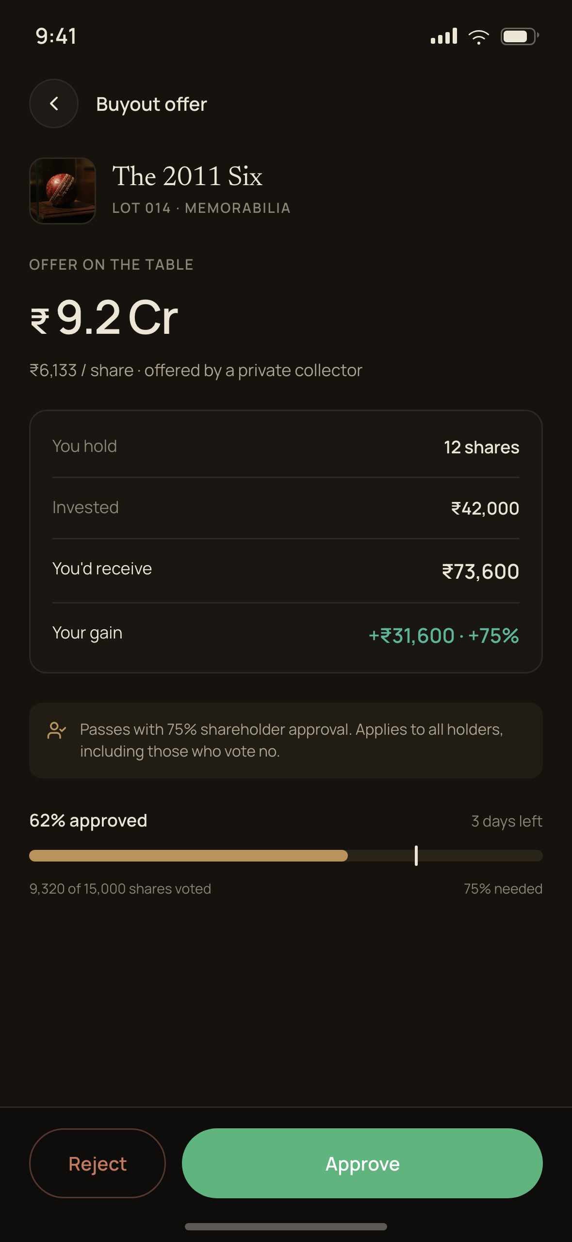
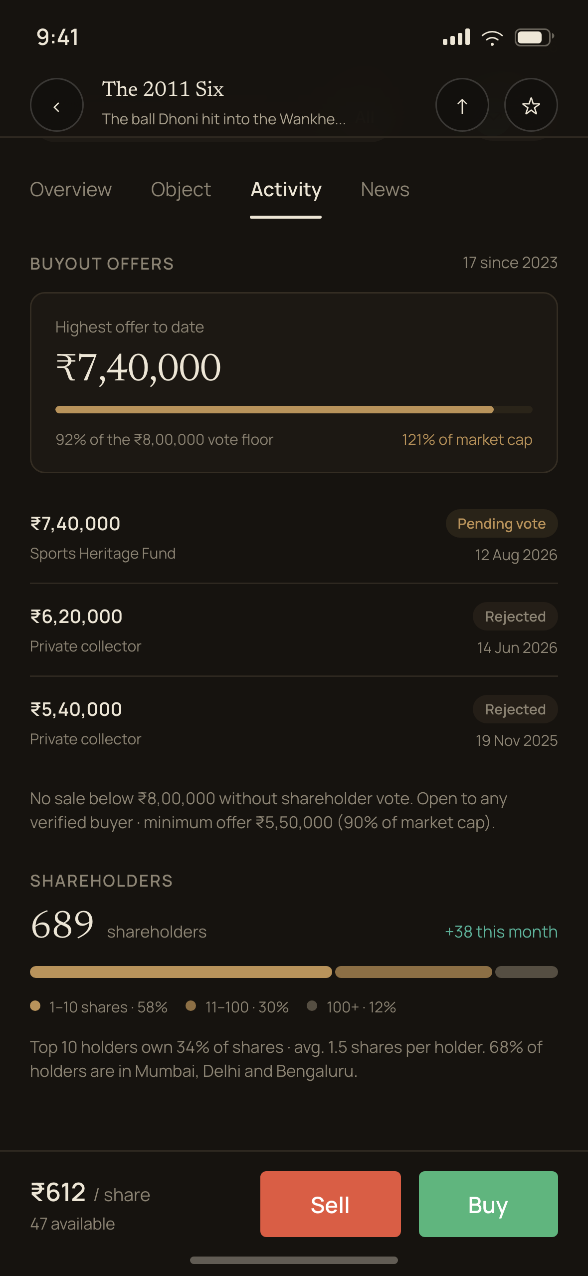
The brief spends a full page on the buyout. It is the primary way anyone actually makes money here, and it is the part most submissions would reduce to a success toast. I designed it as a flow with six stages and a persistent state the rest of the app has to respect.

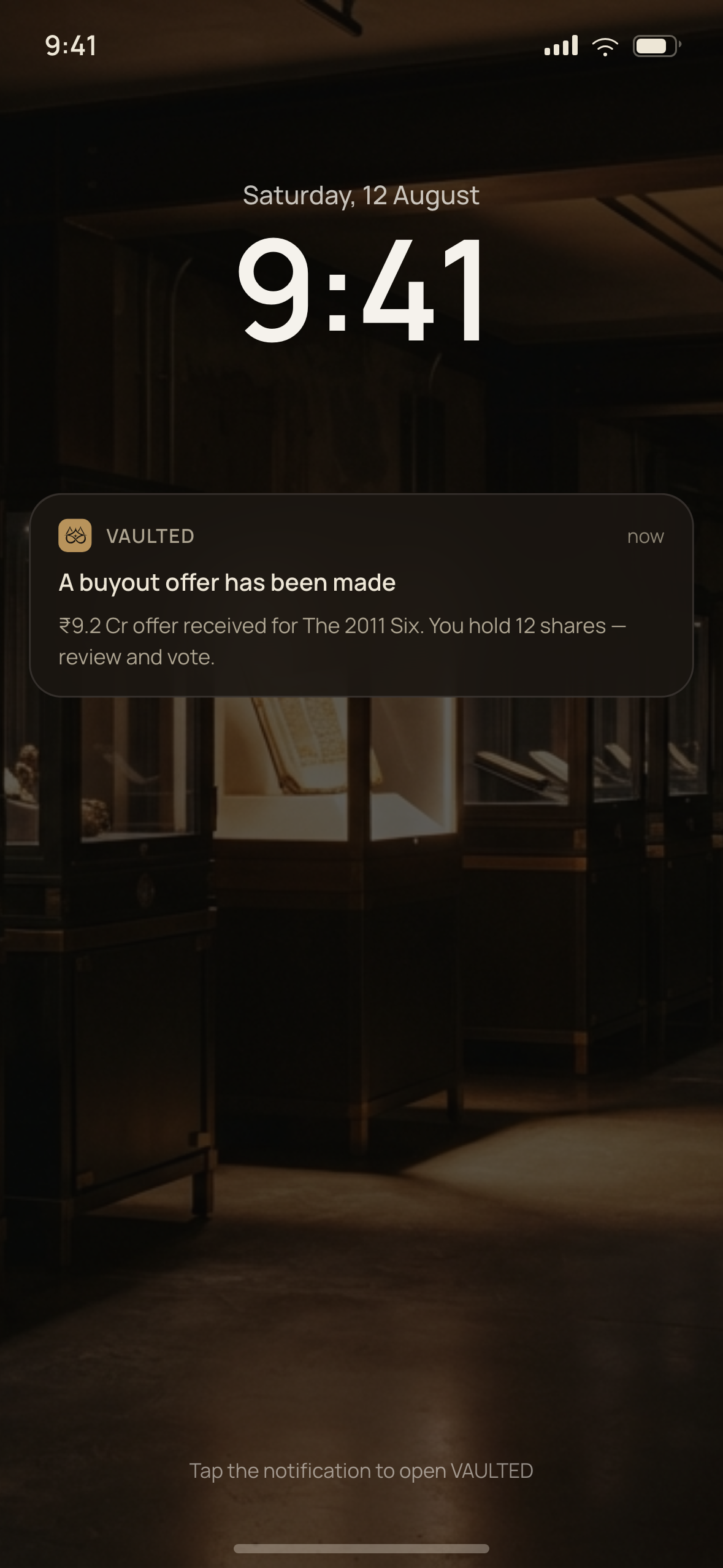
  1. 01Offer receivedPush, then a takeover. Your payout in rupees, not just the headline figure
  2. 02Offer detailGross offer, minus taxes and fees, to net distributable
  3. 03Vote48 hours. Approve, reject, or let the advisory board decide
  4. 04Live tallyShare-weighted and head-count-weighted, both shown
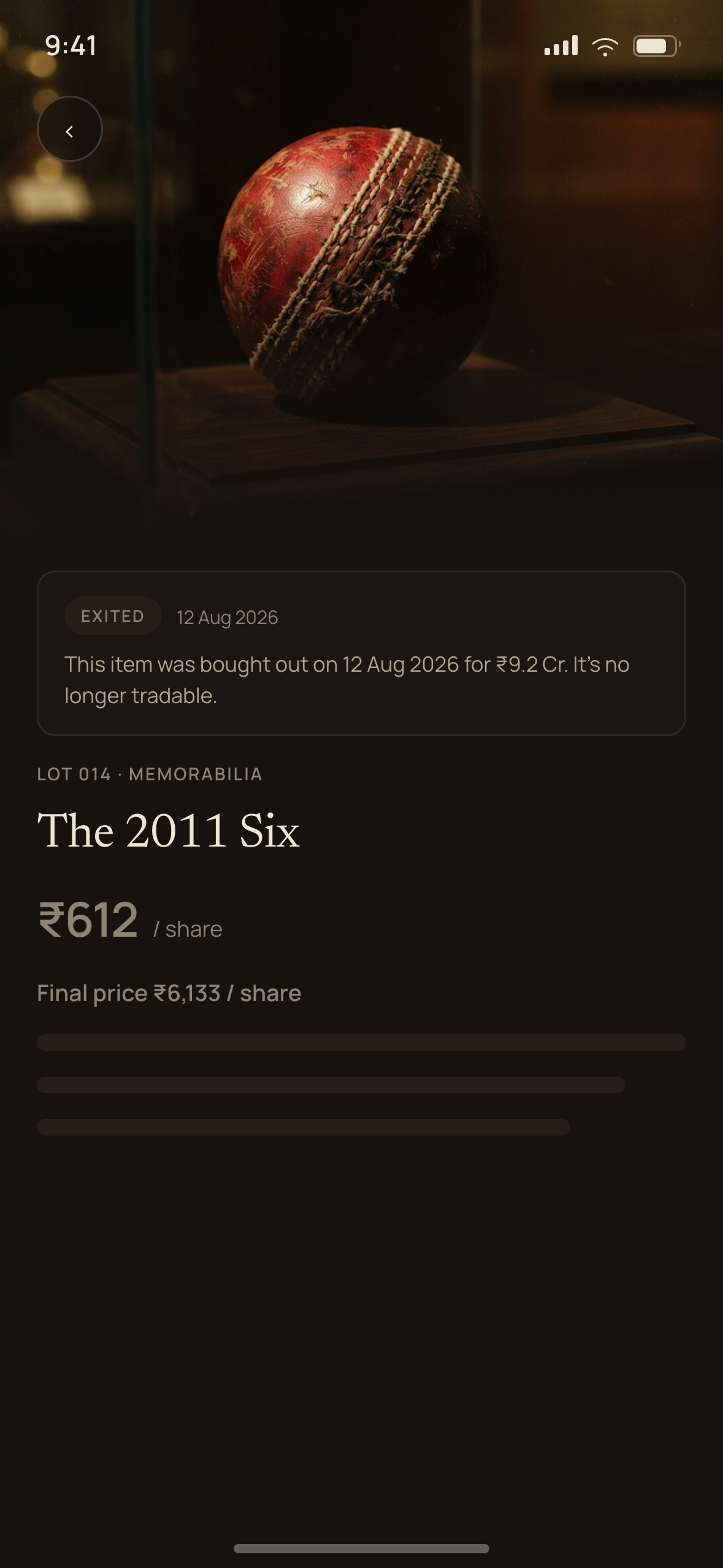
  5. 05DecisionTrading stays halted; a rejected buyer must return higher
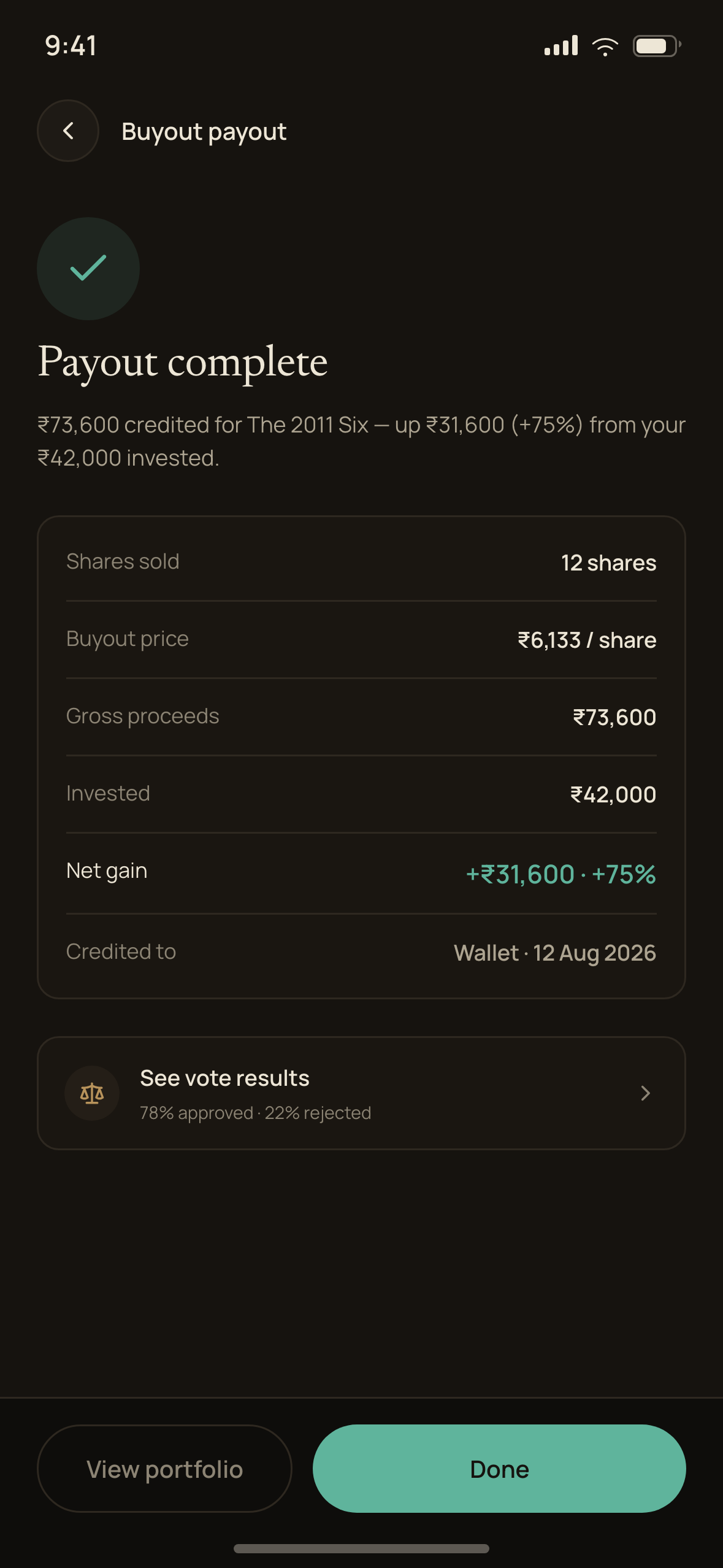
  6. 06PayoutPer-share distribution with the TDS line, then the item exits
The offer arrives on the lock screen
Your payout, the approval threshold, and the live tally
Distribution, with the tax line shown
After the exit — final price, and no longer tradable

One thing I deliberately did not fake: the deal-making itself. Finding a buyer and negotiating a price genuinely happens off-platform, and no honest app can simulate it. What the app can do is make everything from the moment an offer lands fully visible and voted on by the people it affects — which is precisely what holders of the collapsed platforms never got.

Two modes, one skeleton

Dark is the market: prices, orders, portfolio, the book — screens where you are a trader. Light is the catalogue: provenance, custody, the vault, the buyout narrative — screens where you are an owner. The switch is the argument, so it had to be disciplined: mode changes only at the market–provenance boundary, never mid-section, and only colour changes between them. One type scale, one spacing scale, both modes.

Type is a high-contrast editorial serif for object names and section openers, a neo-grotesque with tabular figures for everything numeric, and a mono face used sparingly on certificate numbers and order-book rows. Uppercase labels with wide tracking over a hairline rule are the exhibition-wall device — it is what makes the provenance section read as a catalogue rather than a form.

Ground — warm near-black, not #000#0E0D0B
Surface#161512
Brass — ownership only#C8A24A
Positive#5FB37E
Negative#D4705C
Catalogue paper#FAF7F1

Every text colour was checked against every surface it is allowed on rather than eyeballed, so the palette clears WCAG AA throughout. Green and red are non-negotiable in Indian investing interfaces, so both are deliberately desaturated to sit inside the palette instead of shouting over it — and neither is ever the only signal, always paired with a sign and an arrow.

What it added up to

Twenty-two screens, a token set across two modes, and an interactive prototype covering the full path — first run, browse, item detail, order ticket, queued order, portfolio, and the complete buyout sequence through to payout and exit.

The submission argues a position rather than presenting a styling exercise: that this category failed for reasons a designer can address, and that the market model, the closed state, and the buyout are where that work has to happen. The restraint — no urgency, no scarcity, no promised returns — is the part I would defend hardest.

  • The client and any identifying details are withheld; the product name here is not the one used in the submission.
  • Figures shown in the screens are illustrative, built for the concept rather than drawn from a live platform.

Every screen

22 frames
Next projectFourCore Like what you see? Let’s talk