All work
UI/UX → Senior 2+ years · ongoing 2024 to Now
Professional experience

FourCore

Breach & attack simulation product

Product DesignDesign SystemCybersecurityB2B
FourCore — web dashboardFourCore ATTACK, platform dashboard
Company
FourCore, breach & attack simulation (cybersecurity)
Role
UI/UX Design Intern → UI/UX Designer → Senior UI/UX Designer
Timeline
2024 to present · 2+ years, ongoing
Scope
Marketing site, full platform redesign, design system, and 40+ new screens across 5+ features
Team
First design hire. Now leading a junior designer, working with product and engineering

FourCore ATTACK lets security teams safely run real attack techniques against their own systems to find out what their defenses actually catch. I joined as the company’s first design hire, on an internship, and have spent 2+ years redesigning the product end to end and growing its design practice.

At a glance

40+
New screens shipped
5+
Major features
10+
Website screens, in a two-month sprint
Company revenue growth over a year
View website
ContentsOverview
  1. 01Overview
  2. 02The Brief
  3. 03Chapter 01
  4. 04Chapter 02
  5. 05Chapter 02
  6. 06Chapter 02
  7. 07Chapter 02
  8. 08Detail
  9. 09Process
  10. 10Key Decision
  11. 11Chapter 03
  12. 12Shipped
  13. 13Feature
  14. 14Feature
  15. 15Feature
  16. 16Feature
  17. 17Practice
  18. 18Outcome
  19. 19Reflection

What FourCore is

FourCore ATTACK is a breach-and-attack-simulation (BAS) platform. Security teams use it to safely emulate real-world adversaries against their own live environment: executing attack techniques, moving laterally, escalating privileges, and then seeing exactly where their defenses held and where they broke, mapped to frameworks like MITRE ATT&CK.

That makes it a genuinely hard product to design for. Every run produces a large volume of technical output, and the person reading it is usually under time pressure and needs to know one thing first: what should I fix, and in what order. Most of the design work over the past two years has been in service of that question.

Hired as an intern, as the first designer in the company

I joined FourCore as a UI/UX design intern and was the first hire for their design team. There was no design function before me: no system, no shared components, no one whose job it was to own how the product looked or felt.

The brief I was given was much larger than the title suggested. Redesign the entire platform and the brand experience around it. That turned into three chapters, each one earning the next: the marketing site as an intern, the platform itself once I converted to full-time, and then the design system and new features after being promoted to Senior UI/UX Designer.

  1. 01UI/UX Design InternFirst design hire. Marketing site redesign.
  2. 02UI/UX DesignerConverted full-time. Platform redesign, 40+ screens.
  3. 03Senior UI/UX DesignerDesign system, new features, leading a junior designer.

The marketing site, my first project

My first responsibility was the public face of the company. FourCore’s website had grown cluttered and inconsistent, which is a problem when the thing you are selling is precision and trust to security buyers. I redesigned it end to end across 10+ screens, for both mobile and desktop, in a two-month sprint.

The site shipped, and it is what got me the conversation about staying on full-time and taking on the product itself.

Converting full-time, and redesigning the platform

After the website, I converted to a full-time UI/UX Designer and moved onto the product. The platform worked, but it looked like what it was: an engineering-led tool that had grown feature by feature, with each screen solving its own problem in its own way.

My job was to take every existing screen to a new look: a premium, enterprise-grade experience that felt like it belonged in a security operations centre, and that held together as one product rather than a collection of pages.

The dashboard was the place to start. It is the first thing a customer sees in a demo, and the screen that has to be understood fastest.

Dashboard
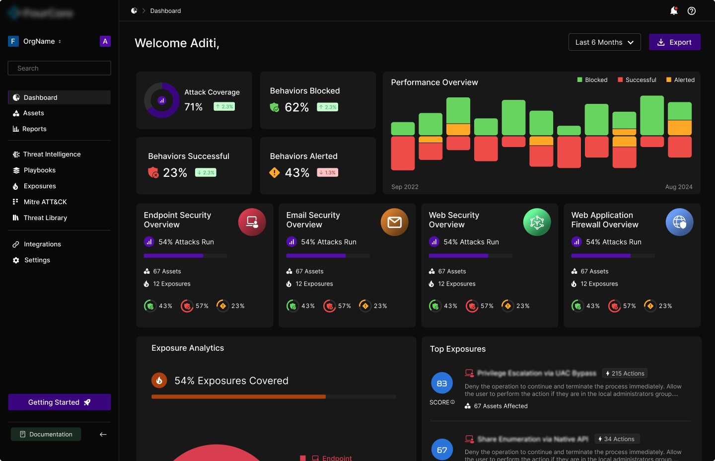
BeforeDashboard — before
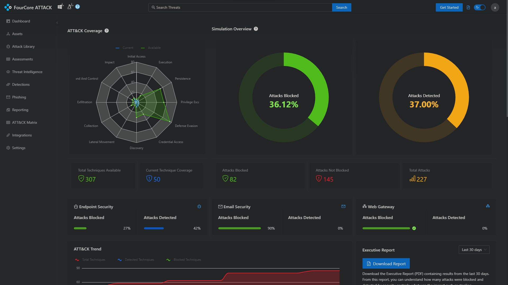
AfterDashboard — after

The old dashboard opened with a radar chart and two large donuts. Between them they took the top third of the screen to say three numbers, and the radar in particular is a shape that is hard to read quickly: you are comparing distances from a centre point across twelve axes at once.

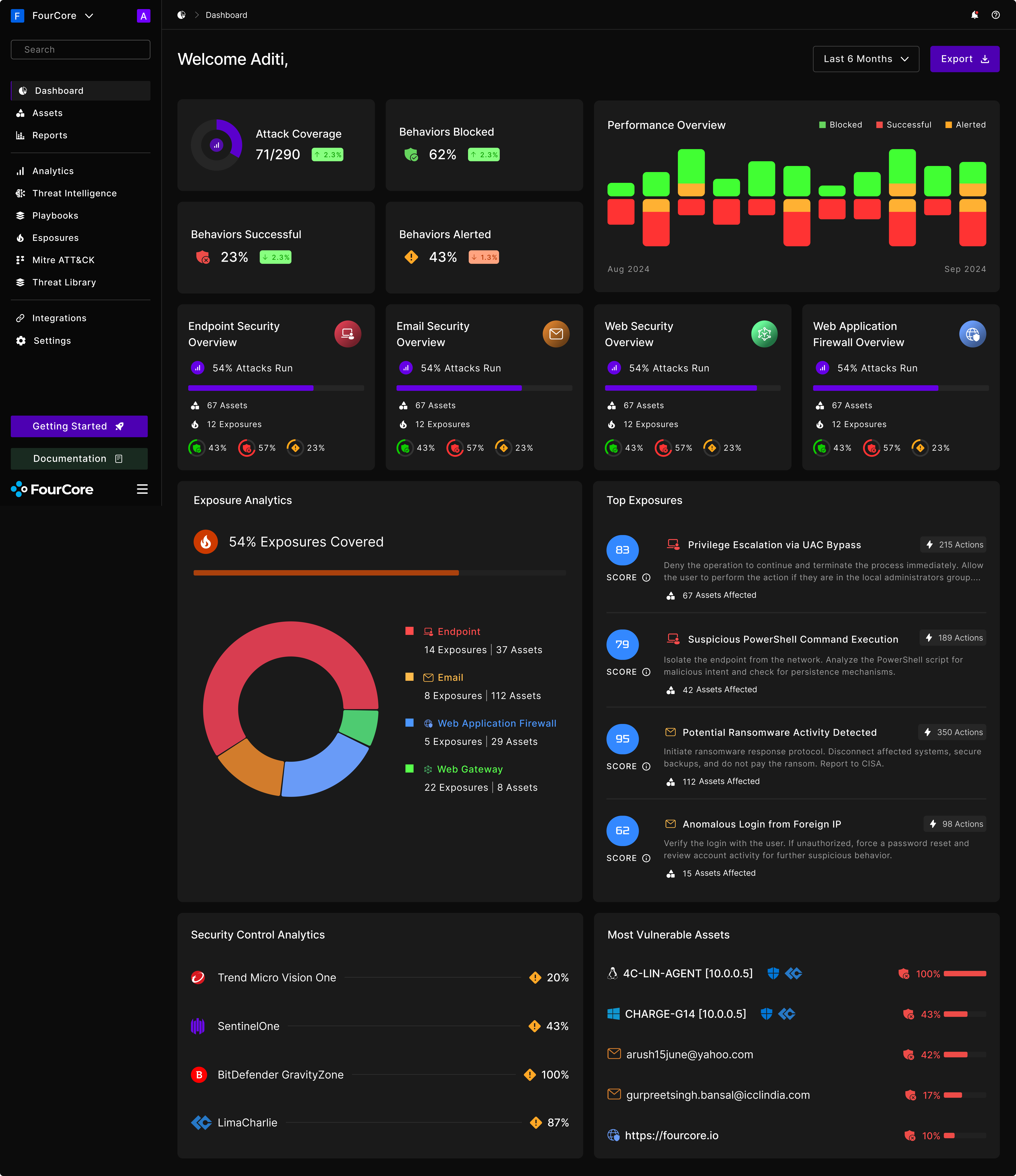
The redesign puts the four numbers that matter across the top as plain figures with a direction of travel against the previous period, then gives the rest of the screen to detail that is actually actionable: how each class of security control performed, which exposures scored highest, and which assets are in the worst shape. Nothing on the new screen needs a legend to read.

It also fixed a structural problem. The old left-hand navigation listed eleven destinations in one flat column, mixing top-level surfaces with individual report types. The new one is grouped, and the groups match how people actually talk about the product: what you are protecting, what you are running against it, and what you have connected.

The full dashboard, top to bottom. Scroll inside the frame: the real screen runs about seven thousand pixels.

Surface by surface

Past the dashboard, the redesign worked through the surfaces a security team lives in day to day. Each one had the same underlying problem: the data was all there, and none of it was ranked.

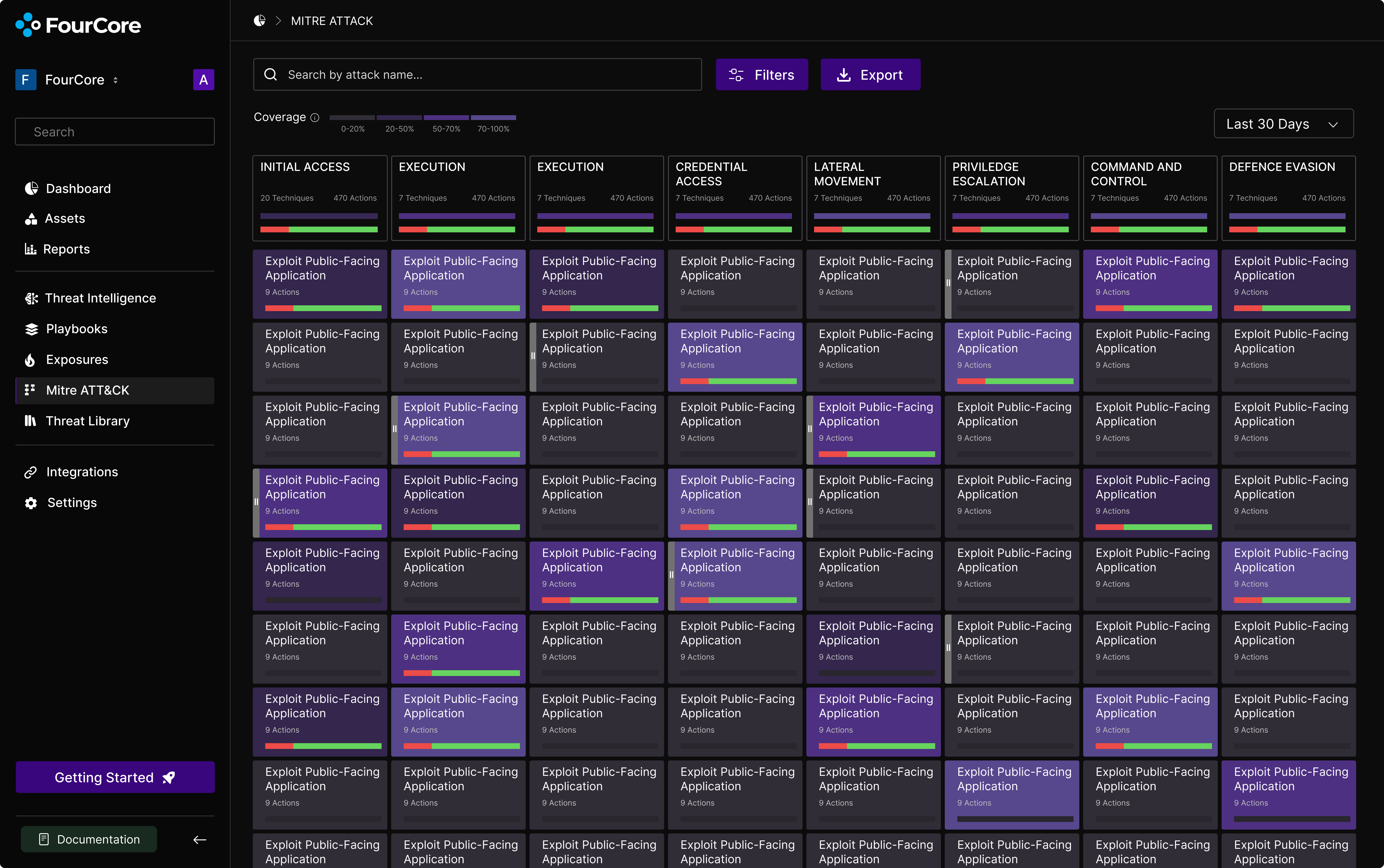
MITRE ATT&CK matrix
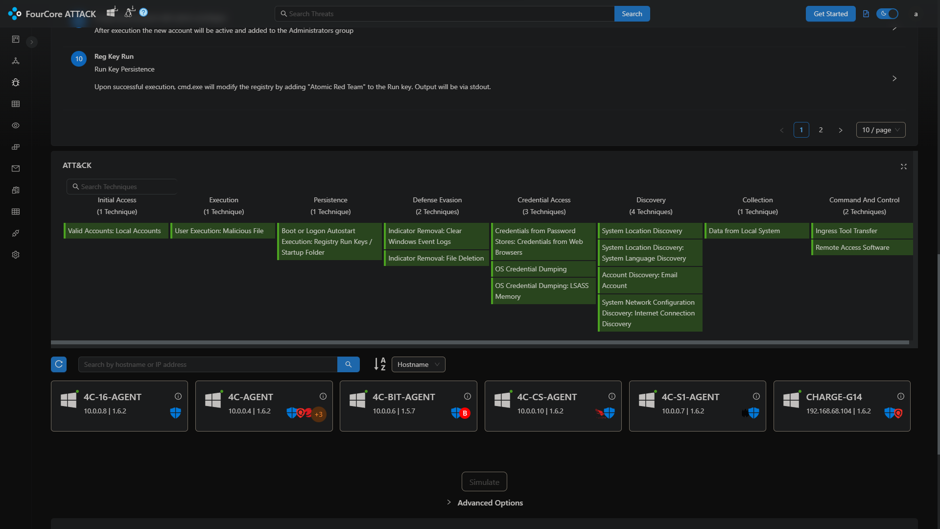
BeforeMITRE ATT&CK matrix — before
AfterMITRE ATT&CK matrix — after

The ATT&CK matrix is the canonical way security teams think about attacker behaviour, and in the old build it was a panel embedded halfway down another page, scrolling horizontally inside its own box. It is the industry’s shared map, and it was being treated as a widget.

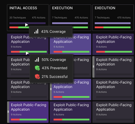
The redesign gives it the whole screen and adds the thing the old one was missing: banding. Each technique carries a coverage band, so the matrix reads as a heat map first and a list of names second. You can see where you are weak from across the room, which is the only way anyone reads this thing in a review meeting.

Hovering a technique
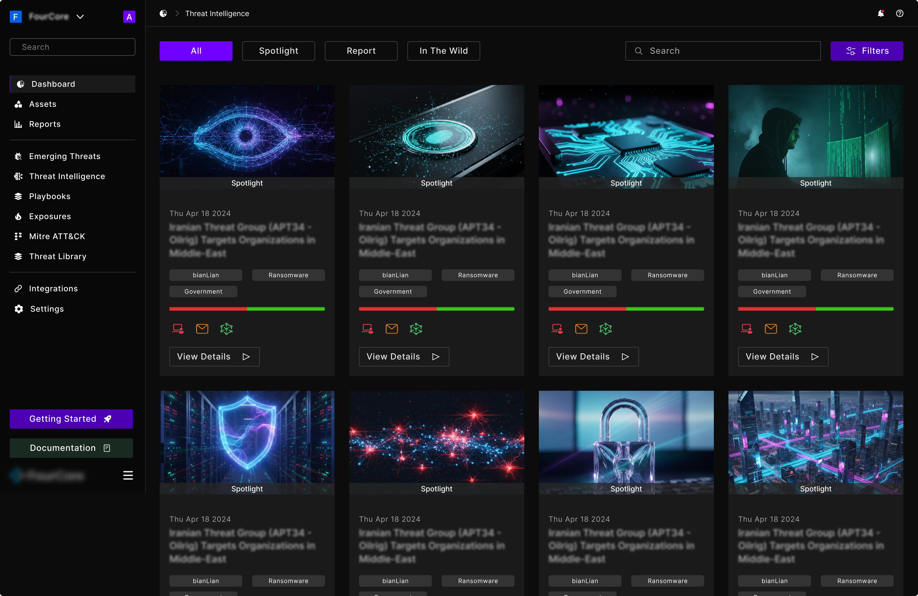
Threat Intelligence: spotlights, reports and in-the-wild activity in one feed

Threat Intelligence is the part of the product that answers “should I care about this one”. It is editorial content, so it is laid out like editorial content: a card grid with imagery, a date, the actor and the categories, and a coverage bar showing how you would fare against it right now. That last element is the one that makes it a product feature rather than a news feed.

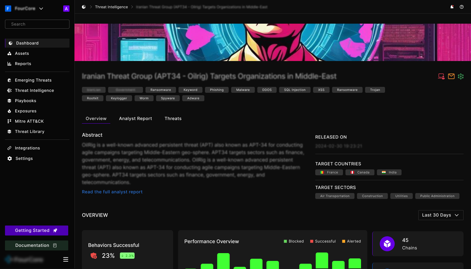
A threat, opened: abstract, who it targets, and your own performance against it

Opening a threat splits it into three tabs so the analyst, the executive and the operator each have a place to land: the abstract and target profile up front, the full analyst report behind a tab, and the specific threats you can run behind another.

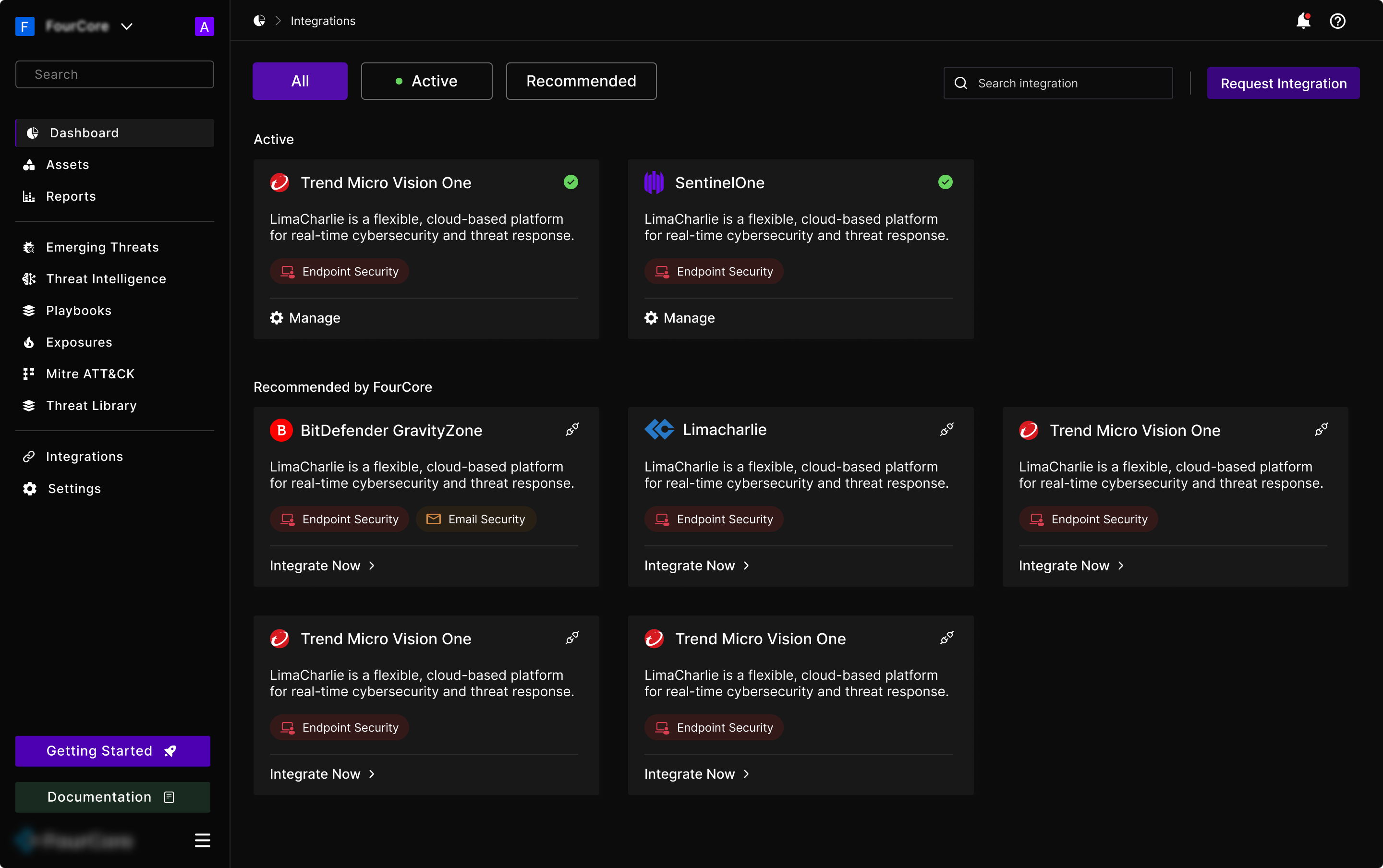
Integrations: what is connected, then what FourCore suggests connecting next

Integrations splits into two states on one page: what you have connected and can manage, and what FourCore recommends you connect next. Recommendations sit below active connections rather than in a separate tab, because the moment someone is thinking about their tooling is the moment they are already on this screen.

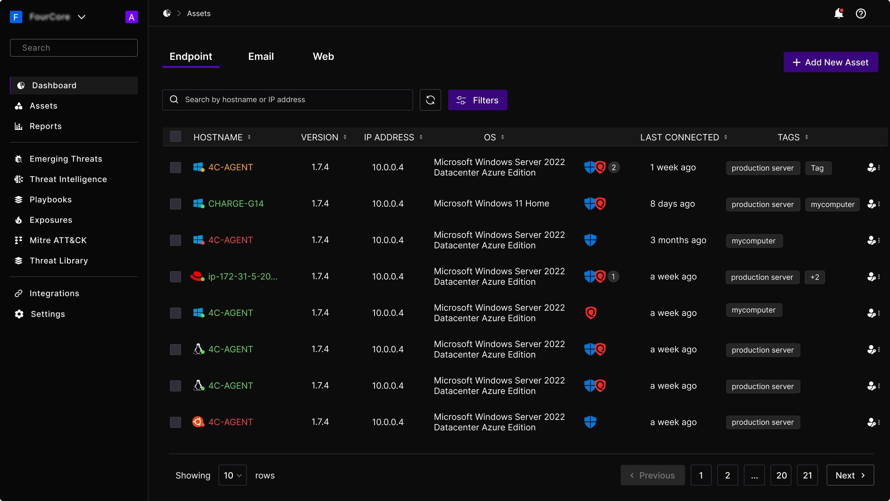
Assets, the thing every simulation points at

Nothing in the product works until a customer has assets in it. An asset is a machine, a mailbox or a web endpoint with the FourCore agent installed, and it is the target every simulation runs against. It is also the least glamorous part of the product and the one most likely to be where a trial quietly dies.

Assets, split by type: endpoint, email and web
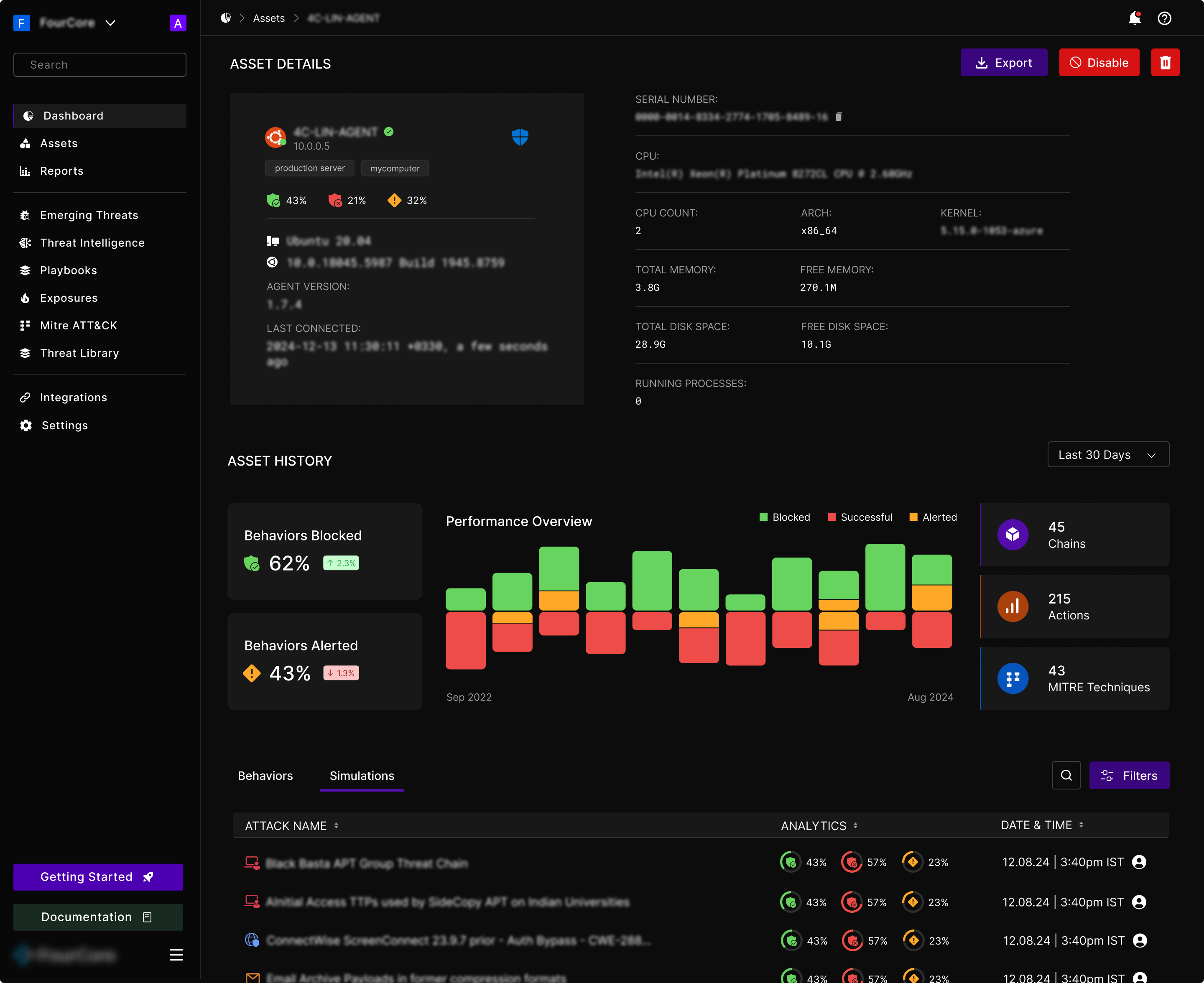
One asset, opened: what it is, how it has performed, and every simulation it has been through

The asset detail page carries two audiences at once. The top half is machine facts, the kind an engineer needs and nobody else reads: OS, kernel, CPU, memory, agent version, last seen. The bottom half is history: blocked and alerted rates over time, and the full run log with the same analytics column used everywhere else in the product.

Splitting them vertically rather than into tabs means the person who came for the run history scrolls past the specification once and never has to think about it again, while the person debugging an agent gets it without a click.

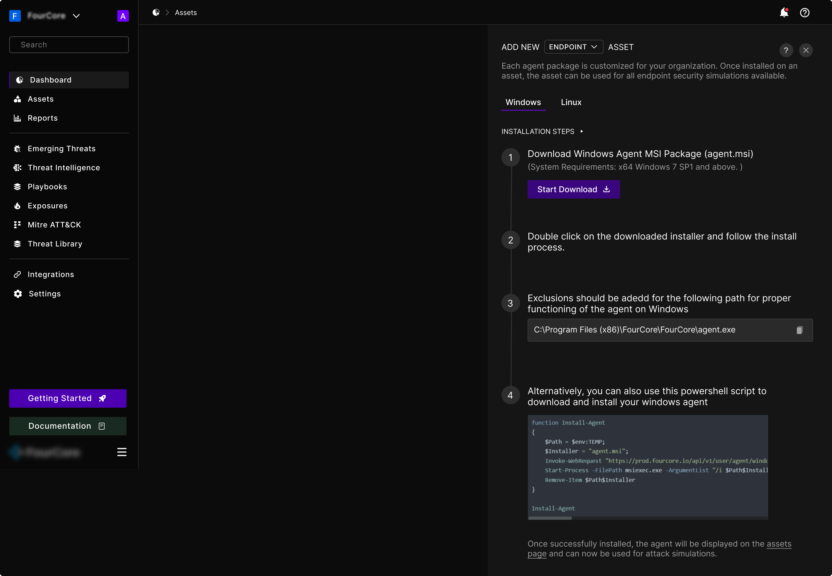
Adding an endpoint: the install laid out as numbered steps, per platform

Adding an asset means installing software on a production machine, usually by someone who has to justify doing it. The drawer lays the install out as numbered steps with the exact exclusion path and a copyable script, and it ends by telling you what success looks like: the agent shows up on the assets page. Instructions that stop before the confirmation are how support tickets get made.

Getting in, and getting a team in

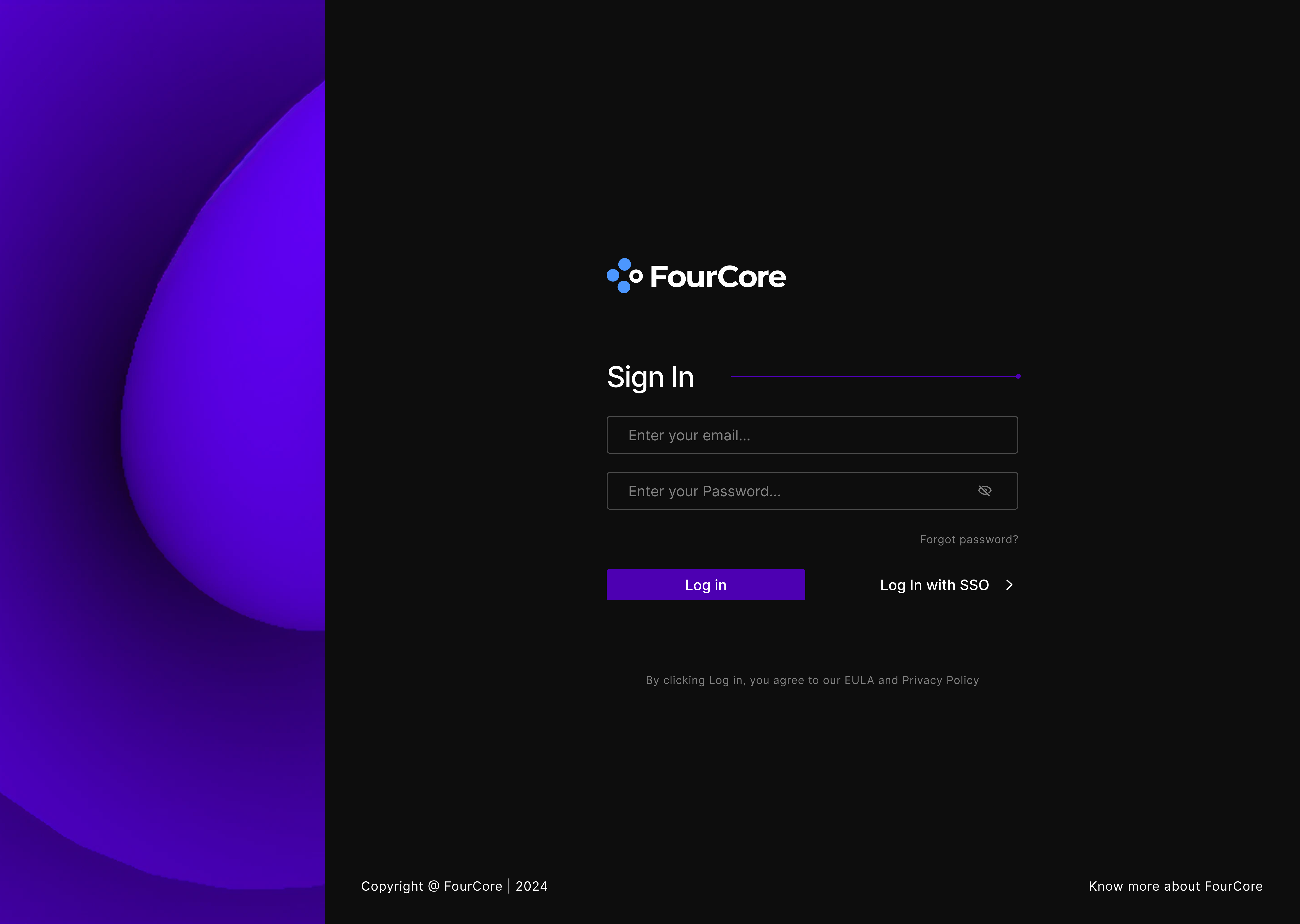
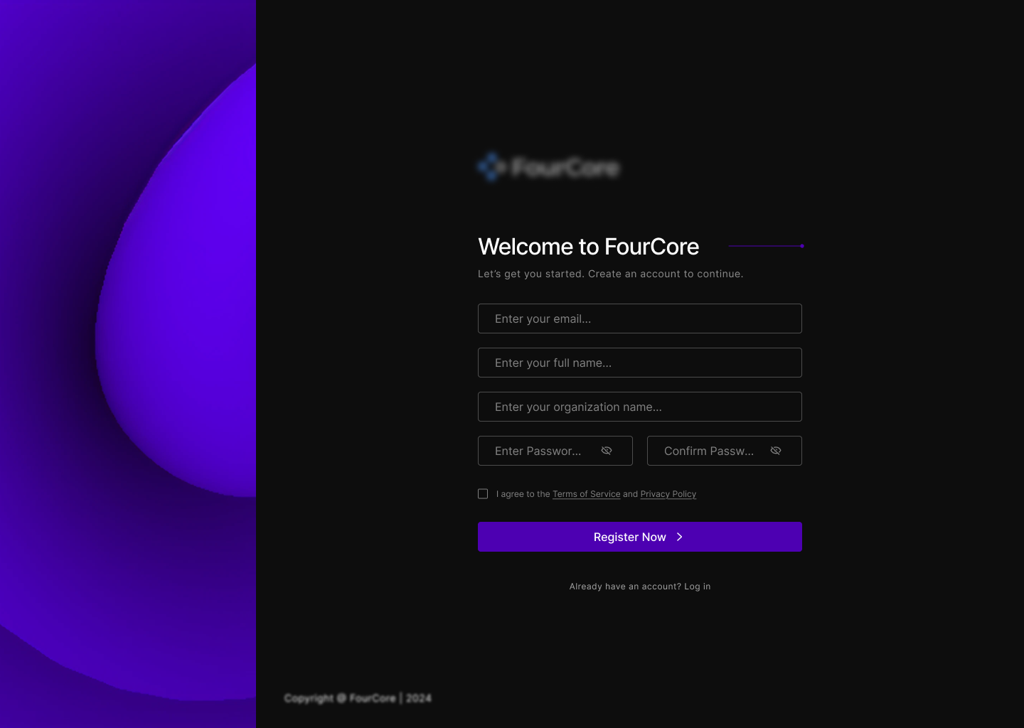
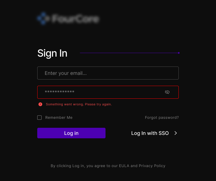
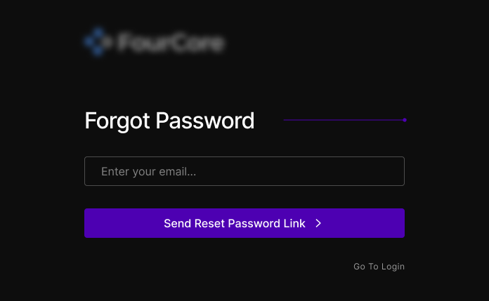
Authentication and settings are the screens no one puts in a portfolio, and they are the ones every single customer sees. I redesigned the whole set.

Sign in
Sign in
Registration
Registration

Sign-in and registration share one composition: a full-bleed gradient panel on the left holding the brand, the form on the right, and nothing else on the page. The gradient is doing real work: it is the only place in the entire product where the brand gets to be loud, because every screen after this one belongs to the customer’s data.

A failed sign in
A failed sign in
Forgot password
Forgot password
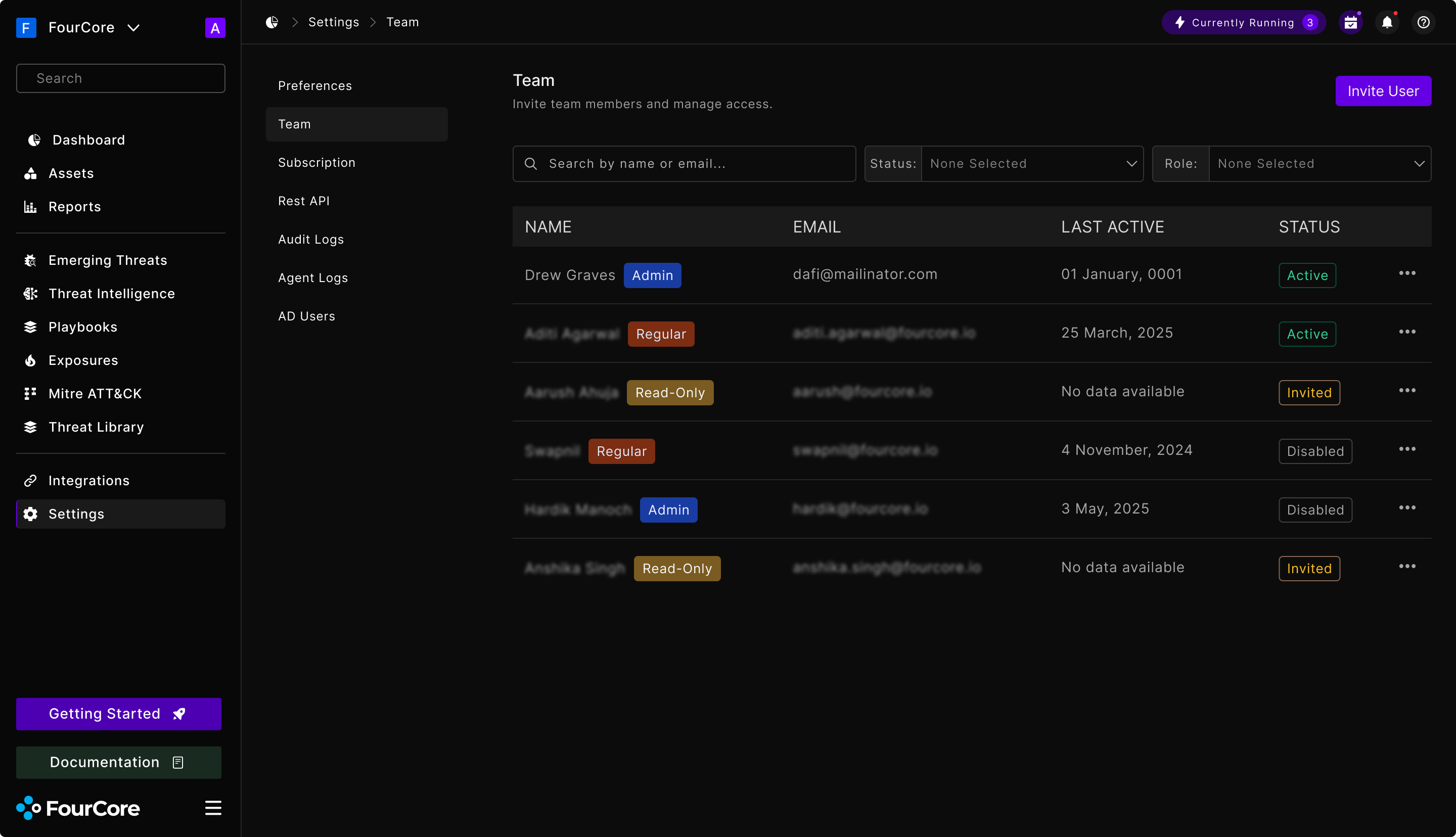
Settings → Team: roles, status and last active in one table

Team management is where a single-seat trial becomes an account with a security team on it. The table carries, without a click, the three things an admin checks: who they are, what they can do, and whether the invite was ever accepted.

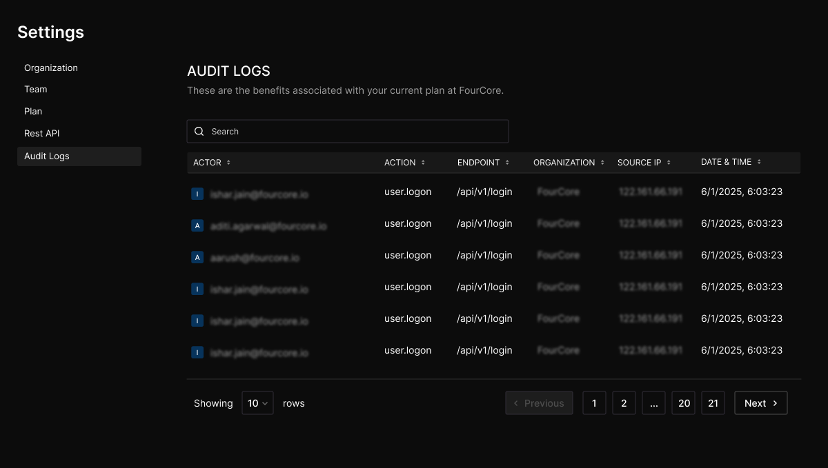
Audit logs
Audit logs
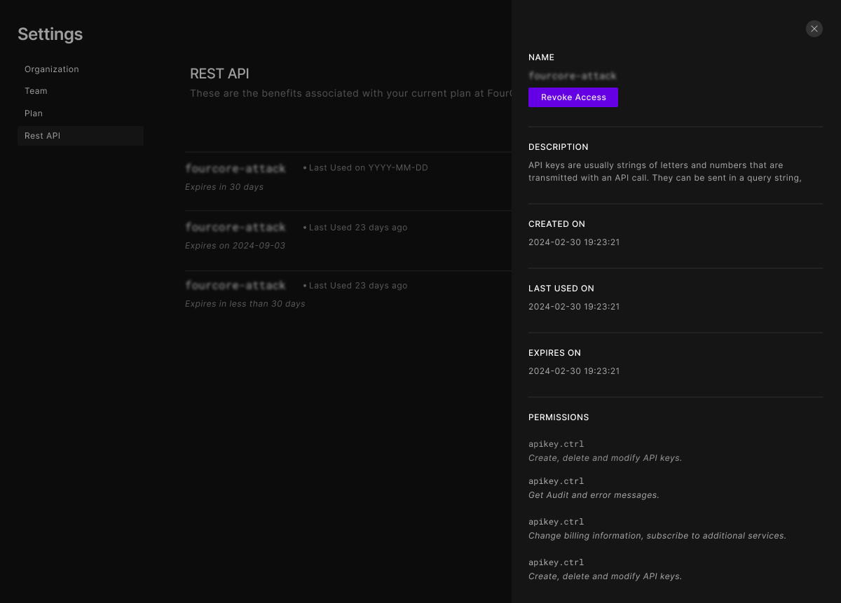
API keys, with a key opened

Audit logs and API keys are compliance surfaces: they exist because a security buyer’s procurement checklist asks for them. The key drawer spells out every permission a key grants in plain sentences next to its scope name, because the person revoking a key at 2am is not the person who created it.

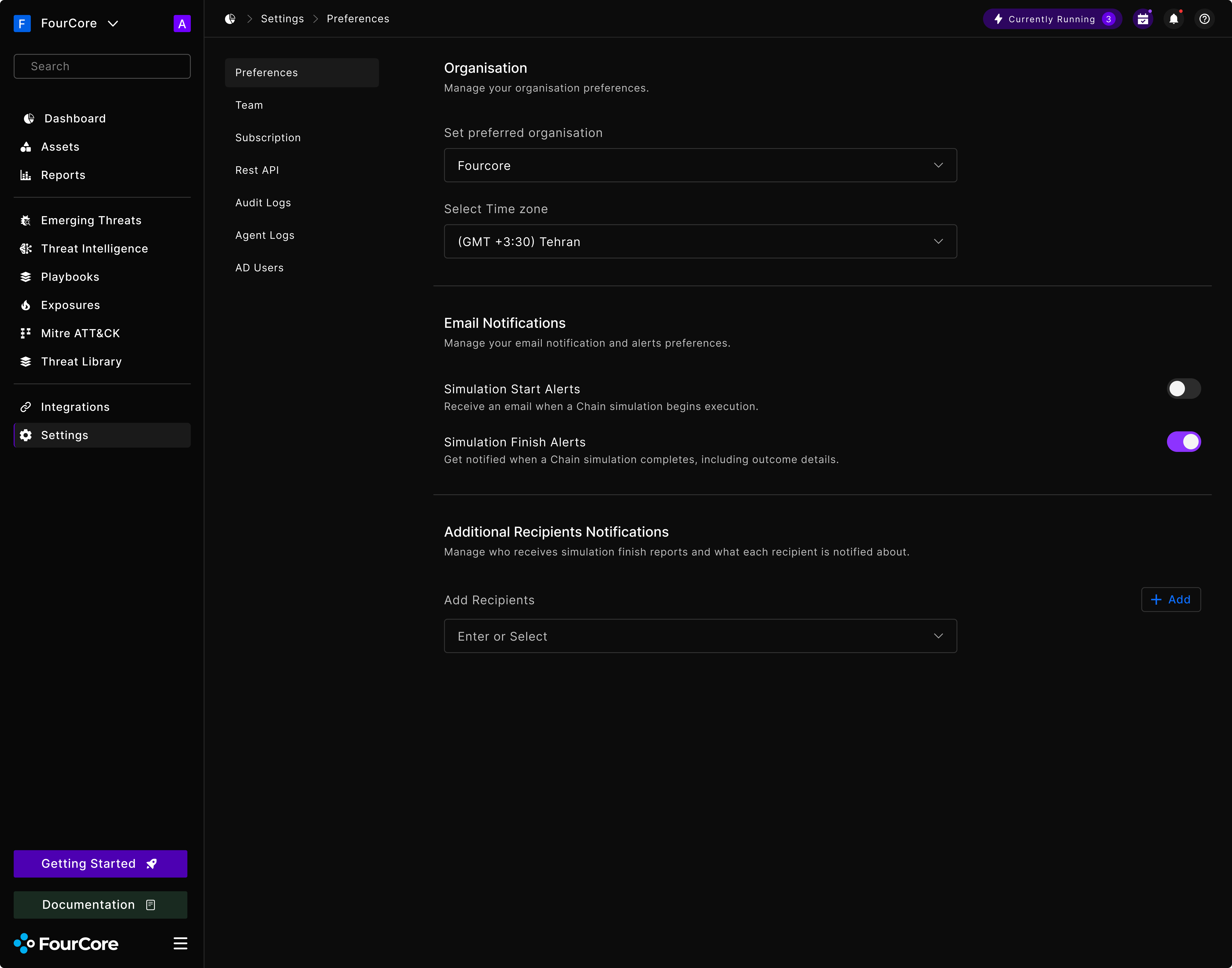
Preferences: organisation, time zone and alerting

The screens nobody asks for

A design system is mostly judged on its happy path and mostly used off it. These are the states that get skipped in a redesign brief and then get built badly under deadline, so I drew them up front.

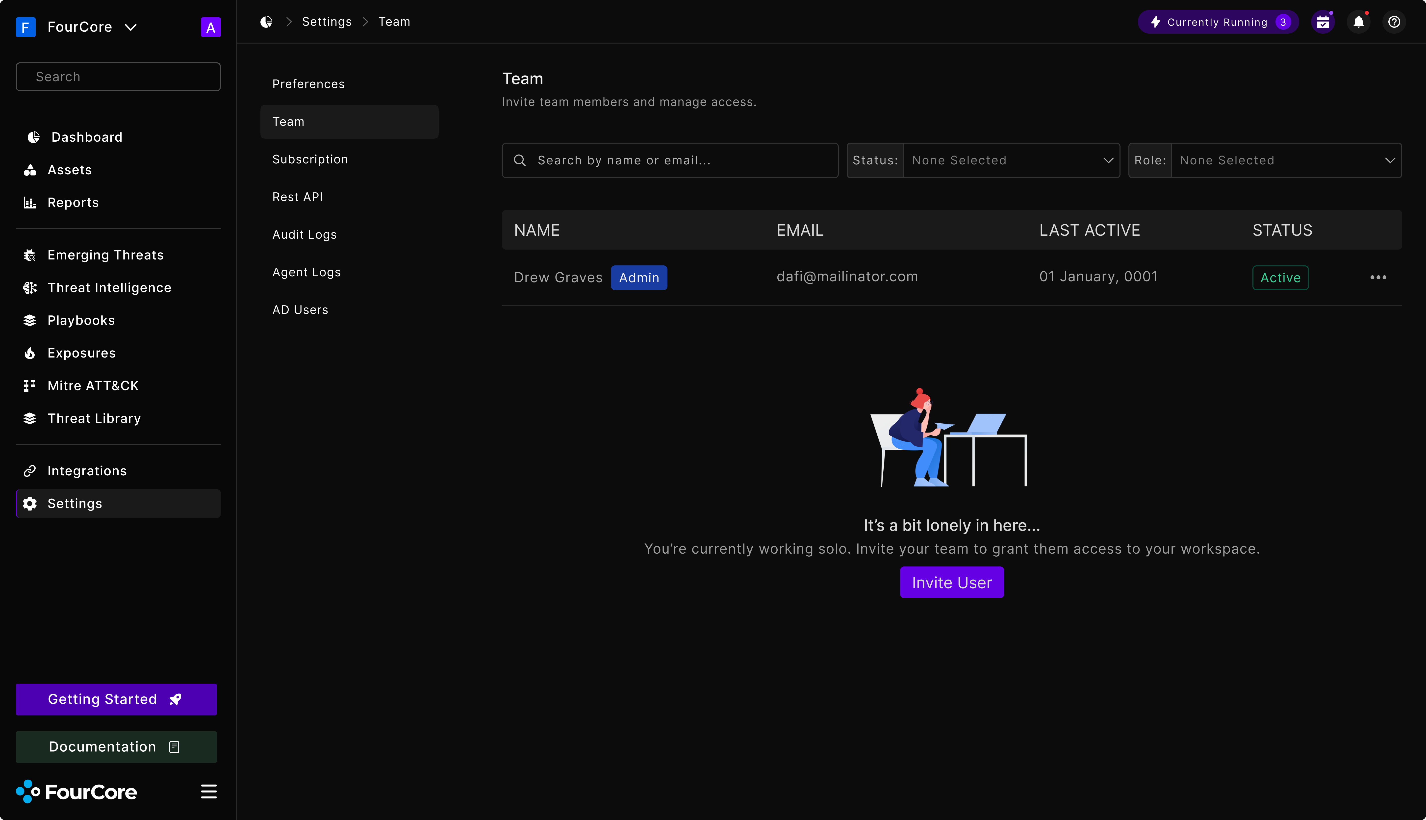
Team, before anyone has been invited
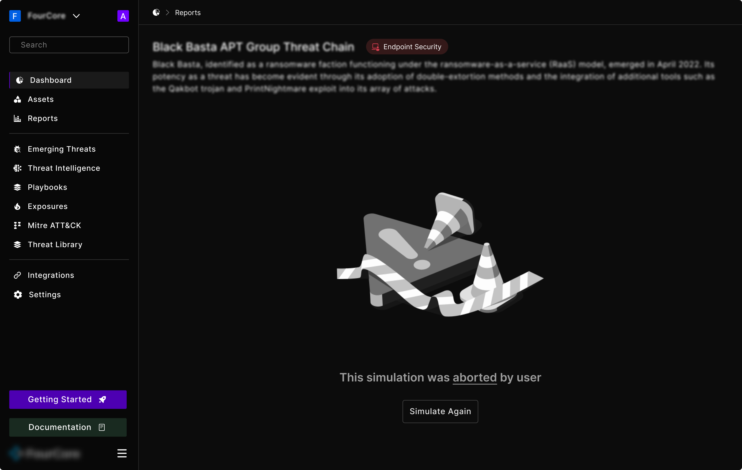
A simulation the user stopped part way

Both of these do the same two jobs: say plainly what happened, and offer the one action that resolves it. “It’s a bit lonely in here” with an Invite User button; “this simulation was aborted by user” with Simulate Again. Neither leaves the reader wondering whether something is broken.

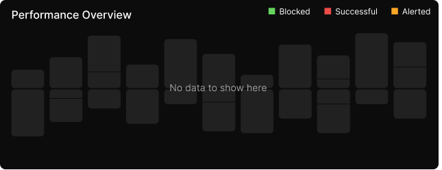
A chart with no data yet
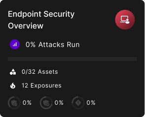
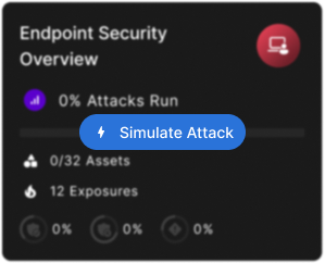
A zeroed card, at rest
The same card, on hover

The zero states are the ones I care most about. A new account opens a dashboard where every number is legitimately 0% and every chart is legitimately empty, and that screen has to read as “nothing has run yet”, not as “this product is broken”.

So the empty chart keeps its own skeleton: the bars are still there, greyed, holding their shape. And the zeroed card hides a Simulate Attack button until you hover it. The card is not just reporting that nothing has happened; it is offering to make something happen.

The same screen, more than once

None of the screens above arrived in one pass. A few of them are worth showing twice, because the distance between the two versions is most of what the job actually is.

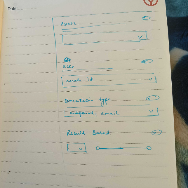
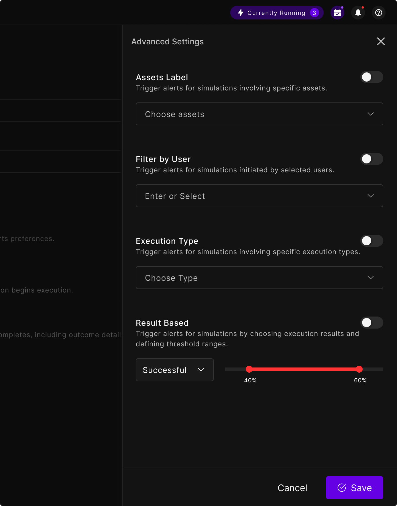
Alert filters: from a page of a notebook to a shipped drawer.

Where it started
Where it started
Where it ended up
Where it ended up

The problem was that simulation-finished emails were firing on everything, so people either muted them or ignored them. The fix was to let an admin narrow what triggers an alert: which assets, which users, which execution types, and most importantly which results.

The sketch already has the whole structure in it. Four filters, each with its own on/off so the defaults stay quiet, and a result filter that needed a range rather than a value. That last control is the only thing that really changed between the two: the loose slider in the notebook became a two-handled threshold with the numbers called out, so “alert me when successful attacks land between 40% and 60%” is something you can read back off the screen.

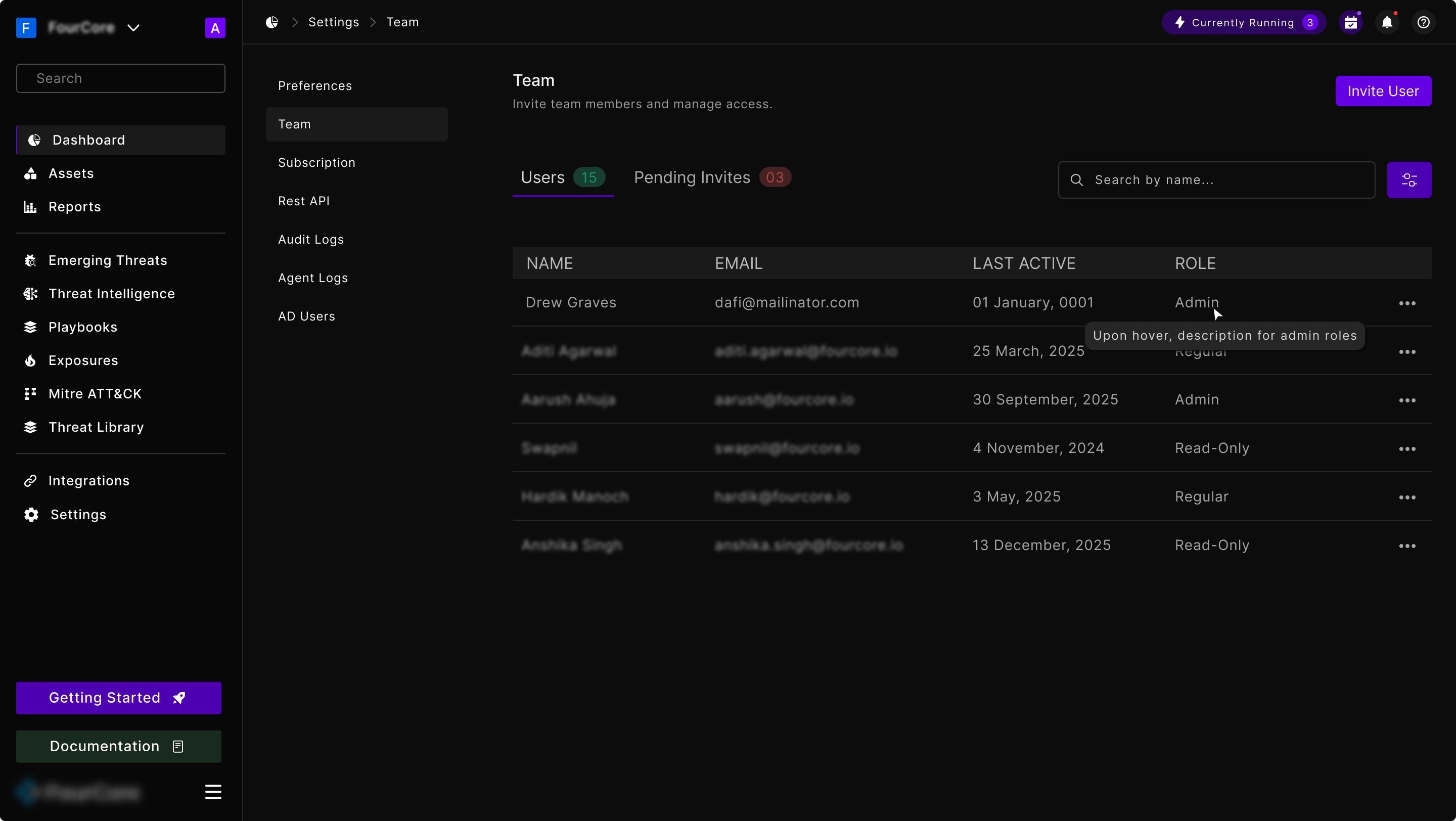
Settings → Team, first pass and second
BeforeSettings → Team, first pass and second — before
AfterSettings → Team, first pass and second — after

The first pass split users across two tabs, Users and Pending Invites, and put the role in its own column as plain text with a tooltip explaining what each role meant. Reviewing it, two things were wrong. Splitting by invite state meant the answer to “is everyone set up” lived in a badge on a tab. And a tooltip is where you put an explanation you hope nobody needs.

The second pass merges the tabs into one table and adds Status as a real column, so Active, Invited and Disabled sit side by side and can be filtered. The role moves up next to the name as a coloured badge, where it reads as a property of the person rather than a cell in a grid. The hover explanation is gone.

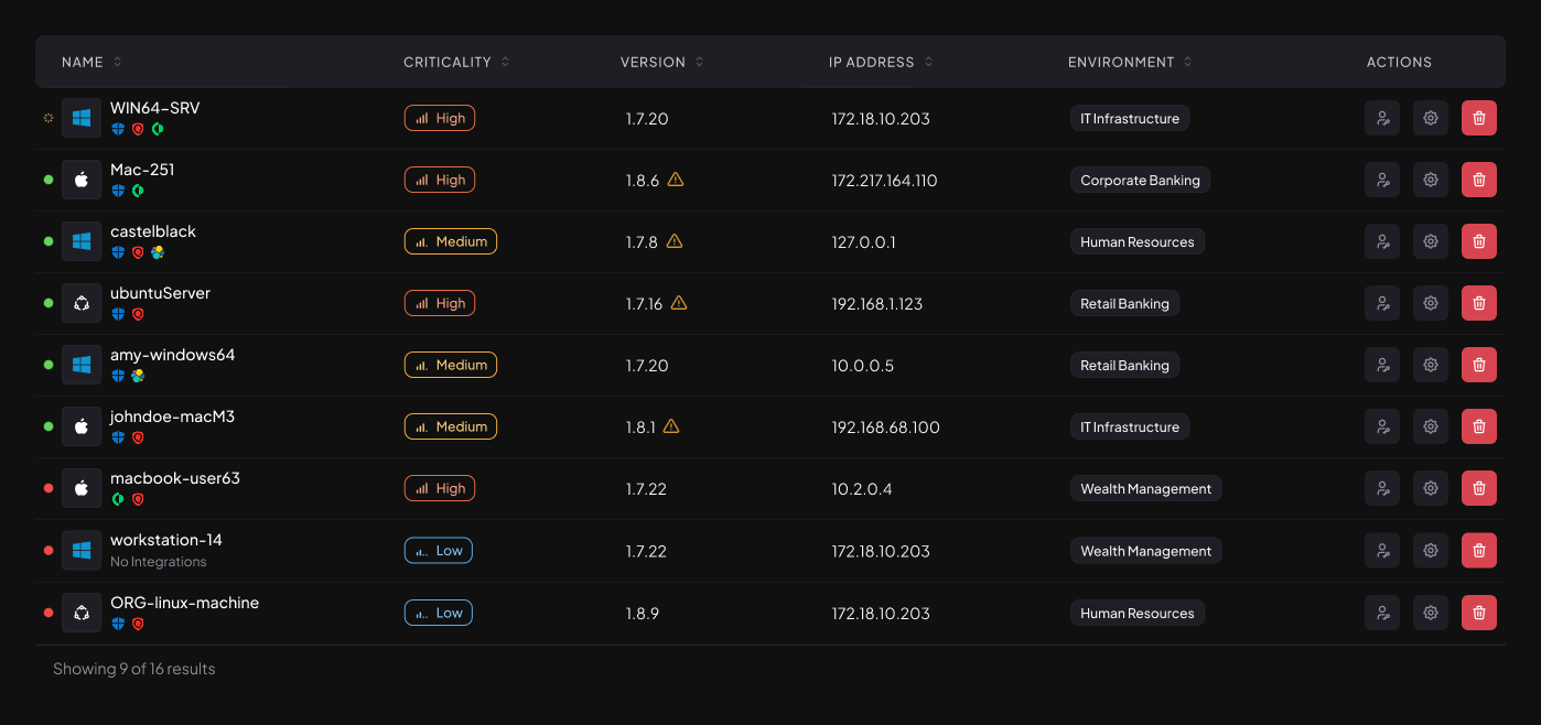
The asset table as it shipped
A later pass: criticality and environment

The asset table went the same way. The first version answered “what is connected”: hostname, version, IP, OS, last seen. The later pass answers “what matters”, adding a criticality level and the business environment each asset belongs to, so a list of machines becomes a list of machines you can prioritise.

And two cards, explored at two densities.

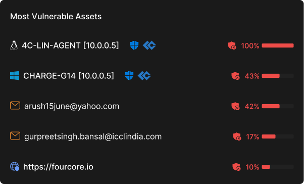
Most Vulnerable Assets, lean
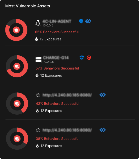
Most Vulnerable Assets, expanded
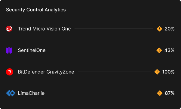
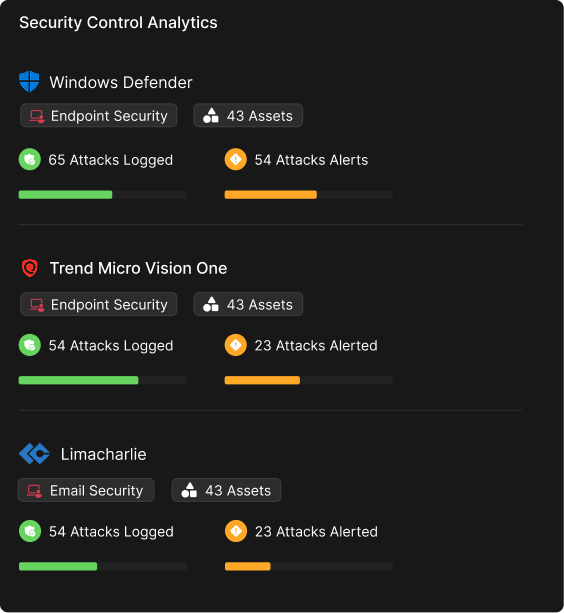
Security Control Analytics, lean
Security Control Analytics, expanded

Both cards were drawn twice: once as a ranked list that fits five rows in the height of a dashboard tile, and once as a fuller record with a ring per row, the exposure count, and the security tools covering each asset.

The lean version is the one on the dashboard. On a screen where a card is competing with eleven others, the job is to name the worst offenders and hand you a link: the detail belongs on the page you land on when you take it.

Making a table tell you where to look

Percentages told users the number. They did not tell them where to look.

FourCore is a data-heavy product, and a lot of that data lives in tables. Users kept telling us the same thing in different words: they could read any individual row fine, but scanning a full table to work out which entry needed their attention first was slow.

The analytics in those tables were rendered as percentages. A percentage is precise, and precision is the right call in a security tool, but a column of numbers gives the eye nothing to catch on. Reading it is a serial task: you go row by row, comparing as you go. That is exactly the wrong shape for a screen someone opens when something is on fire.

The constraint was that whatever replaced it could not cost us the table. Tables here are dense and have to stay responsive across a lot of columns and a lot of rows, so anything that needed real horizontal space, a bar column, a sparkline, an extra cell, was out before it started.

What I landed on was combining the two rather than choosing between them: the percentage stays, and a small ring chart wraps it in the same cell. The ring costs almost no additional width because it occupies space the cell already had, and it turns the number into something the eye can compare in parallel. Users get the exact figure when they need it and, before that, an at-a-glance read of which rows are worth their attention.
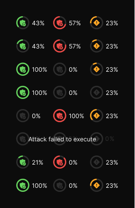
The component had to survive every value the data could hand it, not just the demo-friendly middle. A full ring at 100% and an empty one at 0% both have to stay legible at sixteen pixels, and the colour has to carry meaning without being the only thing carrying it: blocked, successful and alerted are green, red and amber, but they are also three different icons.

The row that mattered most was the one that is not a number at all. When an attack fails to execute there is no percentage to show, and the honest answer is to say so in words and grey the rest of the row out, rather than render a 0% that reads as “nothing got through”.

The ring across its states, including the one that has no value
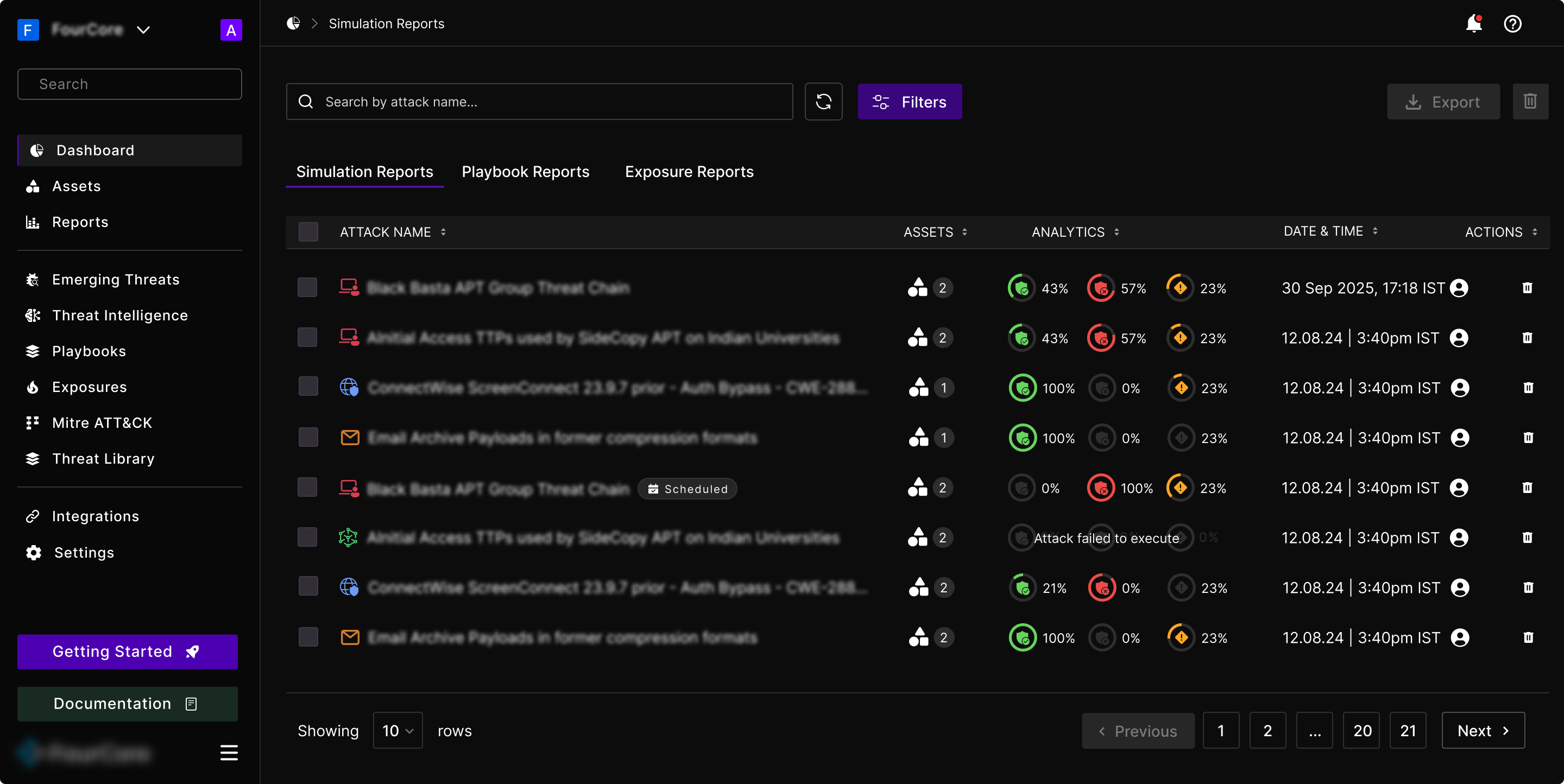
The rings in production, in the Analytics column of the reports table

In place, three rings sit in the width a single percentage used to take. The table keeps its density, with attack name, assets, date and actions all still fitting, and the column that used to be read row by row can now be skimmed down.

The old simulation report: results as full-width bars and status badges

For contrast, this is how results were presented before: horizontal bars that each needed most of a column, and Success / Detected badges repeated down every row. It is readable one row at a time, which was exactly the complaint.

Promoted to Senior, and building the design system

Being promoted to Senior UI/UX Designer changed what the job was. Redesigning screens one at a time had got the product to a consistent place, but nothing was holding it there. Every new feature was a fresh negotiation about type sizes and spacing and what a button looked like.

So the first thing I did as a senior was stop designing screens for a while and build the design system for FourCore from scratch: the entire library, spanning typography, colour, components, and a custom icon set. In a product this dense, that system is what lets a hundred different screens, dashboards, attack graphs, MITRE matrices and reports feel like one tool, and it is the reason new features started shipping much faster after it existed.

New features, concept to production

With the system in place, the work moved to net-new product. Over the following stretch I designed and shipped 5+ major features and 40+ new screens, taking each from first concept through to production alongside engineering.

  • Emerging Threats: a feed of live malware campaigns you can run against yourself
  • The scheduler: everything the platform runs, on a calendar
  • Playbooks: attack chains grouped into the stages of a real intrusion
  • Exposures: the ranked list of what to fix
  • Reporting, rebuilt

The four sections that follow take each of them in turn: what the feature is for, and the decisions inside it that are not obvious from a screenshot.

Emerging Threats, end to end

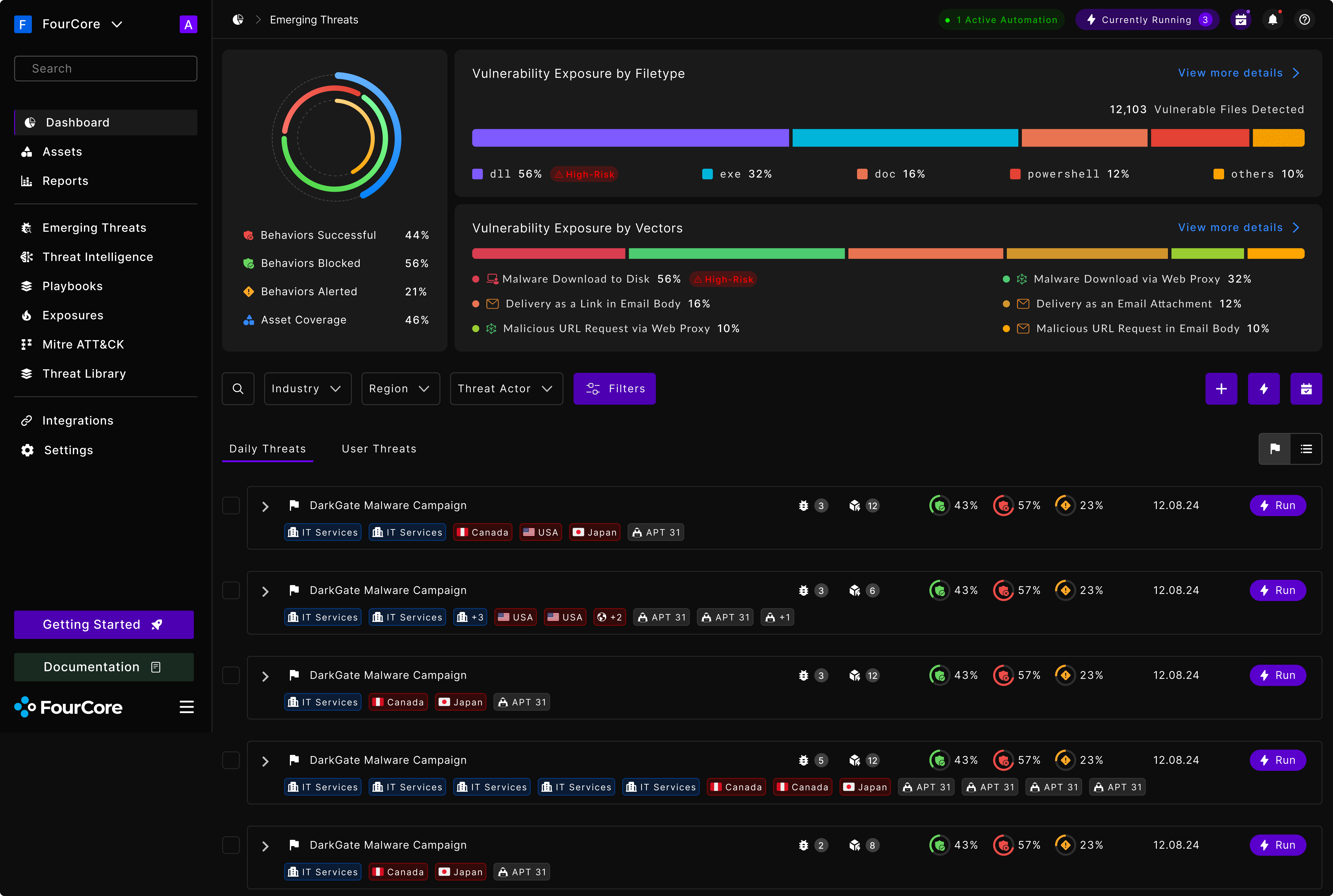
Emerging Threats is the feature I took furthest, from the first concept through to production. The premise is simple to state and hard to build: a new malware campaign appears in the wild, and a security team needs to know, today, whether their own defenses would stop it.

Before something like this exists, that question takes days. Someone reads a threat report, works out which techniques it uses, finds or writes samples, sets up a run, and interprets the output. Emerging Threats collapses that into a feed you can act on, where every row is a real campaign and every row has a Run button.

The Emerging Threats surface: exposure summary above, the day’s campaigns below

The top of the screen answers “how exposed am I, overall”, and it does it twice, along the two axes that change what you would actually do about it. Exposure by filetype tells you what to tighten: if 56% of your vulnerable files are DLLs, that is a different afternoon than if they are Office documents. Exposure by vector tells you where to tighten it: on disk, through the web proxy, or in email.

Both are single stacked bars rather than pie charts, with the high-risk slice called out in words rather than left to colour alone. Underneath, the ranked list carries the same three rings used everywhere else in the product, so a rate here means what a rate means anywhere.

Each row is a campaign, tagged by the industries, regions and threat actors it is associated with: the three things a reader uses to decide whether it is aimed at someone like them. And the primary action sits on the row itself. There is no detail page to visit first, because the whole point is to shorten the distance between reading about a threat and testing yourself against it.

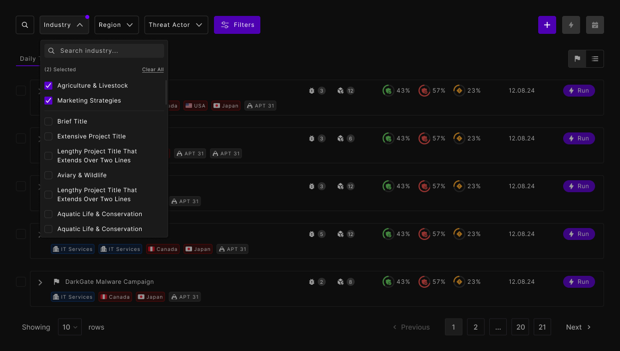
The industry filter, specified with realistic labels rather than convenient ones

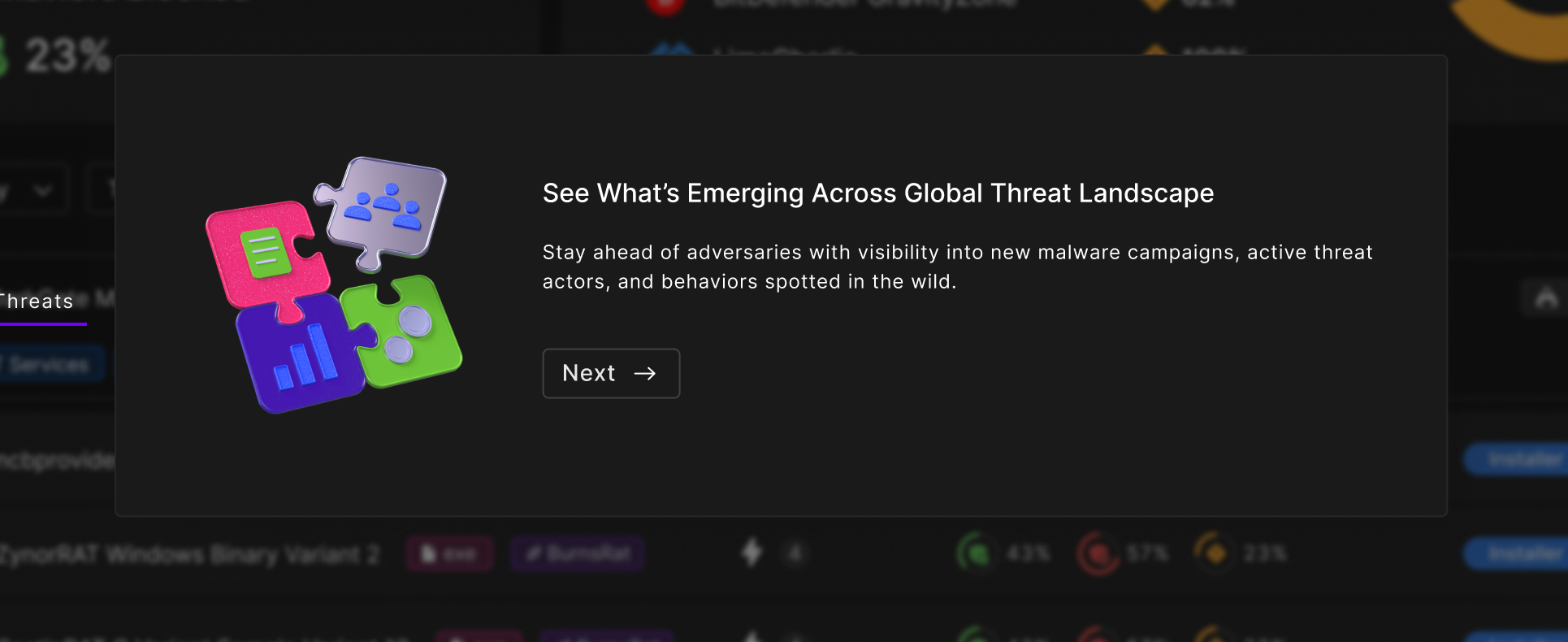
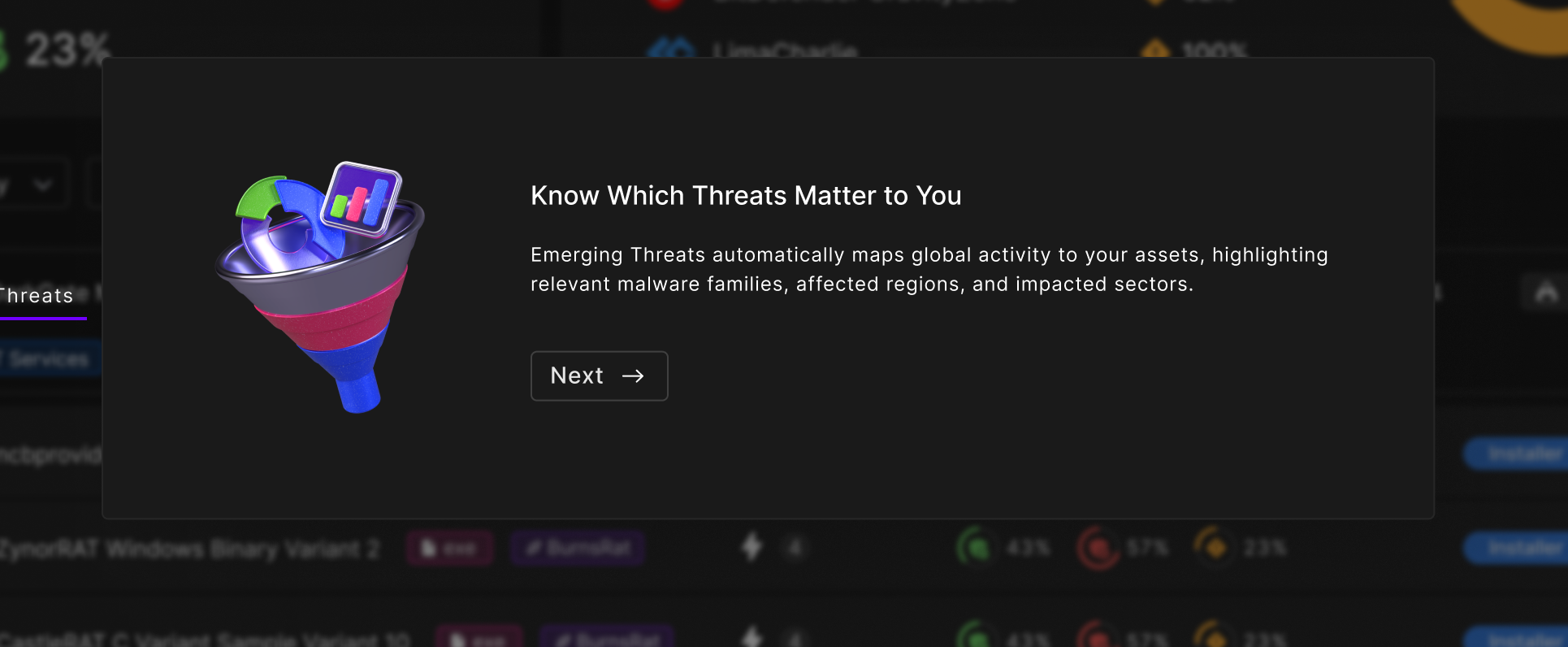
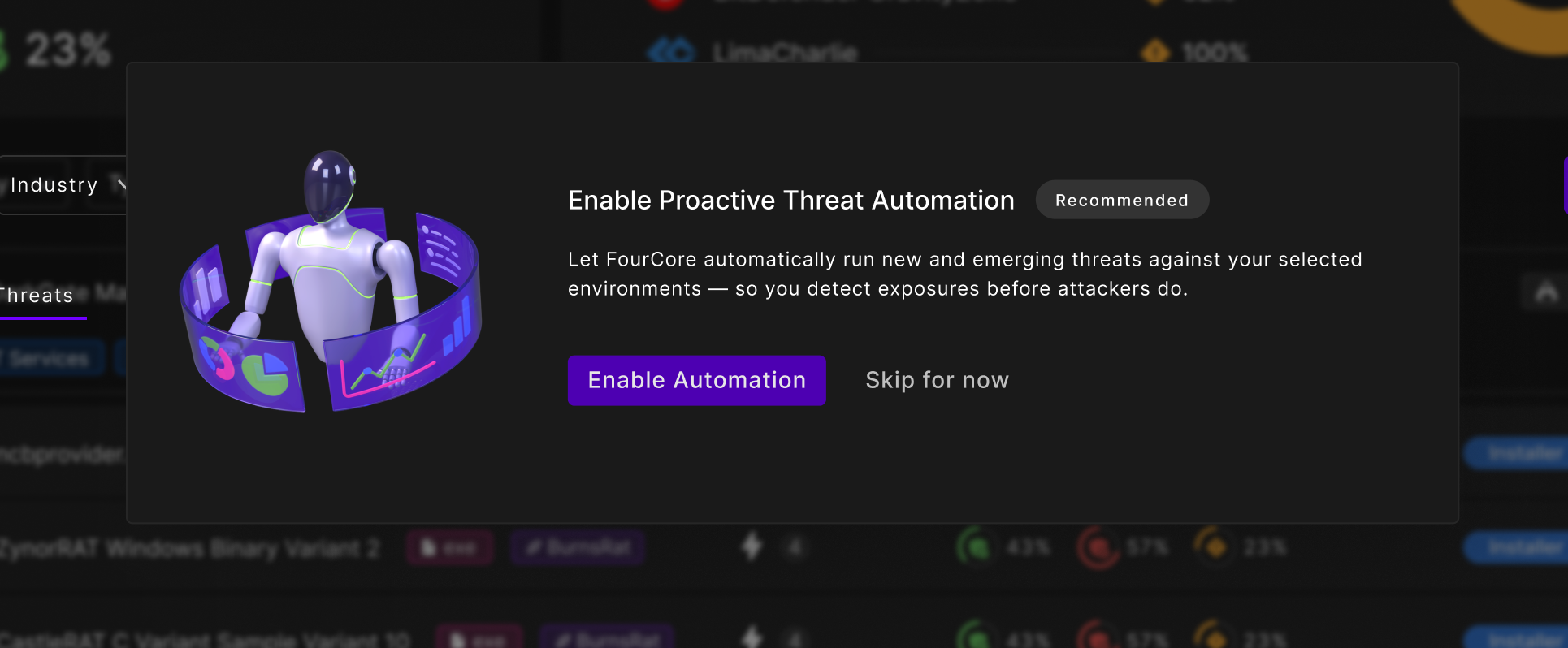
A feature nobody knows exists has not shipped. So it introduces itself.

01: Say what it is
01: Say what it is
02: Then say why it is theirs
03: Then ask for the one decision

Three steps, each doing a different job. The first names the thing. The second is the one that turns a global feed into something personal: the platform maps worldwide activity onto your assets, your regions, your sectors. Without that step, Emerging Threats reads as a news ticker; with it, the list behind the dialog is a list about you.

The third step is the reason the flow exists at all. Automation is what makes the feature useful without anyone remembering to open it, so it is marked Recommended and given a real button, but the way out is a plain “Skip for now”, set at the same size as the thing it declines. A first-run flow that traps people is worse than no first-run flow.

All three sit over the live screen rather than on a blank page, blurred but still legible at the edges, so the reader can see the thing being described while it is described.

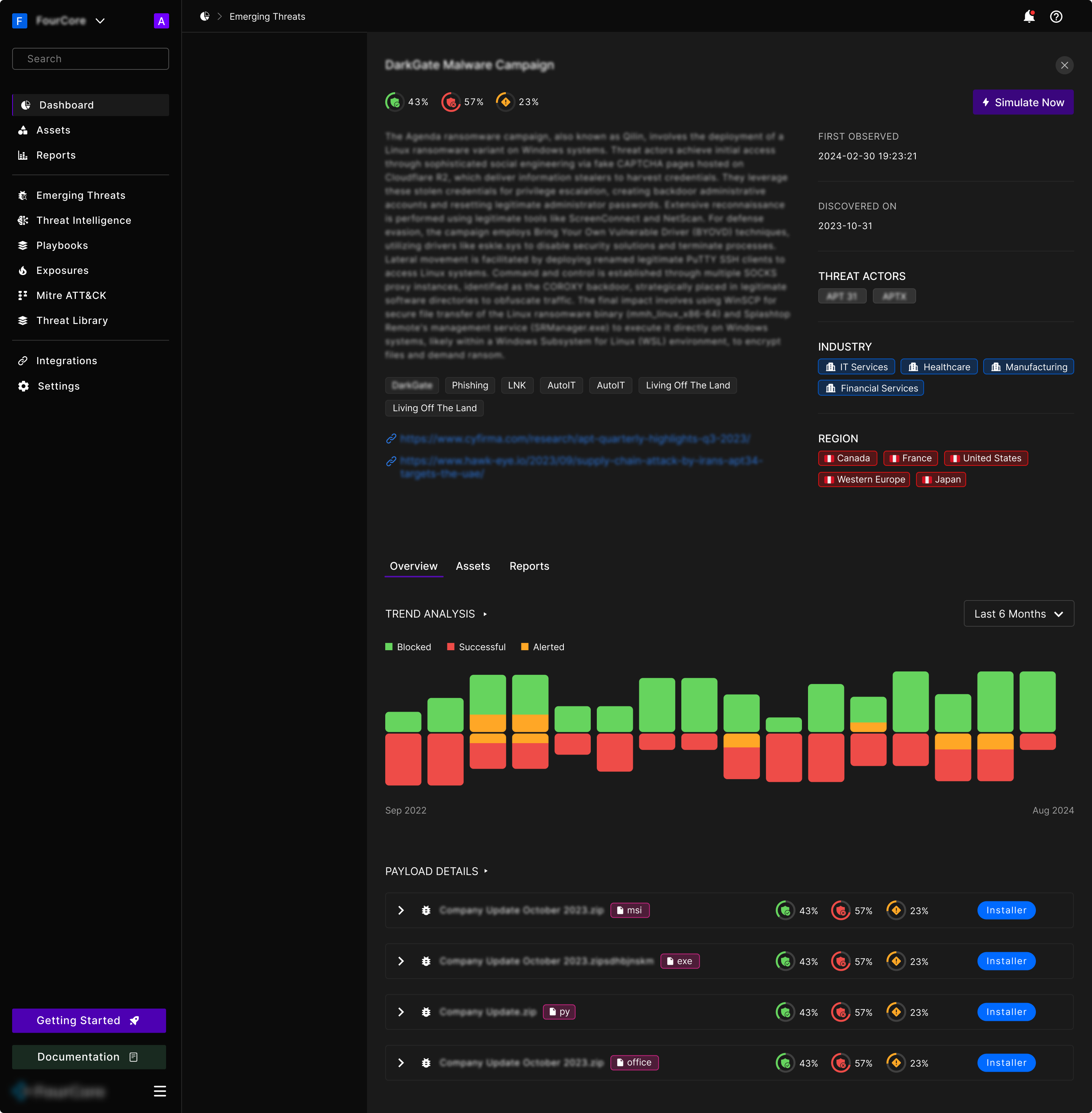
A campaign, opened: what it is, who runs it, who it targets, and how you have fared

Opening a campaign has to serve two readers at once. The analyst wants the write-up, the source links, and the payload hashes. The person who has to make a decision wants to know whether it applies to them and what happened last time it ran.

So the narrative sits on the left, and the attributes sit in a scannable right rail: first observed, discovered on, threat actors, industries, regions. Simulate Now is at the top next to the current rates, because the most common reason to open this page is to decide whether to run it.

Below that, trend analysis over time, then the payloads themselves. That order is deliberate: the trend is the thing you can act on, the payload list is the thing you check afterwards.

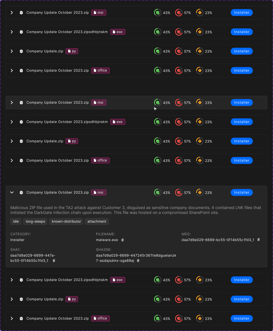
The payload row is the densest object in the feature, so it was specified as a small state machine rather than a static row: resting, hovered, and expanded.

Collapsed, it shows the filename, the filetype and the rates. Expanded, it adds what the file actually did, its behavioural tags, and the hashes an analyst will paste into their own tooling, each with a copy button, because nobody types a SHA256 by hand.

One payload row, specified across its three states

Two doors into the same room.

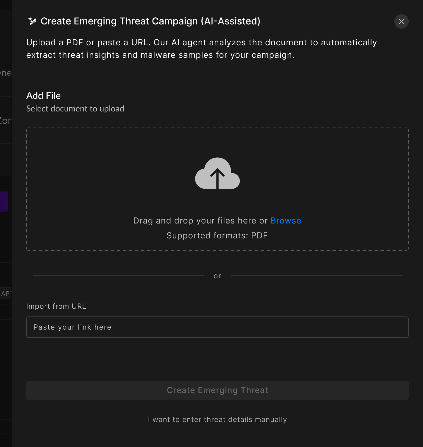
The AI-assisted path: hand it the report you already have
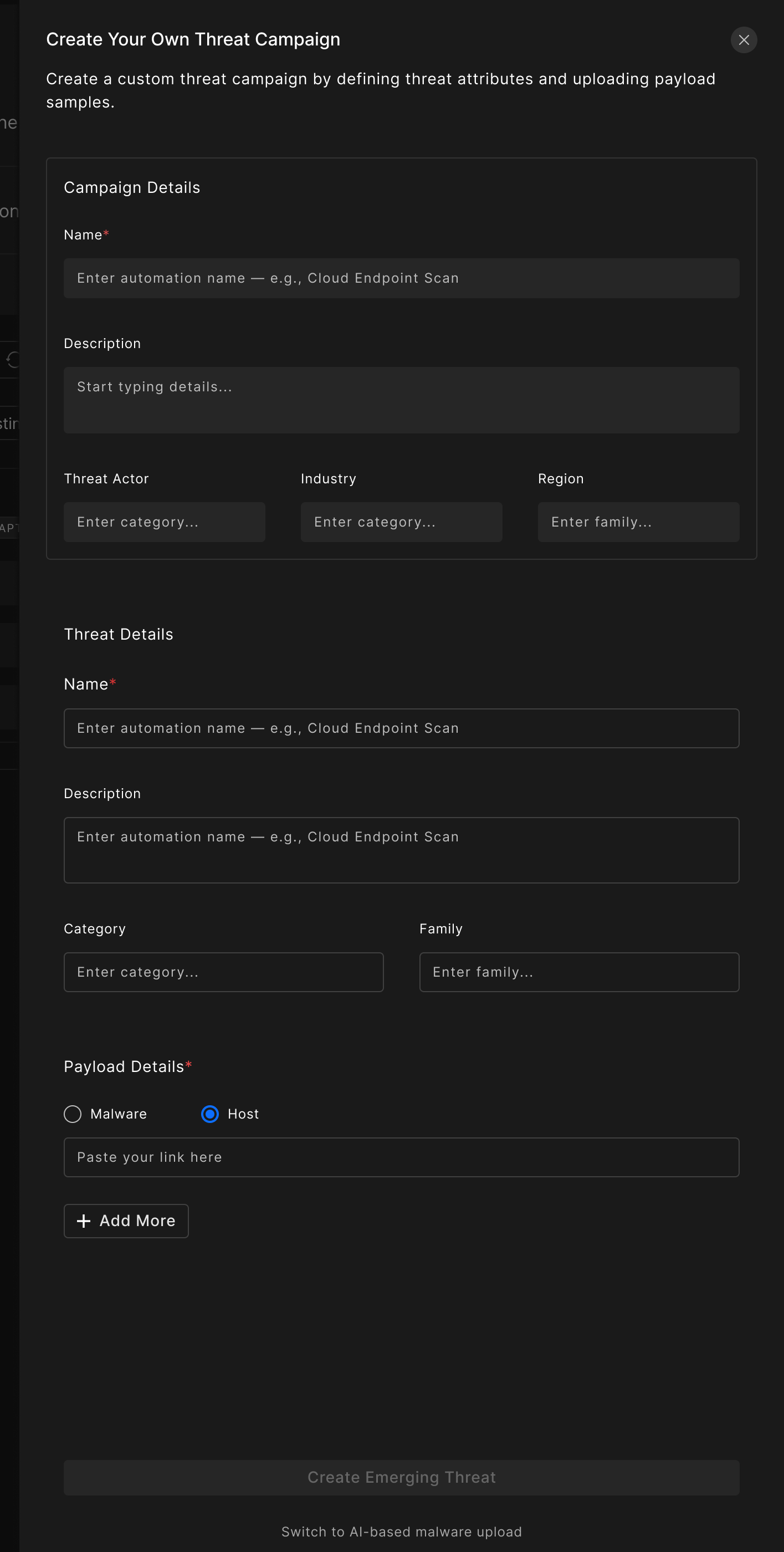
The manual path: the same campaign, entered field by field

Customers also need to test threats that are not in the feed: something their own intel team found, or a report a vendor sent them. That is a lot of structured data to enter by hand: campaign name, actor, industry, region, threat family, category, and every payload.

The AI-assisted path takes the artefact people already have, a PDF report or a URL, and extracts that structure automatically. The manual path is the same campaign, entered field by field.

Neither is hidden behind the other. Each drawer ends with a plain-text link to its opposite: “I want to enter threat details manually”, and “Switch to AI-based malware upload”. That link is the whole design decision. An automated path that cannot be escaped is a trap when the extraction gets it wrong, and a manual path with no shortcut is a chore when it would have got it right.

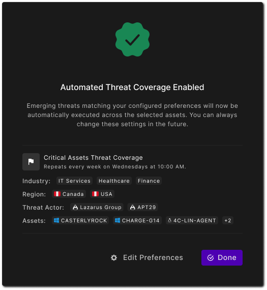
Automation, switched on: the config read back as a receipt
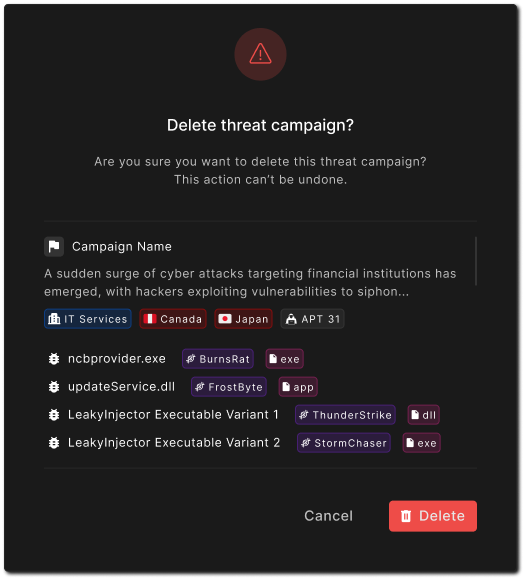
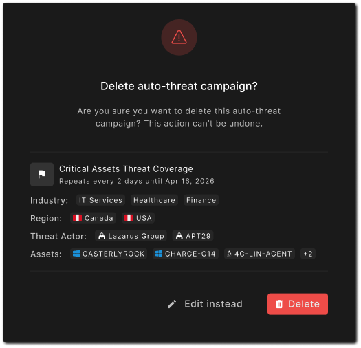
Deleting a one-off campaign
Deleting a recurring automation: “Edit instead”, not just Cancel

Automation runs attacks against production systems on a schedule, so the moments where it is switched on and off get the same care as the feature itself. Every one of these dialogs restates the thing being acted on in full, naming the schedule, the industries, the regions, the actors and the named assets, rather than asking “are you sure?” about an abstraction.

The confirmation screen doubles as a receipt: it is the first time the reader sees their configuration written out as a sentence, and Edit Preferences sits right there in case reading it back changes their mind.

The two delete dialogs differ by one word, and it is the word that matters. Deleting a one-off campaign offers Cancel. Deleting a recurring automation offers “Edit instead”, because someone deleting a schedule usually wants it to stop doing what it currently does, not to stop existing.

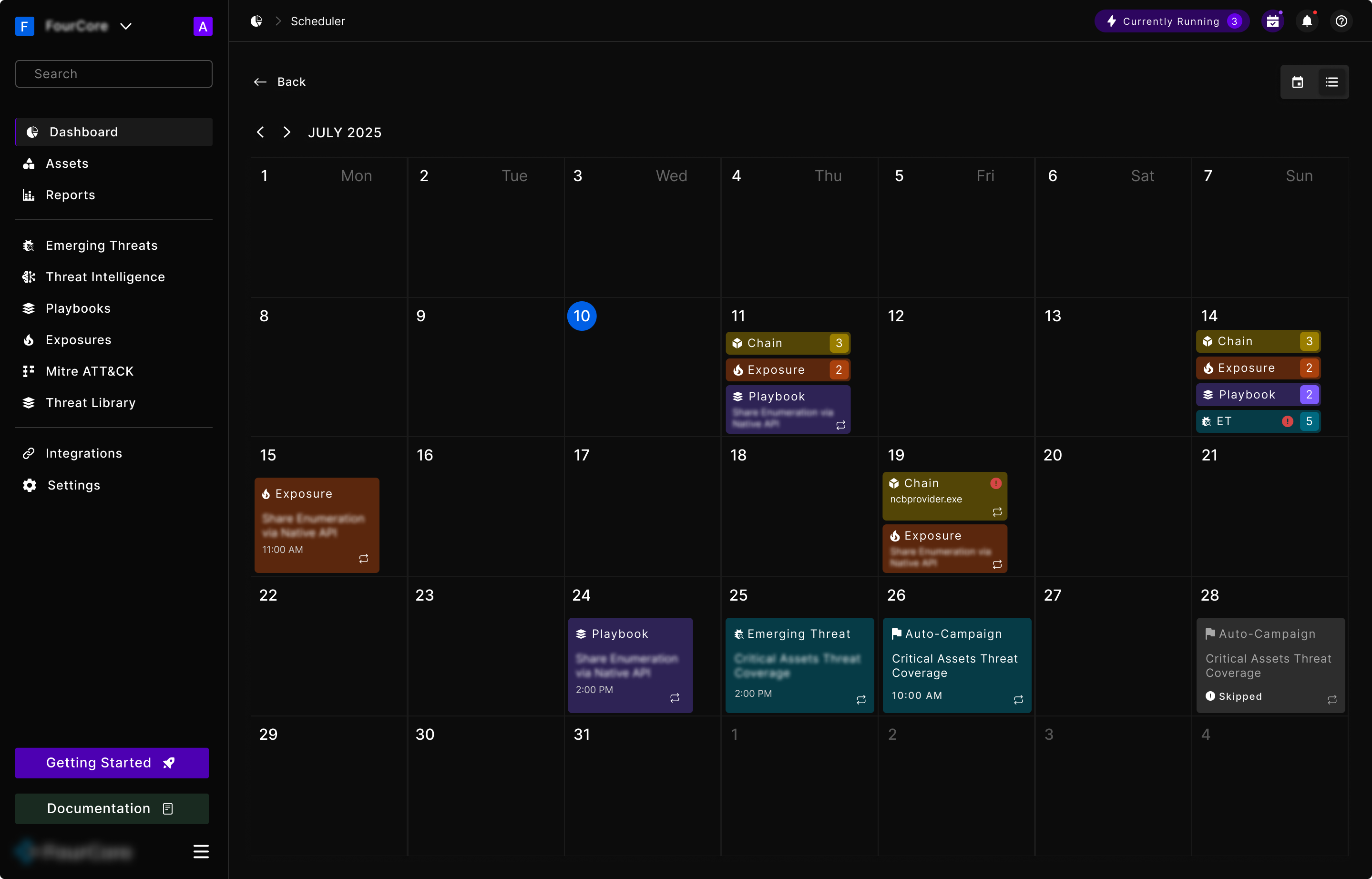
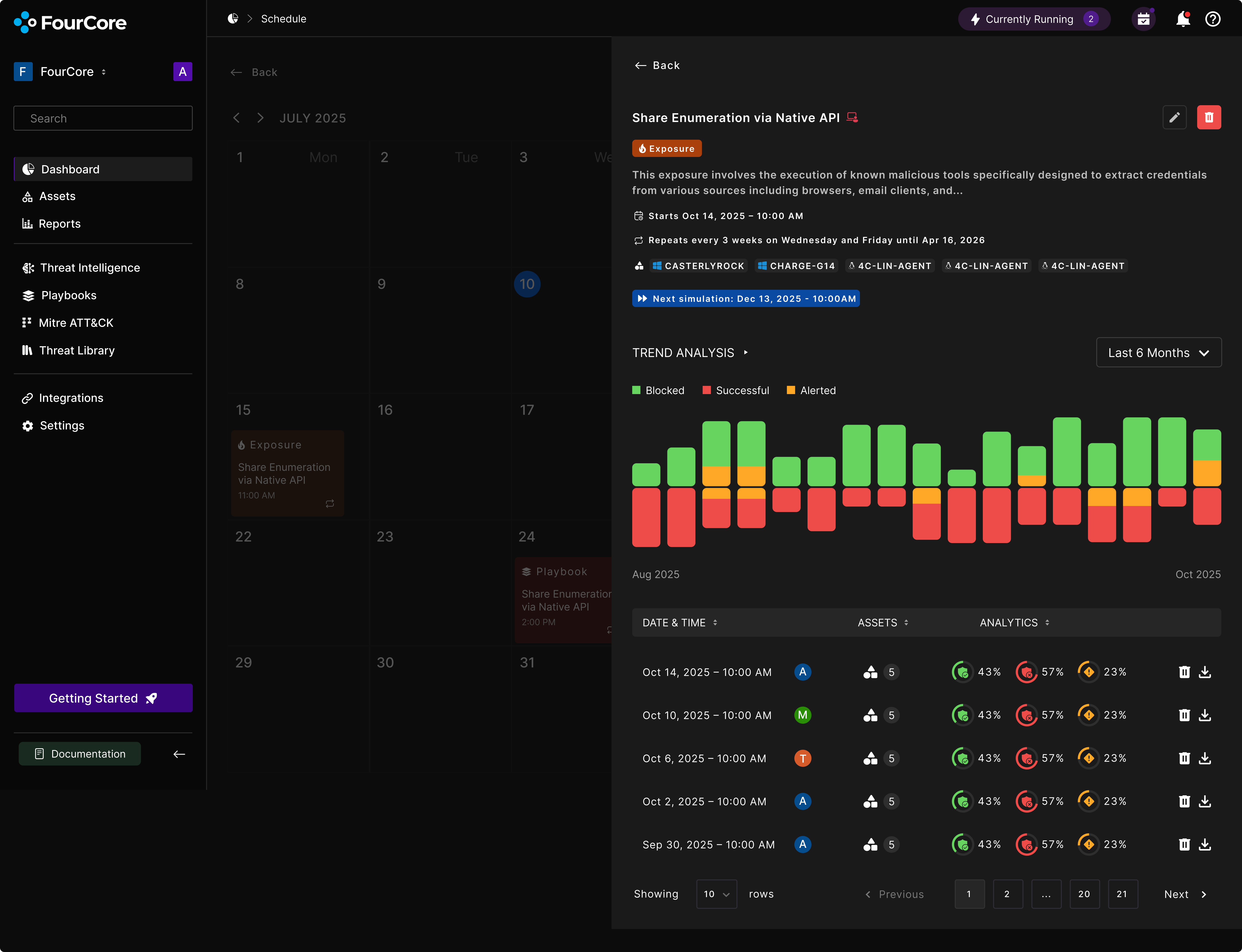
The scheduler, and the calendar that runs it

Everything the platform can run can also be run on a schedule: a chain, an exposure test, a playbook, an emerging threat, an automated campaign. Which means the scheduler quietly became the surface where the whole product shows up in one place, and where the question stops being “what can I run” and becomes “what is already running, and when.”

It ships as two views of the same data. The calendar is for “what is happening this month”. The list is for “tell me the rules”. Neither is a subset of the other, so they get equal billing behind one toggle rather than one being buried.

The calendar view: a month of scheduled simulations, colour-coded by type

In the calendar, every entry is colour-coded by what kind of simulation it is, and carries a count when a day holds several of the same type. A recurrence icon marks anything repeating, so a one-off and the fourth instance of a weekly schedule are never confused. Days that failed carry an error dot; days that did not run say Skipped rather than showing nothing.

That last one matters more than it looks. On a calendar, an empty cell and a cell where something was supposed to happen and did not are visually identical unless you say otherwise.

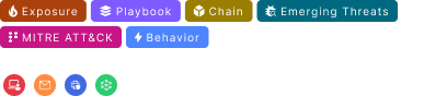
The six simulation categories
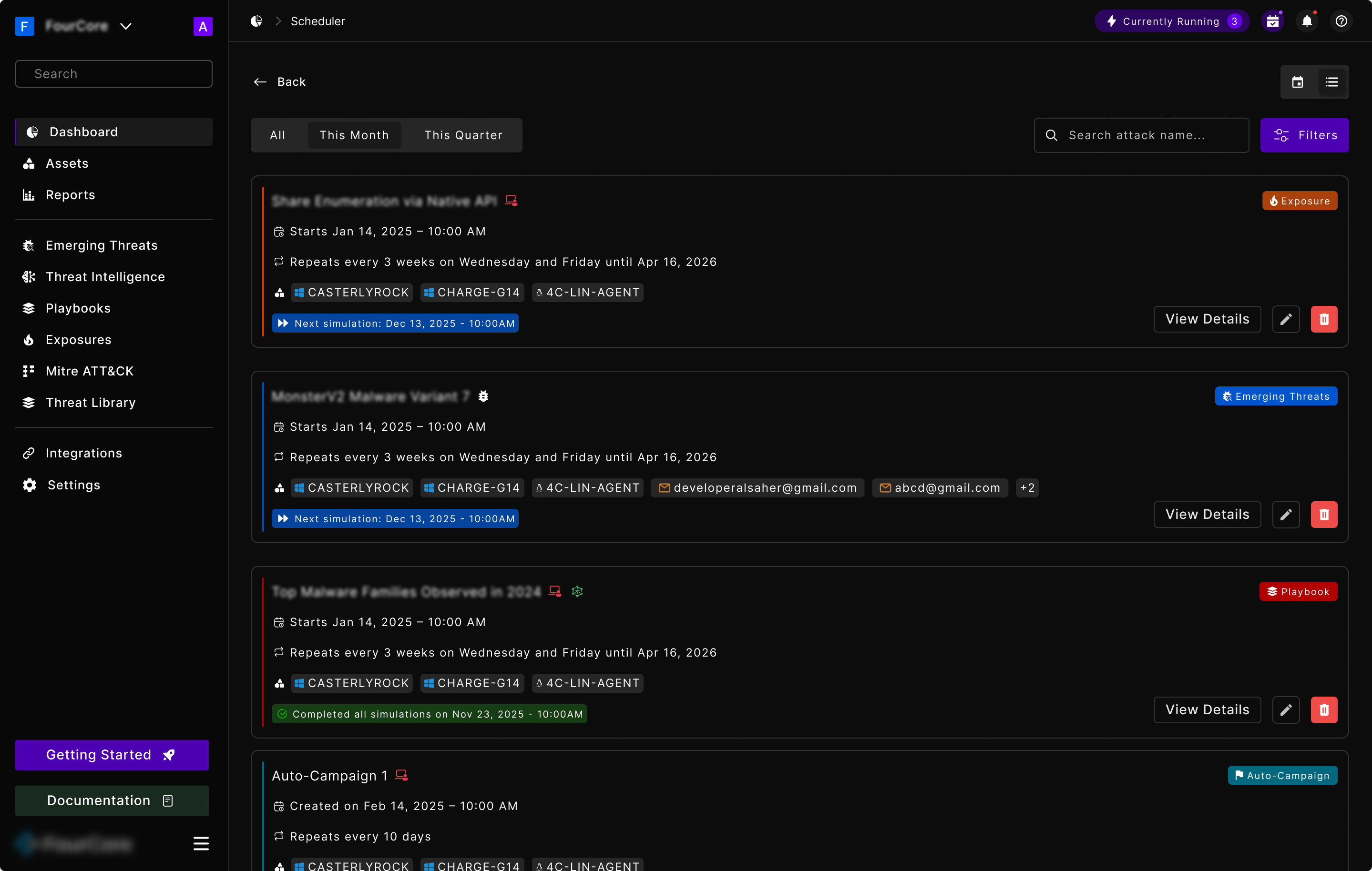
The list view: the same schedules, stated as rules

The list exists because a calendar cannot tell you a rule. “Repeats every 3 weeks on Wednesday and Friday until Apr 16, 2026” is a sentence, and no arrangement of coloured blocks on a grid says it. So each row states the rule in plain English, names the assets it targets, and ends with the single most useful piece of status: when the next run is, or that every run has already completed.

The type badge sits top-right and the coloured rail runs down the left edge of each card, which is the same colour language as the calendar, again.

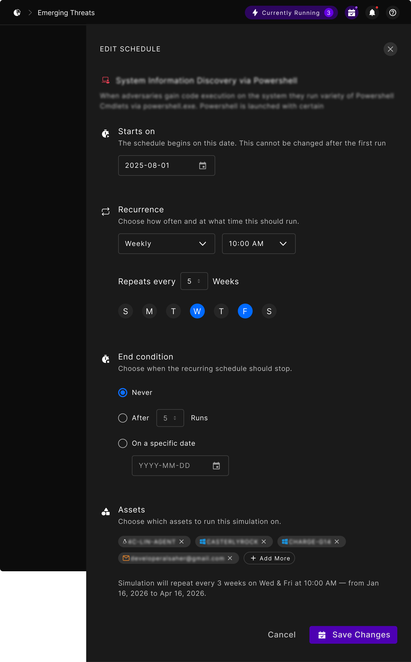
Editing a schedule: recurrence, end condition, targets, and the sentence that checks your work

The edit drawer is the hardest screen in the feature, because recurrence rules are famously easy to build and famously hard to verify. Someone sets a start date, a frequency, an interval, two weekdays and an end condition, and then has no way of knowing whether the thing they just described is the thing they meant.

So the drawer ends by reading the whole configuration back as one sentence: repeat every three weeks on Wednesday and Friday at 10:00 AM, from this date to that one. Every control above it is an input to that sentence, and the sentence is the answer to “did I get this right”.

The rest is guardrails. The start date says up front that it cannot be changed after the first run, rather than failing later. End condition is three explicit choices: never, after a number of runs, or on a date. That beats an optional field that silently means “never” when left blank.

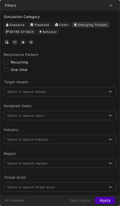
The filter panel, untouched
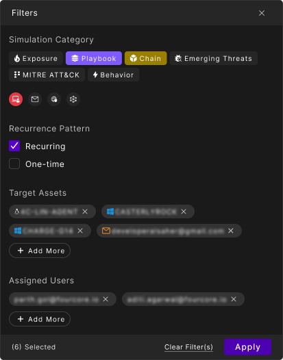
The same panel, six filters deep

The filter panel was drawn in both of its states, because the interesting one is not the empty version. As selections accumulate, the long select fields collapse into removable chips with an Add More button, so the panel shows you what you have chosen instead of making you reopen each dropdown to find out.

The count in the footer is doing quiet work too: once you are six filters deep and looking at three results, “(6) Selected” next to Clear Filter(s) is the fastest explanation of why the screen behind looks so empty.

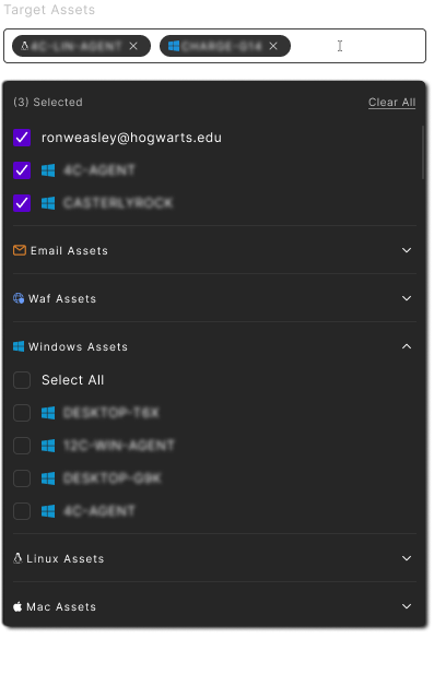
Picking targets has the same problem the filter has, one level down. A mature account has endpoints, mailboxes, web apps and firewalls, in numbers that make a flat alphabetical list useless.

So the picker groups by asset type, collapses each group, gives every group its own Select All, and pins what you have already chosen to the top with a Clear All. You can take every Windows machine in two clicks without scrolling past the Linux ones.

The target picker, grouped by asset type
A schedule, opened over the calendar: the rule, the trend, and every run it has produced

Opening an entry slides its detail in beside the calendar rather than navigating away, so the month stays visible behind it. The drawer restates the rule, then gives the two things you came for: how results have trended over the schedule’s life, and the individual runs, each downloadable.

Playbooks

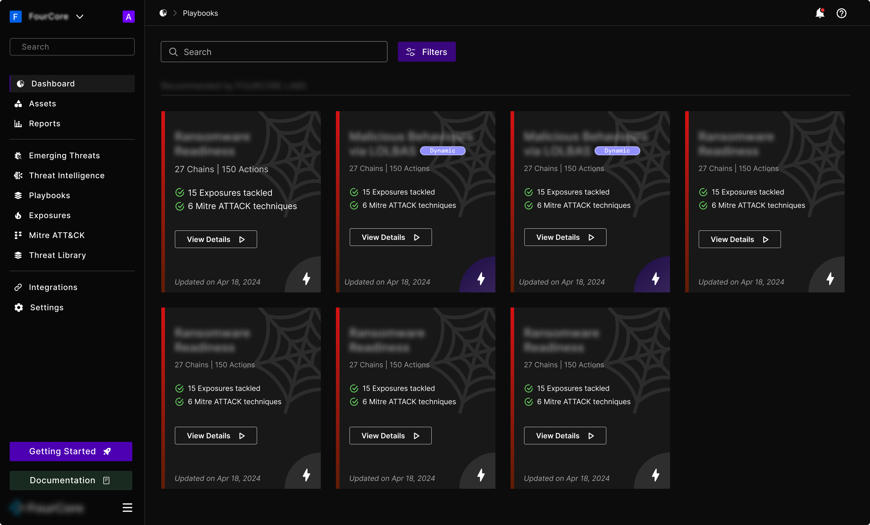
A single attack technique tells you very little. Real adversaries run sequences, and the interesting question is not “can this one command get through” but “how far down the chain do they get before something stops them”. A playbook is that sequence, packaged: a curated set of attack chains, grouped into stages, aimed at a scenario a security team actually worries about.

The playbook library: each card sized by what it covers

Every card answers the same three questions in the same order: how big is this (chains and actions), what does it get me (exposures tackled, MITRE techniques covered), and is it current (last updated). Those are the terms a security lead compares options in, so they are the terms the card is built from rather than a description they would have to read four times.

Some playbooks carry a Dynamic marker, which sets them apart from the fixed ones, a distinction the card makes with a single pill instead of a separate section of the library.

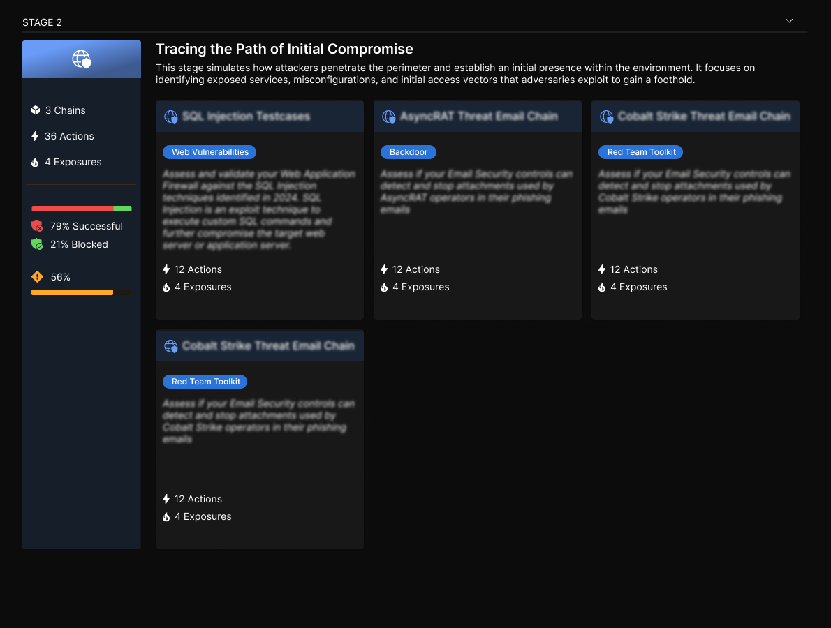
One stage of a playbook, with its chains and its own scoreboard

Inside, a playbook is broken into named stages that follow the shape of a real intrusion, this one covering initial compromise, and each stage gets a plain-language explanation of what it is simulating before any chain appears. That sentence is the difference between a tool a security engineer can use and a tool only its authors understand.

Each stage also carries its own scoreboard: chains, actions and exposures on the left, with the successful and blocked split right underneath. So you can see which stage of the attack your defenses actually broke at, rather than getting one number for the whole playbook. Stages collapse, because a long playbook read end to end is a wall.

Exposures

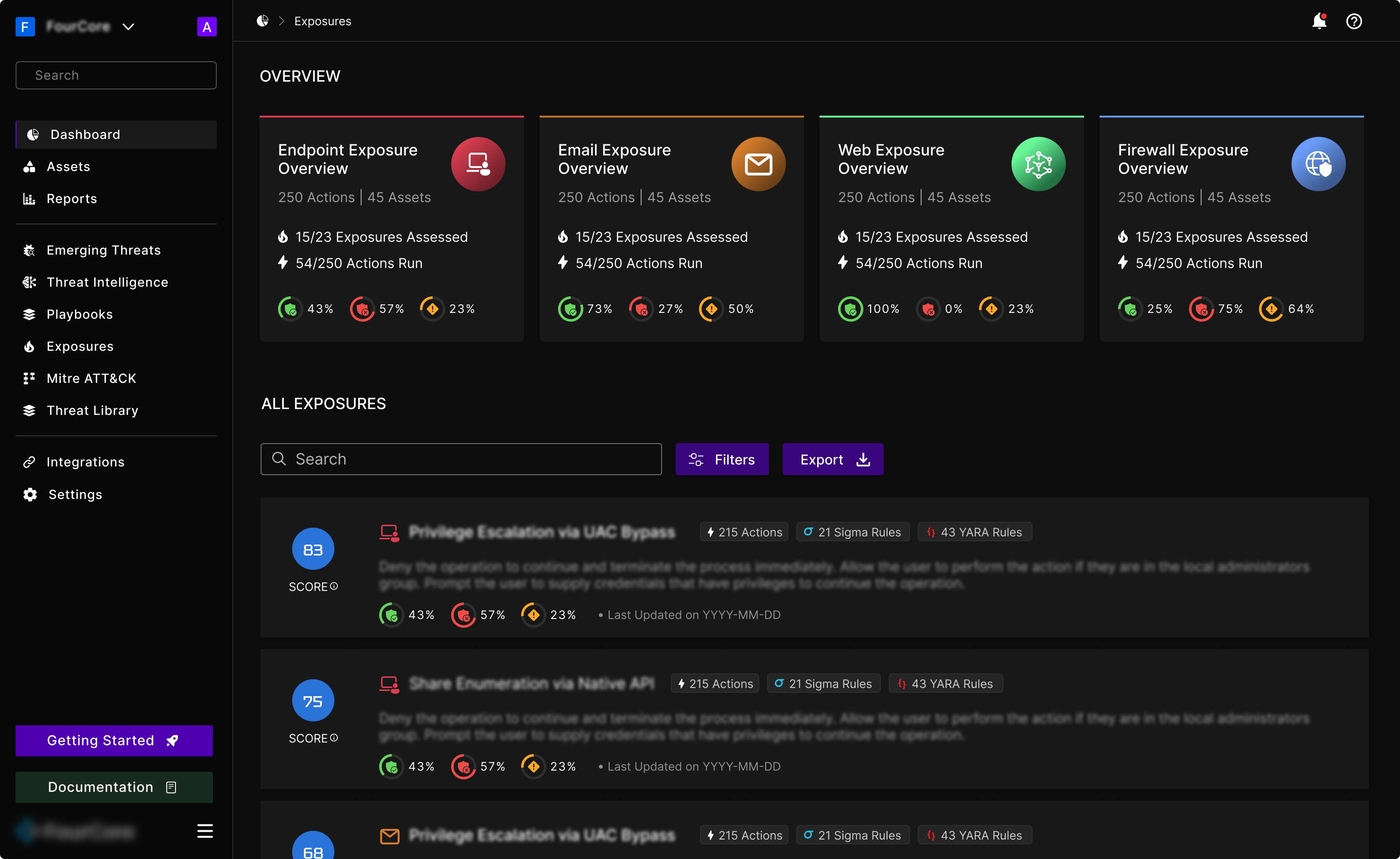
Everything else in the platform produces evidence. Exposures is where that evidence turns into a list of things to fix, in order, which is the output the whole product exists to produce.

Exposures: coverage by control class, then the ranked list of what to fix

The top of the screen is scoped by control class: endpoint, email, web, firewall. That is how remediation work gets assigned. The team that fixes an email gateway is rarely the team that fixes endpoint policy, and each card carries both progress fractions a lead needs: how many exposures have been assessed at all, and how many actions have actually run.

Below it, every exposure leads with a score. That score is the reason the page works: it turns a list into a ranking, and a ranking is the only form of this information anyone can act on before lunch.

Each row then carries what you need to decide and what you need to act. The chips count the actions behind the finding and the detection rules that exist for it, in Sigma and YARA, the formats a detection engineer already writes in. The body text is remediation guidance, not a restatement of the problem. A finding that tells you what is wrong without telling you what to do is a ticket someone else has to write.

How the work actually happens

The title changed, but so did the shape of the work. Design at FourCore is not a request queue at the end of a product process, and most of what I do now sits earlier than the file.

  • Applied AI-assisted prompt engineering to speed up rapid prototyping and day-to-day product design work, getting to something testable in hours rather than days.
  • Took part directly in user research, and turned what clients and users said into features that shipped.
  • Worked directly with engineers, the CTO and the founders, rather than handing designs over a wall.
  • Led the design function, and mentored a junior designer joining the team.

What it added up to

Over the year that followed the redesign, the design system, and the new features, FourCore’s revenue doubled. That is a company result, not a design one: it belongs to the product, engineering and go-to-market work as much as anything I drew.

What design can fairly claim is the part it made possible. A product that looks and behaves like enterprise software is one that enterprise buyers will take seriously in a demo. A design system meant features stopped taking as long to build. And restructuring how simulation results are presented turned dense security output into something a customer could act on in the room, which is usually where the buying decision actually gets made.

Company revenue growth over a year
Company-wide outcome across product, engineering and go-to-market
40+
New screens shipped
5+
Major features, concept to production

Two years from amateur to professional

I joined FourCore as an intern who could make things look good and left that version of myself behind fairly quickly. For most of that time I was the only designer in the company, which means there is nobody to check your work and no house style to inherit. Every convention in the product is one you either set deliberately or set by accident.

The biggest shift was learning to design for a domain I did not start out understanding. I could not have told you what lateral movement was on day one. Designing a security product means the interface is only as good as your grasp of what the user is actually looking at, and a lot of the past two years has been spent closing that gap by sitting with engineers, with the CTO, and with the people who use it.

The rest of it was learning that the job is not the file. It is arguing for a direction, cutting scope when the deadline is real, keeping a system coherent while the product changes underneath it, and now helping someone else find their footing as a designer. That is the part that turned this from an internship into a career.

Every screen

31 frames
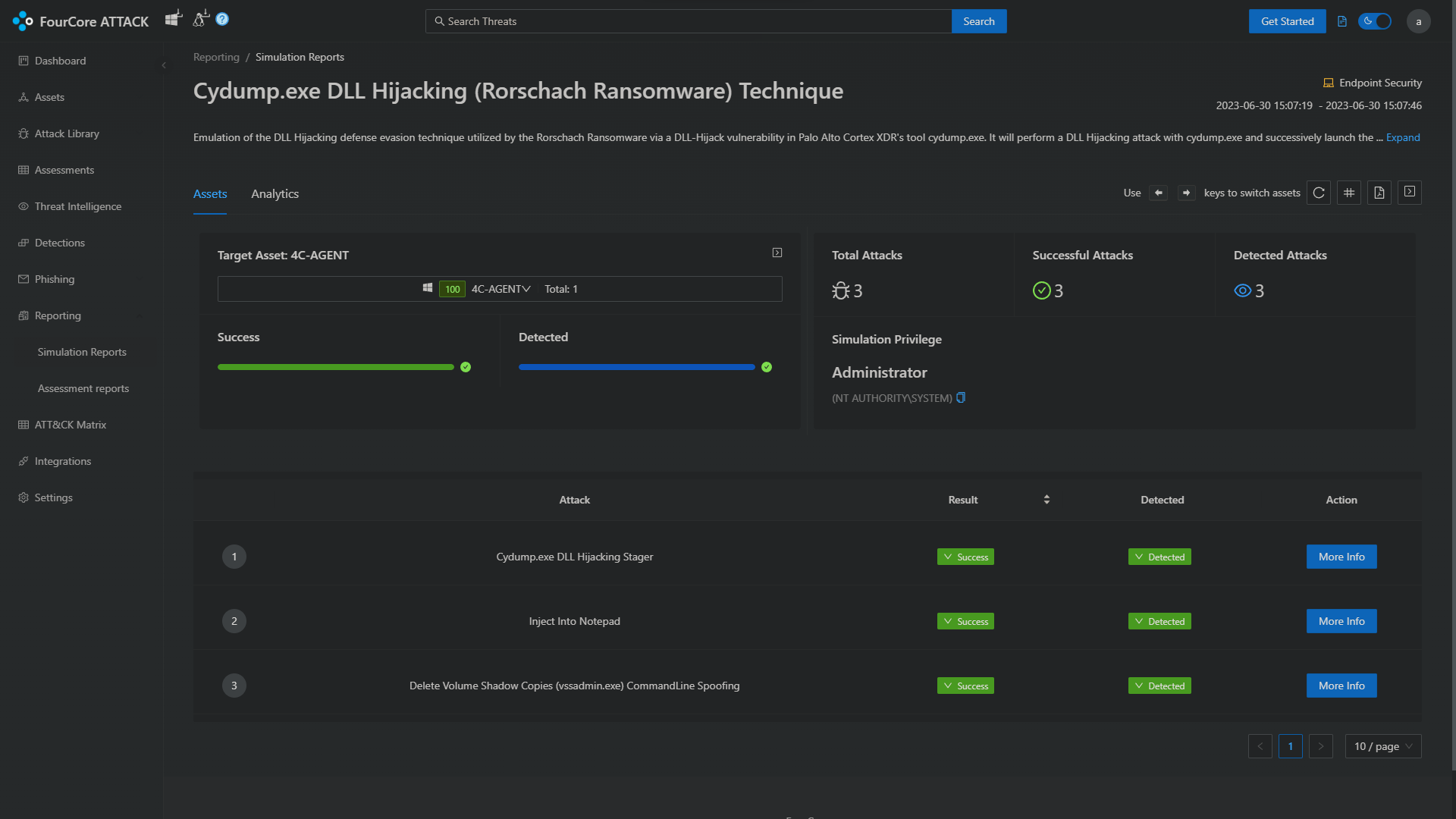
Next projectFourCore: Landing Like what you see? Let’s talk