Make it look established, not launched
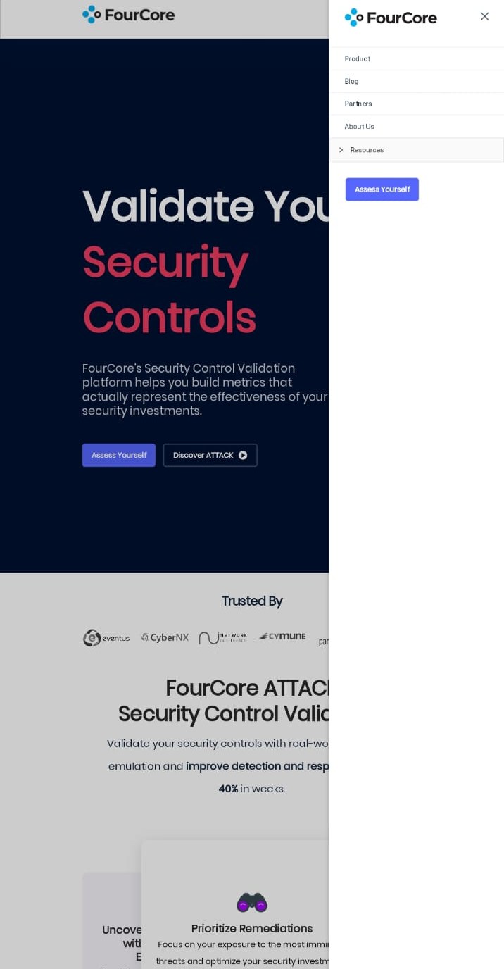
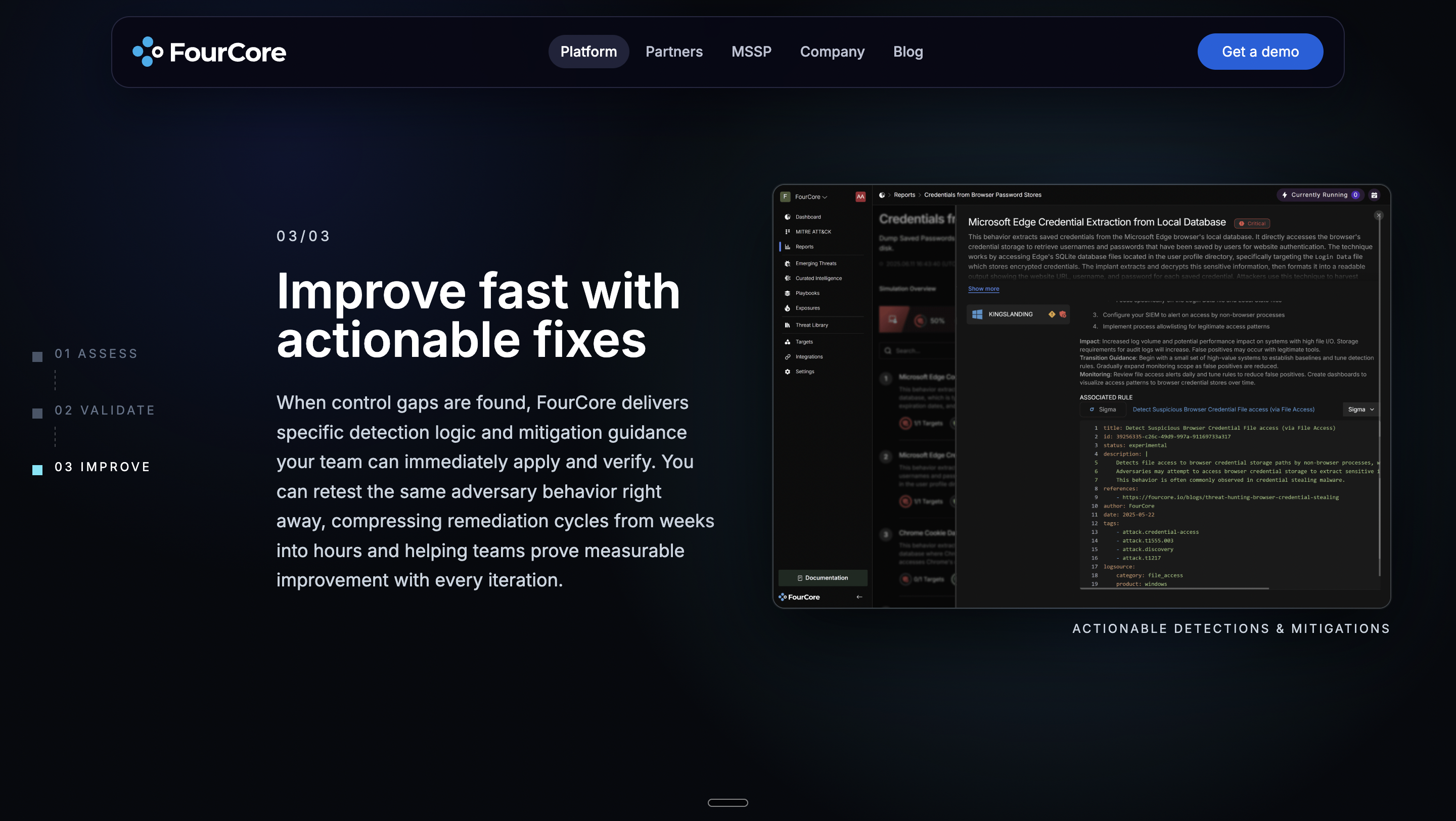
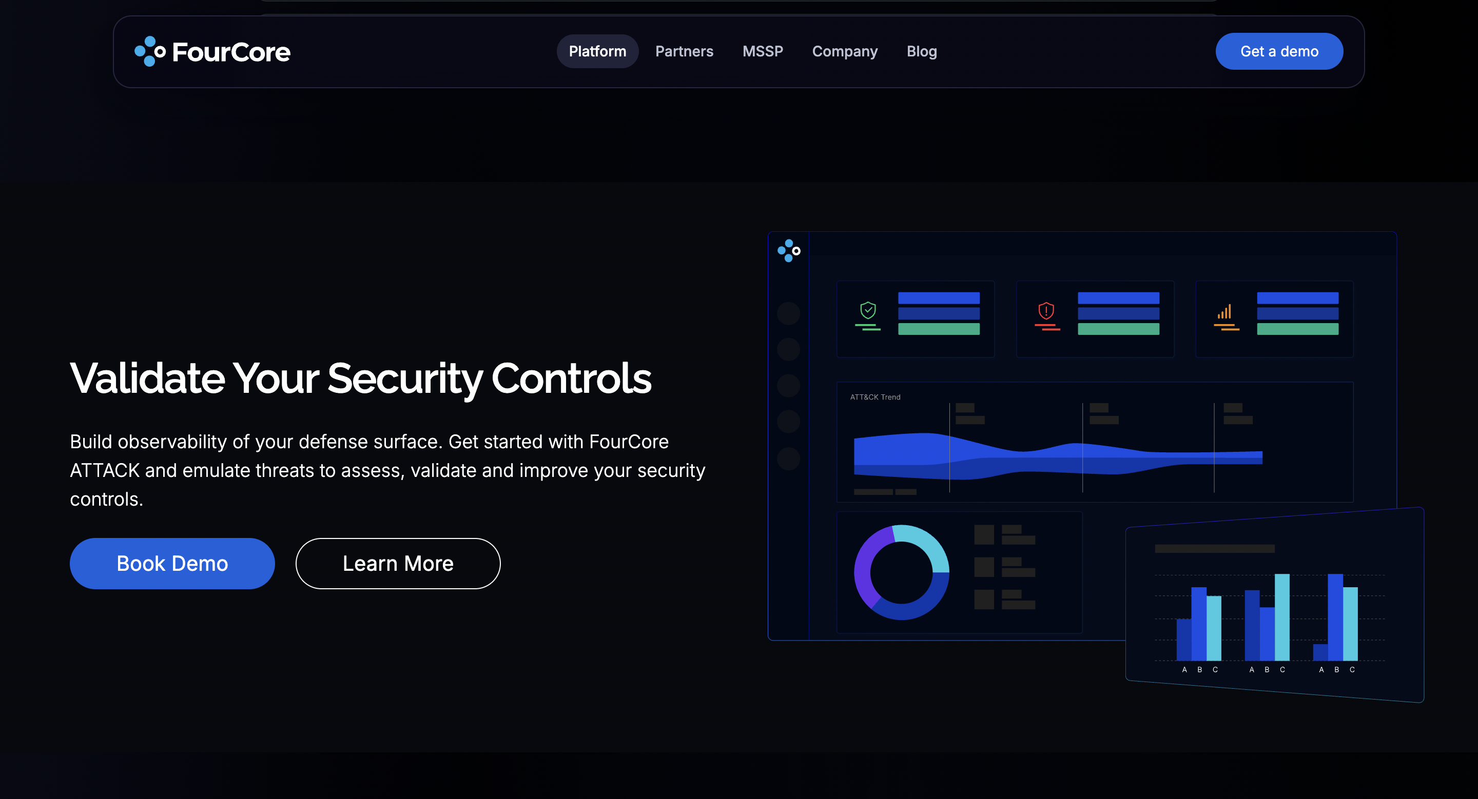
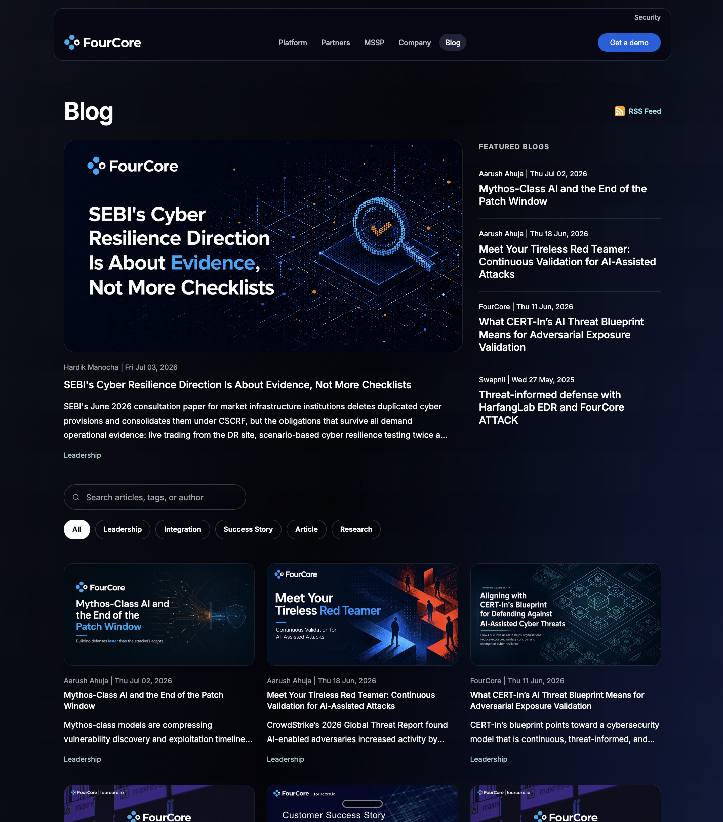
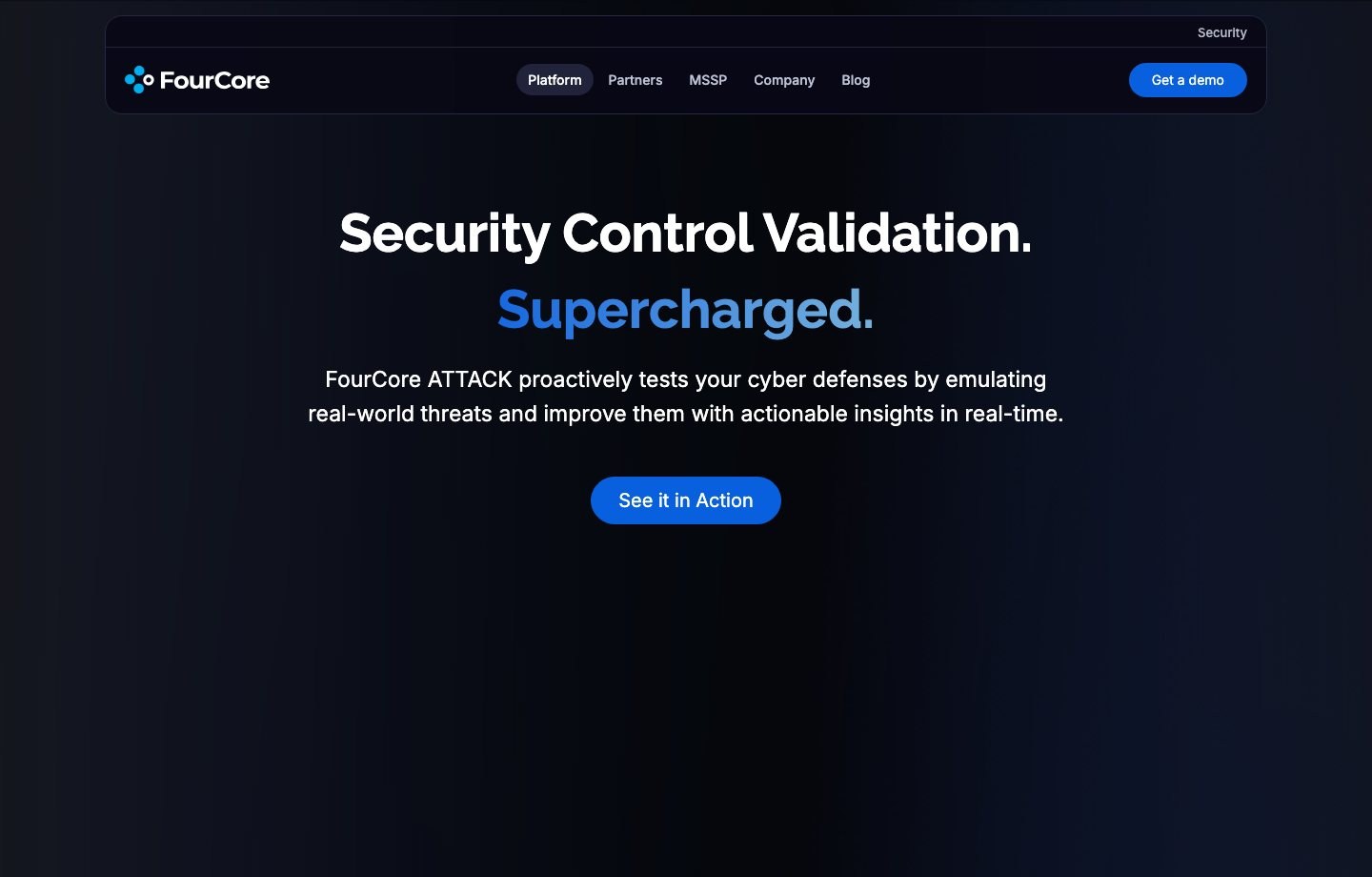
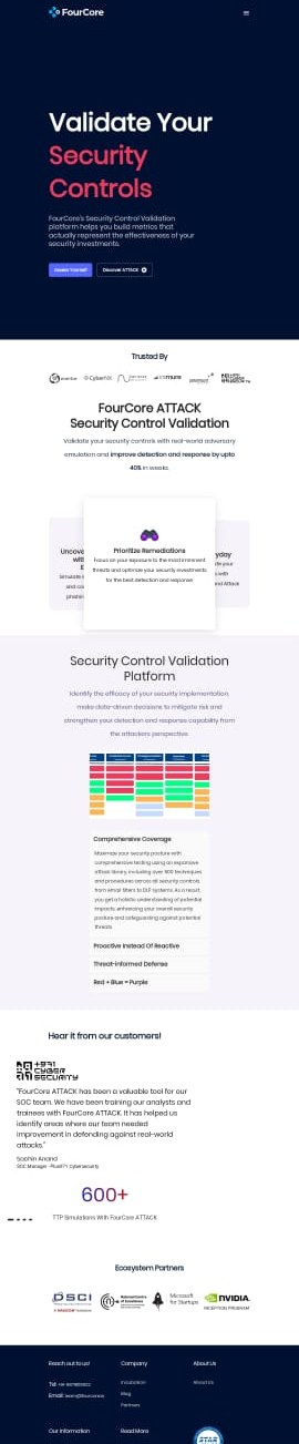
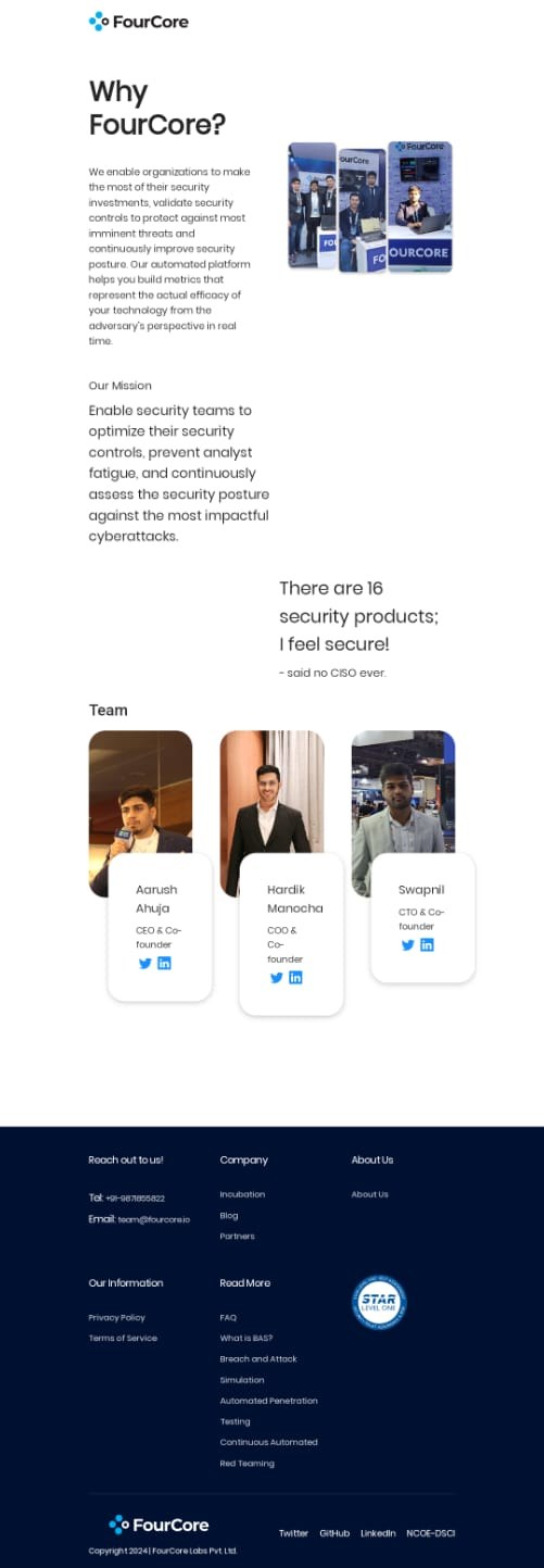
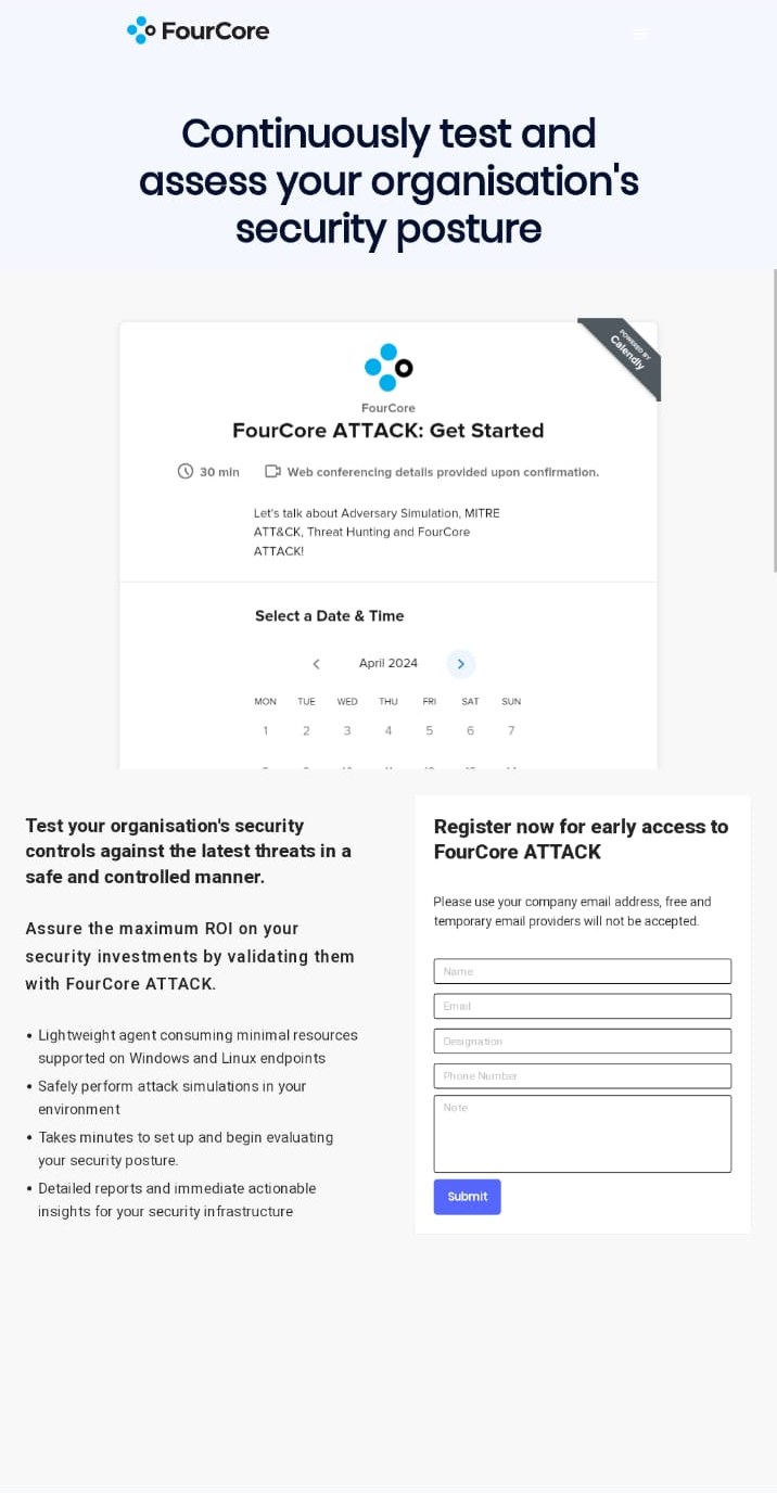
The old site read as pre-launch. Not broken, just new. It carried the visual signals of a product still finding its footing, at a point where the product itself had long since moved past that.
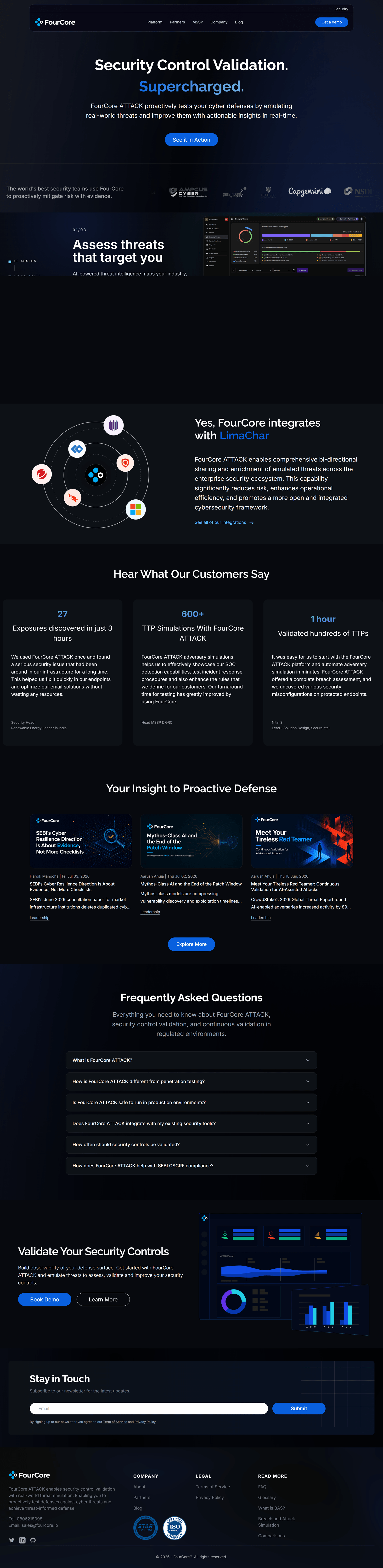
In security that’s a commercial problem, not a cosmetic one. FourCore sells to teams whose job is to be suspicious, and who are being asked to point the thing at their live environment. A site that looks provisional makes the product look provisional.
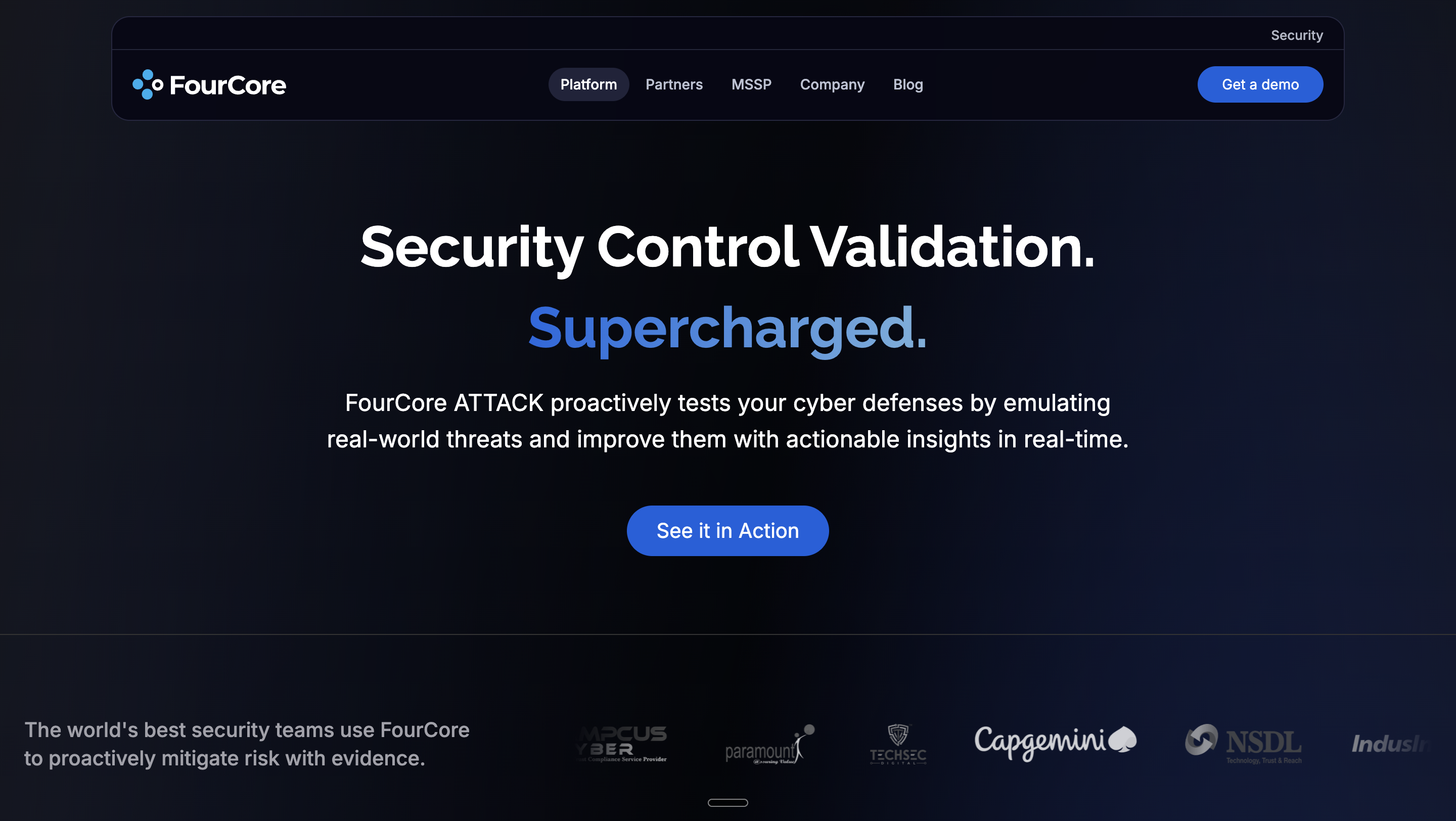
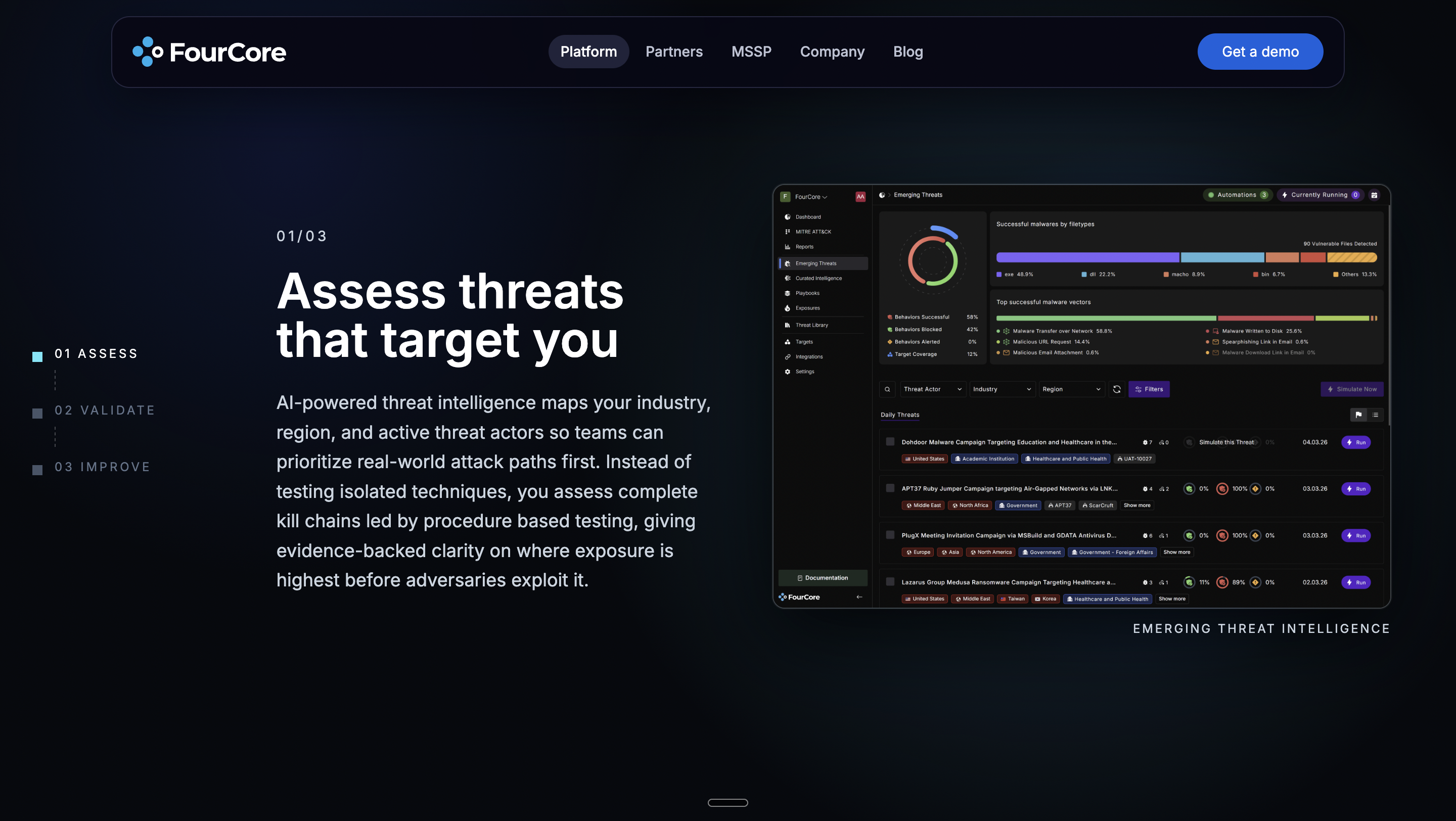
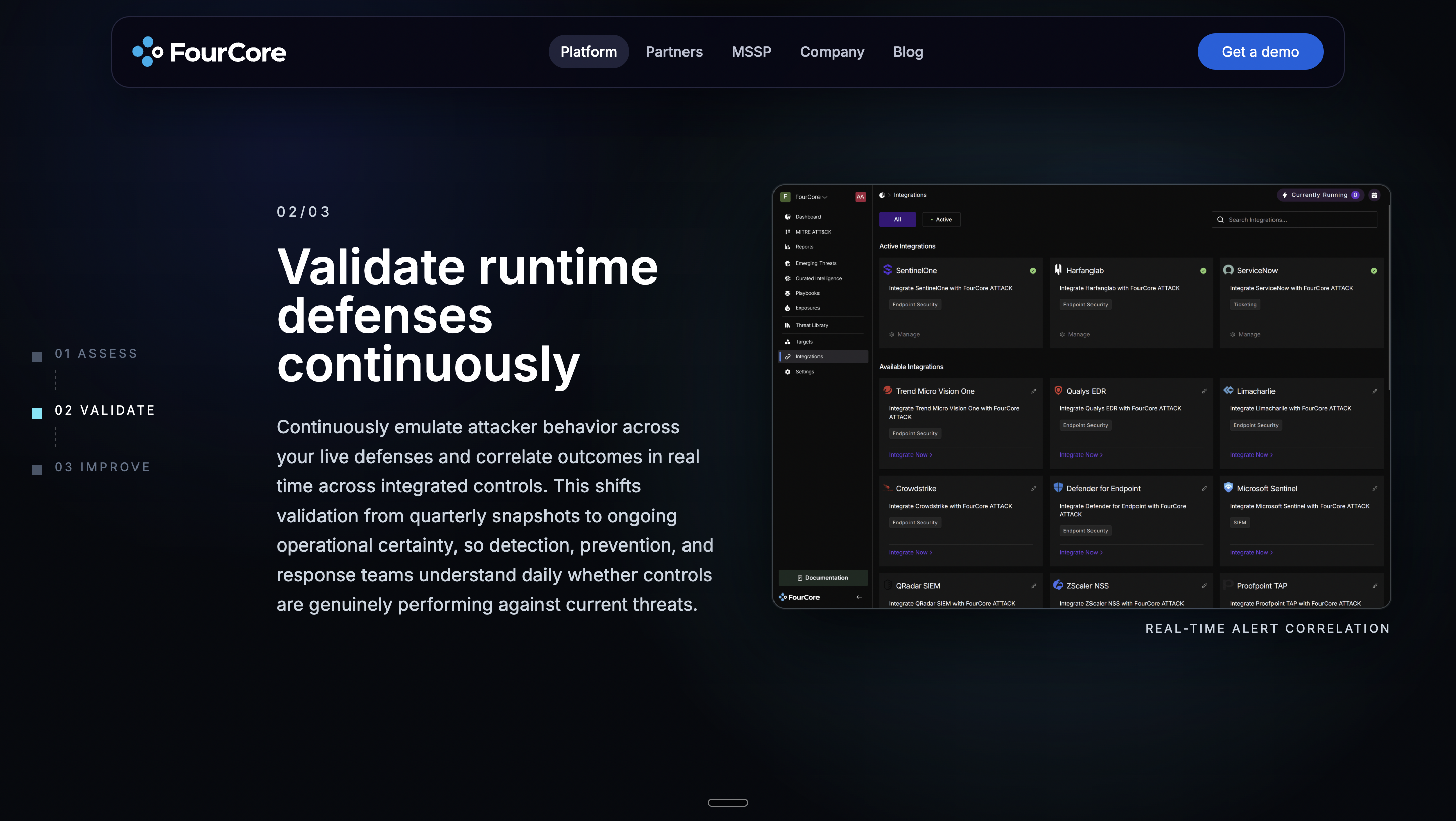
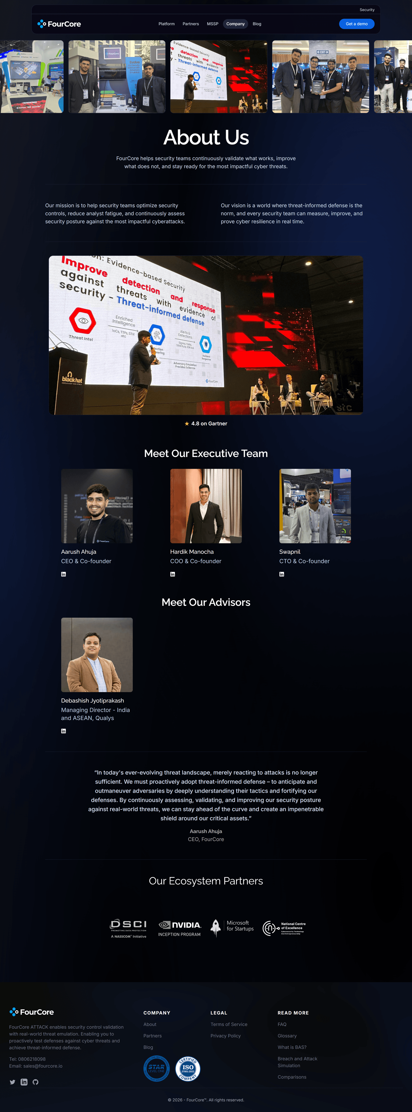
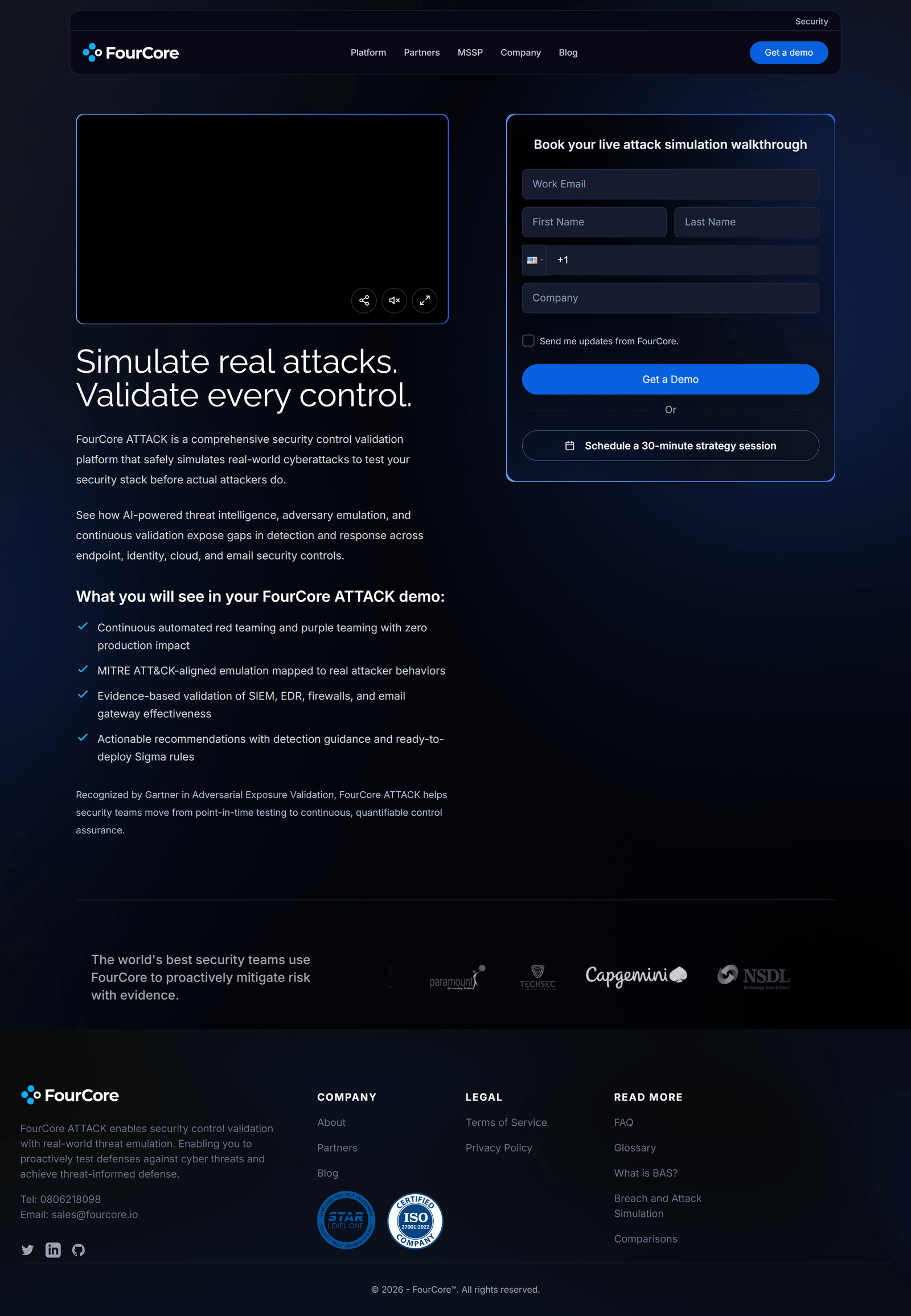
So the brief wasn’t “modernise” in the abstract. It was to make the platform feel well-placed, premium and trustworthy: and every choice underneath, typography included, was made against that one test: does this read as a company that has arrived, or one that just showed up?