All work
Independent Project Concept · 2–3 months 2024

Autumn

Immersive e-book reader, mobile app

MobileInteraction DesignReadingConcept
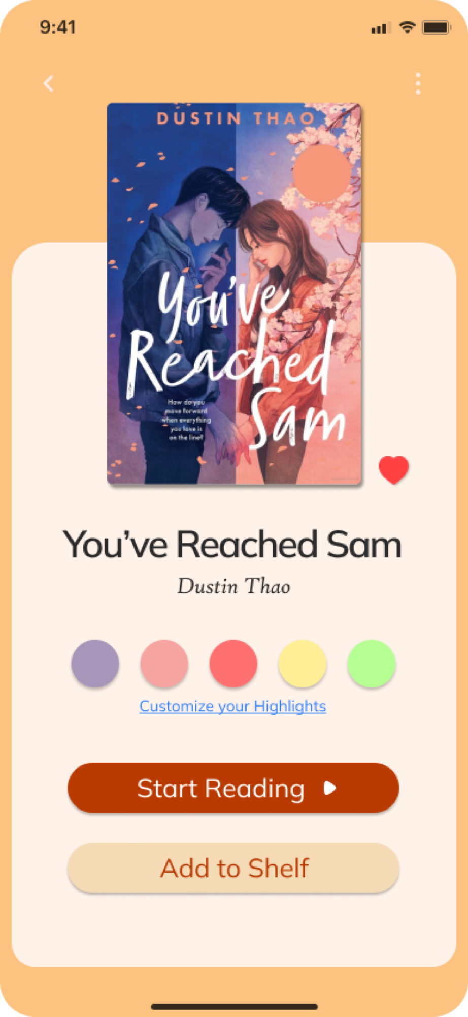
Autumn — patient mobile app
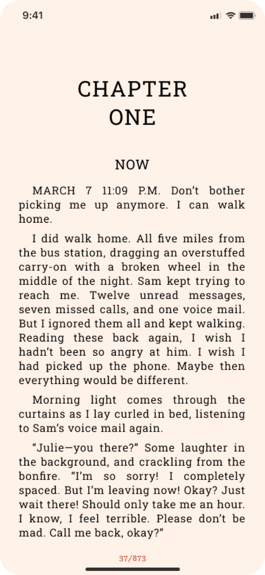
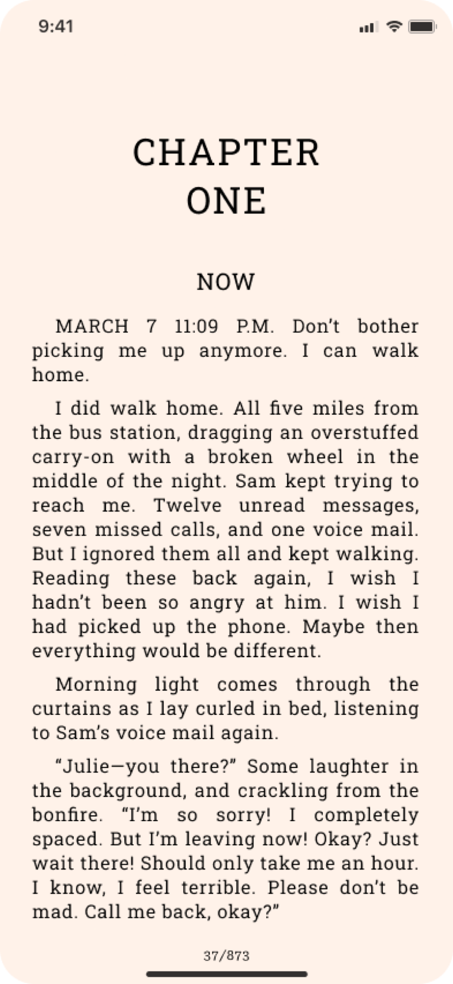
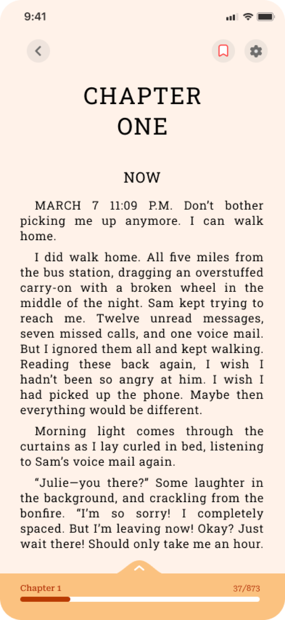
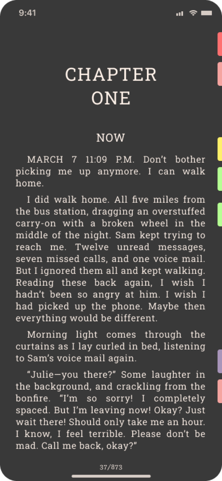
Reading view
Project type
Independent Product Design, personal project
Role
Solo: first UI/UX project, designed entirely from scratch
Platform
Mobile app
Status
Concept: designed, never built or shipped
Timeline
2–3 months

An e-book reader that starts from the physical reading experience instead of from a feature list, built to ask one narrow question rather than to compete with a Kindle.

At a glance

12–15
Screens designed
2–3 mo
Solo, start to finish
Concept
Never built
View Behance
ContentsOverview
  1. 01Overview
  2. 02UI Design
  3. 03Key Decision
  4. 04Where it’s headed
  5. 05Reflection

Reading lost its rituals when it went digital

Physical books carry small rituals that most e-readers strip away without noticing: dog-earing a page, lending a book to a friend with a note in the margin, someone recommending exactly the right book at exactly the right time. Digital reading solved portability and lost the parts that made a book feel personal.

What does an e-reader look like if it starts from the physical reading experience instead of the feature list of a Kindle?

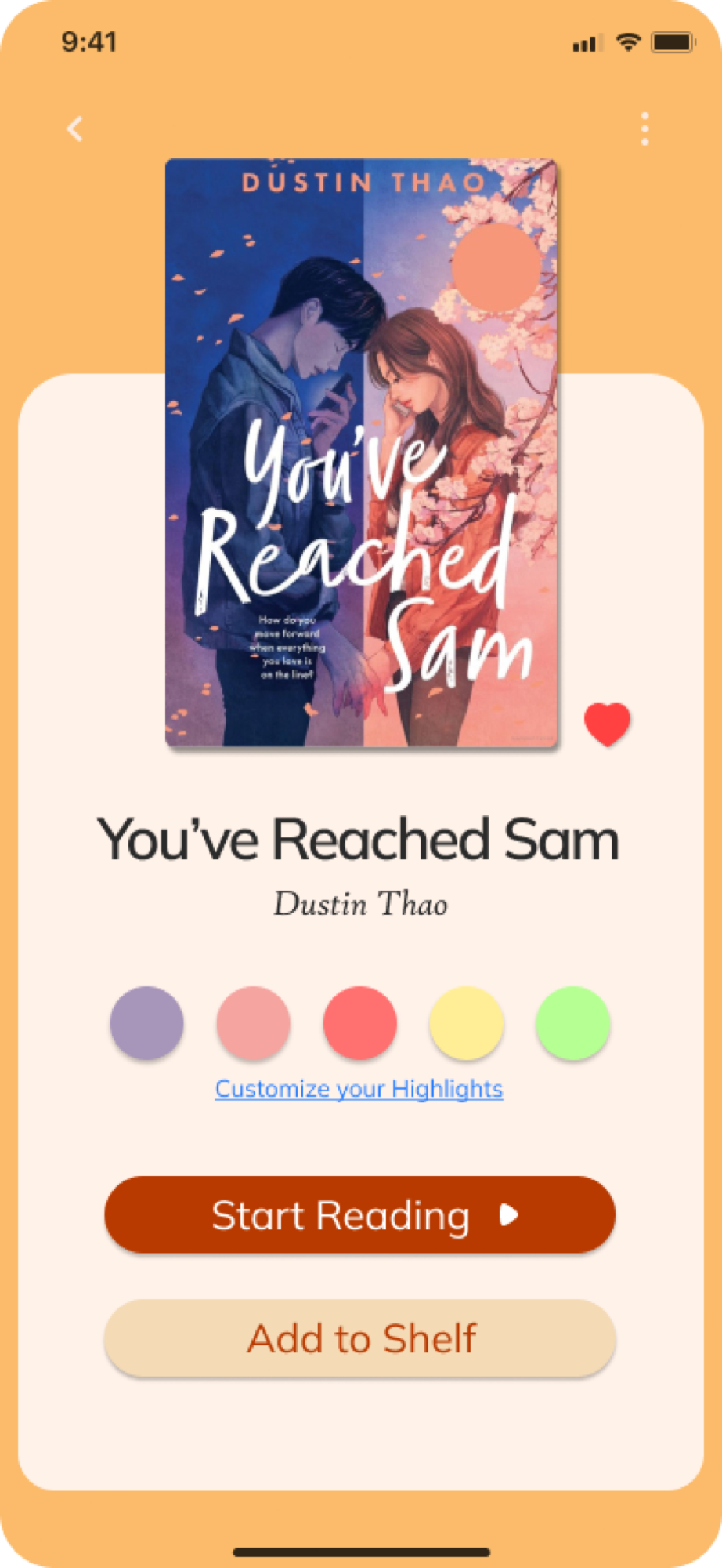
What shipped

The first independent project: built solo, end to end, with no client or team to answer to. Scope was deliberately core-first.

01 / 04

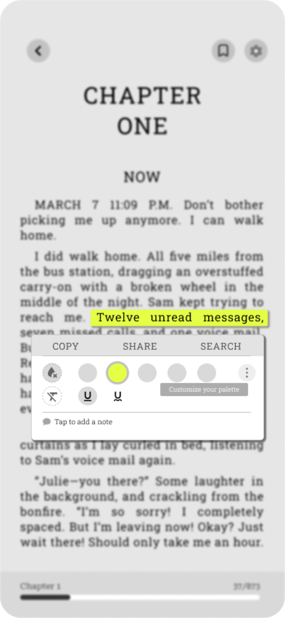
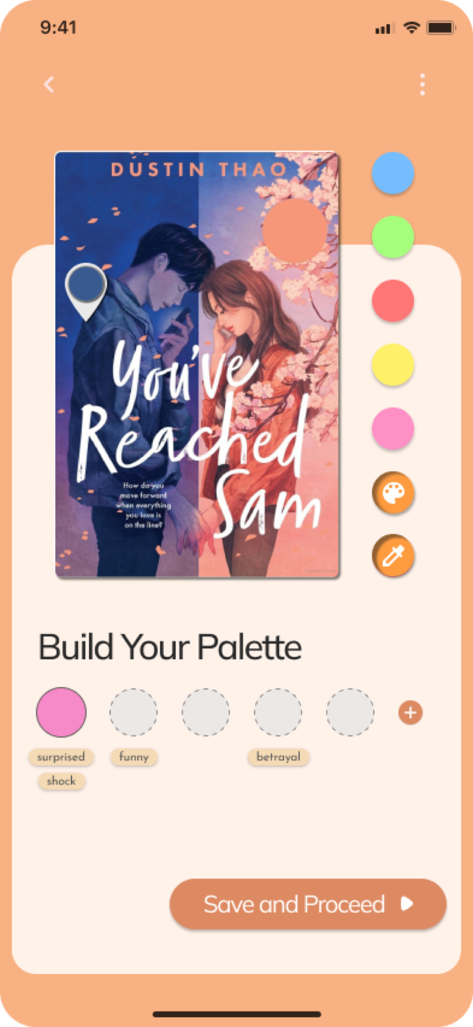
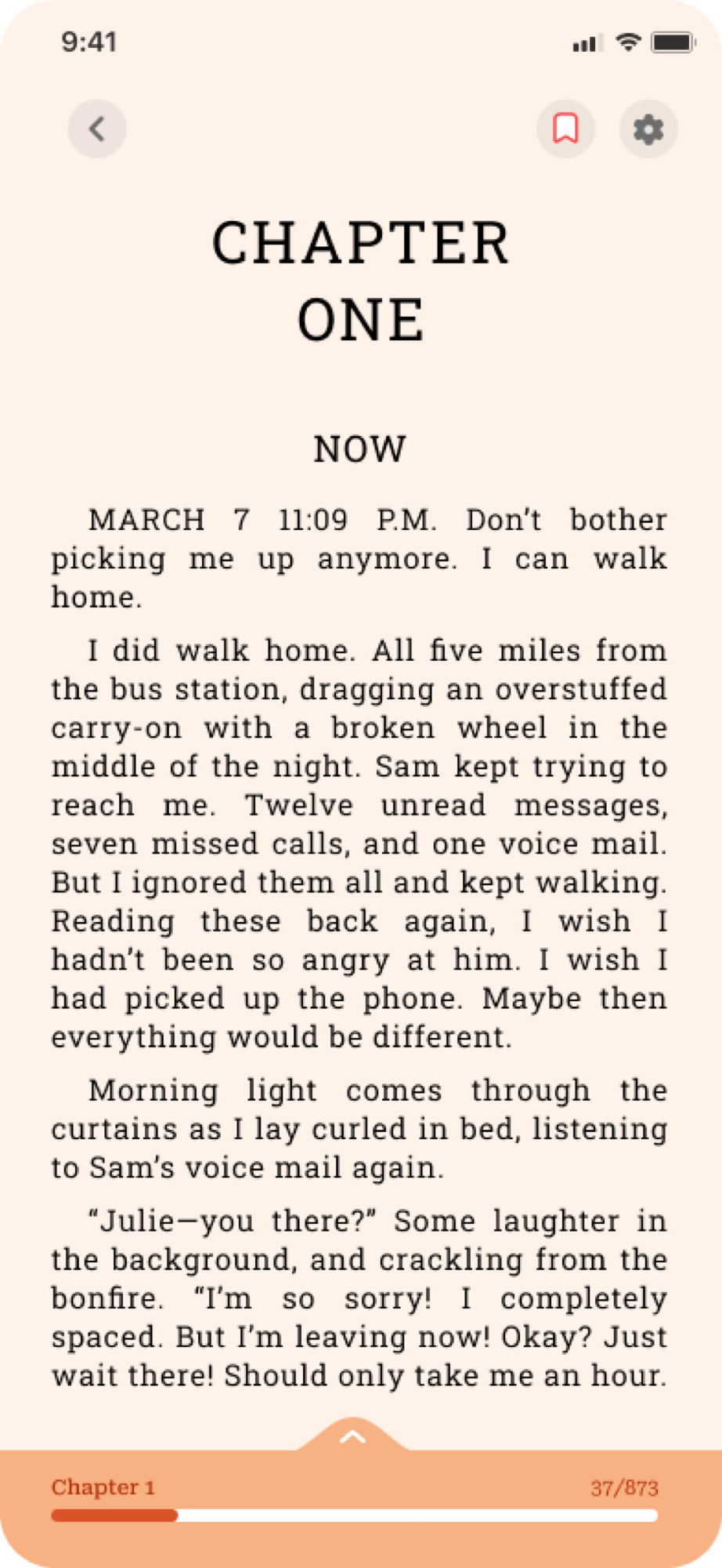
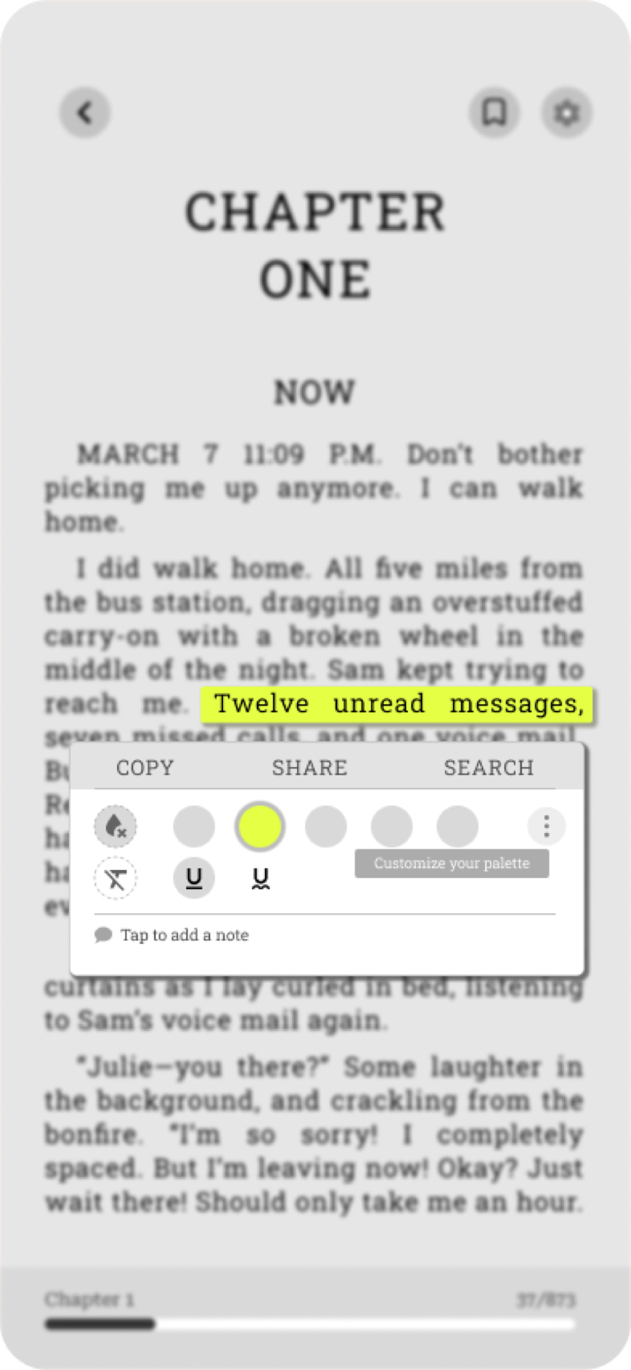
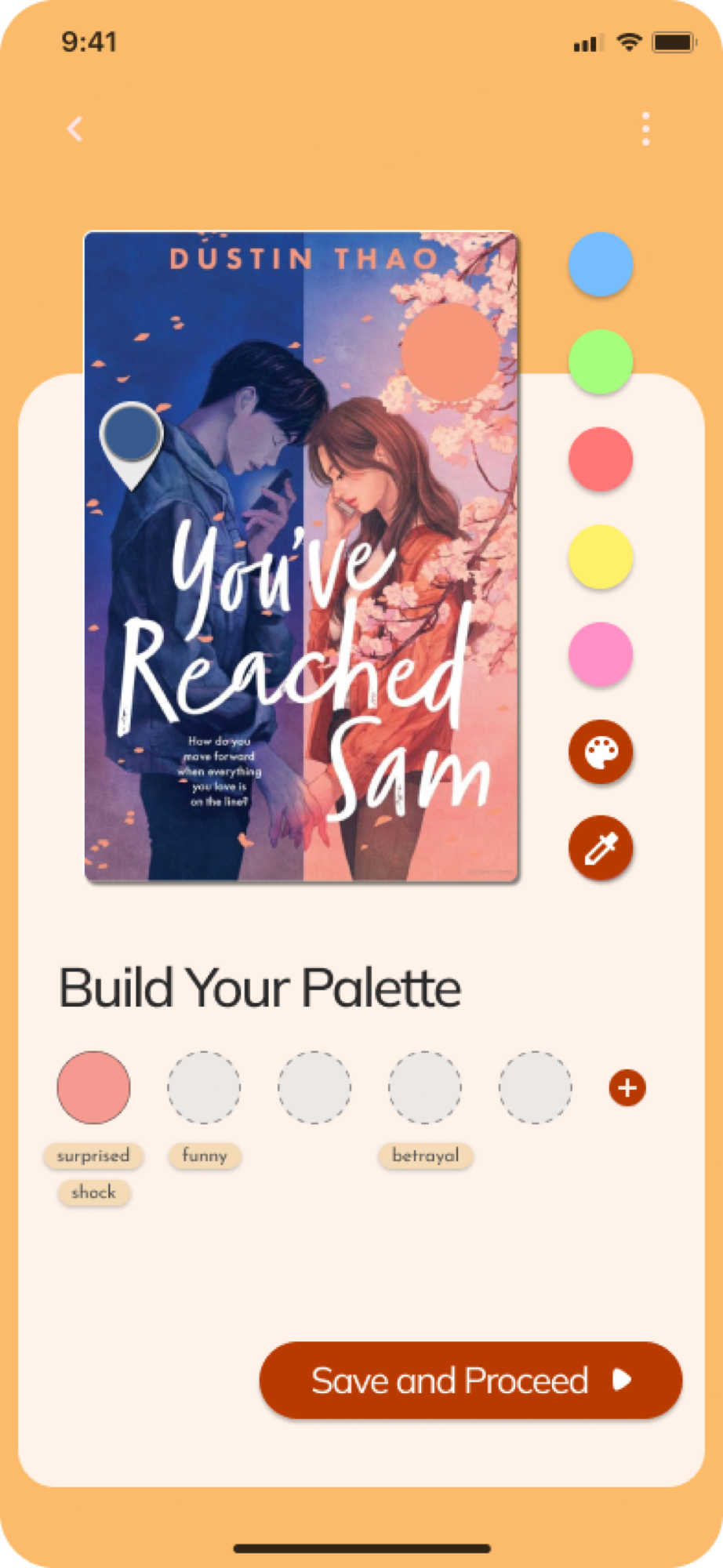
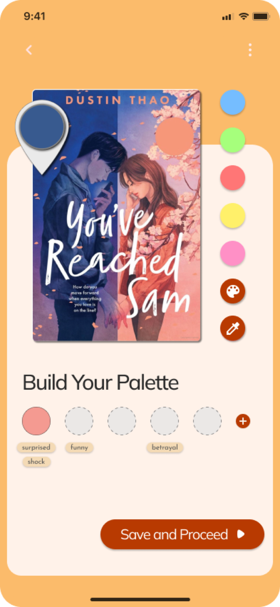
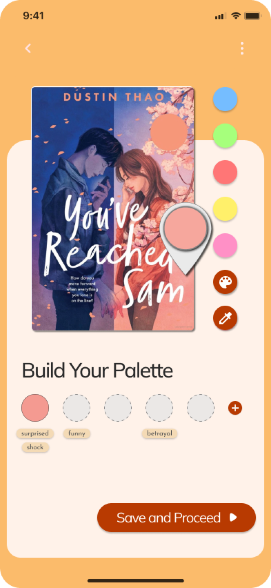
Layout customisation

Text, spacing and background tuned to how someone actually likes to read, rather than to a default someone else picked.

Layout customisation

Layout customisation

Text, spacing and background tuned to how someone actually likes to read, rather than to a default someone else picked.

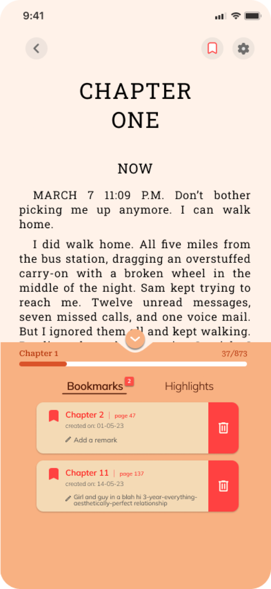
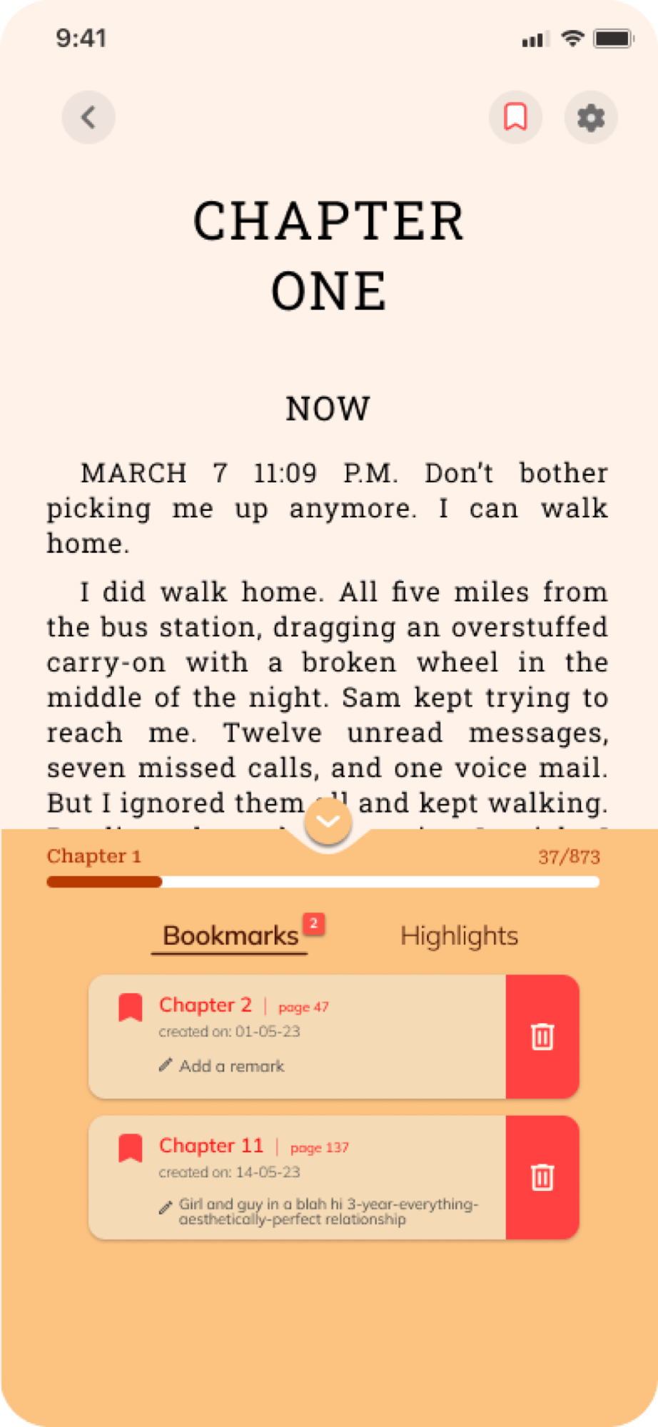
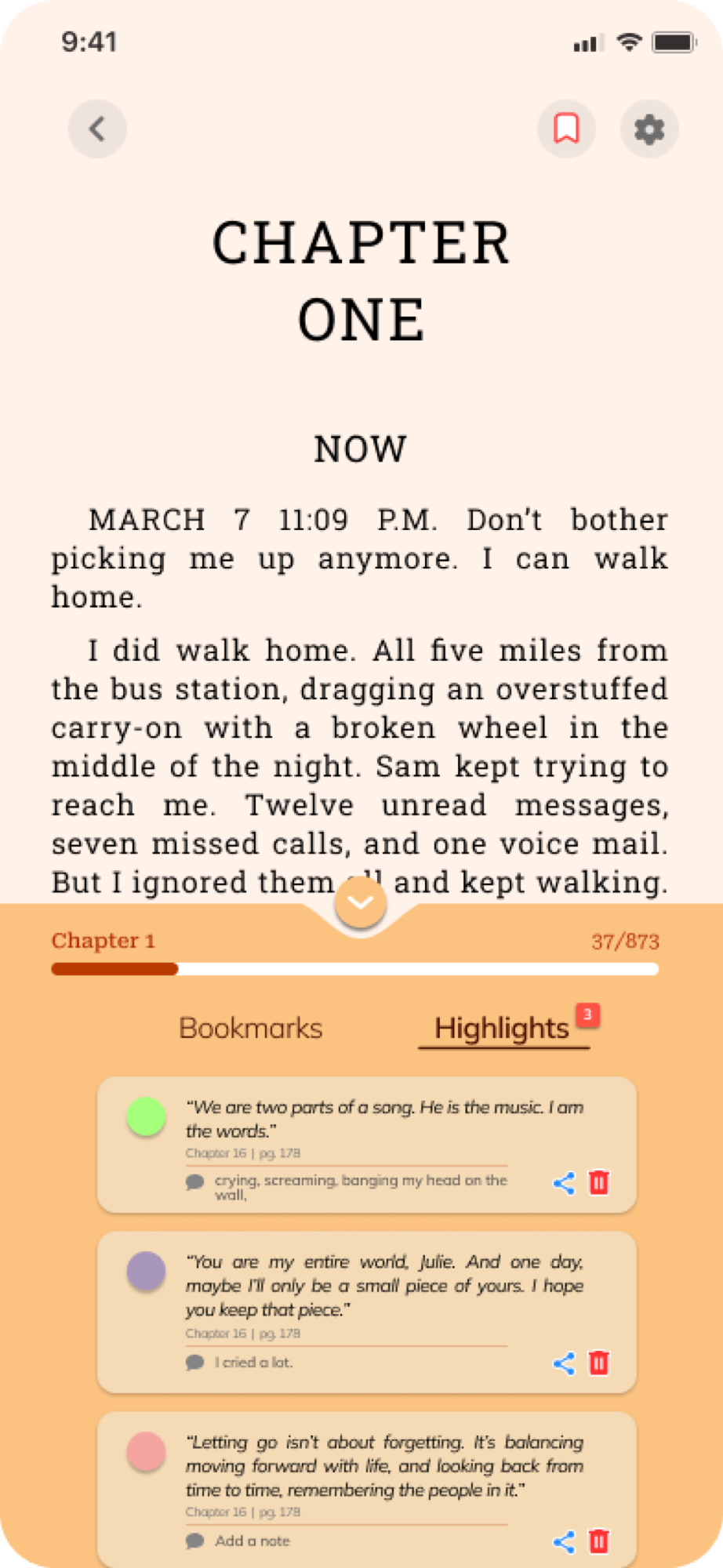
Bookmarks

Bookmarks

Mark a page the way you’d dog-ear it.

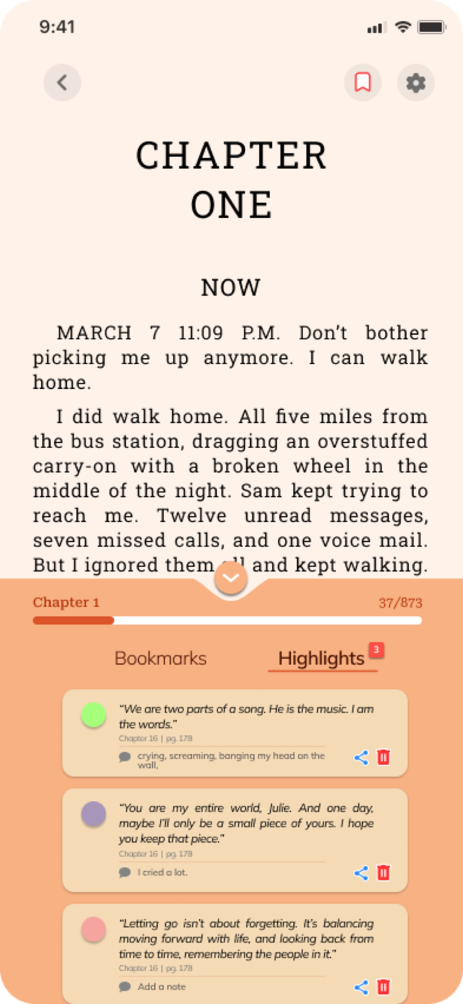
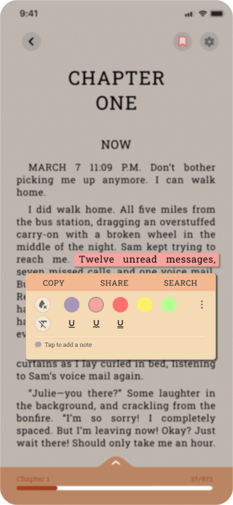
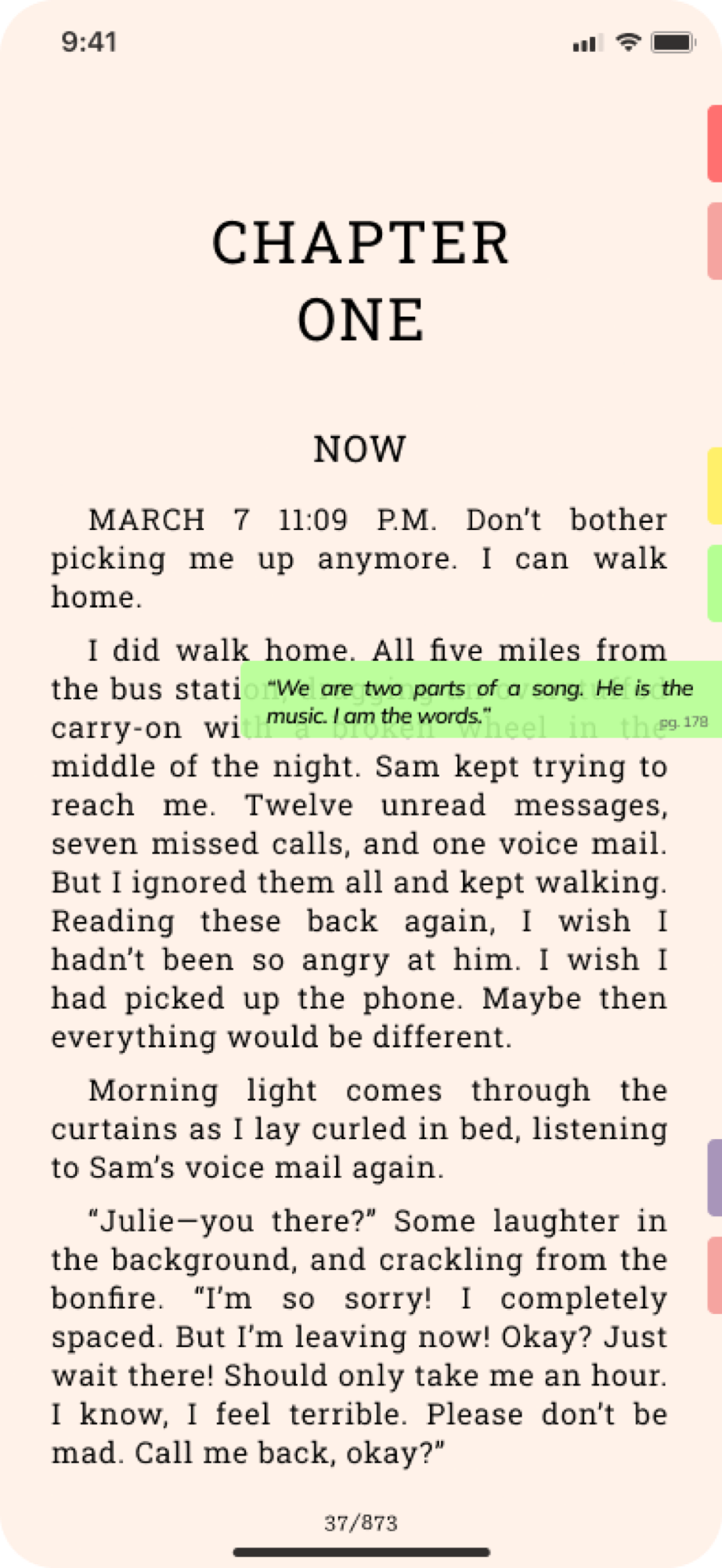
Notes

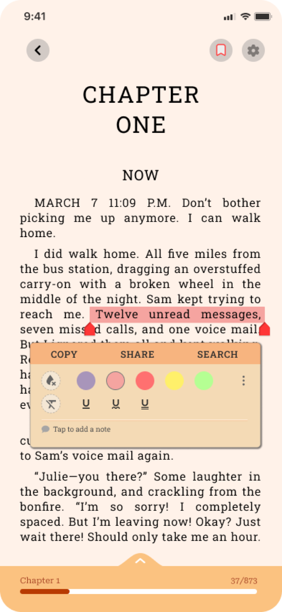
Notes

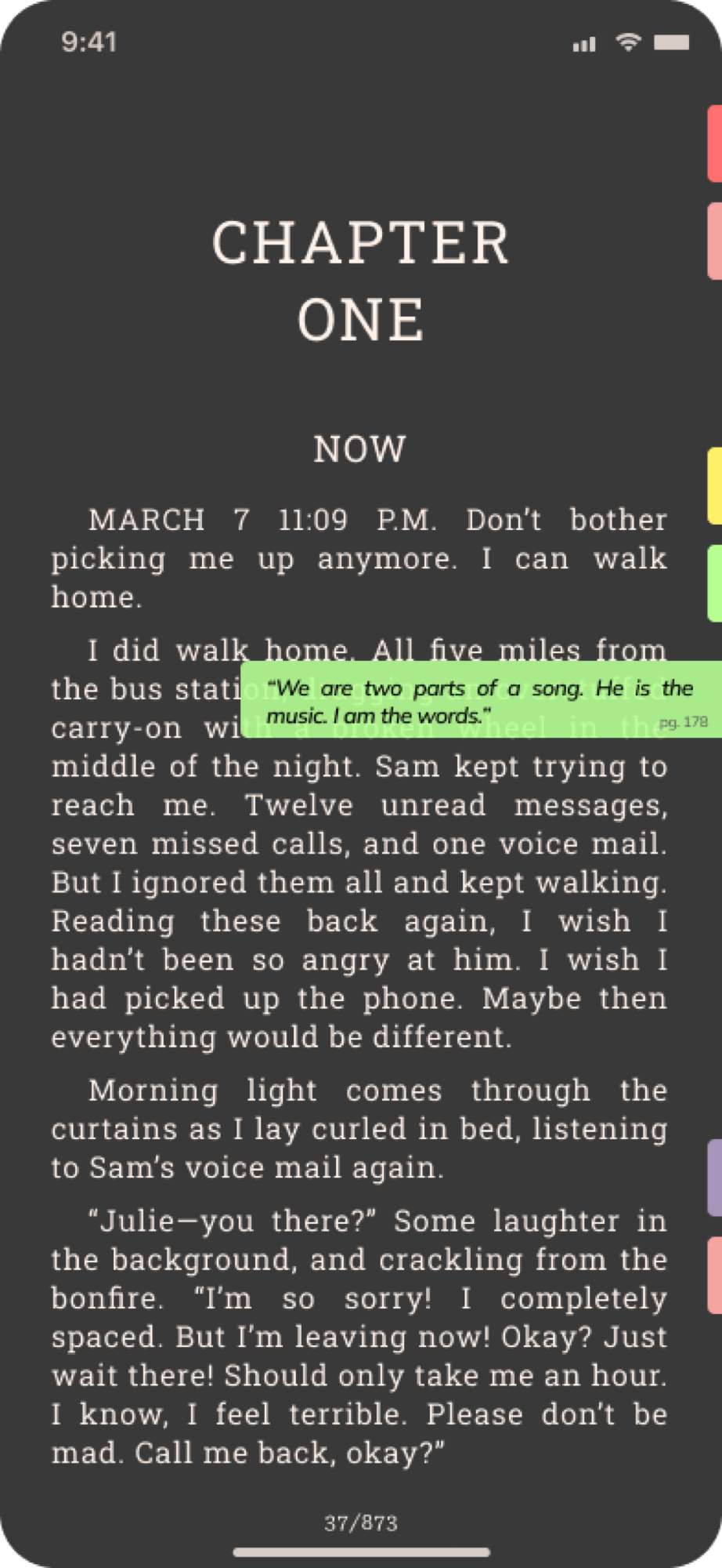
Margin-style annotation, written while reading rather than after it.

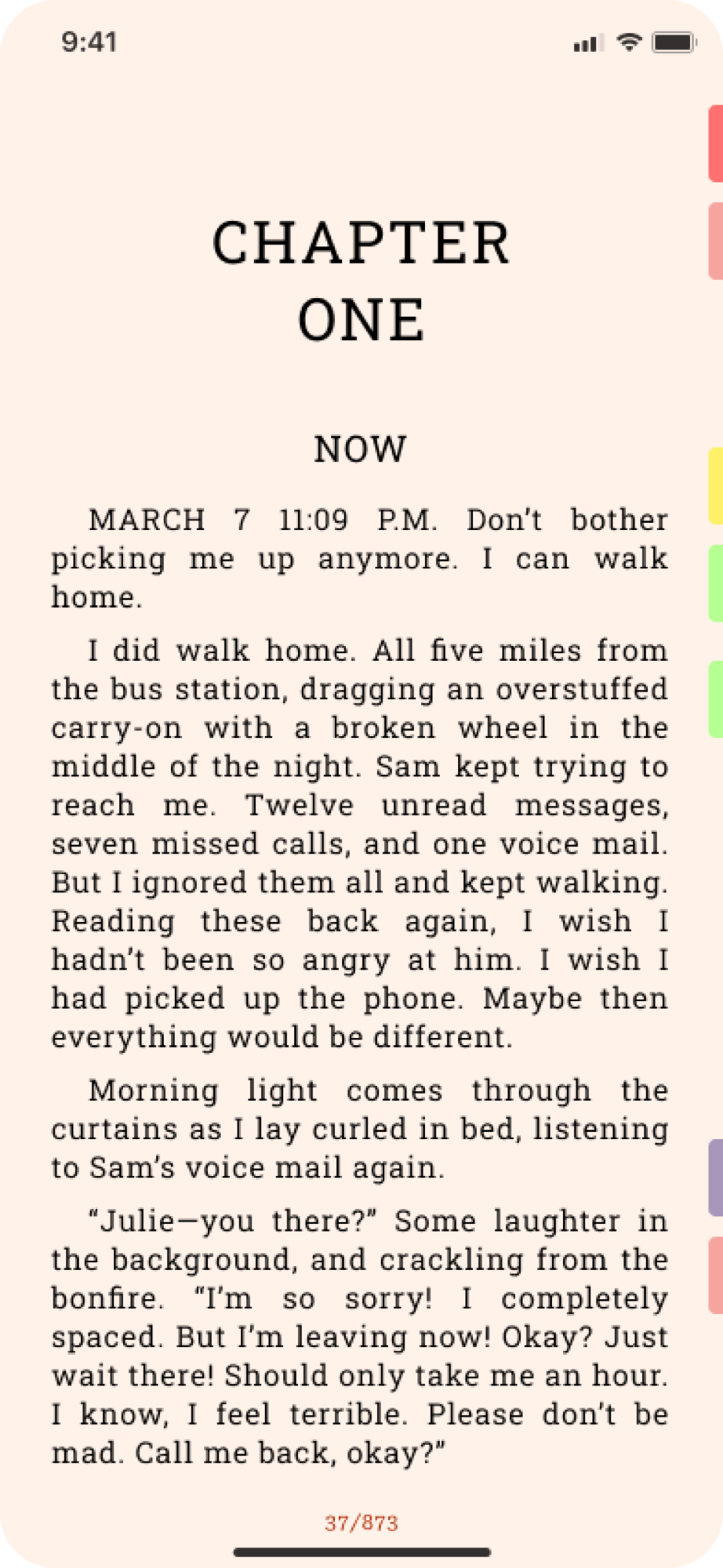
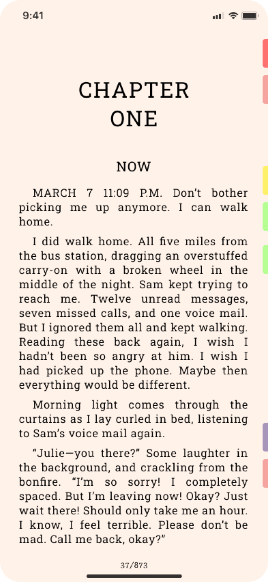
Tabs

Tabs

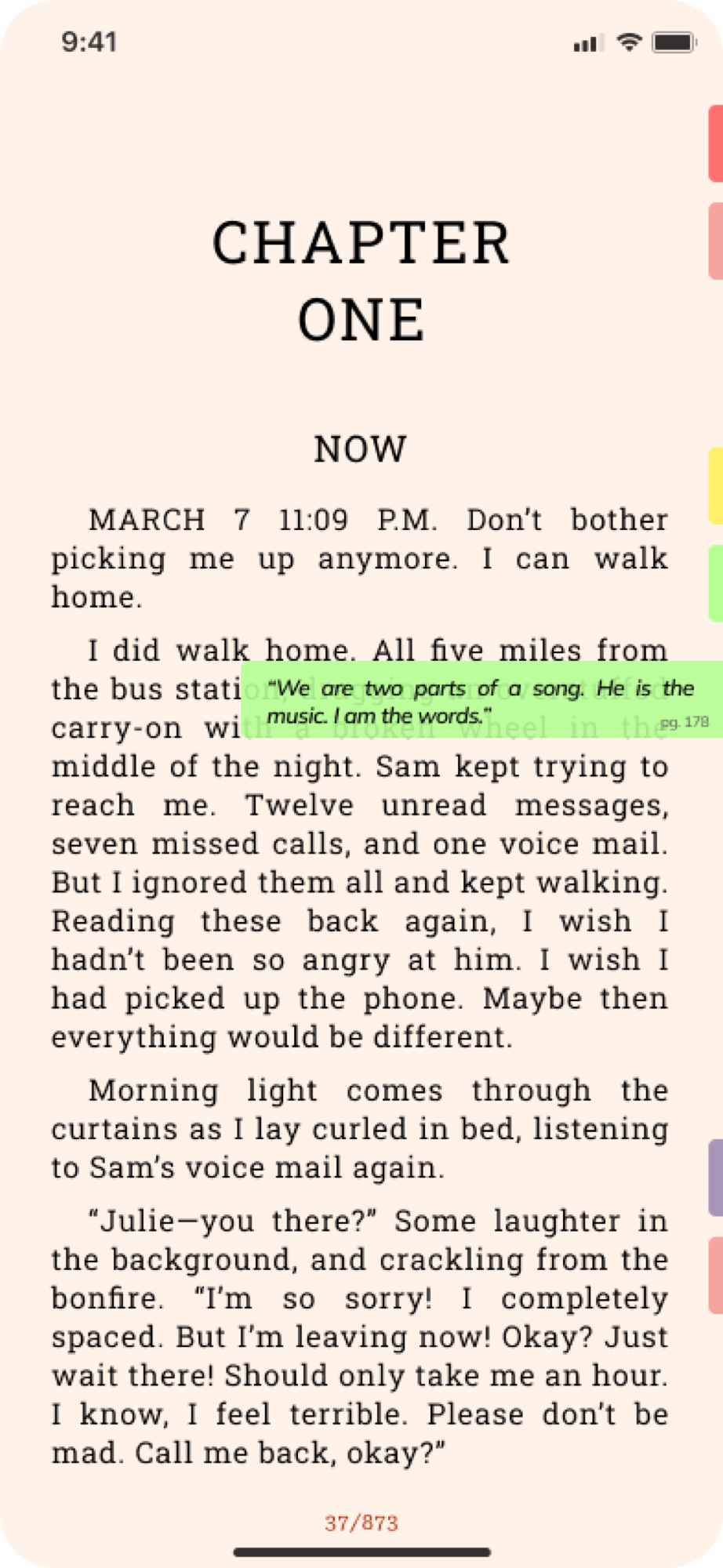
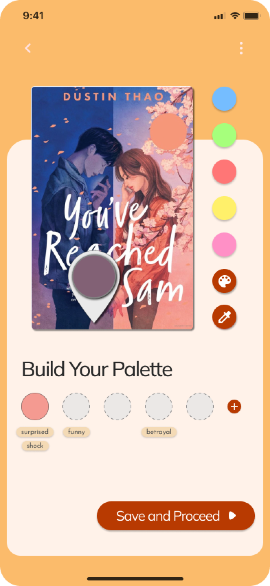
The standout feature: a digital analogue to leaving paper tabs sticking out of a book, marking chapters, favourite passages, or places to come back to.

Tabs, not folders

Tabs, not folders

Most e-readers organise saved content the way a file system does: folders, lists, favourites. That’s software logic applied to a book.

Autumn’s tabs skip that model and mimic the physical habit directly: a tab sticks out from the edge of the page, visible while flipping through, findable by feel and memory rather than by opening a menu.

It’s a small decision, but it’s the one that best captures the whole premise: digital reading should borrow its logic from books, not from software.
Three directions, none of them designed

  • A marketplace, Kindle-style subscription access to a book library
  • Sharing and gifting: two subscribers exchanging an annotated copy, margin notes included, or gifting a book outright
  • Reading together, a collaborative mode where two people read the same book on their own time and leave annotations for each other to find

The first one

A personal project, and the one that opened UI/UX design up for me. No client, no team, no brief, which meant the problem had to be found rather than handed over.

That turned out to be the actual lesson: noticing what’s wrong with something people already use, and then converting that noticing into a solution specific enough to design. Everything since has been a version of the same two steps.

Every screen

27 frames
Next projectVaulted Like what you see? Let’s talk