
All work
Independent Product Design Ongoing 2026

Formi

Physiotherapy platform, two-sided product

Product DesignDesign SystemHealthtech0 → 1
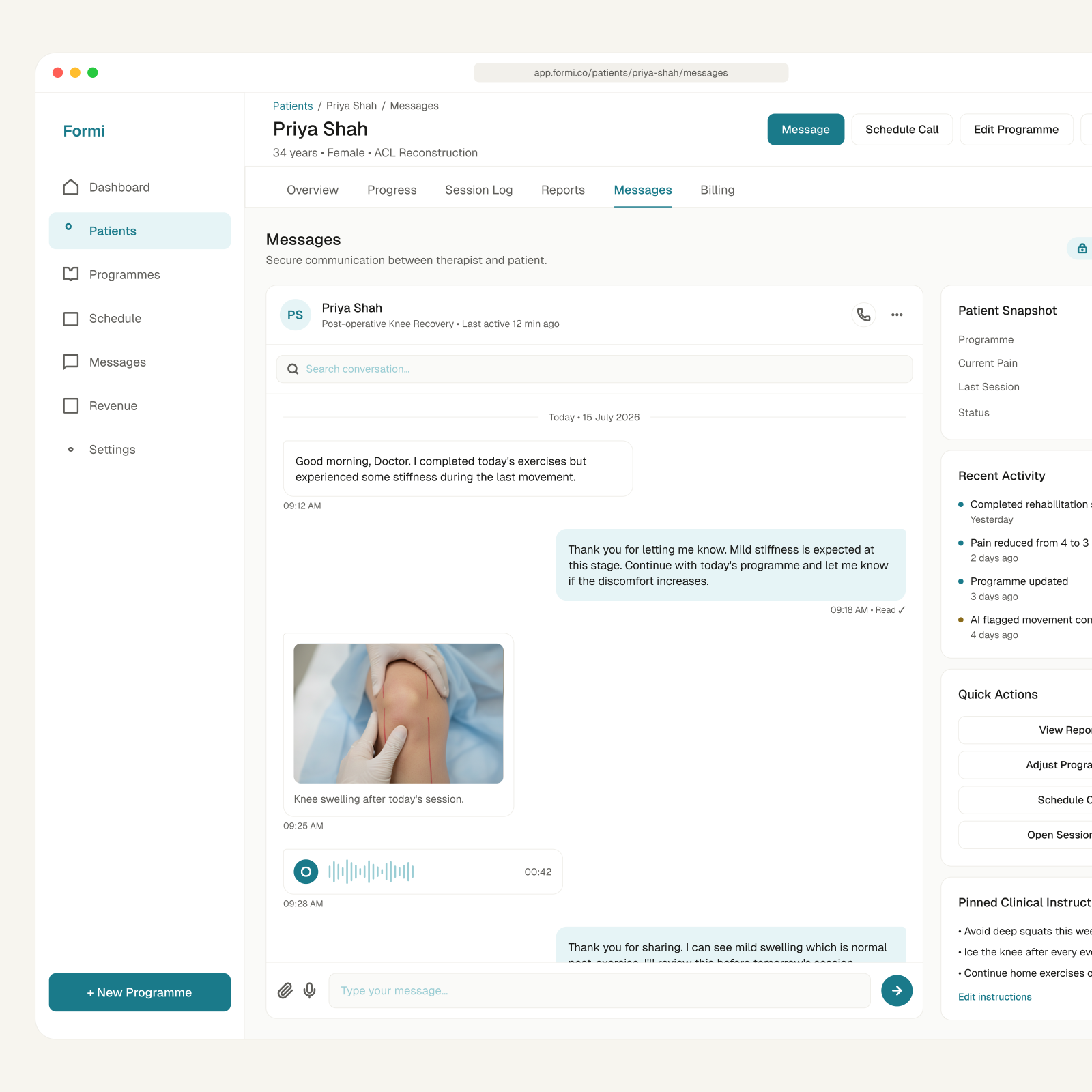
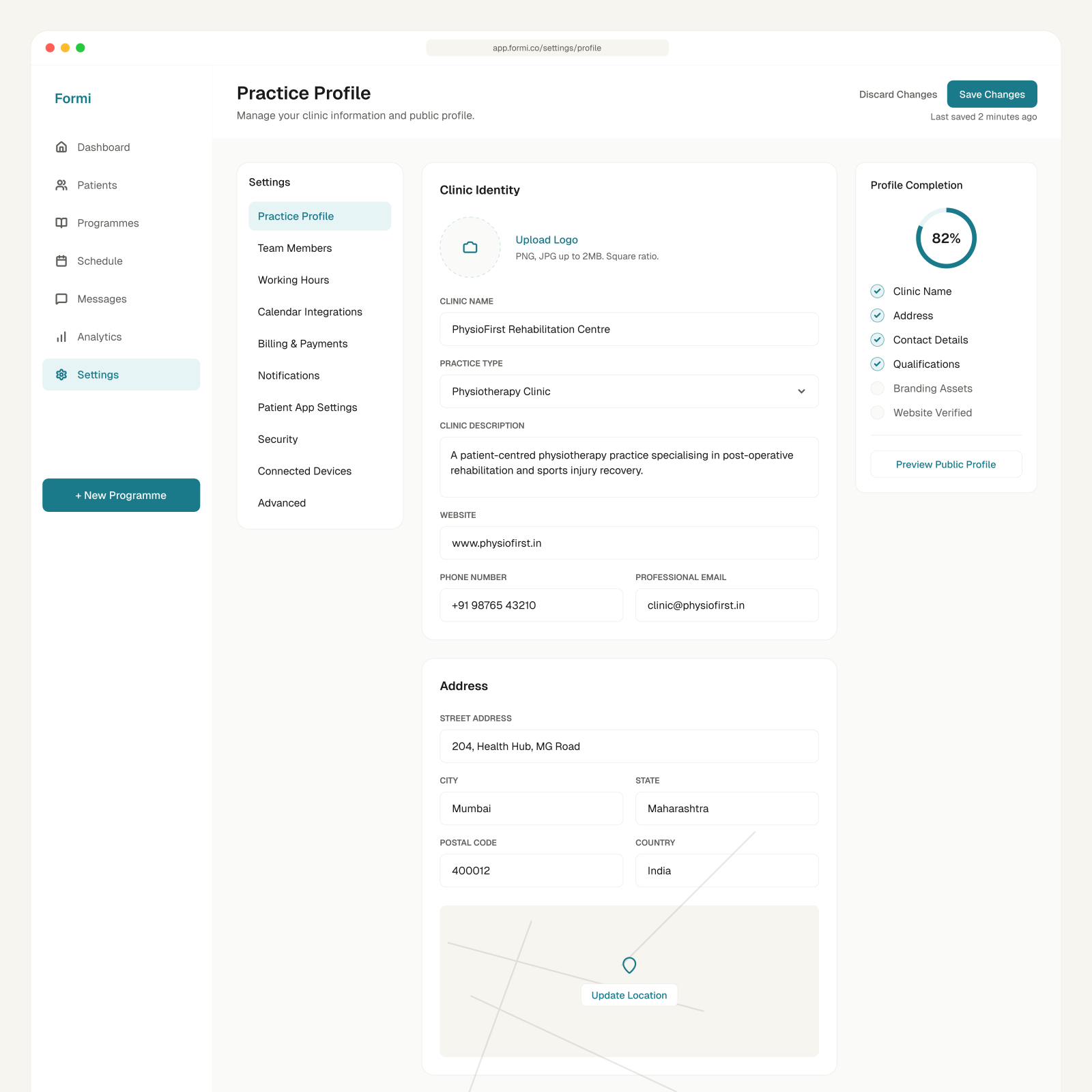
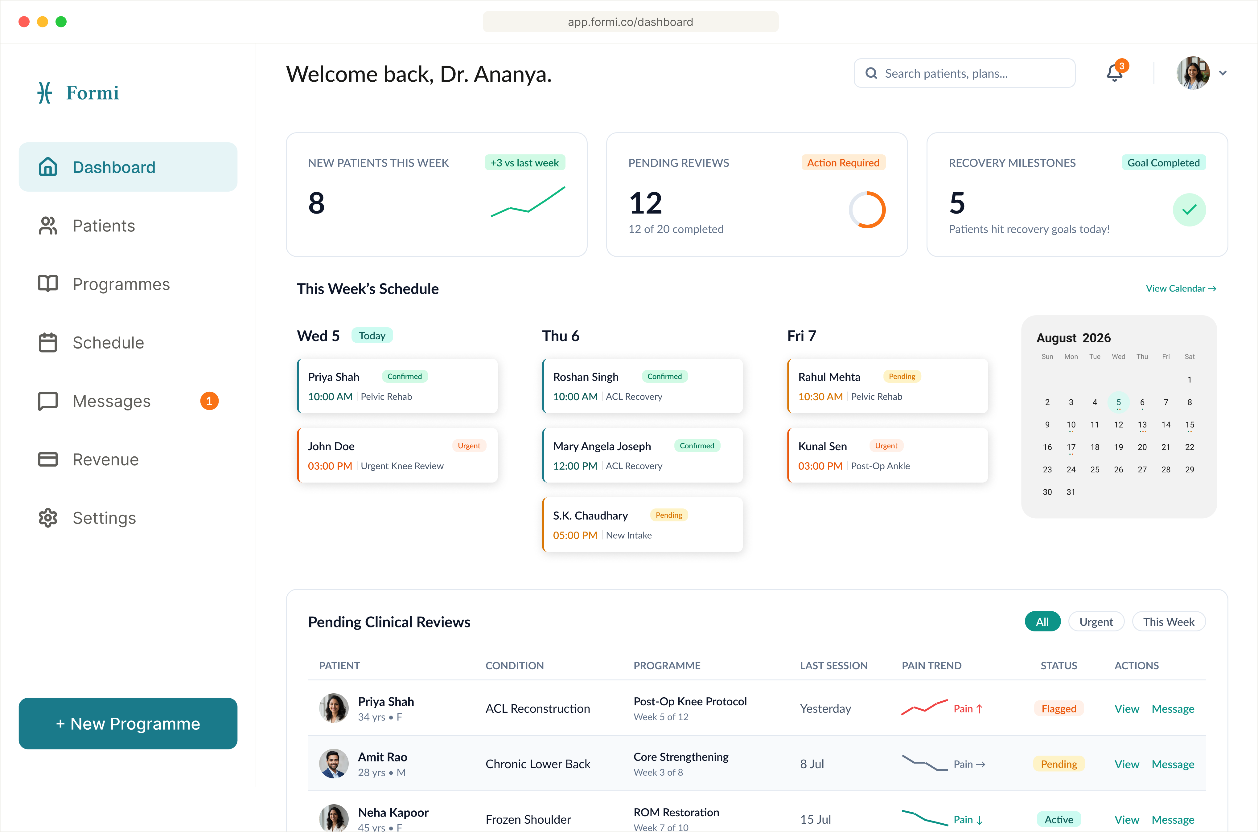
Formi — web dashboardTherapist dashboard (web)
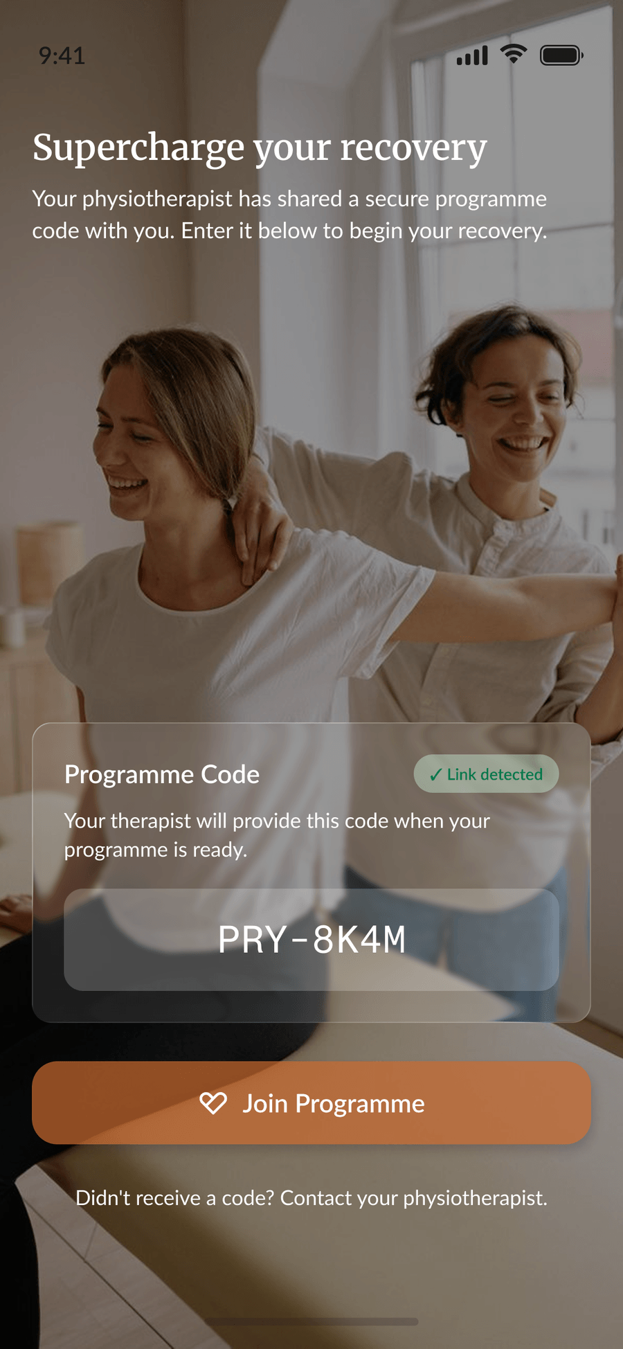
Formi — patient mobile app
Patient app (iOS & Android)
Role
Product Designer: 0 to 1 (PRD, research, UX, UI, design system)
Platforms
Web dashboard for physiotherapists · Mobile app for patients
Scope
53 screens across two products, one connected system
Timeline
Ongoing · 2026

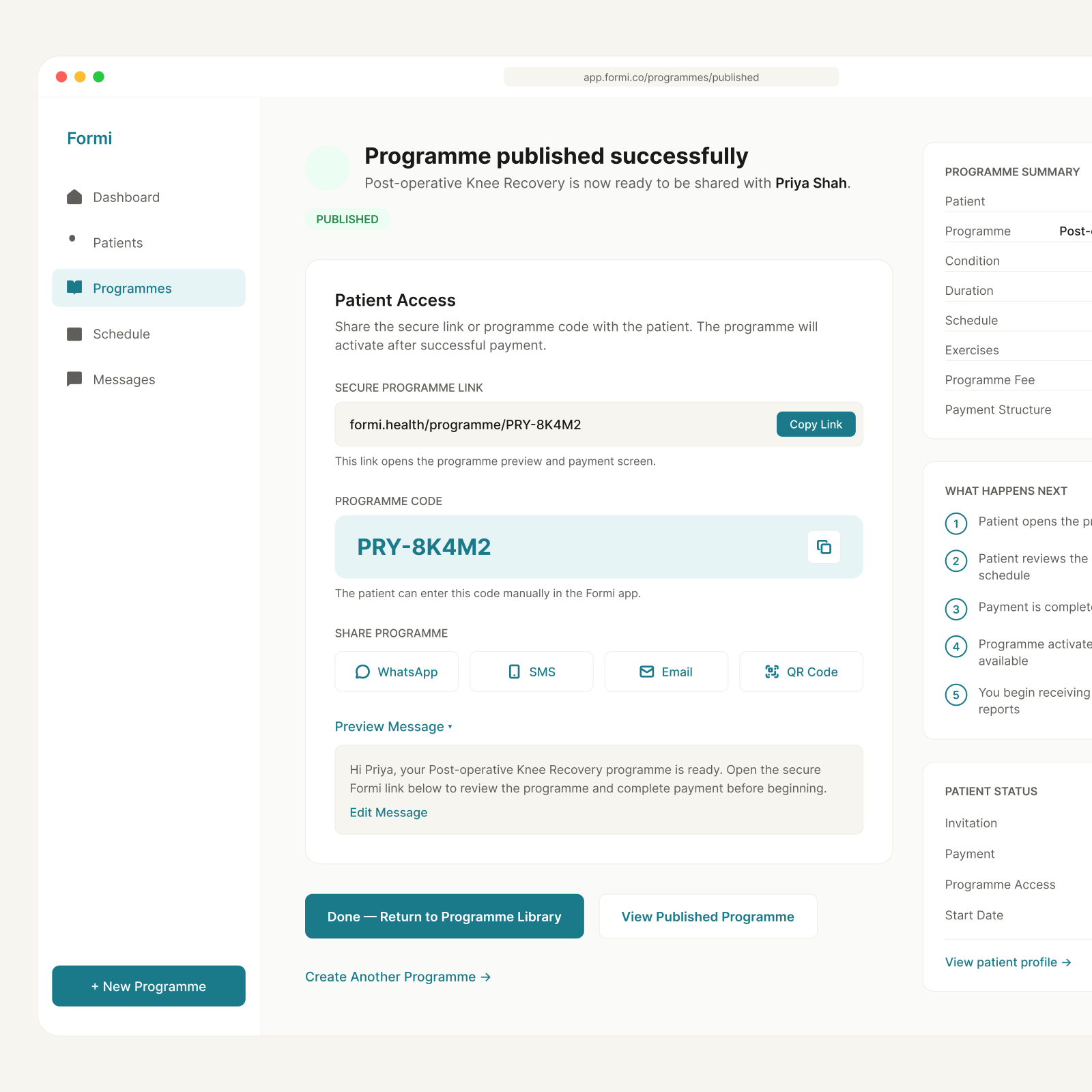
A physiotherapist-first platform that keeps the care relationship productive between clinic visits. Evolved from ‘Proctify’, a patients-only college project, into a full two-sided product: I authored the PRD, the research, and the design system, and introduced the therapist-facing half the original never scoped.

At a glance

53
Screens across two products
23 + 30
Therapist dashboard + patient app
8–12%
Platform fee, the whole business model
Top 50
Google Solution Challenge, Global (as Proctify)
ContentsOverview
  1. 01Overview
  2. 02Problem
  3. 03User Research
  4. 04Synthesis
  5. 05Strategy
  6. 06Design System
  7. 07UI Design
  8. 08Key Decisions
  9. 09Outcome & Reflection

Recovery doesn’t happen in the clinic

Physiotherapy recovery extends far beyond the appointment, yet almost every tool treats it as session-bound.

A physiotherapist sees a patient for forty minutes a week. The other six days and twenty-three hours, the part where recovery actually happens or doesn’t, are invisible to them. Patients go home with a printed sheet of exercises and no way to know whether they’re doing them correctly.

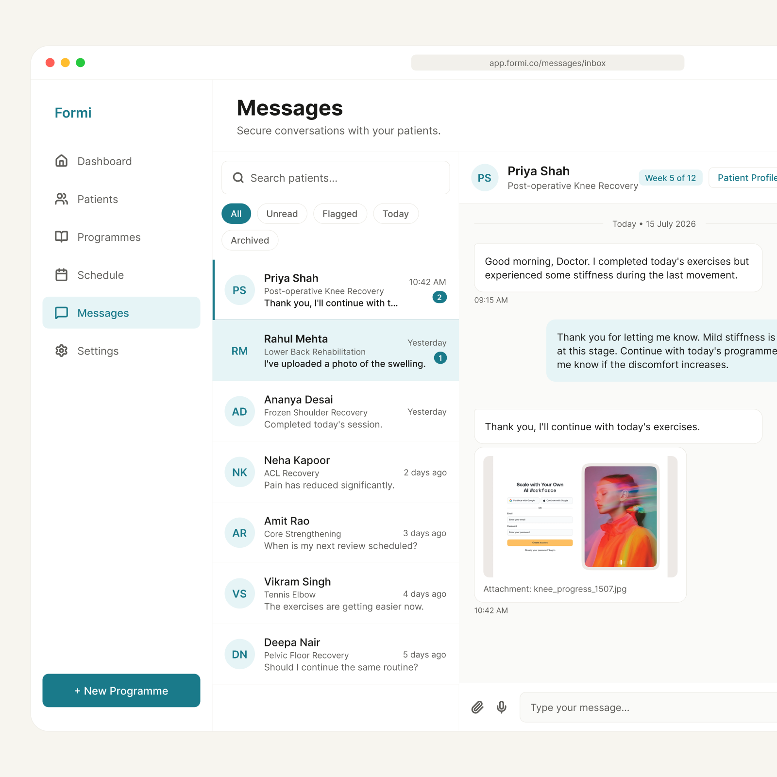
Formi closes that gap from both ends: a practice-management dashboard that gives therapists visibility into what happens at home, and a mobile app that gives patients real-time guidance while they exercise. One connected system, two very different jobs.

The therapist’s home view, the whole caseload triaged by who needs attention first.

Care given away for free, in a gap no one can see

India has roughly one physiotherapist for every 25,000 people. Independent practitioners already deliver remote care between visits: but informally, over WhatsApp: unpaid, invisible, and impossible to scale past 10–15 active patients without burning out.

The result is revenue leakage from dropout, no clinical visibility between visits, ad-hoc cash and UPI billing, and progress that’s anecdotal rather than evidenced. Two completely different jobs exist inside one recovery programme, therapists manage it, patients live it, and most tools address only one side.

35%
of physiotherapy patients fully adhere to their home exercise programme
Sprypt, 2025
50.6%
potential revenue lost to patients dropping out before treatment goals are met
Physiotutors clinical research review
7 of 10
trials showed an adherence boost from digital tracking tools
Physitrack RCT meta-review

Two users, one programme

I built the product around two people whose needs only overlap at one point: the programme itself. Everything else, what they want to see, when they open the app, what a good day looks like, pulls in opposite directions.

Dr. Ananya Rao, 34

Independent physiotherapist running a small clinic

I can prescribe the right programme, but I have no idea if it’s actually happening at home.

Goals
  • See actual patient behaviour between visits
  • Cut down manual notes and follow-up chasing
  • Keep patients engaged through the full programme
Frustrations
  • No visibility once the patient leaves
  • Forced to rely on inaccurate self-reporting
  • Existing software prioritises billing over patient care

Mary Cooper, 56

Post-operative recovery patient

I do the exercises, but I never know if I’m doing them properly until my next appointment.

Goals
  • Recover fully and safely without reinjury
  • Get feedback on her form while she exercises
  • Track pain trends and see progress accumulate
Frustrations
  • Zero feedback between appointments
  • Uncertain about exercise form when alone
  • Loses track of progress over time

From insights to three themes

Clustering what both groups told me produced three themes: and the useful finding was that each theme shows up on both sides of the relationship, as the same problem wearing different clothes.

Visibility
Therapist
  • Can’t see what happens after the patient leaves
  • By the time I find out something’s wrong, it’s been two sessions
Patient
  • Don’t know if I’m doing this right
  • I only find out my form was wrong at the next appointment
Continuity
Therapist
  • I’m re-explaining the same programme every time
Patient
  • I forget what I was even told to focus on
  • Every visit feels disconnected from the last
Motivation
Therapist
  • Patients disengage without check-ins
  • Silence between sessions usually means they’ve stopped
  • No visibility means no way to intervene early
Patient
  • It’s easy to quit when no one notices
  • Hard to stay consistent when I can’t see progress

The bet, physiotherapist-first

Most health apps acquire patients directly and treat the clinician as a distribution channel. Formi inverts that. The physiotherapist is the primary customer: they build programmes, set prices, and invite patients. The patient’s app is an extension of the therapist’s clinical work, not a separate product competing for the same attention.

That choice set the constraint that shaped every dashboard screen: a therapist should be able to complete their full daily patient review in under ten minutes.

One system, two apps

Both products sit on a design system I built from the ground up, shared colour, type, and a 4pt spacing base, so the two-sided product reads as one product rather than two apps that happen to talk to each other. Dense clinical data had to render as calm, scannable views.

Primary teal#1A7A8A
Teal light#E6F4F6
Orange accent#F97316
Warm off-white#FFF0E8
Near-black#1A1A18
Slate#E2E8F0
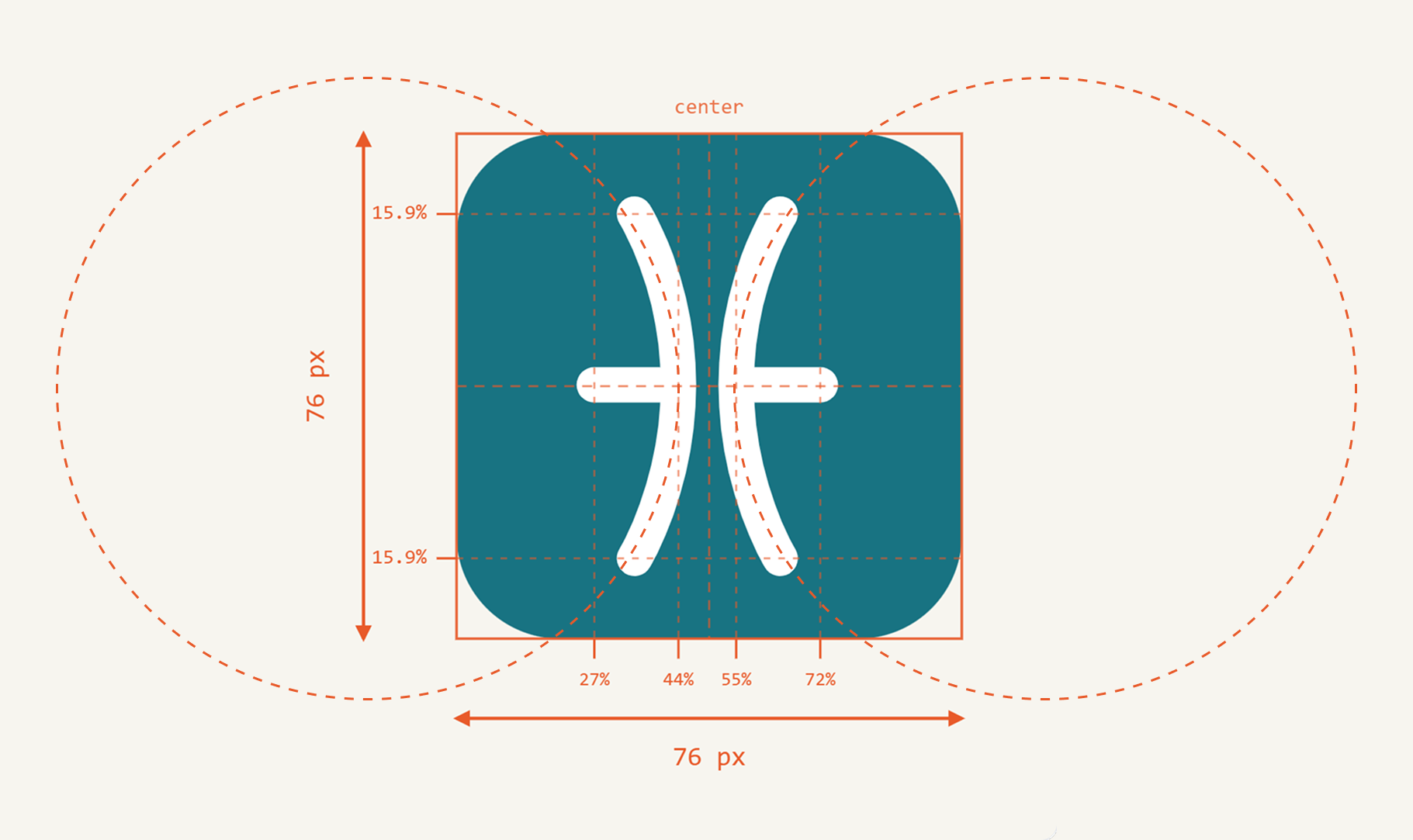
Constructed, not drawn: both arcs are cut from two circles overlapping a 76px square.

The therapist dashboard, surface by surface

01 / 06

Triage before anything else

The home screen sorts by urgency, not alphabetically. Flagged patients rise to the top, pain spike, form deterioration, missed sessions, then active patients by last session, then upcoming starts.

A banner states the day plainly: X patients need your attention. That single line is what makes a ten-minute daily review possible.

Triage before anything else

Triage before anything else

The home screen sorts by urgency, not alphabetically. Flagged patients rise to the top, pain spike, form deterioration, missed sessions, then active patients by last session, then upcoming starts.

A banner states the day plainly: X patients need your attention. That single line is what makes a ten-minute daily review possible.

The patient overview

The patient overview

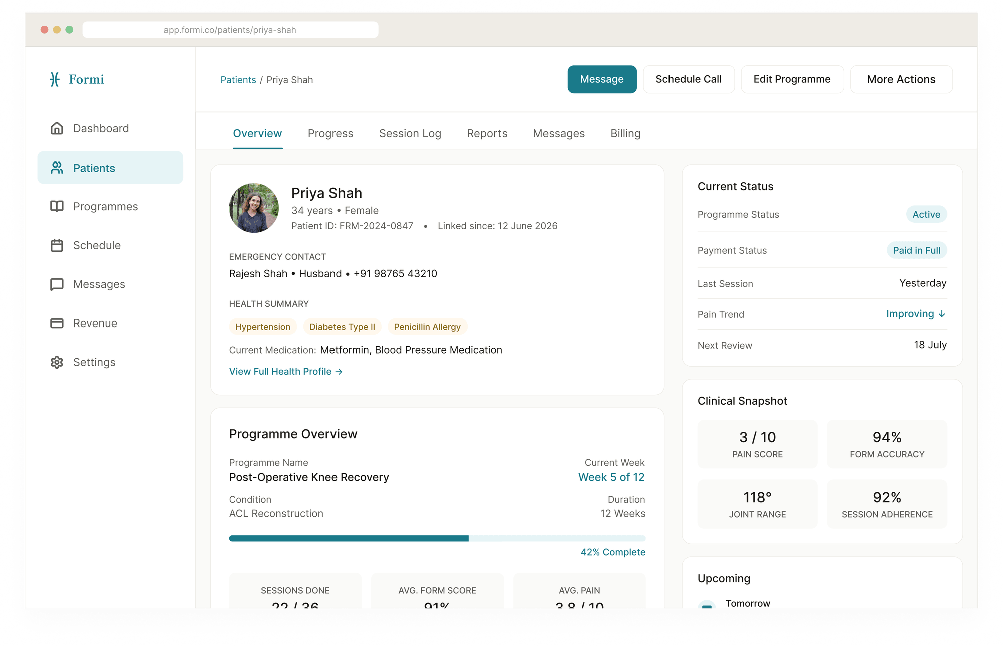
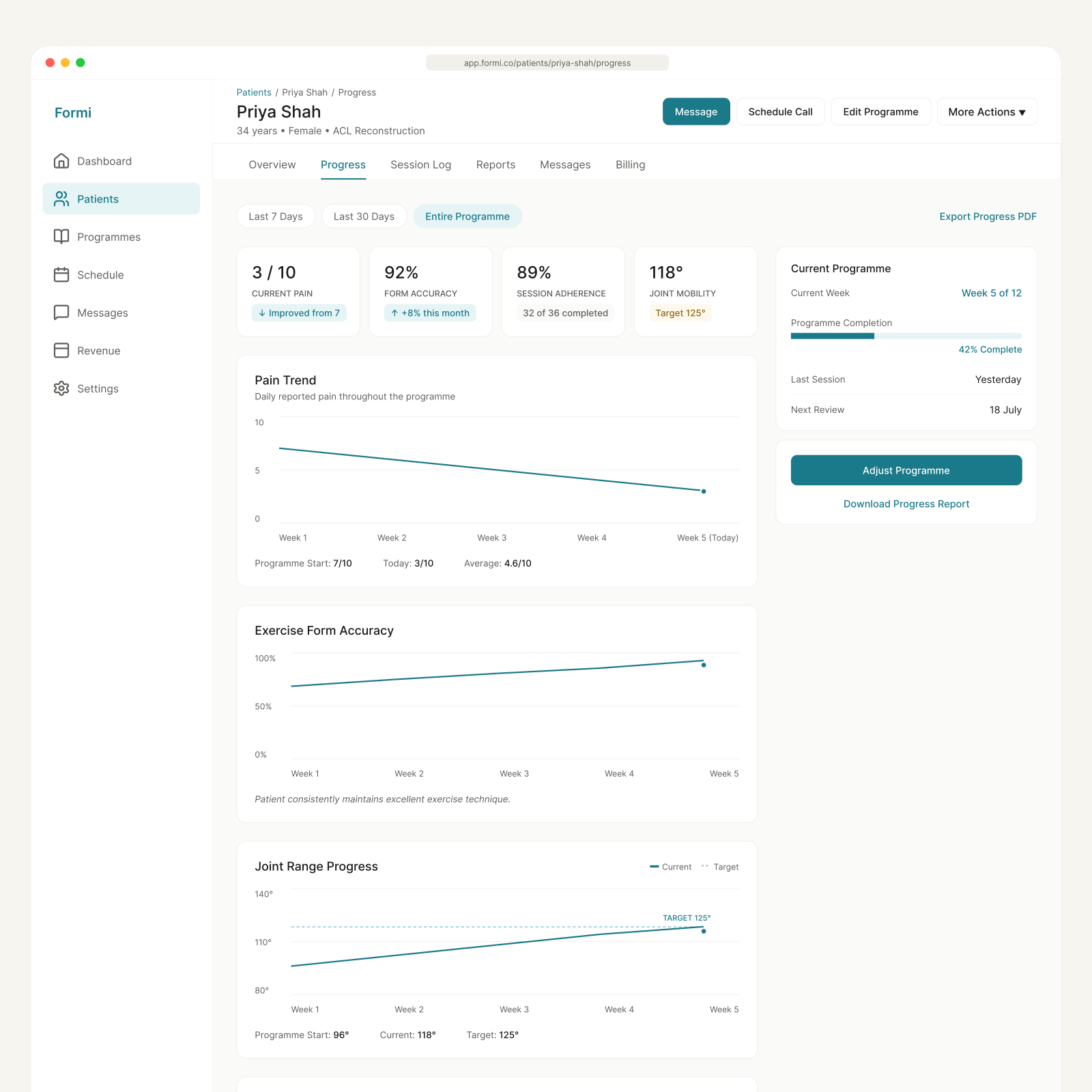
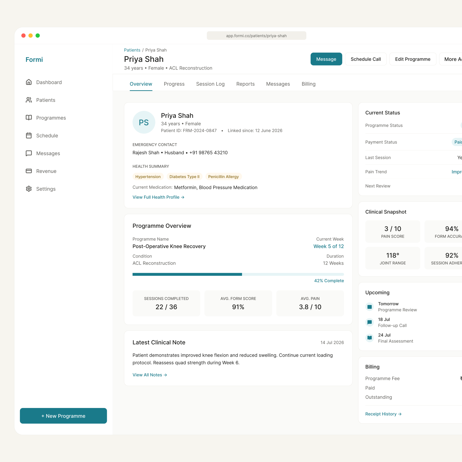
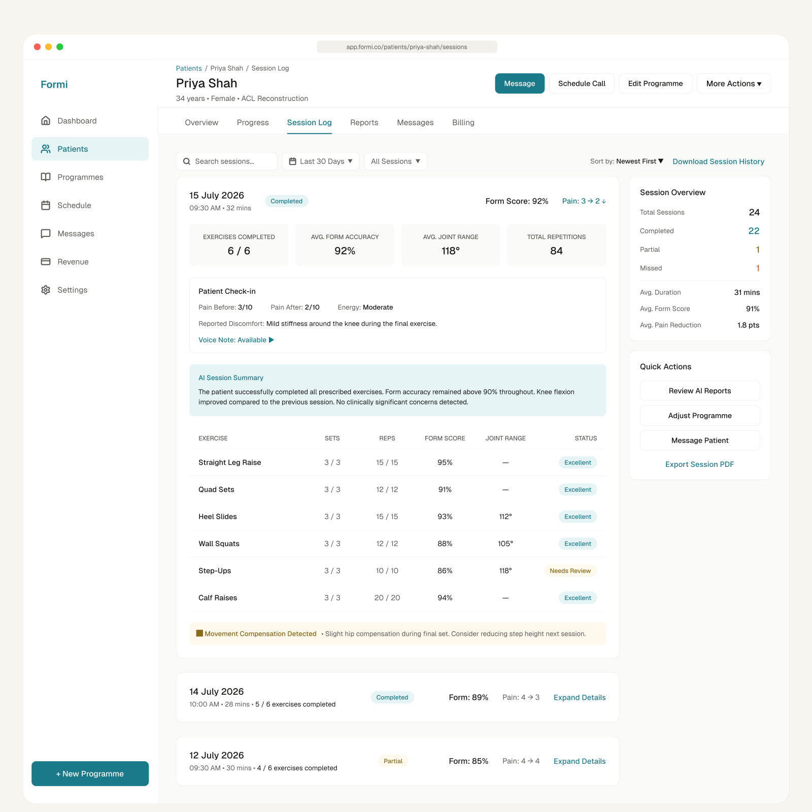
Everything needed to prepare for a session in one view: health summary and medications on the left, current status on the right, clinical snapshot underneath.

Progress is stated in plain language: Post-Operative Knee Recovery, week 5 of 12, 42% complete. Pain score, form accuracy, joint range and adherence sit together, so the numbers are read as one clinical picture rather than four separate metrics.

Programmes as reusable objects

Programmes as reusable objects

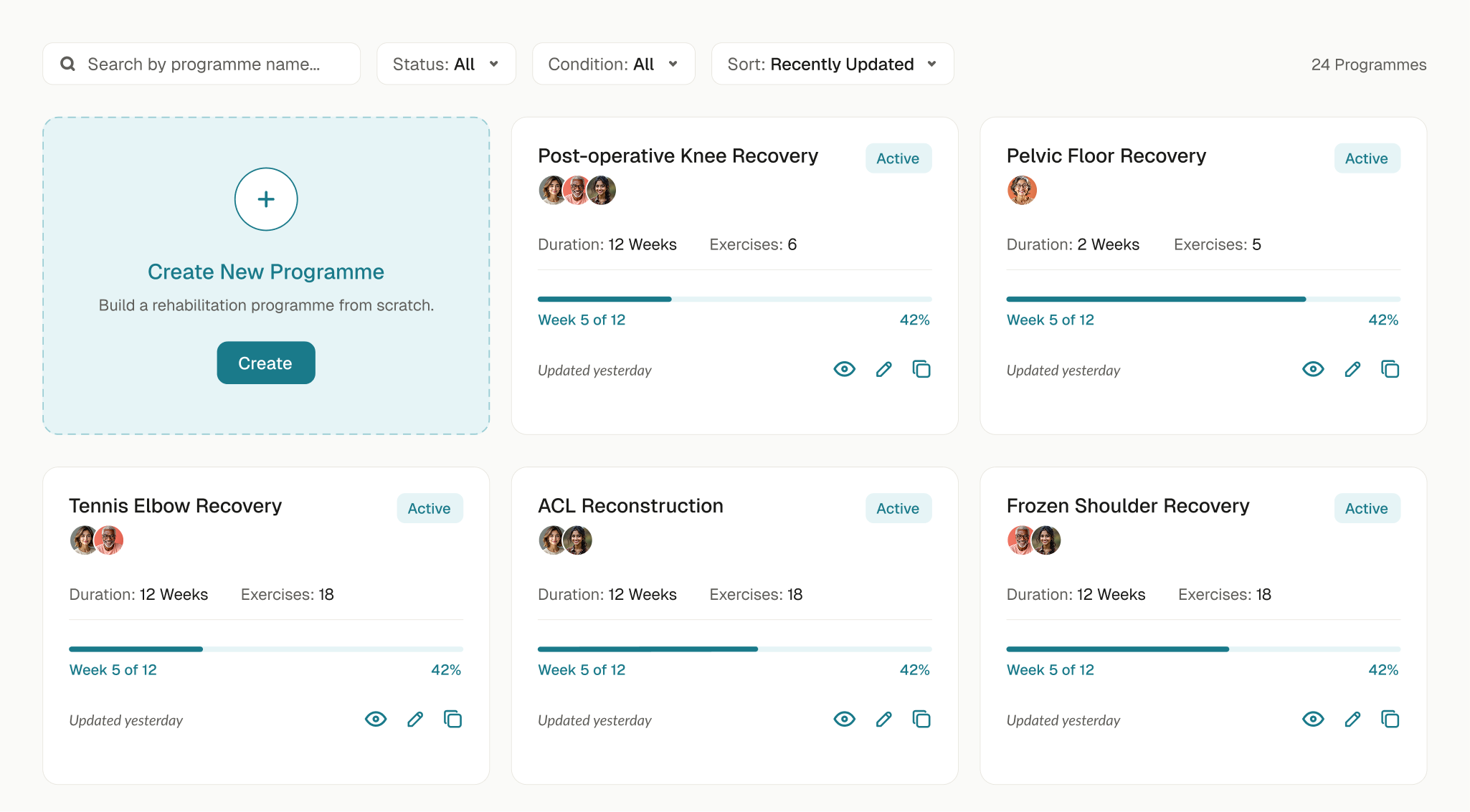
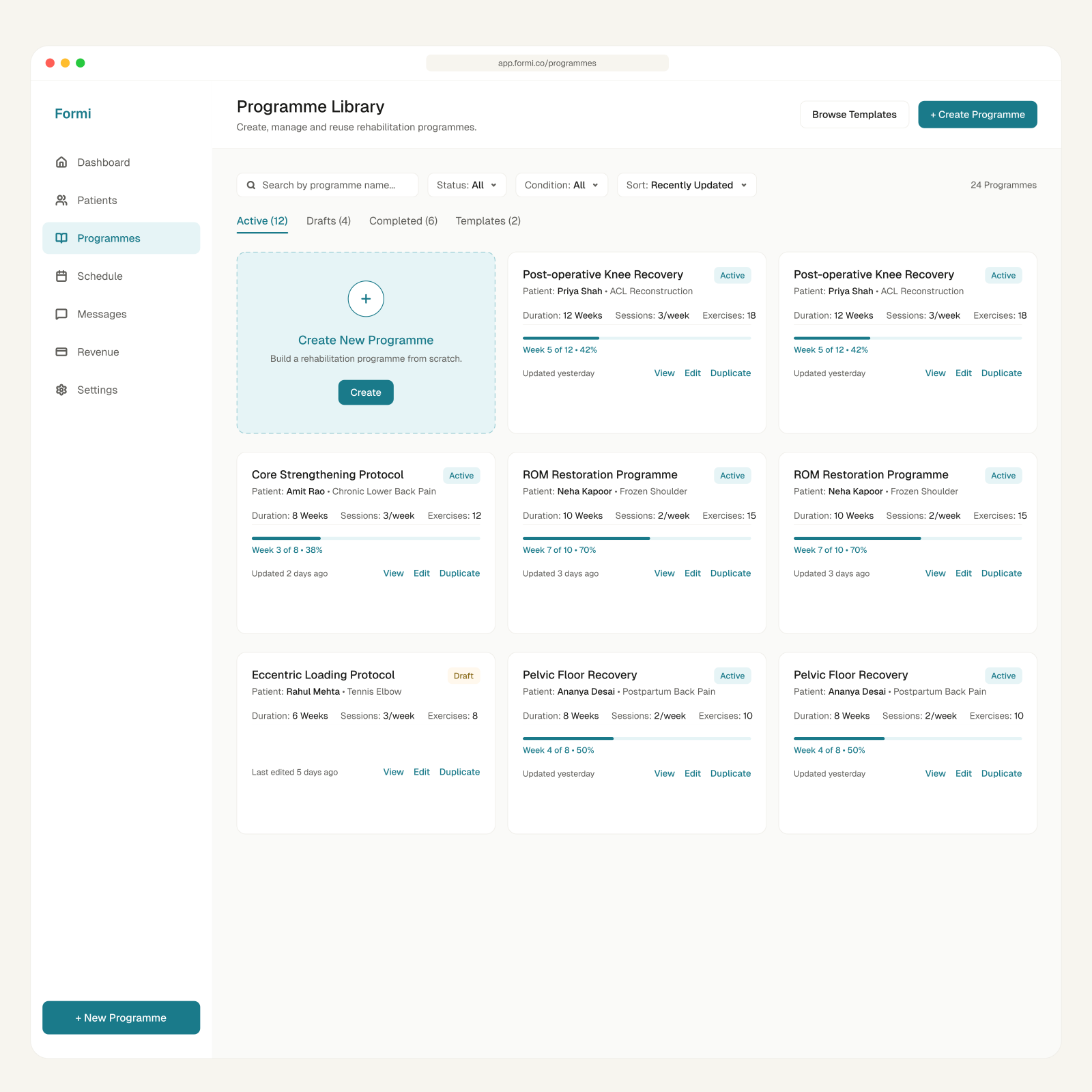
Most programmes start as a variation of a previous one, not a blank page. The library shows duration, exercise count, enrolled patients and progress at a glance, with view, edit and duplicate on every card.

Creating from scratch is deliberately the one dashed card in the grid: available, but not the default path.

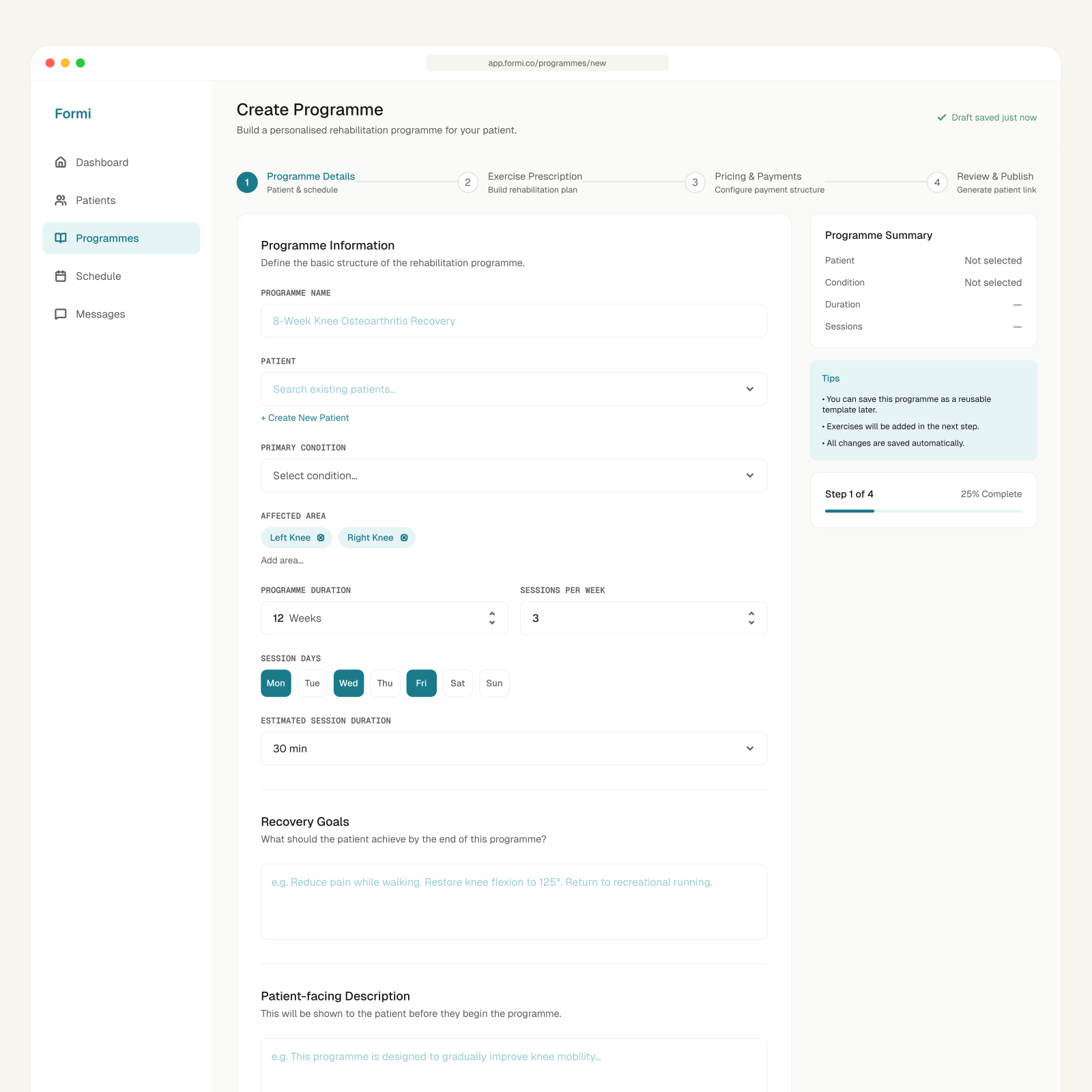
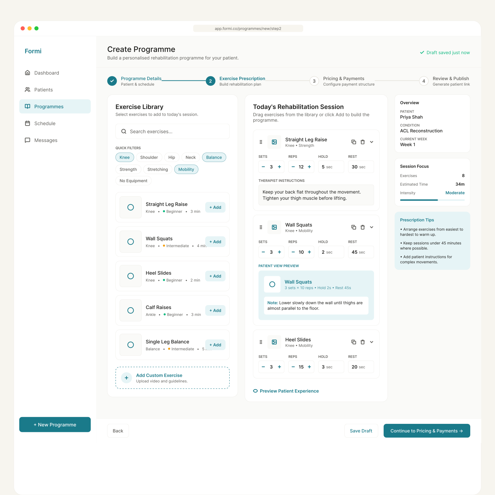
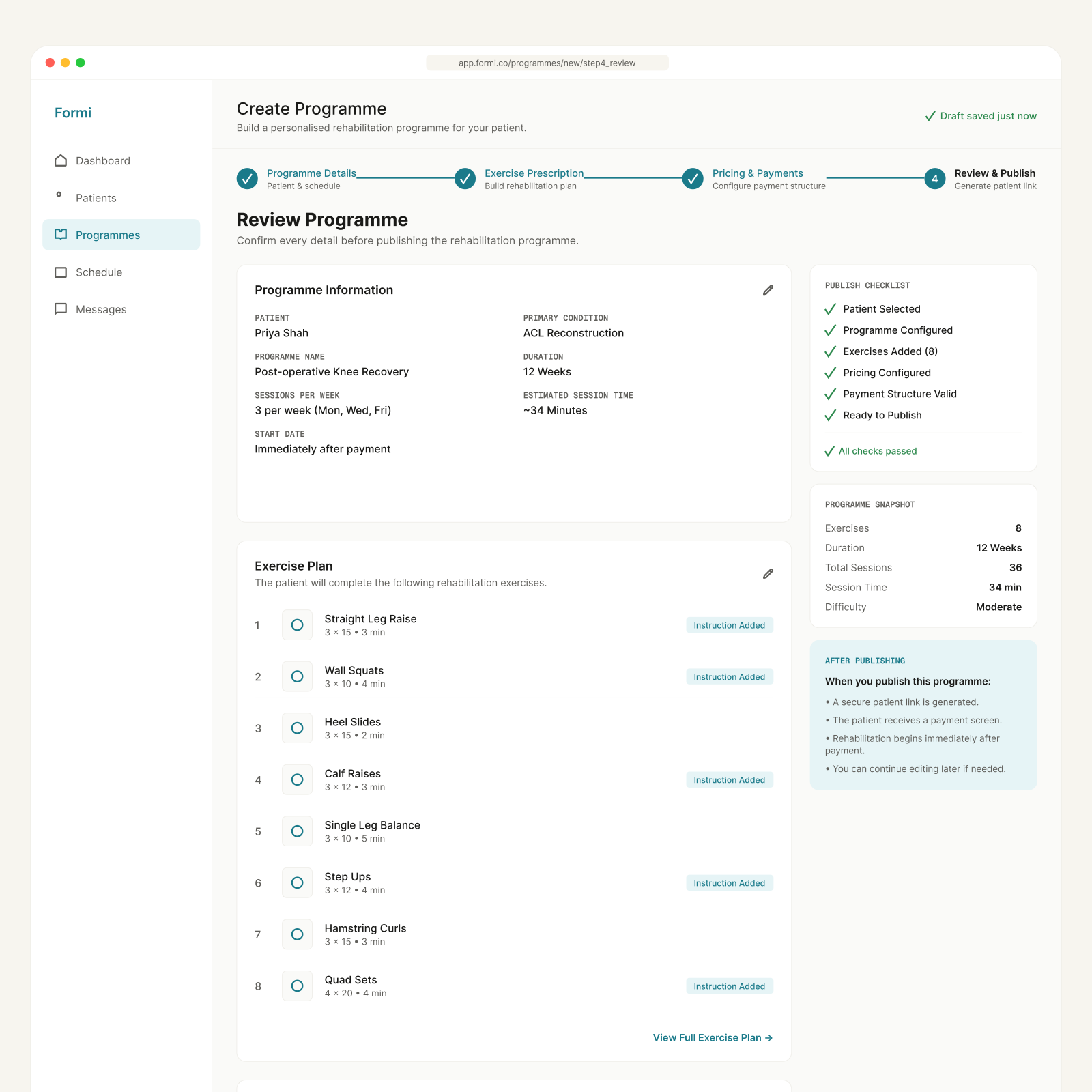
The programme builder

The programme builder

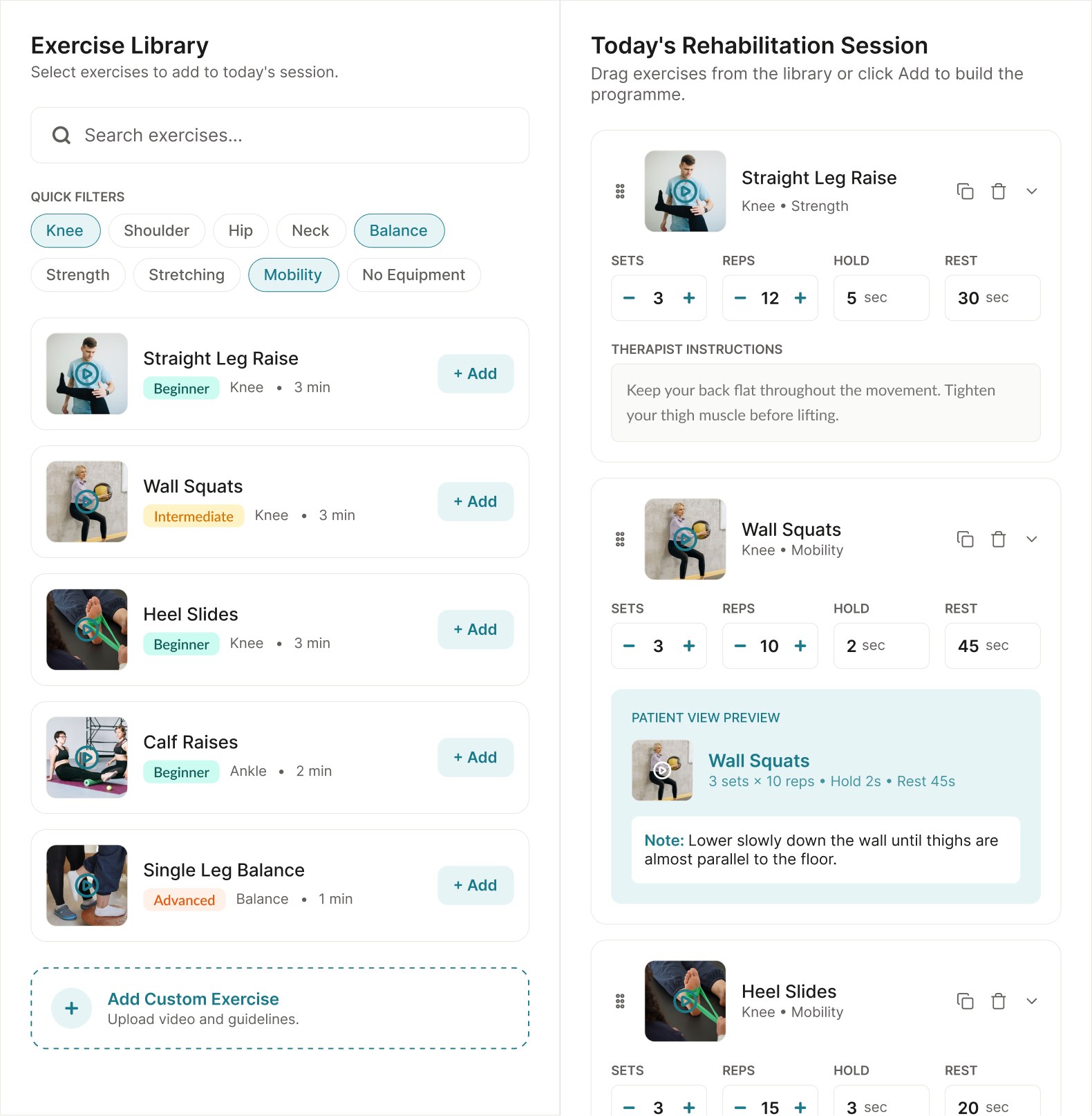
Programme creation is the therapist’s primary action and the single gate every patient enters through. Exercises are dragged from a clinician-validated library into the session, each with its own sets, reps, hold and rest.

Therapist instructions travel with the exercise, and a patient view preview shows exactly what will appear on the phone, so the therapist never has to guess how their prescription reads at the other end.

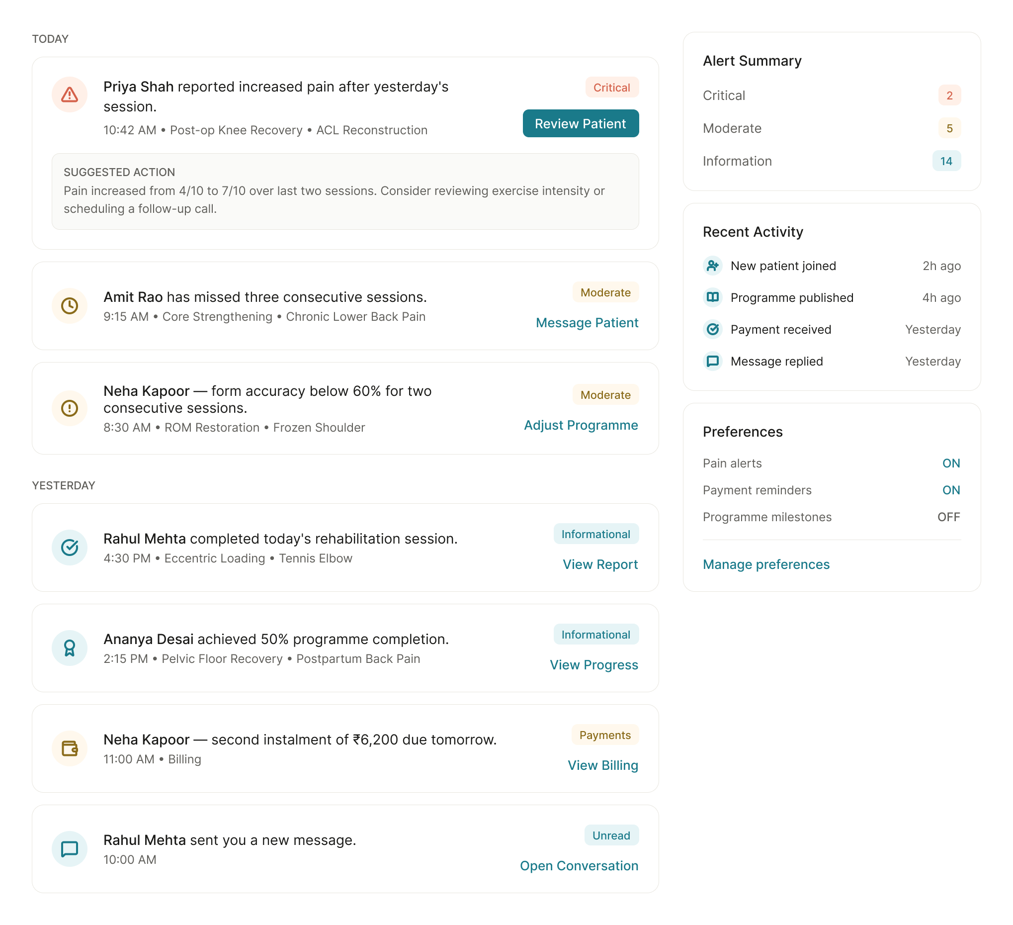
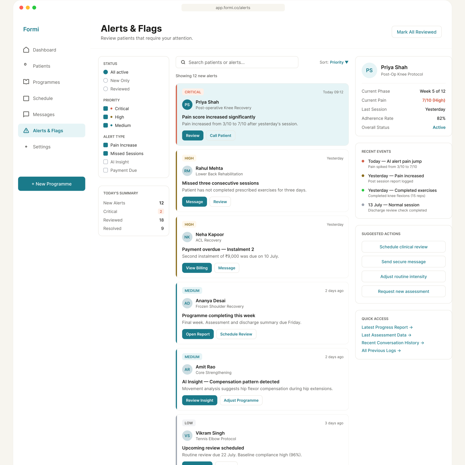
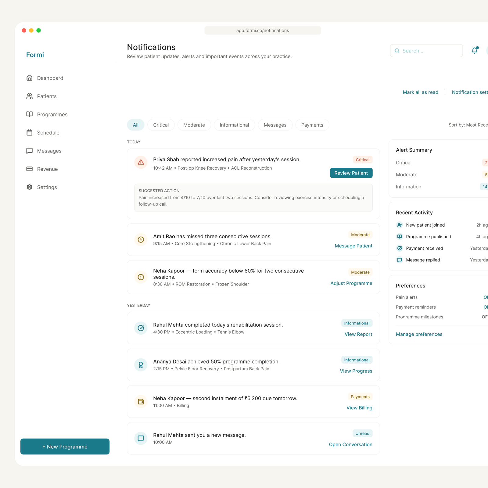
Alerts as the safety layer

Alerts as the safety layer

Tiered Critical, Moderate and Informational so urgency stays visually distinct. A pain spike carries its own suggested action, “pain increased from 4/10 to 7/10 over the last two sessions”, rather than leaving the therapist to work out what changed.

Missed sessions, form deterioration, instalments due and completion milestones all run through the same tiering. One mental model to learn, not five, and every alert ends in a button rather than a dead end.

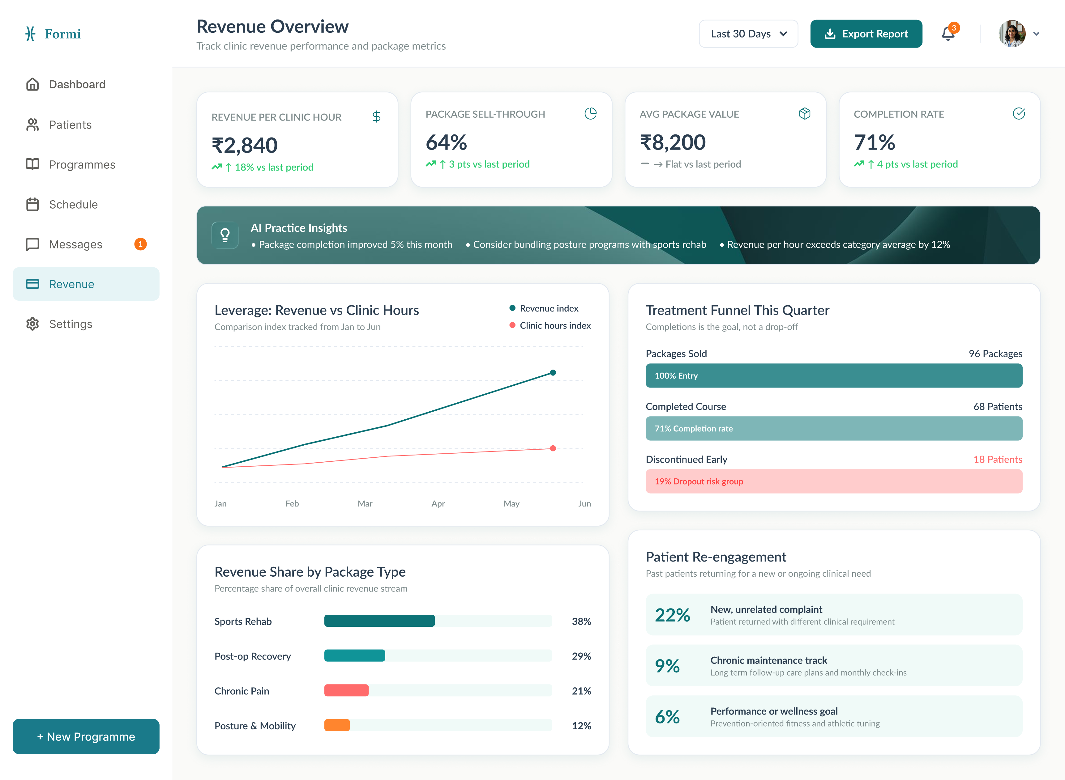
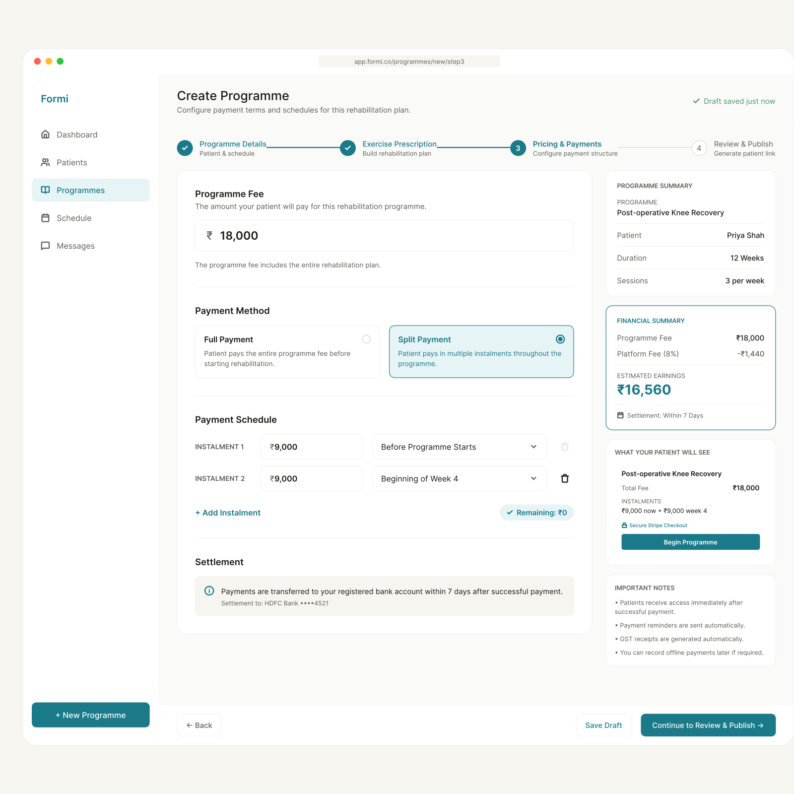
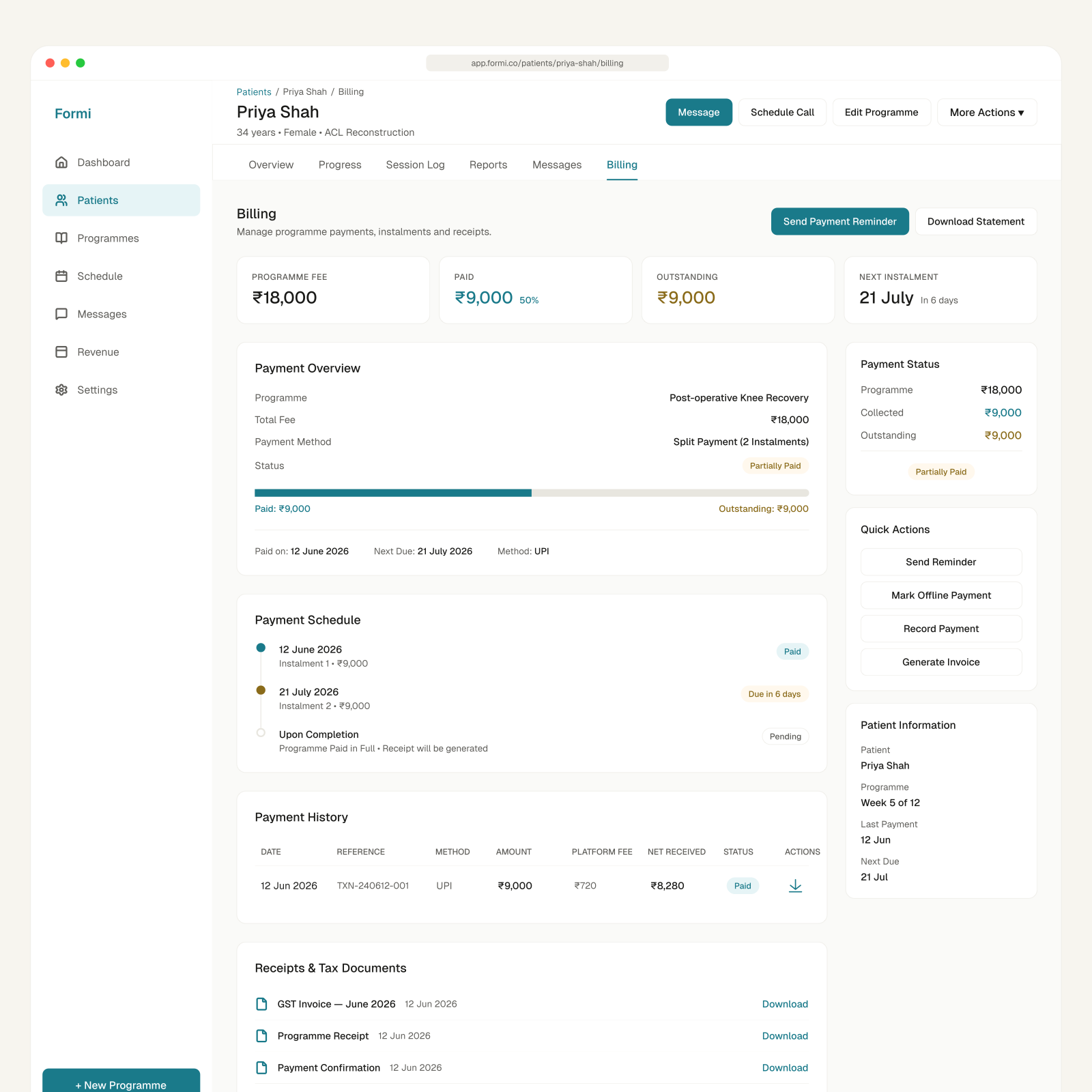
Revenue that tracks the clinical goal

Revenue that tracks the clinical goal

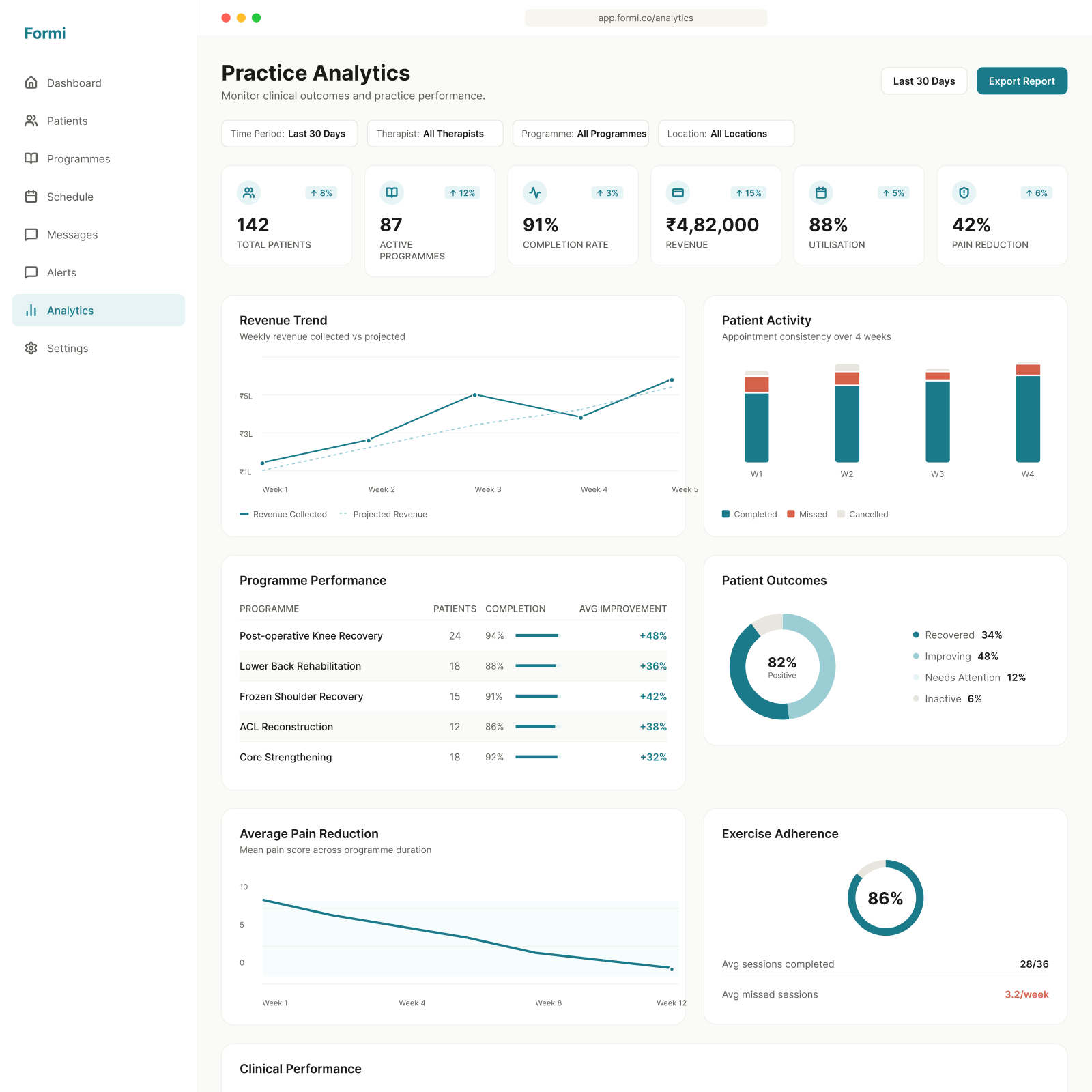
The money view replaces cash-and-WhatsApp billing: revenue per clinic hour, package sell-through, instalment tracking and weekly payouts, turning previously unbillable clinical time into tracked revenue.

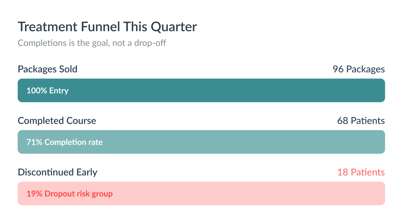
Completion rate sits in the header row beside revenue, and the treatment funnel states the intent in its own subtitle: completions are the goal, not a drop-off. The commercial metrics and the clinical ones point the same way by construction.

Two choices that defined the product

A platform fee, not a subscription

Most tools in this space charge a subscription, either a flat cost to the therapist or a paid app for the patient. Both create the wrong incentive: a therapist pays whether they use it well or not, a patient pays regardless of how recovery is actually going.

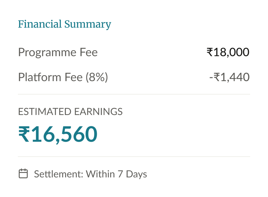
Formi takes a different route. Patients pay nothing. Therapists are charged a small platform fee, 8 to 12%, only when they prescribe a programme. No programme, no fee.

That decision shaped the dashboard’s revenue section too. Not a subscription screen, but a live read on programmes prescribed and earnings tied to real usage. And it meant patients get zero friction onboarding, no paywall sitting in the middle of a recovery journey.

Completion rate over renewal rate

The obvious metric for a platform like this is renewals. But optimising for renewals quietly rewards keeping someone in treatment longer than they need to be, which is the opposite of what a good physiotherapist is trying to do.

So the dashboard leads with completion rate instead. A patient finishing their programme and being discharged reads as a win, not as revenue walking out of the door.

It changes what the funnel is for. Early drop-off stops being churn to win back and becomes a clinical risk group to intervene on, which is exactly what the alerts layer already exists to catch.

What shipped, and what’s still unproven

53
Screens across two products
7
Functional groups in the dashboard
2
Native platforms specified
1
Design system shared by both apps

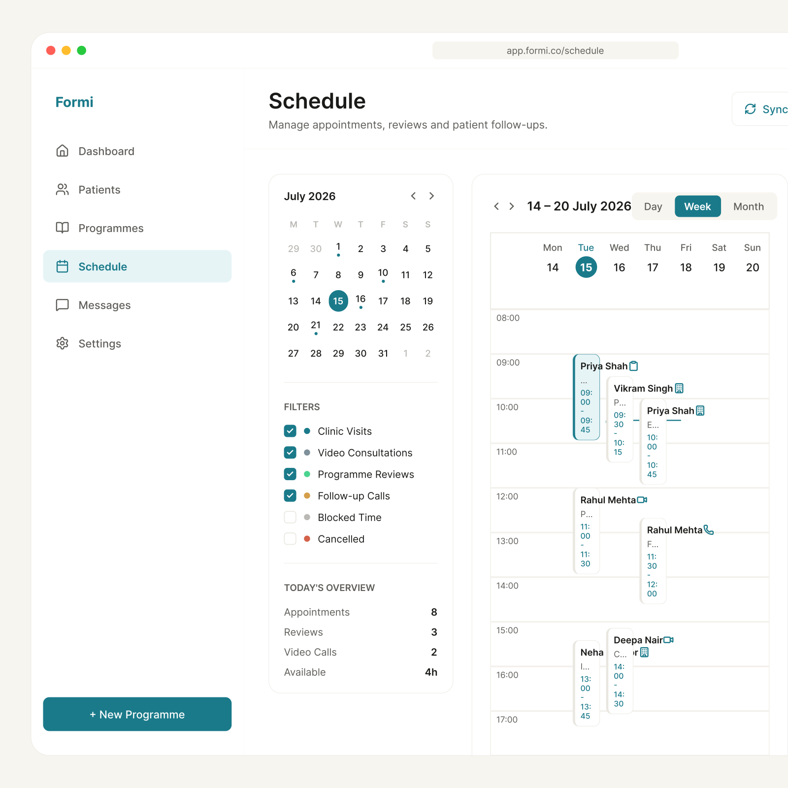
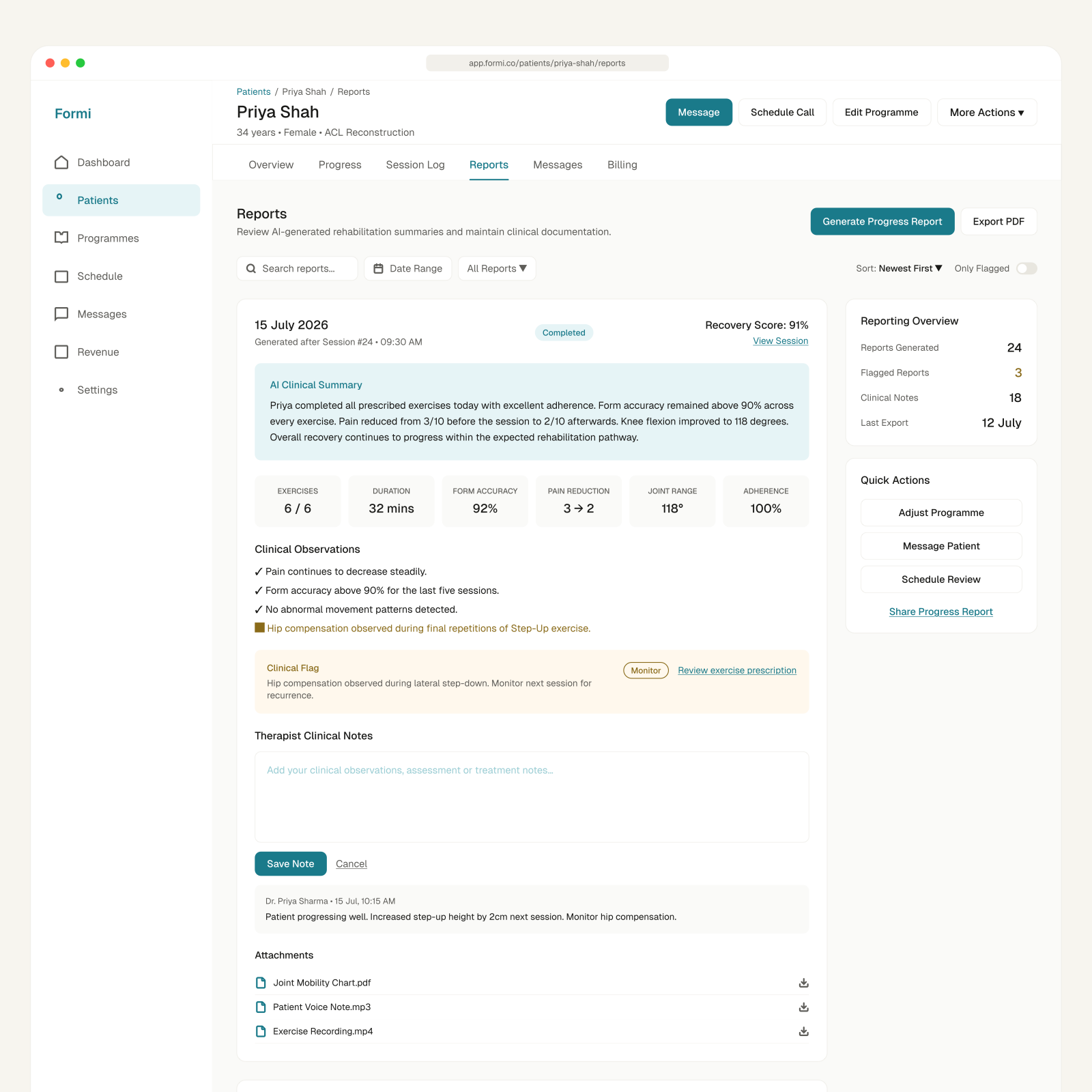
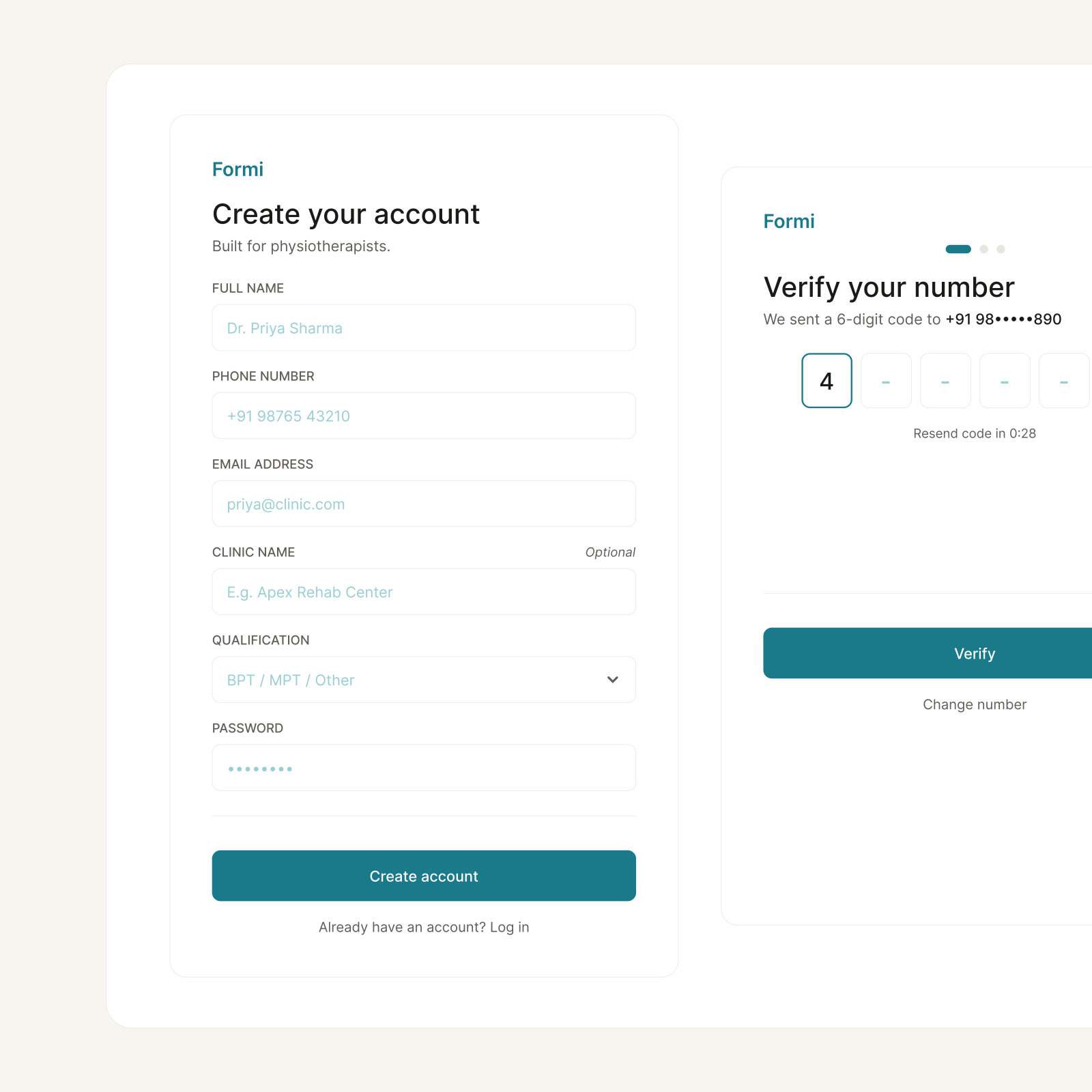
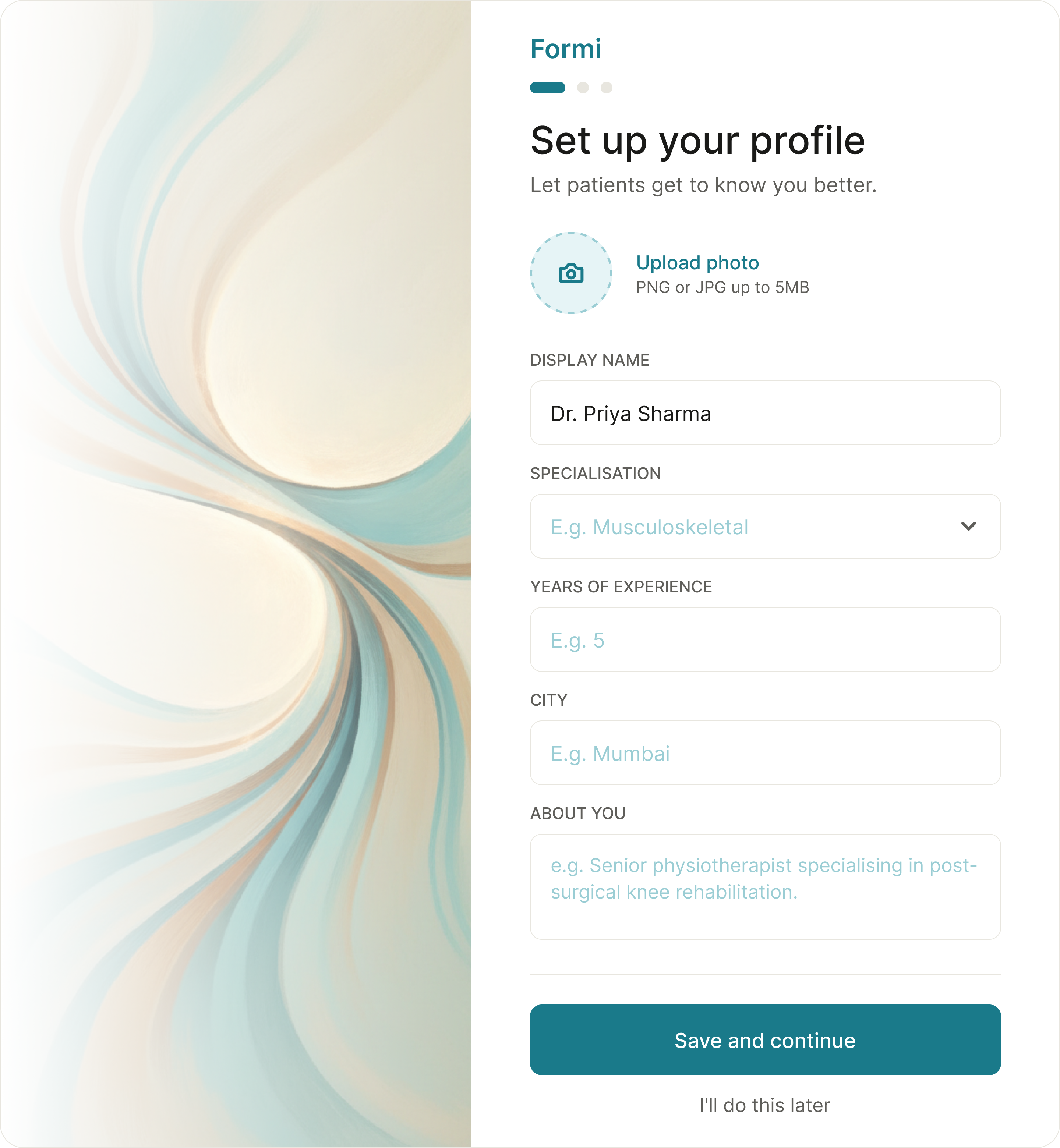
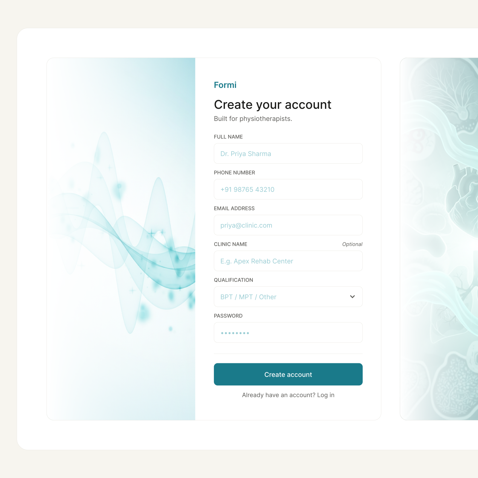
The work landed as a developer-ready specification, not a mood board. A 23-screen therapist dashboard spanning programme creation, patient monitoring, alerts, scheduling, billing and reporting; a 30-screen patient app carrying someone from a therapist’s code through AI-tracked sessions to discharge. Both are composed from one design system, annotated with states, spacing and interactions.

It began as ‘Proctify’, a patients-only college project. The therapist half, the half that makes it a business rather than an app, wasn’t in the original scope at all.

Two things I’d do differently. I designed the pose-tracking session on reasoning alone; it’s the riskiest surface in the product and the one that most needed a rough prototype in someone’s hands early, not a polished spec late. And I’d instrument completion rate from the first build rather than treating it as a reporting feature: the entire business model rests on that single number, so it should have been the first thing measurable.

  • Usability-test the guided session with real patients, on low-end Android, on the floor
  • Pilot with clinics to find out whether an 8–12% fee survives how therapists actually price
  • Track completion rate from day one, the north-star metric has to be observable
0 to 1 design is less about the pixels, and more about deciding what not to build yet.
What I took away

Every screen

21 frames
Next projectFormi: Patient App Like what you see? Let’s talk