A studio homepage, prototyped as one continuous scroll
Web DesignDesign EngineeringMotionPrototype
Brand
Shell Ivory Studio, a marketing and creative studio
Role
Homepage design and scroll-driven prototype
Scope
Hero, who we are, services, selected works, process, clarity, footer
Stack
Figma for design; HTML, CSS and JavaScript for the prototype
Status
Ongoing · 2026. The work shown here is in progress
A studio homepage designed as motion, not as a stack of sections, and prototyped in code so the transitions could be judged by scrolling rather than imagined from stills. The project is still ongoing, so this is a look at work in progress.
At a glance
7
Scenes in one continuous scroll
1440
Artboard width the whole stage scales from
3
Brand colours: blue, ivory and red
4
Typefaces, each with one job
Overview
A homepage that moves as one piece
Shell Ivory Studio is a marketing and creative studio. Its homepage has seven things to say: who it is, what it believes, what it offers, what it has made, how it works, why that matters, and how to get in touch.
Rather than stacking those as seven blocks, the design treats the page as one piece of choreography. Each scene transforms into the next, so scrolling feels like a single continuous move through the studio rather than a list.
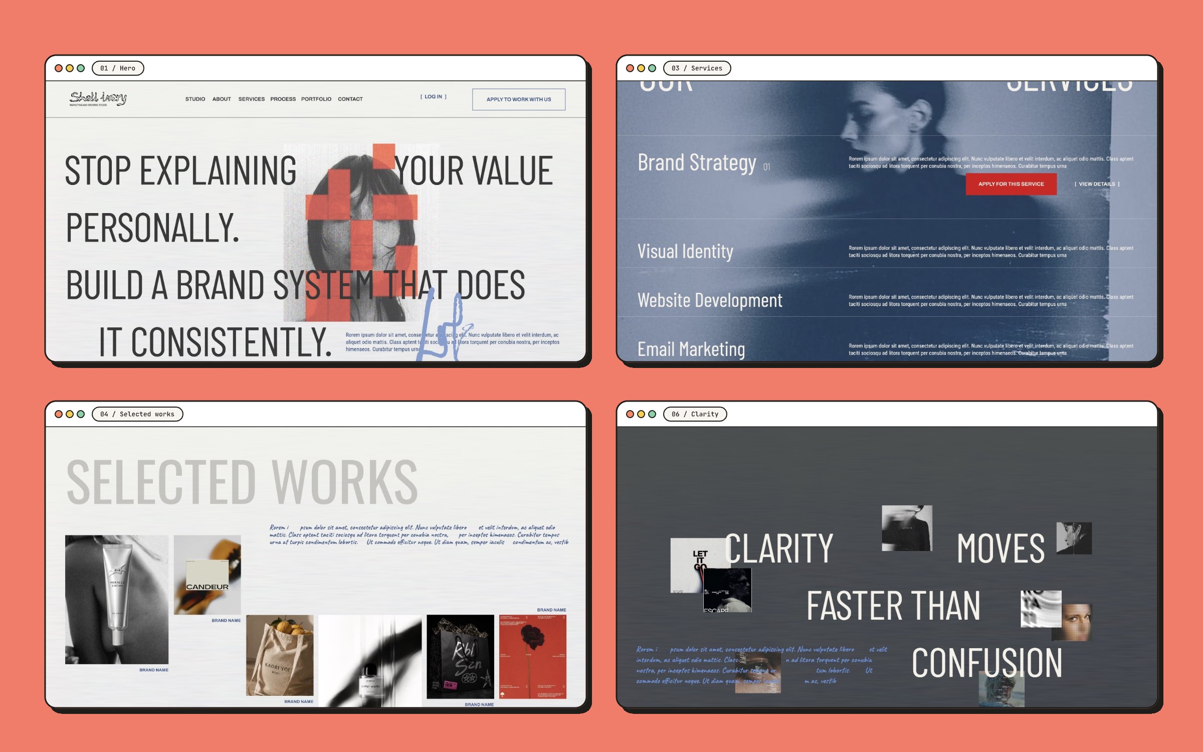
01HeroCards, wordmark, then the headline.
02Who we areA portrait that opens into the next scene.
03ServicesEight rows that expand.
04Selected worksA collage that opens into project pages.
05ProcessFour steps, moving sideways.
06ClarityThe closing statement.
07FooterNewsletter and sign-off.
Visual system
Three colours, four typefaces
The palette is deliberately small. A muted blue and a warm ivory trade places as the ground from scene to scene, and red is mostly kept for the things you can act on: the primary buttons and the newsletter field.
Blue#395583
Ivory#F4F1EA
Red#D80019
Ink#383838
Highlight#A4C7FF
Type is four faces with one job each. A condensed sans sets the display lines large enough to become part of the composition. A condensed text face carries the body copy, a wide sans handles navigation and labels, and a handwritten script is kept for annotations.
Secondary actions are set in square brackets rather than drawn as buttons, which keeps the red rectangles rare and makes them easy to find.
Hero
An opening in three beats
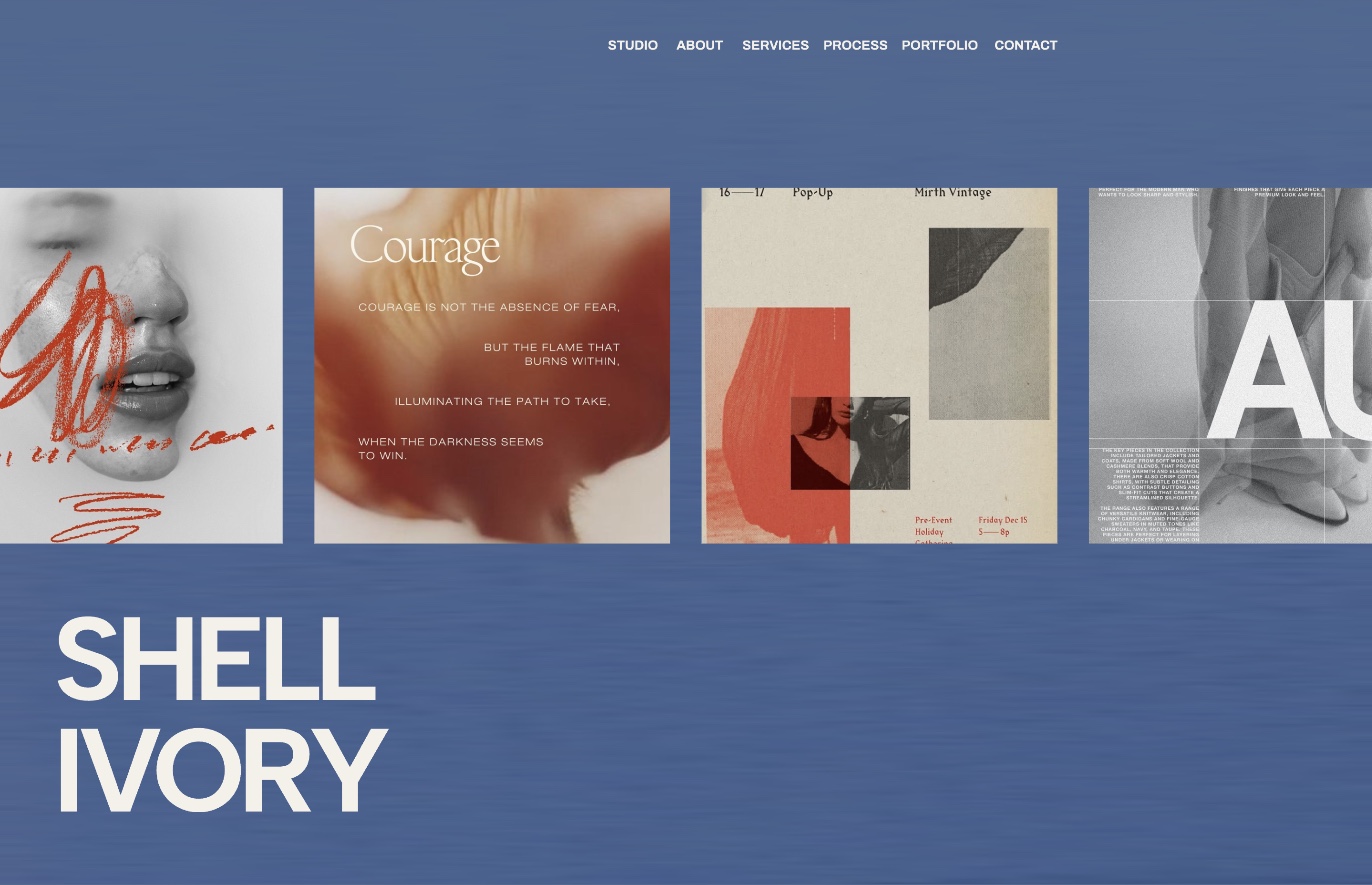
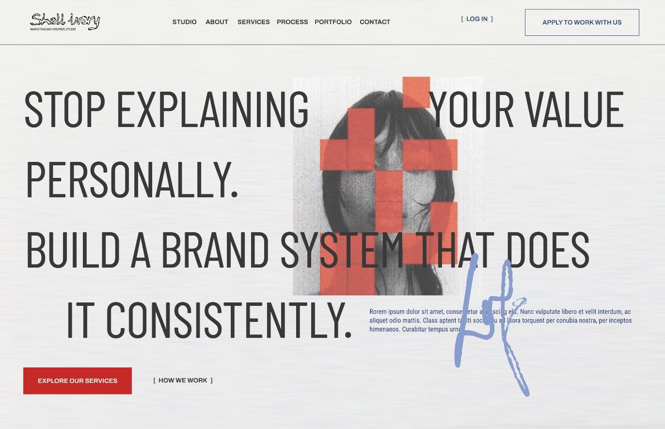
The page opens on blue: a strip of work and the wordmark, with almost nothing else. As you scroll, the cards shrink away, the ground turns to ivory, and the headline arrives line by line around a portrait: stop explaining your value personally, build a brand system that does it consistently.
First beat: the work and the wordmarkThird beat: the headline, portrait and calls to action
The headline is the layout
The display type is set large enough to run the full width, and the portrait sits inside the sentence rather than beside it. The words break around the image, so the hero reads as one composed spread instead of a headline next to a picture.
Who we are and services
The frame that swallows the page
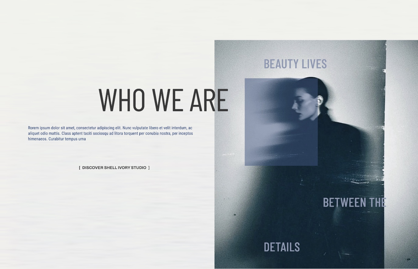
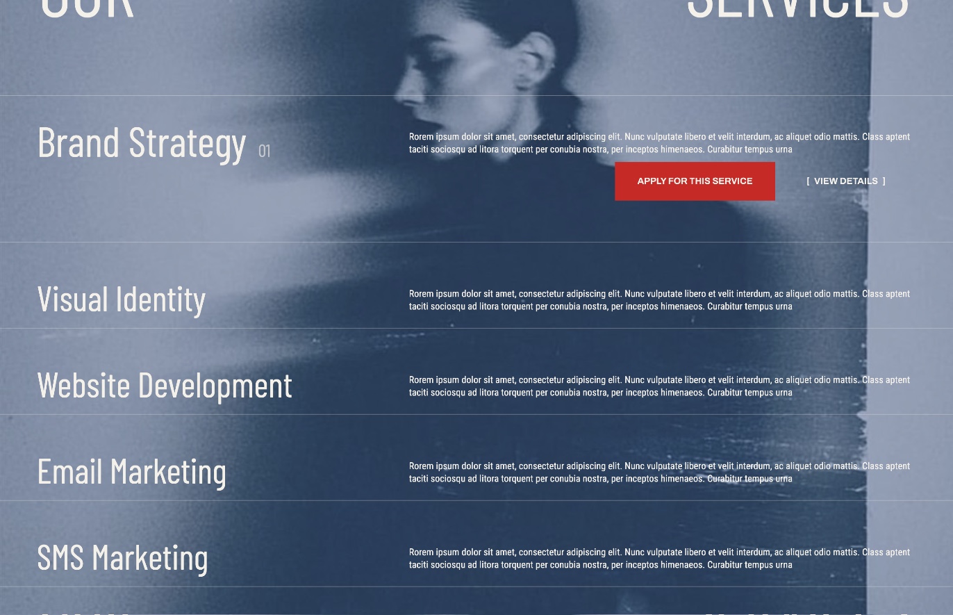
Who we are sits on ivory with a framed portrait to one side. Keep scrolling and that frame grows until it fills the screen, and the photograph inside it becomes the background of the services scene. The section change is the image itself, not a cut.
Who we are: the frame before it opensServices: the same photograph, now the ground
The eight services are a list of rows. The open row grows, shows its number, and reveals the two actions for that service, so the list stays scannable and only one service asks for attention at a time.
Selected works and process
A collage, then a walk sideways
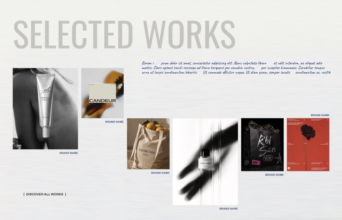
Selected works is a loose collage of six pieces at different sizes, set against oversized display type. Three of them open into full project pages as you scroll, each with a main image and a side frame.
Selected works: the collage
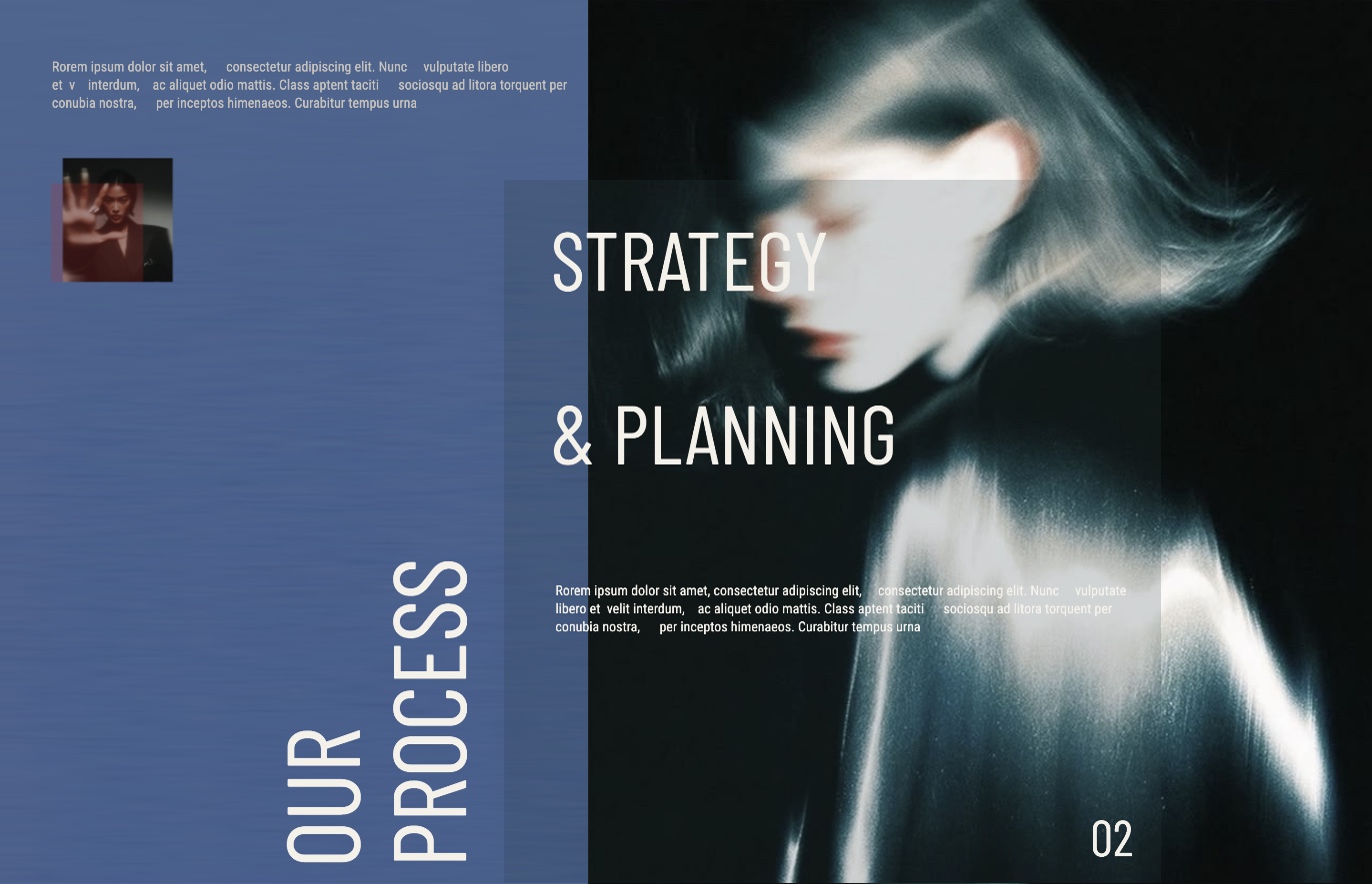
The process scene changes direction. Its four steps, research and discovery, strategy and planning, design and direction, analysis and refinement, move horizontally, and each finished step collapses into a small card on a rail so you can see how far through you are.
Process: step two of four, with step one collapsed onto the rail
Clarity and footer
One line to leave with
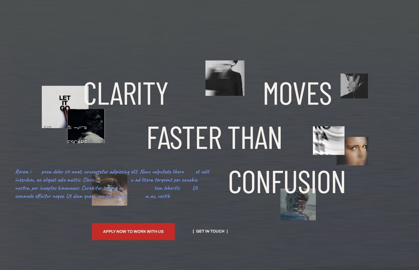
The closing statement, clarity moves faster than confusion, is spread across the screen with small pieces of work drifting between the words, and it carries the page’s main call to action.
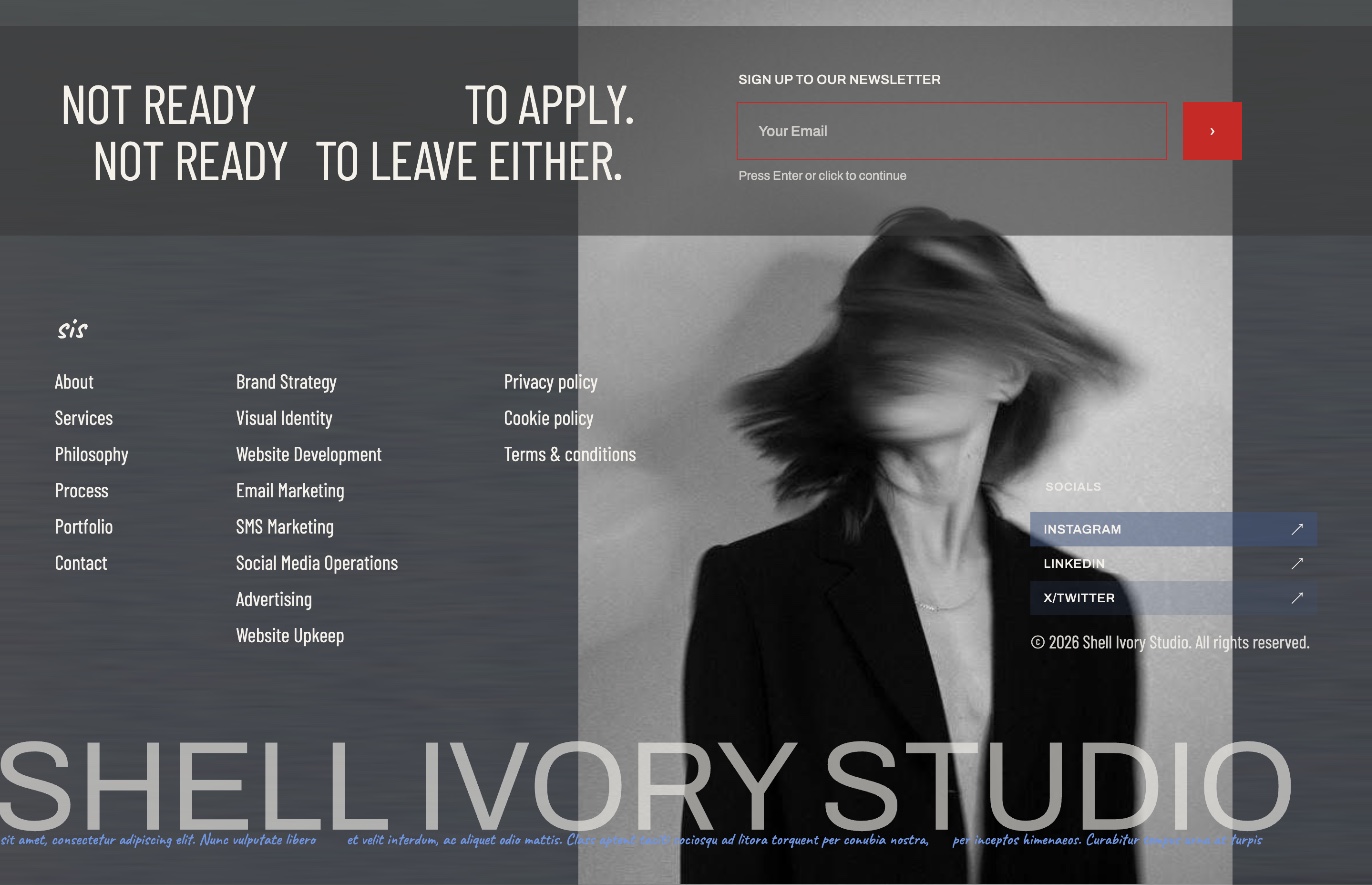
The footer speaks to the visitor who is not ready for that: not ready to apply, not ready to leave either. The newsletter field asks one thing at a time, sliding from email to phone to name, so it never looks like a form.
Clarity: the closing statementFooter: newsletter, sitemap and sign-off
Design engineering
Prototyped in code, on the real geometry
The prototype is a single page of HTML, CSS and JavaScript. Every position and size in it is lifted from the Figma exports in artboard units, 1440 wide, and the whole stage scales as one, so what moves on screen is the actual design and not an approximation of it.
One scroll position drives everything: each scene reads the same timeline and places itself.
A chapter rail at the foot of the screen jumps to any of the ten chapters, including the three project pages.
The service rows, project pages and newsletter field are interactive, not just animated.
Motion is reduced for visitors who ask their system for less of it.