Conqr.ai
Brand, design system, and a launch landing page
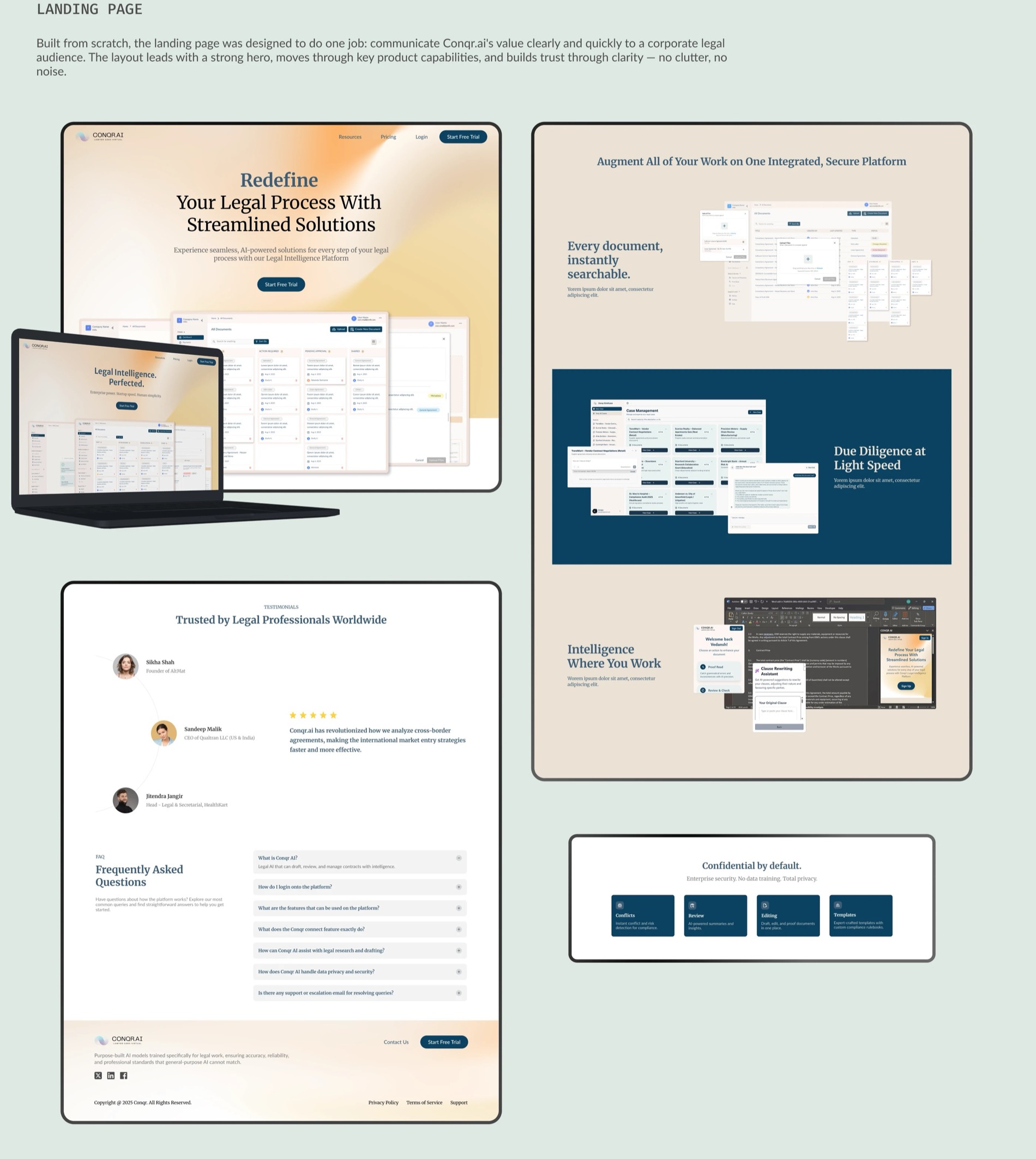
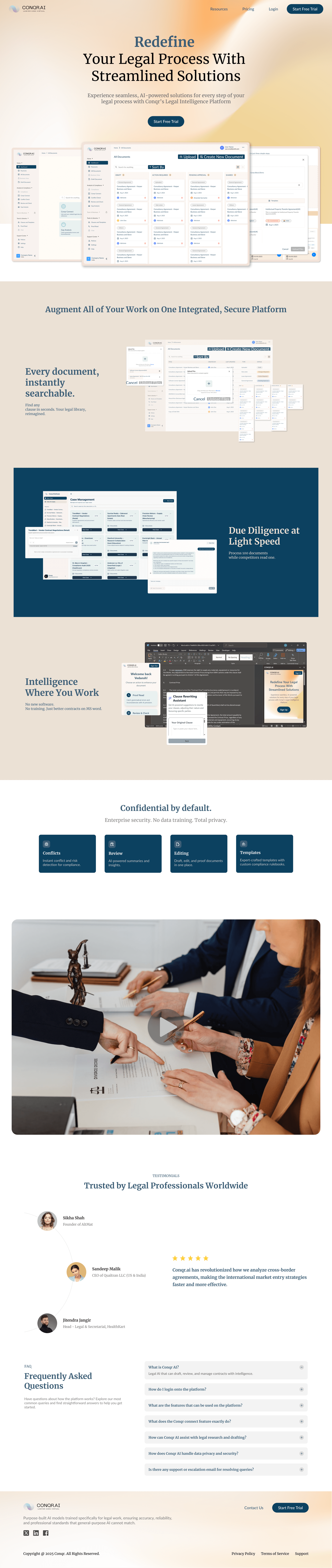
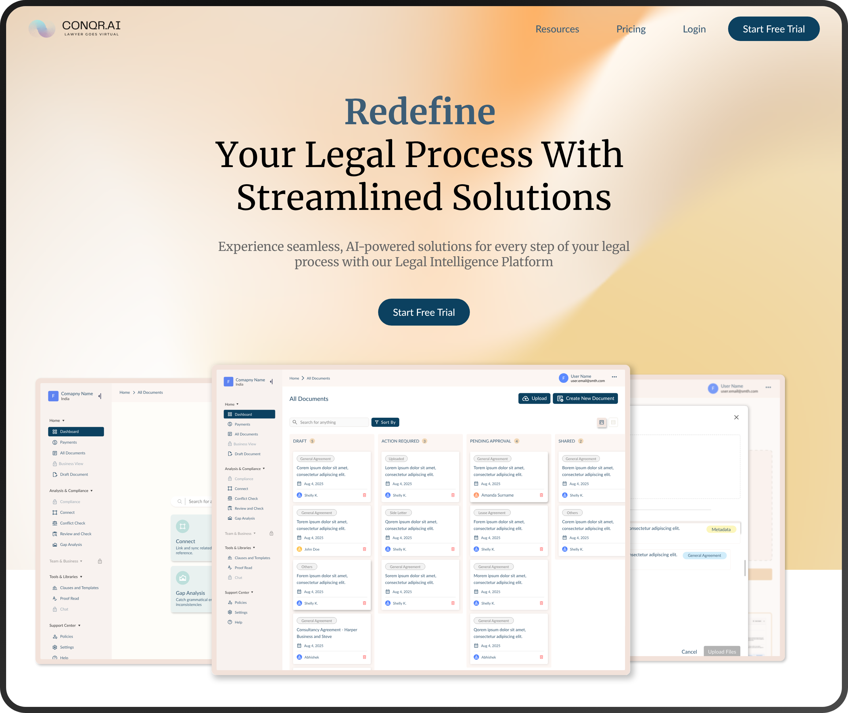 Conqr.ai, the shipped landing page
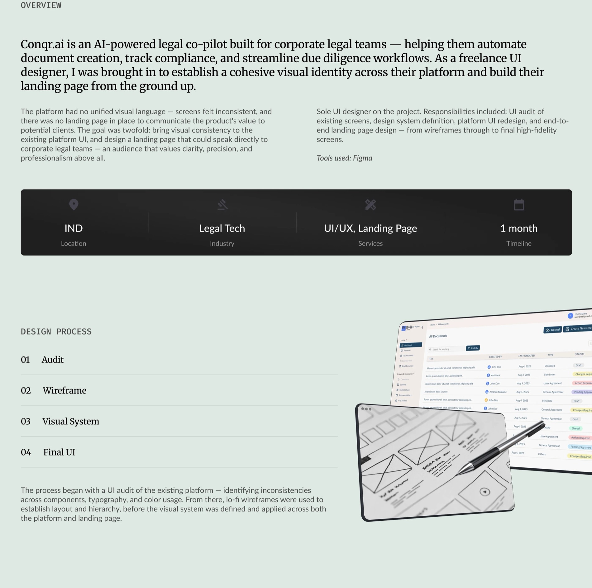
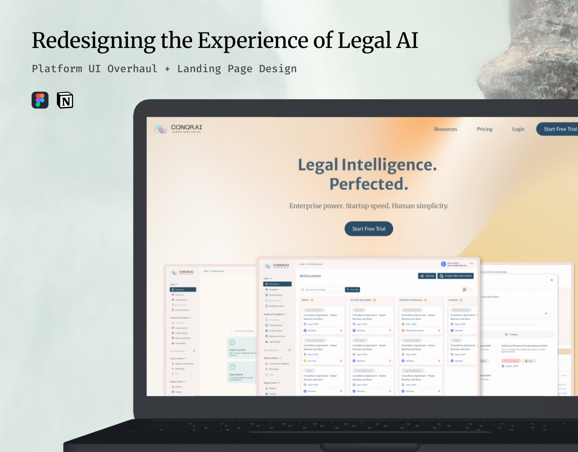
A visual redesign, not a product one. Conqr.ai’s legal AI assistant, its features and its flows, was built separately. This work was the brand identity, the design system, a landing page from scratch for the launch, and that system applied across the product’s existing screens.
At a glance
ContentsOverview
“Redesign our website”, with no sense of direction
Conqr.ai came in with a clear ask and an unclear target. They wanted their website redesigned, but had no point of view on what it should look like, feel like, or say.
That’s a harder brief than a detailed one. There’s no direction to react to: only a blank page to fill on the client’s behalf, and no way to tell whether you’ve filled it correctly until you show them.
Finding direction through iteration, not discovery
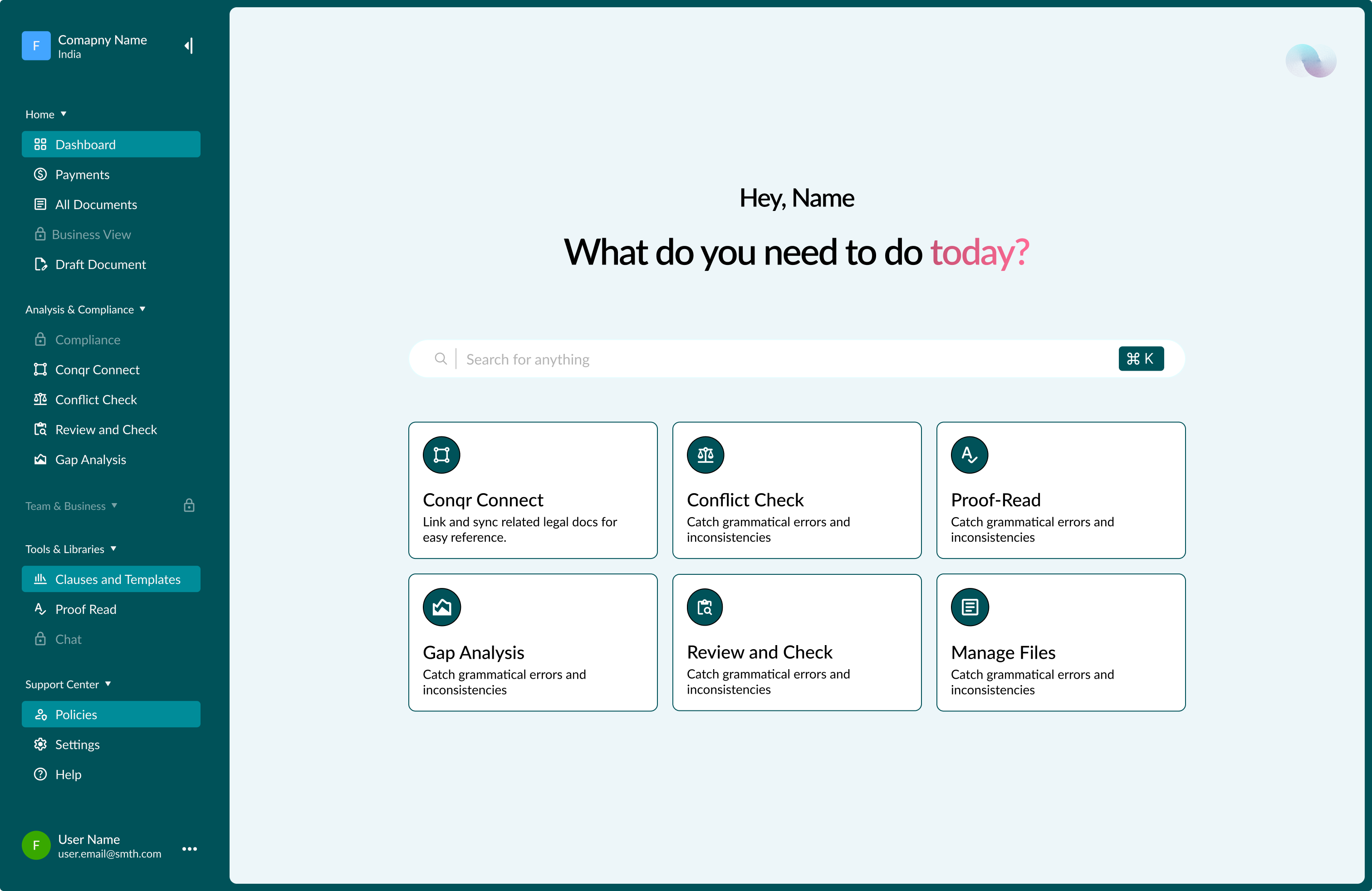
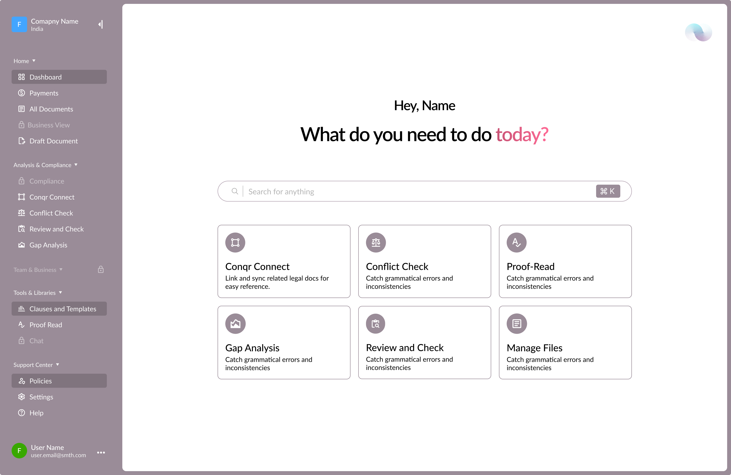
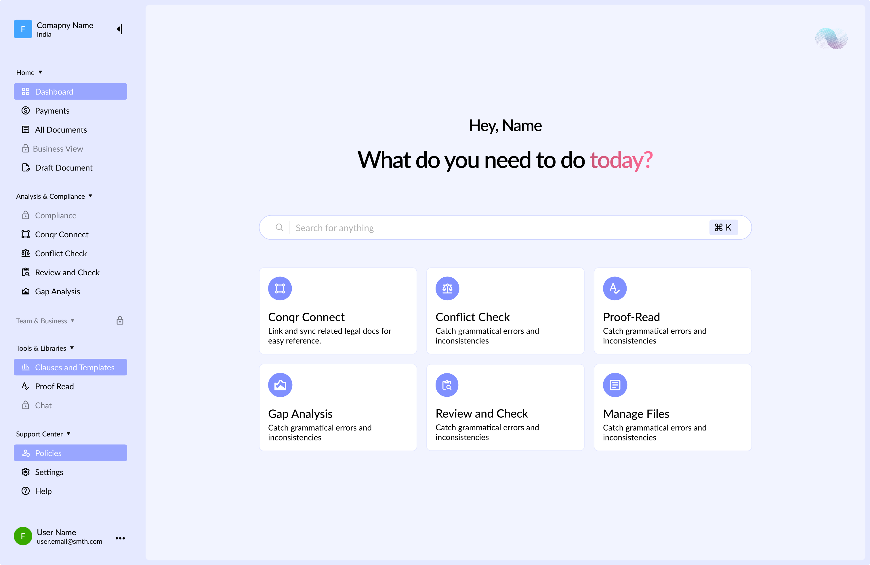
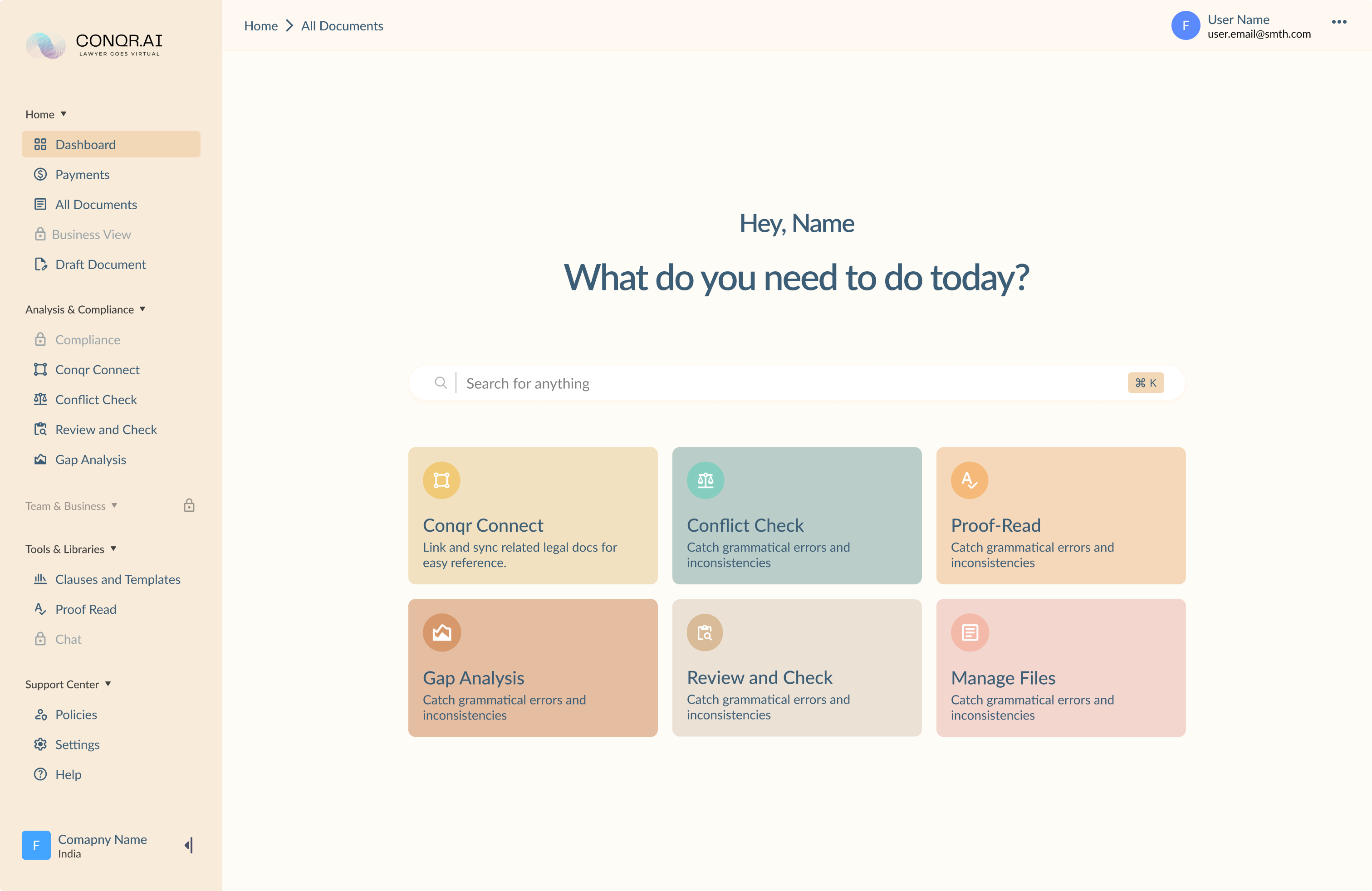
With no strong brief to anchor to, the process leaned on showing rather than asking. I brought a wide set of visual references to give the client something concrete to react to, then iterated on whatever pulled them in a direction: a loop of “does this feel more like it, or less”.
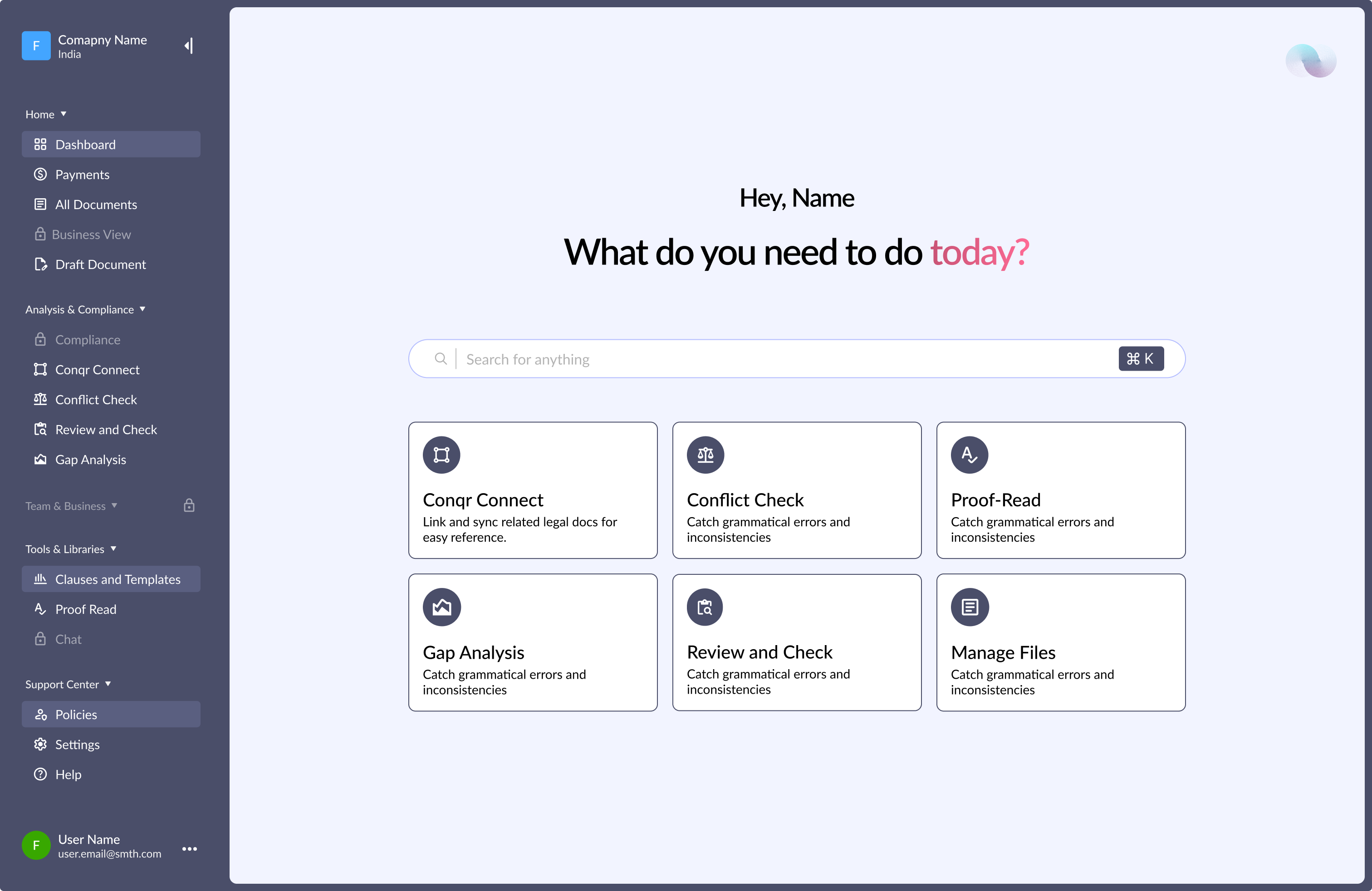
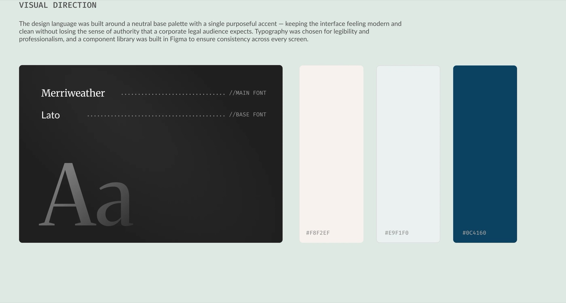
It took three to four full iterations before a direction solidified into an actual design system: a defined colour palette, typography, and a component language the client could commit to.
What shipped
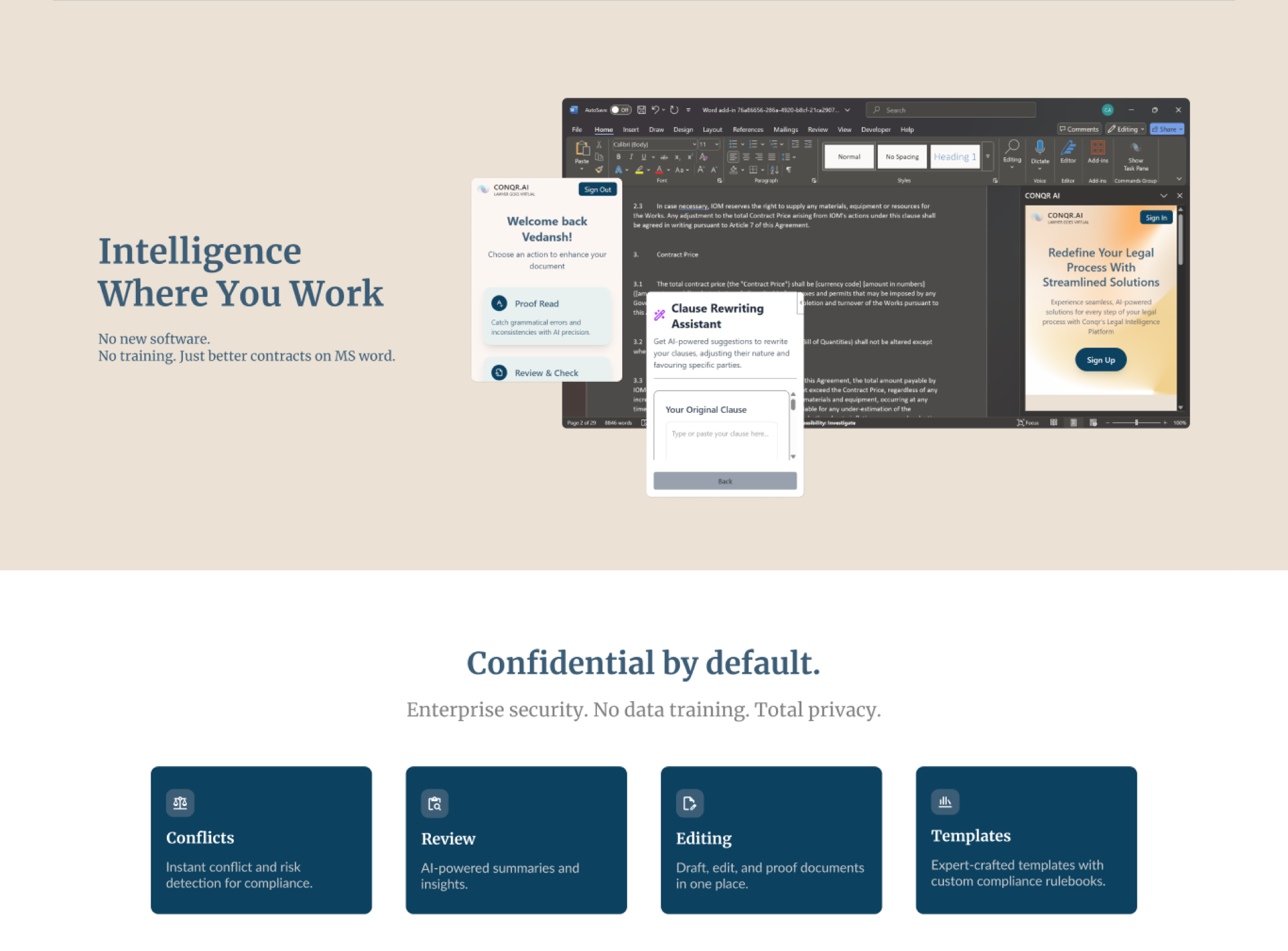
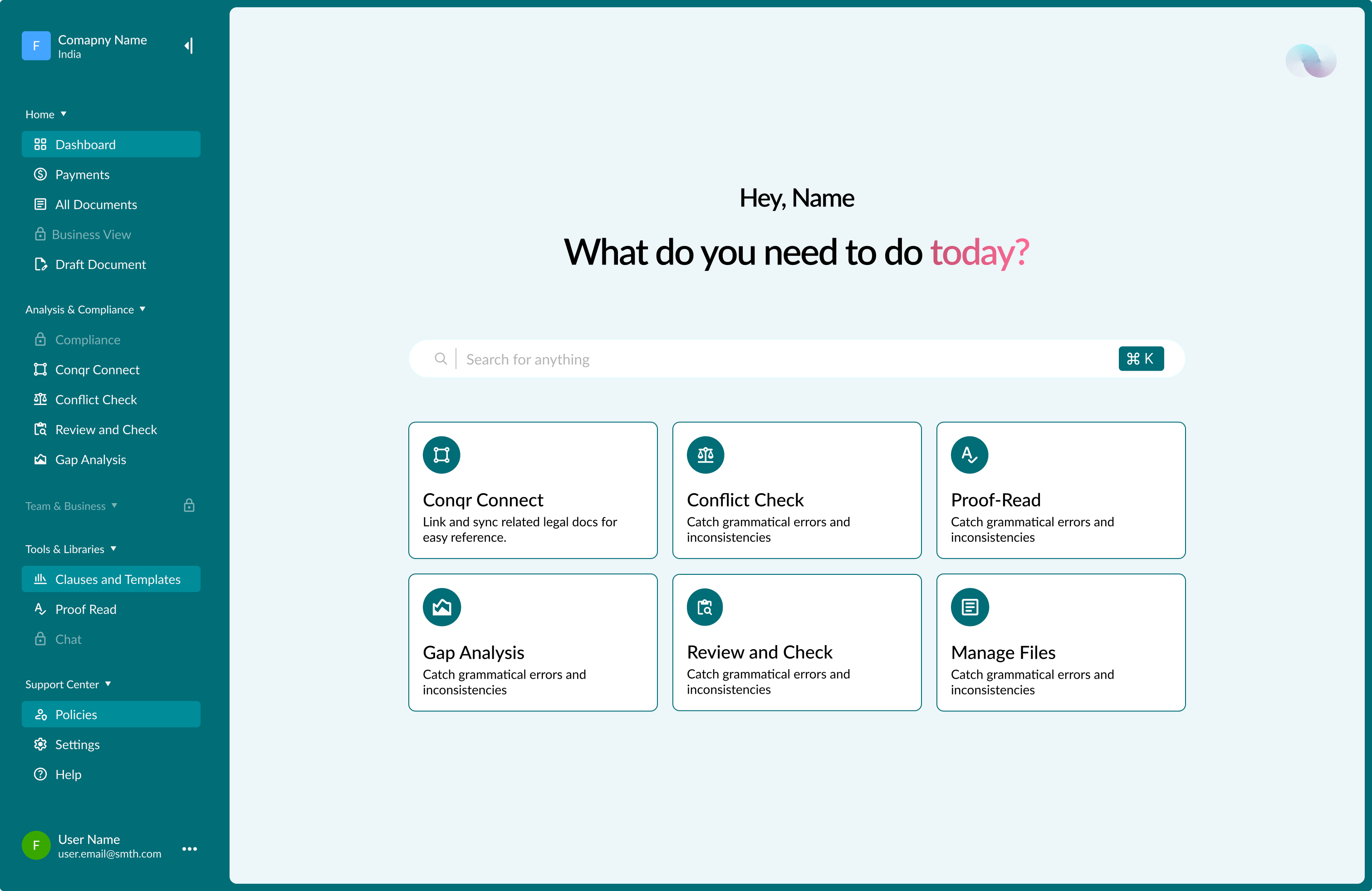
Two deliverables came out of the two months: a brand design system, colour, typography and component language, arrived at through the iteration above, and the landing page itself, built from scratch rather than as a redesign of an existing page, single-scroll, used for the product’s public launch.
The system on the product surfaces
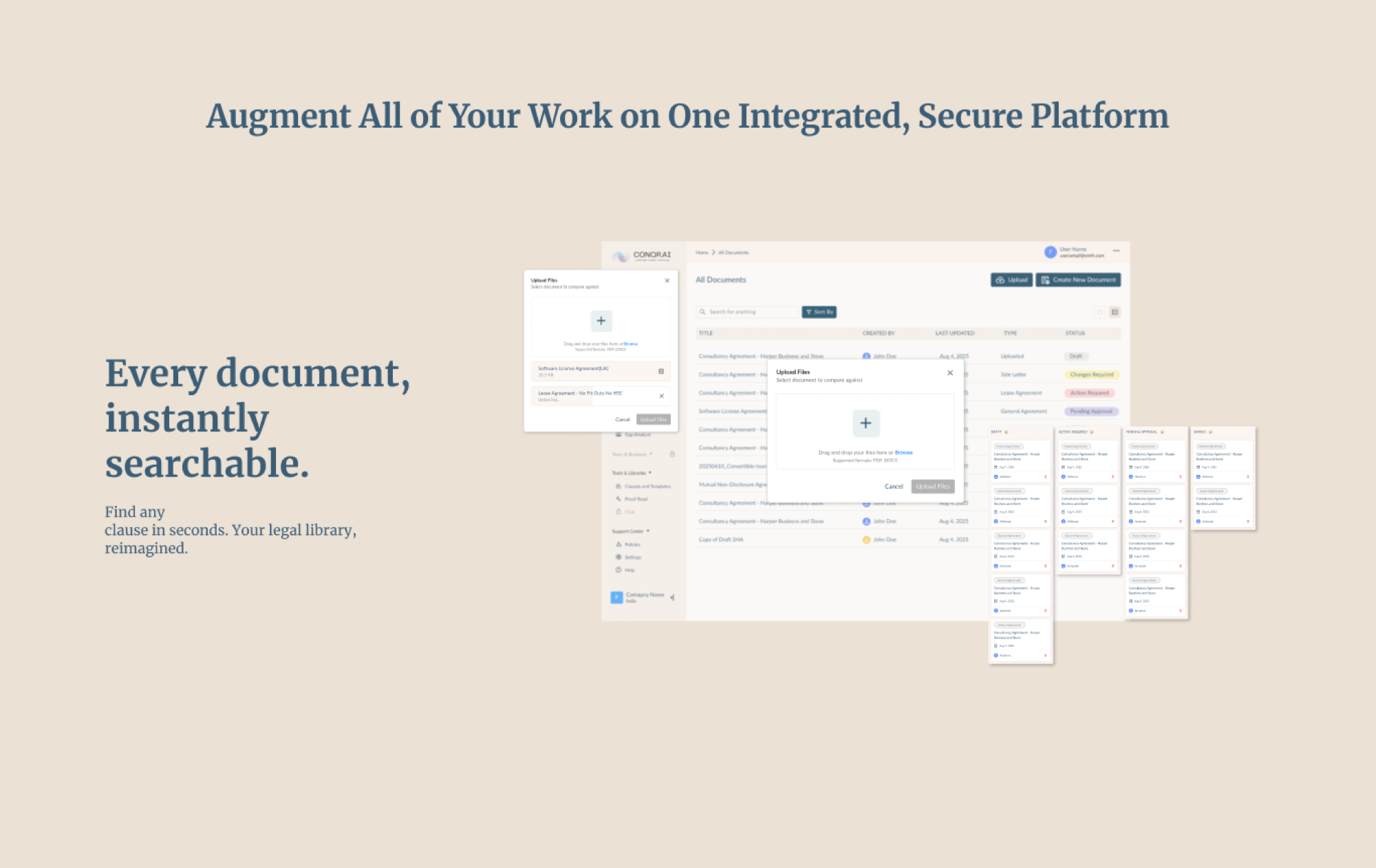
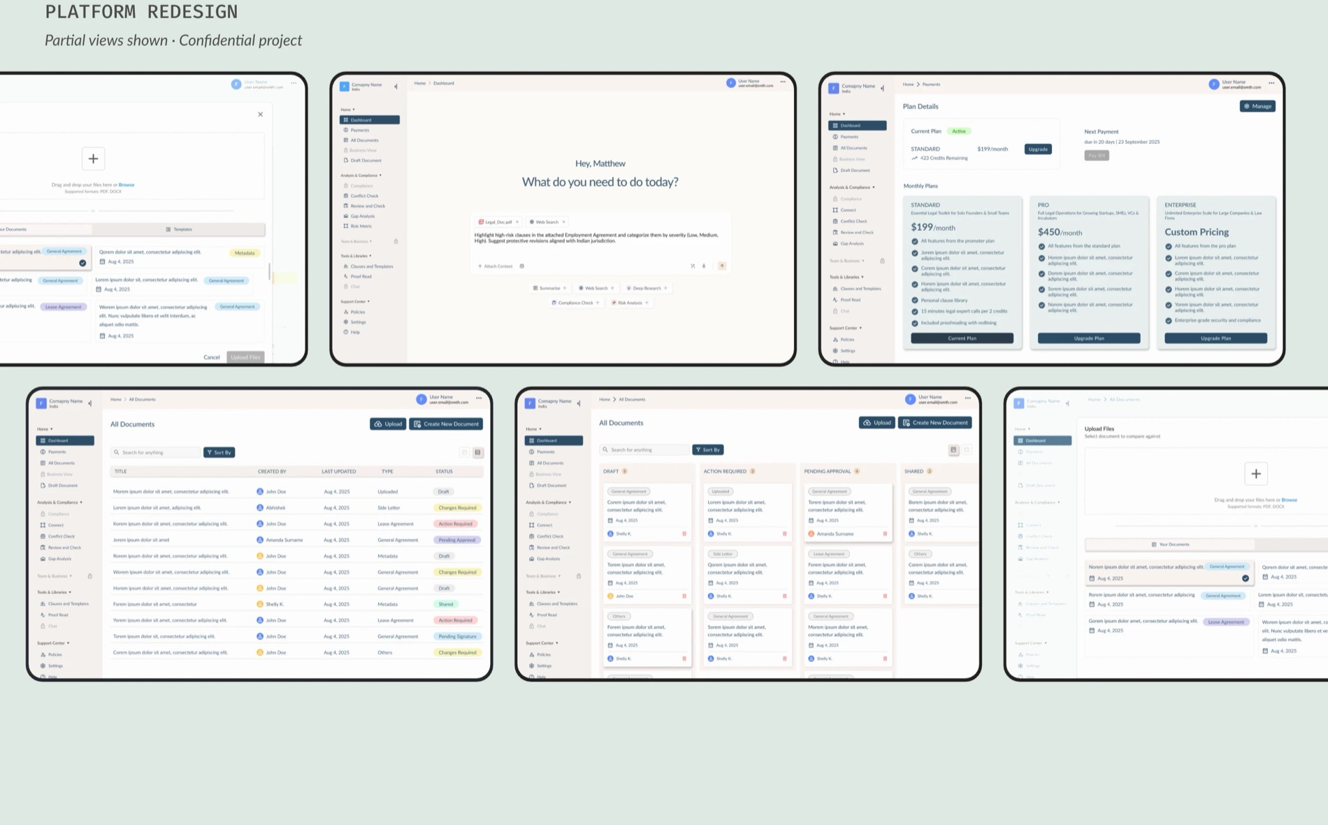
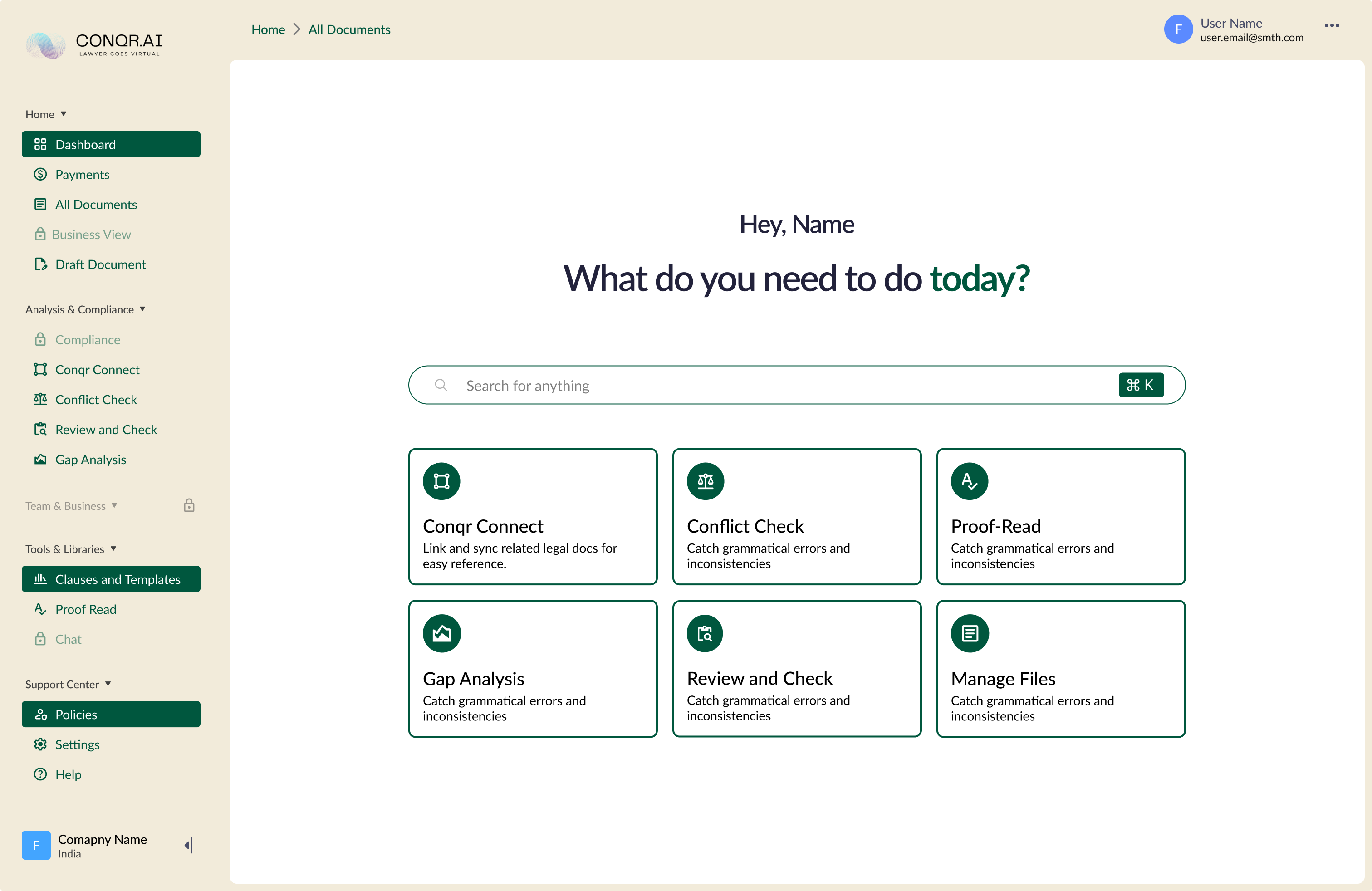
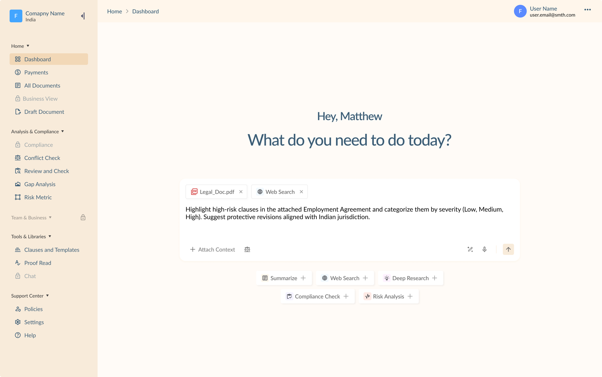
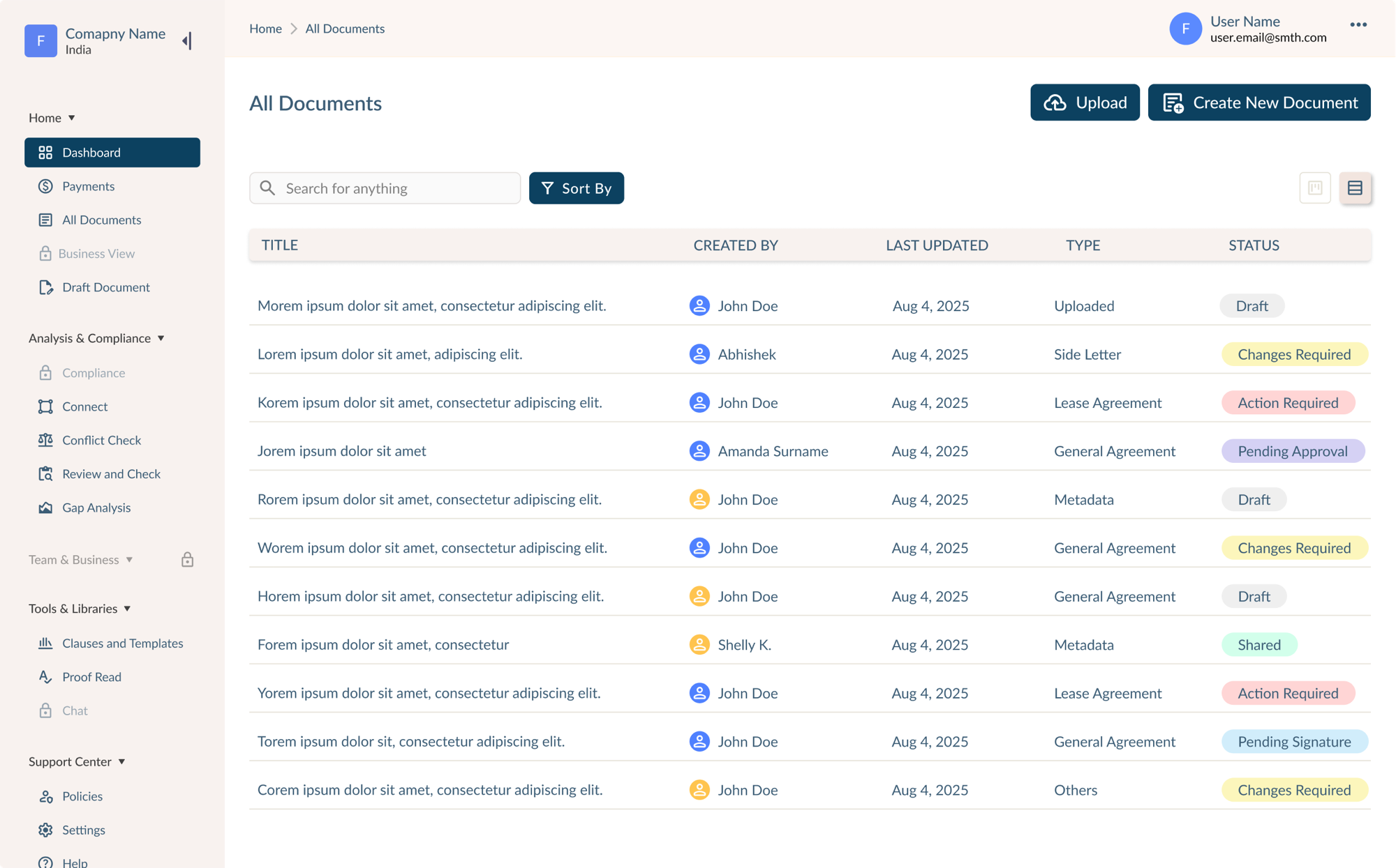
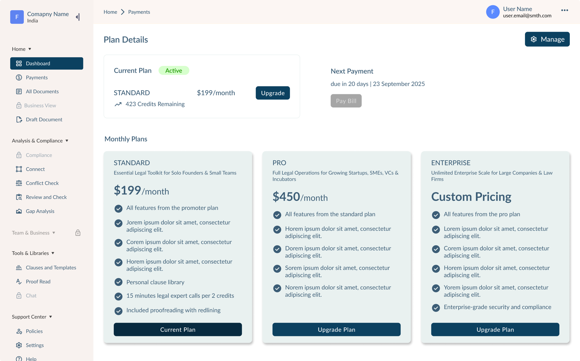
The features and the flows were the client’s. The visual language was mine: and it was carried onto the product itself: the workspace where legal teams draft, review and pay for agreements.
Nothing about how the product worked changed. What changed was whether it looked like something a corporate legal team would hand a contract to. Dense document management stopped reading as unfinished software and started reading as a tool with a point of view, and the marketing site and the product it sold stopped looking like two different companies.
Honest about the outcome
The engagement ran the full two months, delivered a settled design system and a shipped landing page, and the client still wasn’t fully satisfied at the end. That’s part of the case study rather than something to smooth over.
What it taught: how to build a design system from a genuinely ambiguous brief, and how to convert vague, shifting requirements into decisions that actually ship, even when “shipped” and “everyone’s happy” don’t fully overlap.
Every screen
10 frames